Usability heads in the right direction

We’ve built something new. It’s a widget for giving your web users easy access to clear directions for the location of your school/faculty/service.

It’s the efficient way for our lovely web editors to help potential visitors to the University.

It eliminates the need for paragraphs of vague/potentially incorrect routes to take:

  • roads
  • rail services
  • walking routes
  • cycling routes

Our new T4 content type is ideal for your website’s Find Us or Contact Us page.

How it works

If you’re seeking to add this content type, you’ll need to choose 14. Google directions.

We advise you add this to the bottom of your page, as it sits to the left under preceding content. Use it further up and people might miss something you’ve written that is important.

There are two boxes to fill out once you’ve selected this content type. The first is title, which should be filled out with:

DIRECTIONS: insert name of your school/service/faculty here

The second box relates to where you actually want to send your website users.

Because much of the university campus has the same postcode, you need to enter the building name and postcode.

An example for the Institute of Cellular Medicine, would be:

William Leech Building NE2 4HH

Then just update and approve your content and wait for it to publish.

What your users get

Your website users will see a search facility on the page with a Find Us button. All they need to do is add their address or postcode into the box and click on the button.

They will instantly arrive on a Google Maps page that will plot the routes to your location:

  • road
  • rail
  • walking
  • cycling
  • flight (if they’re far enough away)

Because it’s all done through Google, the information is constantly updated to remain as accurate as it can be.

It’s also a visual representation that takes you through the journey and works with GPS, instead of paragraphs that vaguely get your users here.

An example is on our demo site. Have a go applying it to yours.

Share this post:
Share

Go Mobile: the Story So Far

Our Go Mobile programme is up and running: 17, yes 17 (!) sites went live in September.

Phase 1 (our ‘beta/test/is this even possible’ phase) was a success. And because of this, we’re going to carry on and put the rest of our external-facing website through the programme.

Go mobile explained

Go Mobile is a project to make our website mobile responsive. This means it works on desktop computers as well as tablets and mobile phones.

But we’re not making things easy for ourselves. As well as adding a responsive design we’re also:

  • improving content – rewriting for mobile
  • updating assets – our new design needs higher quality images to support content
  • moving to a new content management system (TerminalFour – T4)

You can see some examples in action:

Oh no! Why have they changed everything?

Some of our feedback, particularly from University staff, has been unhappiness that we’ve changed or moved things. Remember we’re doing this for the greater good!

Our websites now work just as well on mobile as on huge desktop screens. Go Mobile is about improving access for all.

Key developments cover navigation, design and content

NAVIGATION

How you move through pages needs to be simpler and easier for mobile (smaller screens). Navigation is improved for those using desktops too. We’ve made sites shallower and removed redundant content.

DESIGN

Design enhances your website but doesn’t rule it. We’re always thinking about what our users want from the web content. For example, we’ve made sure that images are impactful and support our messages. But we’ve made sure that our template prioritises for you: on mobile, images shrink and drop under content.

Content

Text for mobile is written in short, easy to read paragraphs.  This helps when it’s stacked for smaller mobile screens.

We’ve also introduced styles like the introduction which helps to focus the point of the content on the web page. It’s allowed us to firm up our content standards. A paragraph should be around 20 words because this works better on mobile.

Even though this is part of writing for the web/writing for mobile, a lot of our changes are just about good writing generally.

So, how did we do it?

By magic of course! Well actually, a whole lot of design, technical and word wizardry.

We worked closely with colleagues in our IT Service (NUIT) as well as those in schools, faculties and central services.

We developed a brand new suite of training for our web editors. This covers editing in the new system, writing for the web, defining site objectives and using media (images and videos). We also introduced various tools to help you evaluate and improve content.

Find out what our web editors thought of the Go Mobile process.

Next steps

There are exciting times ahead. We’re turning attention to Phase 2. This is where we take the rest of the external website through Go Mobile. We’re planning to do this between January and December 2016.

It’s going to mean a lot of change for the team:

  • Agile ways of working
  • focused, time-bound project cycles to get through all the sites
  • extra staff
  • new office space

It’s going to mean a lot of commitment from our faculties and services. We need staff dedicated to developing their websites working with us and giving time for training on writing best practice and the new content management system.

We’d love to hear your comments on what we’re doing. Either comment here or use our feedback form.

Share this post:
Share

How Meaningful Titles and Descriptions Engage Site Visitors

As we move into our responsive design (and T4), we’re introducing ways to make our content work better for mobile and tablet users.

This means that our editors are changing the way they write web ‘pages’.  In fact, let’s scrub that. The web page doesn’t exist anymore.

You are not writing for desktop.

The way the content looks on your computer, in your browser, is not the only way that it will look.

Writing for our new responsive design

Some of our new content types have different behaviour depending on where they are used.

You should always check your content on other devices (or use this handy responsive design emulator).

Titles and navigation

Titles as a style aren’t new, but are important when writing content for smaller screens. They might be the only thing your reader sees. They can also appear as navigation and part of search results.

It’s important that what you write makes sense out of context.

News items called ‘Congratulations’ and sections called ‘Additional Information’ aren’t going to encourage people to read more.

Teaser content

We’ve introduced teaser content into some of our new content types. It’s used here as the text overlay on the Masthead.

An example masthead style of content. Full width image with text overlay.

It’s important that it’s meaningful. It should summarise the page content as it displays in this order on mobile:

Masthead shown on mobile. Overlay text shows first on the page. the image flows second.

This content could be the difference between someone reading the page or going somewhere else.

Descriptions

We’ve used descriptions in news and events for years:

description-news-list

Adding a short description to the news content types doesn’t appear on the news article page. It does appear in all sorts of other places where news is syndicated:

  • News grids
  • News lists

This micro content acts to entice your site visitor to read more – it needs to work for you.

This example is vague:

  • Title: Call for Papers
  • Description: Submit now

This example gives some context, you know if it’s for you and if it is, you want to read more:

  • Title: Call for Papers: Environmental Planning
  • Description: Submissions close on 31 October. The School encourages researchers to read the submission requirements.

Introductions

We’re aiming to make sure all core pages to have an introduction. The intro style works well on mobile. It pulls out (and styles differently) the first piece of content.

We recommend a focused 50-word statement about what the page covers. It helps users decide whether to read more. (50 words sit well as a chunk of content viewed on most mobile screens.)

Expandable/mobile collapse

We’ve a new expandable content style that allows us to hide content. Users have to choose to select to read the content – they can’t see it at a glance.

This means that the heading you choose for the content is important:

Example expandable content - users have to click to see more.

We don’t want to see vague terms like ‘More information’, ‘Additional details’, ‘Other’.  If the content contains details about your facilities call it ‘Facilities’ or even better ‘Libraries and laboratories’.

Using terms that are more specific, help your readers find what they need.

Write chunks of content

We’ve had some comments about how it feels more complicated and takes longer to build up web content.

Writing for mobile forces you to think about the order of your message.

We could have slapped a responsive template on your desktop-focused content. If content was too long we could have hidden it in expandable boxes (or truncated lengthy titles).

The page would still look okay on desktop (it wouldn’t work very well on mobile).

Rewriting your content and thinking about how people read on mobile, makes sure your users don’t get a sub-standard experience.

Everyone who wants to read your message, can.

Get in touch

Let us know if you need help in reworking your content (University Login required) or post questions in the comments.

Share this post:
Share

An Introduction to the Language of T4

Through the Go Mobile programme we’re replacing the tools we use to publish websites. Here’s a quick introduction to some of the terminology used in the new systems.

Content management system (CMS)

A content management system is a tool that can be used to add, edit, publish and maintain websites.

TerminalFour (T4)

T4 is the University’s new content management system. It is currently used to publish the undergraduate and postgraduate prospectuses, and sites on research.ncl.ac.uk and conferences.ncl.ac.uk.

As part of the Go Mobile programme we will migrate all external facing sites into T4.

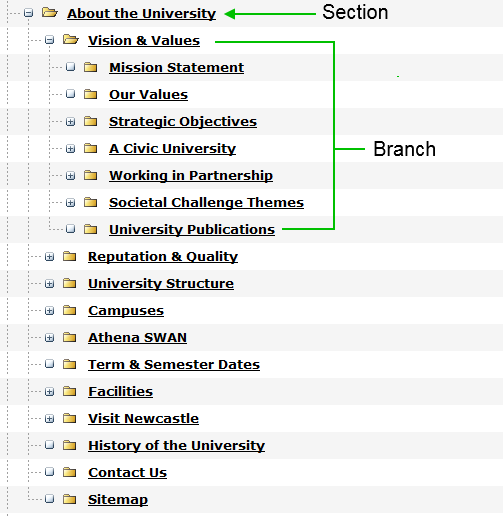
Section

A section is a folder in the Site Structure. It is a container for the content that appears on your website as a page. Your site is built up a number of sections in a hierarchy.

Branch

A branch is a section and its sub-sections.

T4 sections and branchesContent Type

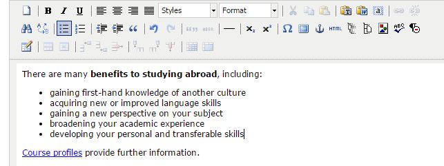
A content type allows you to create some content in a particular format, eg a pullquote, a button, or expandable content. Each content type has a customised form with fields for you to enter your content into.

Some content types contain a TinyMCE – this is the content editor interface (a bit like word) that lets you format your text.

This is the T4 content editorWorkflow

A workflow is an approval process that a piece of content can go through before it is published. Workflows will be set up in consultation with site owners.

Media

Media refers to all files uploaded to your site, ie images and documents. The media for each site is grouped together as a category in the Media Library.

Channel

The channel is the method of publishing content as a page on a website.

Share this post:
Share

Training our Editors to Think Digital First

Our Go Mobile programme is the driver for some brand new training to get the University thinking digital first.

Raising the bar

We’re training our web editors to operate the new content management system – T4.

We’ve also invited key site owners to come and learn about managing a site. This includes setting goals for content and best practice in writing for the web.

The first sessions ran on 7 and 8 May for trainees from the:

  • Undergraduate and Postgraduate marketing teams
  • Research Office
  • Institute for Sustainability
  • School of Agriculture, Food and Rural Development

Day 1: Writing and Planning Web Content

We want to get our web editors really thinking about their content.

The University doesn’t want a team of content-putter-uppers. It needs digitally savvy writers who understand what their site is for and how to evaluate it.

Day 1 introduces setting a site purpose and how you prioritise content to support it. It was good to be able to try out some exercises we’d picked up at Confab Europe (a content strategy conference).  Even better, our editors seemed to really understand them and could see how they might use them.

“[The] site purpose planning doc was super helpful!”

The session also covers tips for writing web content and introduce a range of tools to help you do this.

“The writing tips I know, but still find hard to put into practice…it was a useful refresher.”

Day 2: T4 Training

Our T4 training day provides an introduction to the Content Management System. It showcases the idea of responsive design and how we’re configuring T4 to support editors to write for a range of devices.

“Having news and staff lists in one place is fantastic.”

Empowering editors

Site editors can more easily influence the design of their content in T4. The first editors are starting a 2-4 week period of supported editing. In this time they’ll get to apply new layouts, add quality assets, and improve their content for reading online.

It’s a chance to cut words, tighten copy and focus on users.

Initial feedback

As we go, we’re gathering feedback on the training topics, the delivery and the new CMS. We’re in Beta mode at the moment – but hope we’ve got a good starting point. We’ll be improving the training content as we go.

Accessing training

Training is only available to site editors as part of the Go Mobile Programme: we’ll be in touch when it’s your turn!

Share this post:
Share