Making Research Readable for All

Journalists learn early that if you can’t explain your story simply – you don’t know it well enough.

It’s the old adage from experienced editors. It’s a rallying call for plain English and making the complex easy to understand.

Plain English and readability are key in getting your message across, whether your audience are esteemed academics or laypersons.

Fear of ‘dumbing down’

Some research academics break into a sweat over this. It’s as if making research understandable to all is ‘dumbing down’. But researchers often do themselves a disservice with their ‘impenetrable’ web content.

The recent Research Excellence Framework review by Lord Stern recommends research impact case studies provide evidence of public engagement and understanding.

You can achieve this with your website content. It’s also a way to attract non-traditional sources of funding. But explaining your work in 65-word sentences laden with verbose language won’t help.

Have the courage to speak plainly

I’m not saying it’s easy to write about technical research. It’s almost impossible to get away from some subject-specific jargon.

But there are ways of delivering easy-to-read research. And that’s without ‘dumbing down’ and patronising your peers.

Writing actively, in tight concise sentences is a start. Bulleted lists and bold to highlight key messages are also good ideas.

The Art of Scannable Content: How to Write for Today’s Online Readers and our blog are great for writing tips.

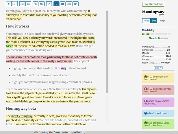
Use Hemingway App to help you. It allows you to play around with your words to get the best readability score.

Just doing this, without removing technical jargon, will help anyone read your content.

Don’t hide your research behind vocabulary

Don’t just stop at sentence size, structure and scannable content. You’re only half way there.

“All too often, research is hidden behind a vocabulary that is overly technical and disengaging, but there are ways to avoid that.”

Cracking the code for effective research communication, where this quote comes from, gives excellent advice on steps researchers can take to engage web audiences.

Always put forward how your research impacts on everyday life. Also think about whether you need jargon to tell people what it’s about.

Five minutes with Mark Blyth: “Turn it into things people can understand, let go of the academese, and people will engage” is useful. Academic Mark Blyth gives insight into his success through promoting his research online.

Share this post:
Share

Improving Readability through Go Mobile

We measure the success of the Go Mobile programme by looking at the readability score for our content.

Why readability is important

It’s important to us as our websites help us communicate with a broad range of users. Everyone from school leavers to top researchers visit our sites. They all have different content needs. They all want to find answers to questions. We need to provide answers clearly and directly. This is where readability comes in.

You can find out more in our blog posts about readability and simplifying language.

Benchmarking our readability

We use a browser-based tool called Clarity Grader to give us a clear language score for a website. They look like this (red indicates a bad score, amber is fair and green is good):

This shows a Clarity Grader report with a bad score for long sentences, a fair result foraverage sentence length and readability, and a good score on passive language.

To work out the scoring of a site, Clarity Grader assesses the following:

Long sentences

A long sentence has more than 20 words. Using short sentences helps you to keep them simple in structure. It means it’s easier to get your message across. It also makes them simpler to read on a mobile screen.

Clarity Grader recommends having no more than 5% of your content in long sentences.

Average sentence length

Clarity Grader recommends an average sentence length of 10 words or lower across the site. Obtaining this average will mean that your content is clearer and easier to understand.

Passive language

You should be aiming for direct language. The Clarity Grader report considers a score of 4% or lower to be a good indicator of active messages.

Readability

A score of 60 or higher indicates your message is clear. It means users of your site will understand your meaning with ease.

Access to Clarity Grader

Our subscription means that we can’t make Clarity Grader available to all editors. If you think it’d be useful to you, get in touch and we’ll see what reports we can run for you.

You can get readability scores on a page by page basis by using the Hemingway app.

University readability – before and after Go Mobile

We’re running Clarity Grader reports before and after a site goes through Go Mobile. This has given us a useful benchmark to look at the readability of University web content.

Our School of Mechanical and Systems Engineering has improved the readability of their content. They’ve reduced the length of sentences and made their content more active.

Before

mech-eng-before

After

mech-eng-after


Setting a readability score for the University

We’ve shown that Go Mobile is improving the content quality across the site. I think the Clarity Grader scores are a little strict for us right now.

I propose a set of targets to get us nearer to where we should be. Unfortunately we’ll not get the lovely all green for good from Clarity Grader. But it’s a start.

I suggest:

  • Long sentences: 15%
  • Sentence length: 10 or lower
  • Passive language: 4% or lower
  • Readability: 45 or higher

Let me know in the comments if you agree with the targets.

Share this post:
Share

How to Improve the Readability of Your Webpages

Readability for websites isn’t just about people understanding the words, although of course that’s a massive part of it.

After all, if you can’t understand what the words are trying to tell you, you’ll just leave the site without the answers to your questions.

We’ve proven it time and time again – the readability of complex information can be improved by using clear, easy to understand English. It’s just making sure more people can understand it.

What I’d like to focus on for this post is some tips about the other elements that can affect readability; prioritisation of content, page layout, the use of design, and ease of navigation.

Prioritisation of content

What is it that people really need to know about on your page? If you identify it, you can prioritise the content to improve readability. Content should always be created and designed with the user’s needs in mind.

For example, here’s a screen shot of the old version of the postgraduate ‘How to Apply’ section. It had low readability; complex information, use of jargon and too many words! Your eye is also drawn to the box in the middle of the page, which was a little distracting.

example of a hard to read page

Old version of the application page (select to view expanded image)

We reviewed the section, identifying the purpose of the content (get people to apply) and  got to work editing.

We use page titles to help accurately introduce the content for people. A change of title from ‘Newcastle University Application Form’ to a very clear ‘How To Apply’ certainly helped…

Also, editing reduced the content from 12 to just four pages.

example of an edited page

New edited version of the application section (select to view expanded image)

Another way we have improved readability is to use introductions on pages. This ensures people can quickly read a descriptive summary of the page. Take a look at Linda’s post about how to write great introductions.

Page layout

We reviewed the page layout or format, quickly deciding a step-by-step guide would be most effective at helping people though the application process. We even added a relevant video to support our primary messages.

content page with tabs

Pages of content were re-worked into a simple step-by-step guide using tabbed content (select to view expanded image)

Use of design

We’ve blogged before about how design can help people navigate around your site, but it can also help draw attention to key content/things you want people to do.  And no…I’m NOT talking about flashing animation here, but more subtle design devices.

I’ll explain – we often use expandable boxes on pages to hold content for specific audiences. It’s so that content can be seen – but doesn’t have to be opened unless it is relevant to you.

We use expandable content on the Undergraduate website for a long list of entry requirements, see the screen shot below. Don’t panic at all the options! Relax and simply choose the content relevant to you…

Image of expandable boxes on the undergraduate website

Using expandable boxes in content to help readability (select to view expanded image)

Test, test and test again

We’ve tested the content on the new postgraduate application pages using Clarity Grader (a website content analysis report) and the results are really positive:

Readability has increased from 48 to 55 (we aim for 60).

Long sentences (harder to read) were at a whopping 19.69% before we re-developed the page and have decreased to 7.97% (we aim for 5%).

This is all the more impressive when you consider the content is mostly complex and detailed information on application procedures.

Final tip

One of the key things to remember – is that you can always go back to pages and improve readability. It might be a slight tweak to a sentence, or a layout change – the main thing is that you can always improve it.

We ran some extensive testing on the postgraduate content. After all, a lot of what we did, not just to the content, but to the layout and design, then formed the master plan for Go Mobile – so it needed to be right. Did we do it?

Oh yes. You can read about the excellent results in an earlier post of mine. A particular favourite is the below word cloud created from user feedback about first impressions of the postgraduate website. The most popular words that users used to describe the site included: easy, simple and clear.

Word cloud showing first impressions of the PG website

Go on, take the challenge – have a go! Choose one of your pages and see how you’d improve readability. I’d love to hear what you get up to!

Related posts

Share this post:
Share

Improve Your Content with Help from Hemingway

Hemingway Editor is a great tool for anyone who writes anything. It allows you to assess the readability of your writing before unleashing it on an audience.

How it works

You can paste in a section of text and it will give you a readability score. This tells you how difficult your words are to read – the higher the score, the more difficult it is. Hemingway uses a grade level to do this which is based on the level of education needed to read your text. If you can get your score under 10 you’re doing well.

The most useful part of this tool, particularly for those not confident with writing for the web, comes in the analysis of your text. The app will:

  • highlight sentences that are difficult or very difficult to read
  • identify the use of the passive voice and adverbs
  • highlight complex words and suggest simpler words or phrases

There are other tools out there that do a similar job. For example, on my own blog I have the Jetpack plugin installed which uses After the Deadline to check spelling and grammar. It works in a similar way to Hemingway App by highlighting complex sentences and use of the passive voice.

Hemingway Editor

The Hemingway analysis of this post

Hemingway beta

The new Hemingway, currently in beta, gives you the ability to format your text with basic styles. You can add headings, bulleted lists, bold and links. If you copy this text to another piece of software, like T4 or WordPress, the formatting is copied too.

Concluding remarks

We use this tool a lot within the Corporate Web team when producing copy for the website. It’s an easy way to check how readable your words are, putting your visitors in a better position to understand your message.

Try it out on some text from your website and see what small changes you can make to improve your writing. My greatest achievement is getting some text down from grade 41 (yes, you read that right) to grade 10. See how you get on.

Related posts

Share this post:
Share