Linda recently posted about how meaningful titles and descriptions engage site visitors. Her post covered the importance of micro content in enticing people to read your content – particularly since content is displayed differently depending on the device used.
In this post I’m going to focus on how you can improve page titles and headlines to help people find your page and encourage them to read it.
Page titles should be clear and descriptive
Page titles help convey your primary message; its important they are clear and descriptive. This is so that your reader can quickly see what your page is about.
As argued by Jakob Nielsen, online headlines are different to printed headlines because they are used in different ways.
“In print a headline is tightly associated with photos, decks, subheads, and the full body of the article, all of which can be interpreted in a single glance.”
Jakob Nielsen, NNg
The contextual information that accompanies a printed headline means that it can afford to be cleverer and less descriptive. However, as pointed out by Nielsen, online headlines can appear out of context. For example they could appear in search results, news feeds, social media or navigation.
“Headline text has to stand on its own and make sense when the rest of the content is not available”
Jakob Nielsen, NNg
Since your page title could be displayed in a number of different places, and on a number of different screen sizes which may reduce the amount of information displayed, it’s essential they make sense out of context.
It’s also best if headlines don’t contain jargon or wordplay. For example, take a look at this example headline:
‘Cutting-edge Research’
This is vague and could be about any topic and relate to any organisation. It’s meaningless on its own as it provides no indication of what the content will be about.
Now take a look at this title:
‘Newcastle Student Unearths Rare Roman Jewellery’
This title is much more descriptive and gives a clear idea of what the article will be about. The reader can then quickly decide whether the content will be useful or of interest to them.
You only have precious seconds to grab your reader’s attention and if you waste those seconds forcing them to fathom out what your title means, they’ll lose patience and leave without reading your content.
Begin with key words
To help with search engine optimisation (SEO) your page titles should contain keywords.
For example, it’s unlikely that a vague title like ‘Students’ Union’ will appear high in search results. It will be competing with other universities who will be using the same general phrase. If we tweak the title to ‘Newcastle University Students’ Union’ this will help with SEO because the title is more specific. People will be more likely to find your page if your title contains words used by your readers.
It’s better if keywords appear at the beginning of your titles if possible, as this will help with scan reading.
“Moving keywords to the front of titles increases the likelihood that they get noticed“
Hoa Loranger, NNg
Eye tracking research conducted by the Nielsen Norman group shows that people read differently online in an F shaped pattern, and tend to see the first two words in a sentence.
Keep page titles short
Keeping page titles concise will also help with scan reading. Our recommendation for page titles is 50 characters (including spaces). This might not sound like many words to play with, but remember that your page title could be viewed on a small screen. If it’s too long it will run over several lines; making it much harder to read and understand.
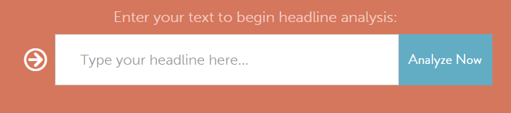
Headline Analyzer tool
In Corporate Web Development we use a free online tool called Headline Analyzer to help write headlines for blog posts.
As shown from the screenshot below you simply type your headline into the headline field and click the ‘Analyse Now’ button. You’ll then be given a score for your headline and tips on how to improve it.
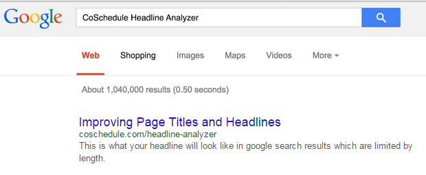
Admittedly this tool is more useful for writing headlines for blogs than webpages. However, what I find helpful is the chance to see how my page title will look in search results. This helps me decide whether it will make sense out of context:
Have a go and see what you think!
Summary
What you call your page is crucial in helping people find it. If you use keywords that your readers will be using and if a title is descriptive of your content this will help with SEO. Furthermore, the more descriptive a page title is, the more likely people will select and read your content. This is because they will be able to quickly see whether the content is relevant to them and will help answer their questions.
References
Jakob Nielsen, Microcontent: How to Write Headlines, Page Titles, and Subject Lines, Nielsen Norman Group (NNg), 6 September 1998
Hoa Loranger, Headings Are Pick-Up Lines: 5 Tips for Writing Headlines That Convert, Nielsen Norman Group (NNg), 9 August 2015