How Compression Can Increase User Satisfaction

Linking to documents that provide more information is vital for responsive design websites.

Let’s face it – no-one wants to read all your content for a specific topic on a single web page, or an endless number of web pages, on a mobile screen.

Having a 70-page research report or the terms and conditions of applying for a job as a downloadable PDF is sensible.

But what happens if that document is 15MB in size? First of all, you won’t get it in the university’s new content management system – it has an 8MB limit.

Even then, someone downloading 8MB on a 3G phone is going to be waiting a while to see it. They’ll also be eating into their data allowance at an alarming rate if they have a few of these to download.

Smaller is better

Making the file size of your documents smaller is key to improving your users’ experiences.

Compression can reduce the time documents need to load and cut the cost for those using mobile data.

Not everyone has access to Adobe Acrobat and its PDF resizing capabilities due to the cost. But there are free tools online to solve this issue; one of the best I’ve found is Smallpdf.

You can drag and drop your document from your computer onto its Compress PDF screen and it’ll do the rest. Then simply download the result for your website.

I’ve seen it take documents of 17MB and reduce them to 600KB, a much more palatable size for users. And there’s no loss of quality.

Even if you think your document is small enough not to bother with this, do it anyway. Every little helps with page loading speed and aiding user experience.

Smallpdf also provides many other PDF manipulation services that could prove helpful to you.

Make it easier for your users to access your documents and there’s every chance they will.

Share this post:
Share

Making New Year’s Resolutions for Our Websites

At the beginning of December I set the editorial team a little task; to come up with their new year’s resolutions for our websites. I gave no more guidance than that. Here’s what they came up with.

Introducing your content

Linda’s resolution is to write better introductions to content. She says:

“It’s so easy to slip into the lazy habit of just making the first sentence on the page into the introduction. And then not bothering to amend it.”

The introduction style is a new feature of our responsive design. It follows the title of a page and is a larger font size to help highlight it. It also comes with its own content standards, it should:

  • summarise the point of the page
  • be no more than 50 characters
  • be descriptive

Advice from the experts

We read lots of blogs, articles and books to keep up to date with what’s going on in the world of web content and design. This helps us to improve the University’s website for our users. We also use what we learn to develop the services we provide to our web editors.

Lisa says:

“My resolution is to come up with a systematic process for reading, collating and, most importantly, using the information I read to help inform our work.”

Content strategy

Jane’s not one to shy away from a challenge. Her resolution is to come up with a content strategy for the University website as a whole! We’re so used to thinking about the websites of schools and services as separate entities, we shouldn’t forget that they’re all part of the University website.

She says:

“We have a core content strategy for the Postgraduate website – now let’s tackle the rest!”

As if this weren’t enough we’ll also be looking at an overall tone of voice for University web content.

Housekeeping

My resolution is a bit of a backwards one – I’m taking a process I do well for websites, and applying it offline.

I’m meticulous about following our standards for file naming when it comes to documents and images I upload to the web. But I’m not very good at keeping on top of it in my computer’s documents folders. This year I want to change that.

This will not only help me to find files but also allow me to match up what’s online and where they’re saved elsewhere.

Health check

Anne’s resolution is to check her Siteimprove reports in January for broken links or misspellings which may have appeared over the Christmas break. And to keep on top of actions from these weekly reports throughout the year.

January might also be a good time to review the assets attached to your website (documents in particular) to make sure they’re all up-to-date. You can review assets using the Inventory function in Siteimprove.

Make your own resolutions

Now it’s your turn. What would you like to do differently this year? What tools or tips can you use to make your content management easier? Is there something you’d like to learn more about?

Follow our lead and make a resolution of your own. If you’re feeling brave, share it in the comments and we’ll check in to see how you’re getting on.

Share this post:
Share

Introducing Our New Website Media Management Training

In our team update from 1-14 October you will have seen a mention of a new module we’ve added to our Go Mobile training: Website Media Management. We developed this in response to requests from the first cohort of Go Mobile editors for more help managing images.

Our training on planning and writing web content, and using the T4 content management system, cover some of the ways images can be used in the new template. The new media training takes things a step further. It covers:

  • when to use images
  • sourcing images
  • selecting images
  • preparing images for publication
  • best practice for documents
  • uploading assets to T4’s Media Library

Sourcing and selecting images for your website

The primary source for images for your website should be the University photo library. In the library you can:

  • browse or search for photos
  • save relevant images to your lightbox so you can easily find them again
  • download the approved University logos
  • access student profiles

In the training we cover some tips for getting the most out of the photo library. These include using multiple lightboxes, browsing by keyword and viewing all photos from a selected photographer.

When it comes to selecting images, we provide guidance on how to select images for the four core themes identified in the University branding guidelines; student experience, sense of place, teaching and learning, and research.

The most important thing for image selection is to choose photos that are natural or appear to be observed, rather than staged. That means nobody looking directly into the camera!

Editing images for use on the web

We recommend that our editors use the free, online photo editing tool, Fotor. Its clean user interface makes it easy to upload, crop and resize images to the required dimensions.

Even if you have access to Photoshop, if you’re not a regular and proficient user it can be overwhelming. Fotor is a straightforward alternative.

I wrote a post earlier in the year that includes advice on editing images for use on your website.

Feedback from attendees

There have been three sessions so far, with more to follow in December. The feedback has been very positive:

‘Great information on the use of appropriate images in terms of context on the web page’


‘Really useful advice on when to use images and how to select the most appropriate ones’


‘Good to get practical, hands-on opportunity to edit and save images’


Further information

For Go Mobile editors, you’ll find lots of guidance on using images on our demo site.

Not yet part of the Go Mobile programme and want to improve the imagery on your website? Get further information from the image guide on our website (University login required). This includes a step-by-step guide for using Fotor.

And I’m always happy to take questions in the comments.

Share this post:
Share

Using Siteimprove to Find Content and Assets on your Website

You may already be using Siteimprove Quality Assurance reports to help fix broken links and misspelling on your website, or find content inconsistencies. If so, then I hope you’ve found it a useful tool to help keep content up to date.

The Inventory module is another function of Siteimprove that we think you’ll find useful when reviewing website content and assets.

You might want to locate a document or telephone number on your website or need help with decluttering your website to prepare for Go Mobile. The inventory module can help with this.

How to use the Inventory module

Siteimprove’s Inventory module provides an overview of all content on your site including:

  • pages
  • links and link text
  • documents
  • media files
  • scripts
  • personal information eg email addresses and telephone numbers

You’ll find a link to the Inventory in the left-hand panel of your Siteimprove report. The summary page lists the number of assets on your site:

Screenshot of Siteimprove inventory

To get at the details you can click into the categories on the left.

In this example, clicking the documents’ section gives an overview of:

  • documents types (PDF, Excel, Powerpoint)
  • Internal (documents within your website)
  • External (links to documents on other websites)

Screenshot of Siteimprove Documents overview

From this table you can click through and view all documents (useful if you’re decluttering your site) or focus on a particular document type:

Siteimprove Inventory module - PDF list

Here you can see a list of all PDF files linked to from the website broken down by:

  • url of each document
  • file size
  • link status – eg broken
  • pages that link to the document
  • last time modified

You can filter the list to view just external or internal PDFs by clicking on the ‘all categories’ field. You can also sort documents within each column.

For example, you can sort the ‘last time modified’ column to find out when a document was last uploaded to your site. This is useful to help you decide if an asset should be updated or removed.

You can also see where a document is linked from on your site and from here click through to view the document link in the page. If a document is not linked up this usually means it can be deleted as it’s not in use.

As you can see from the example below, the Marine handbook is linked to from three pages on the website:

Siteimprove Inventory module - PDF referer links

Using the Inventory module to review content

Documents

As shown by the examples above, you can use the inventory tool to locate and check documents on your site.

Keep emails and phone numbers up-to-date

Out-of-date contact information will affect the credibility of your content. Use the inventory module to review email addresses and telephone numbers and check the format against our editorial style (University Login required).

image files

You can also use the inventory tool to check where an image is on your site, and when it was last updated. Updating the images on your site helps with search engine optimisation (SEO), giving the search fresh content to crawl.

Regularly review and update content

It’s important to regularly review and update your content as inaccurate content can damage the credibility of your site.

Next time you review your website content, try out the Inventory module in Siteimprove.

View the Siteimprove Inventory video tutorial to get started.

Access to Siteimprove

Request access to Siteimprove (University Login required) to get started on your website content clean up.

Share this post:
Share

Decluttering Your Website: How to Prepare for Go Mobile

As we embark on phase 2 of Go Mobile, eager editors across the University are asking when their site will be going through the process. We’re thrilled that our editors are keen to get started.

We’re still finalising the schedule for phase 2. In the meantime, there’s plenty you can do to prepare your site for Go Mobile. In fact, the more you do beforehand the easier the process will be.

Delete, delete, delete

One of the most useful tasks you can do to prepare for Go Mobile is to delete any clutter from your site. Delete old versions of documents, images and logos that you’re no longer linking to in your content.

Similarly, delete old news and events items that are no longer relevant. If this information is still needed, rework it. For example, you could write a review of an event that has already taken place.

Check the currency of your content and consider whether it’s still relevant.

If content is out of date and no longer relevant to your site purpose it’s best to delete it. For more information about how out of date information can harm your website read Jane’s blog post: Why Deleting Old Stuff on Your Website is Good.

Check the accuracy of your content

It might seem like a dull task but ensuring that your content is accurate is crucial to the credibility of your site.

Users will be less likely to trust what you say if your content is littered with spelling and grammar mistakes, or if a link leads to nothing but a dead end. As pointed out by Kara Pernice from the Neilsen Norman Group, a link is a promise.

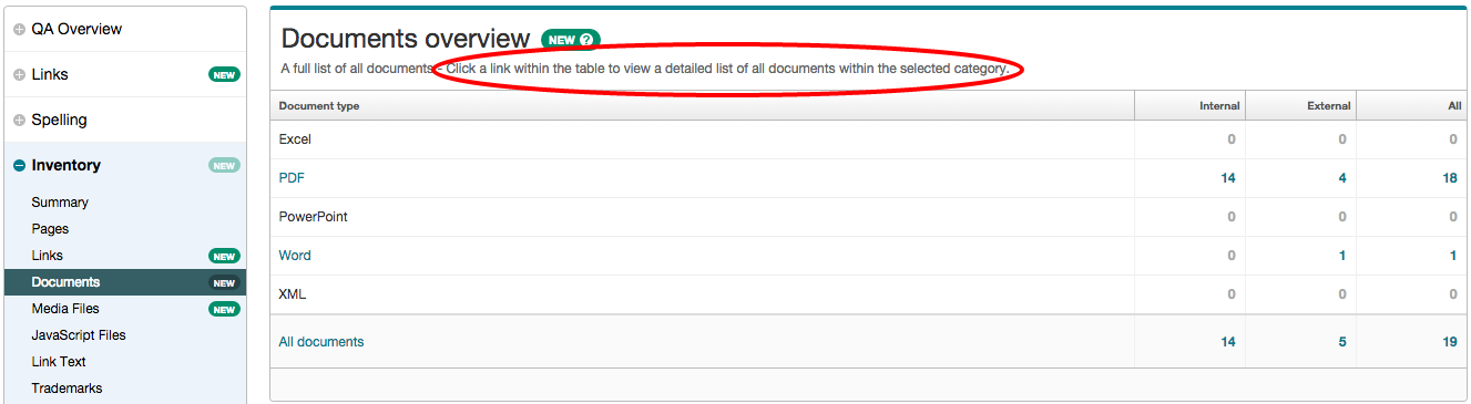
Tools like Siteimprove can help to find broken links and misspellings on your site.

Improve readability

The easier content is to understand the more accessible your message will be to your target audience.

Online readers are more task-focused and tend to scan content rather than read it all. Smaller screens increase this behaviour. So it’s essential to optimise your content for a smaller screen so that users can understand your content on any device they view it on. Part of this involves deleting unnecessary words.

For advice on optimising content for mobile take a look at our top five tips for writing for the web. An effective tool for identifying the readability of your writing is the Hemingway Editor.

Source new assets

As you’ll find out when you attend our Website Media Management training, images need to be larger in the new template. This is so that they retain their quality across all devices.

The majority of images that currently exist on your site won’t be big enough to work in the new template. Sourcing the original images will therefore give you a head start for when your site goes through Go Mobile. Check our Go Mobile Demo site for an idea of the new image sizes.

Go Mobile is an opportunity to check that your imagery is effectively supporting your messages. For guidance on sourcing imagery read Jane’s blog post on improving your website images and videos. For advice about editing images read Emma’s post: Editing Images for Use on Your Website.

Insights into Go Mobile

Find extra tips from editors who have already been through the Go Mobile process in our series of guest posts. Fiona Simmons from the Institute of Social Renewal talks about her experience of Go Mobile. Ivan Lazarov from the Press Office shares his reflections on the Go Mobile training.

Summary

So that’s a whistle stop tour of how you can prepare your site for Go Mobile. The most helpful thing you can do is to review your content. Make sure it will be readable on a mobile phone and delete old content and assets that are no longer relevant to your messages. Go forth and declutter!

Get in touch

Let us know in the comments if you have any questions about preparing your site for Go Mobile.

Share this post:
Share