User Personas

We all know that effective web content starts with our audiences (our users). If we know who we’re talking to and what their tasks and questions are we can create websites to meet their needs and achieve our business goals.

Talking about abstract, generic ‘users’ though is not helpful. After all users are people – living, breathing individuals with motivations, needs and goals. And that’s where user personas come in…

A persona is a fictional representation of a group of target users who have similar needs, goals and behaviours.

User-centred approach

To enable us to take a more user-centred approach when developing websites and creating web content, the Corporate Web team are leading on a project to create personas for all our digital audiences.

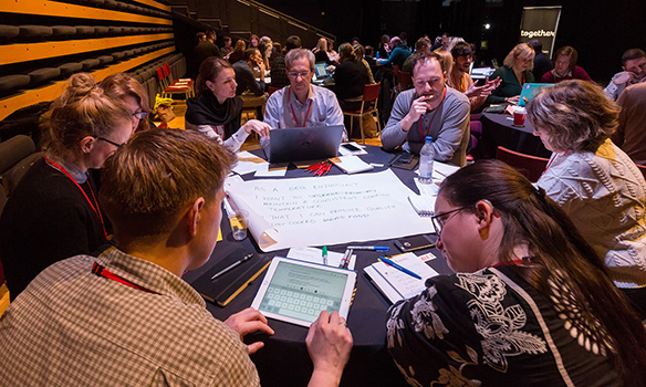
Jane and I recently attended the Nielsen Normal Group (NNg) training Personas: Turn User Data Into User-Centered Design to pick up some tips on how to create personas. Both inspiring and practical, the course furnished us with techniques to create personas and achieve stakeholder buy-in.

Benefits of personas

Personas are valuable because they bring our abstract users to life, making us more likely to relate to and care about them. They:

  • tap into our empathy for people
  • make our audiences memorable to us
  • help us predict users’ behaviour because we understand their attitudes and needs

Personas make us more likely to design for our users rather than designing for our organisation, or copying our competitors.

Framing a statement around a specific persona breaks the listeners out of self-referential thinking and removes the speaker’s reliance on opinions, shifting the discussion away from personal judgments toward that particular persona’s needs.”

Aurora Harley, Nielsen Norman group (NNg)

Personas feed into story mapping so that every time we develop a new section of a website or design a new feature we’ll think of the journey from our personas’ points of view. This means that we’re more likely to develop websites that meet our users’ needs rather than designing features and writing content based just on our opinions.

As pointed out by Aurora Harley, personas also “focus design efforts on a common goal”. They have the power to align attitudes in a team, again because they help us focus on the user rather than individual attitudes and opinions. This enables us to design a usable service that meets our customers’ needs.

Based on user research

Like all data, personas can’t be used in isolation. It’s important to use personas alongside other data such as analytics, market segmentation, usability testing and subject matter experts.

Personas are fictional but they are based on user research and existing knowledge of our audiences.

First steps

Jane and I are starting with researcher personas. We’ve designed a short, online questionnaire to collect data from research-active academic staff.

Using techniques and tips we learned at the NNg training we’ll segment and analyse the data to identify patterns and priorities so we can begin creating our personas for researchers.

Grounded in user research, we’ll also be using our existing knowledge of our audiences to shape our personas.

And of course, we’re not trying to do this alone…we’ll be coming to speak to colleagues across the University who are the subject experts for many of our audiences, and who already have a bank of user research so that we can work collaboratively to create these personas.

We’ll be blogging about our progress and experiences as we venture further into the project.

References and further reading

Kim Flaherty, How Much Time Does it Take to Create Personas? Nielsen Norman Group (NNg), 25 October 2015

Aurora Harley, Personas Make Users Memorable for Product Team Members, Nielsen Norman Group (NNg), 16 February 2015

Aurora Harley, Segment Analytics Data Using Personas, Nielsen Norman Group (NNg), 30 November 2014

Share this post:
Share

Top Five Takeaways From Agile Content Conference

At the end of January, I attended the Agile Content Conference in London. With the overall theme of collaboration, I was excited to pick up some practical tips to improve our work with colleagues in schools and services. Here are my top five takeaways from the day of case studies and workshops.

Embed content professionals within product/service teams

Erica Hoerl talked about her time working as a lone content strategist in the Messenger product team at Facebook. Emphasising the importance of having a voice for content at every stage of the product’s development, rather than drafting someone in for a specific content phase.

I’ve experienced the latter situation a lot. When the content team sits externally to a product or service team, we’re often brought in after the important decisions have been made. Embedding a content professional as a member of the team from the outset helps to get content seen as not just an add-on but a crucial part of any development.

Learn together

Jonathan Kahn introduced the conference with a series of collaboration tips to help find a solution that works for everyone:

  • talk to a range of people, not just those you’ve worked with before
  • align goals before identifying user needs
  • reframe objections as opportunities
  • learn together

They key to this, I think, is learning together; involving all stakeholders in user research and content design. This is supported by something Jo Wolfe asked us – to challenge ourselves to leave our preconceptions behind when starting a project. I think too often we start a project with a solution before really understanding the problem we’re trying to fix.

Pair writing workshop

Proof I was there – taking part in a pair writing activity

Mental models help create empathy

In its simplest definition, a person’s mental model is the way they look at the world. It’s based on beliefs or assumptions about how things should work. Mental models are built up over time through experience. They are unique to an individual and change over time, as we gain more experience of different situations.

We can gain an insight into someone’s mental model through user research. This allows us to understand their motivations and concerns. It helps to create empathy and in turn, allows us to design content that meets their needs.

Use principles to drive content creation

Lauren Pope and Sarah Jones from Brilliant Noise shared a case study from their work with American Express to streamline content creation and reuse through an editorial hub. They aligned the work of multinational content production teams through a clearly defined purpose and set of principles.

The principle that stands out to me is this:

“Only AmEx can do this.”

It’s a bold statement about the importance of producing unique content. Something that I’m painfully aware of in the HE sector is the number of university websites that are just carbon copies of each other. Whenever we create new content for our sites we need to ask “what makes us unique?” and use that to tell a story.

Solve fewer problems better

This nugget of wisdom comes from Alex Watson, a product manager for BBC News. It’s pretty clear what it means, and I’m sure most of us would be likely to dismiss it as a given. And perhaps that’s the problem. We can get so swept along on a treadmill of things we need to get done, that sometimes we lose quality in the work we’re doing. I’m going to make a commitment to myself to do fewer things better. Will you join me?


Image credit: Paul Clarke on Flickr.

Share this post:
Share

A Quick Guide to… Bold

Bold text makes web pages easier to read and more SEO friendly.

You should use bold to highlight key phrases in your copy. There should be enough to help users scan the page, but not so much that it loses impact.

This quick guide will help to clarify why, when and how to use bold text.

Why to use bold

Nearly 80% of users will scan a web page before they read it; they’ll jump around the page, looking for things that catch their eye.

This means that content must communicate key messages at a glance, by drawing attention to important bits of information. One way to do this is to create visual pointers using bold text. The impression created by these visual pointers tells both humans and computers (like Google) what to expect from the rest of the content.

03geordi

To boldly go… Both humans and computers respond well to bold text.

When to use bold

You should bold text that:

  • communicates important information
  • emphasises key points
  • makes sense out of context
  • complements your titles and headings

You should avoid bolding:

  • entire sentences or paragraphs
  • too many individual words

Bold text can be used on pages and in news items.

How to use bold

Finish creating content for a page before you start adding bold to it. Then, pick out the most important pieces of information and make them bold.

An easy way to check if you’ve used bold effectively is to collect your bold phrases into one list. If you gave this list to a user, would they get the right impression about that page?

Share this post:
Share

Excellent Results for Postgraduate Website Testing

We posted an article earlier this year about user testing that the Corporate Web Development team undertook on the Postgraduate (PG) website. Our testing was completed a few months after go live, last October.

Since then, as part of the final stages of the PG website project, there has been a range of extensive evaluations run and co-ordinated by the Postgraduate Marketing Team.

From clarity tests of the content, use of Google Analytics, interviews, remote user testing by our PG target audience – even an externally-run expert review.

There was also a chance to review the new website against our competitors – well it would be rude not to…and anyway we had a clear content strategy to test:

“The new Postgraduate website will have audience driven, engaging content that inspires ambitious high-flying global students to make us their confident choice for PG study”

Headline results

Overall – the new website has performed excellently, with some outstanding feedback alongside some further ideas for development.

Which is great, since the PG website project has paved the way for all our Go Mobile work!

It’s important to note once a website has been launched and tested – that’s not the end. Actually it’s just the beginning; of making further improvements, developments, finding solutions to issues and continually trying to do the best thing for our users.

Read on to find out how we did…

First impressions

The word cloud below shows first impressions of the PG site. The most popular words that users used to describe the site included: easy, modern, simple, clear, professional, clean and cool.

 Word cloud showing first impressions of the PG website

Website content

“Everything is very clear, the words actually stand out because the design of the site is very lean and clean cut…There are no useless pieces of information.”

User tester

  • Ranked 1st or 2nd in comparison to competitor PG content according to Clarity Grader, a website content analysis tool
  • An improvement in quality and consistency of content
  • Users found the content clear, detailed, straightforward and organised and with good comprehension
  • Test participants commented on the quality of course entries they found. Users specifically found the following useful:
    • modules
    • course delivery and duration
    • facilities
    • employment infographics and related courses

some future developments

  • New content quality and consistency measures are being developed
  • Continued focus on the use of terminology, ensuring the content is accessible by our key audiences
  • Further development of supplementary information, scheduled by a web editorial calendar
  • Develop stronger links between supplementary information and course information

Design

“Wow, this one’s layout is different, I like it, it’s colourful, it’s not boring”

User tester

  • The design was well received in all testing
  • Gives a great first impression to users
  • Newcastle compares favourably in comparison to our competitors

some future developments

  • User experience testing helped to influence our Go Mobile template design
  • Further development of the PG homepage and the flow of information
  • Developments to the course search call to action and visibility on the homepage

Course search/funding search

“This is amazing. I came here the last time and I don’t believe I could find things so easily. This actually shows that the website has improved and this is actually a very good filtering that the website has added to its system”

User tester

  • Newcastle’s content performed well in comparison to competitor sites. One user stated they “strongly favoured the course navigation and content over Manchester”
  • New course search was well received and proved to be the most used method of finding a course in comparison to the A-Z list
  • The advanced search filters are being well used
  • Tab layout of the course information on desktop was well received
  • The new step-by-step guide was well received and recognised as providing useful information

Some future developments

  • Further development of search filters to ensure accurate and precise results
  • Development of additional tools to sort search results, eg by relevance, A-Z
  • Streamlining of the course and funding search functionality across all devices

Calls to action

  • Good to have recognisable calls to action
  • Footer calls to action are used well
  • Improvement in number of sessions resulting in the creation of a new (applicant) account

Some future developments

  • Renaming of some calls to action for consistency
  • Revising of placement of some calls to action
  • More visible course start dates and application deadline where they exist

Navigation

  • Users reported on the ease of navigation through the website
  • Use of tabs on course profile pages are well received on desktop

some future developments

  • Development of mobile menus: main menu; secondary menu; and tabbed menus
  • Consistent application of hyperlinks – already addressed as part of ongoing development
  • Review of the breadcrumbs design and functionality

Conclusion

So, has the new PG website been a measurable success? I would argue a resounding YES!

All the testing, evaluation and competitor analysis shows this is largely the case. Phew.

Back to the original plan then:

“The new Postgraduate website will have audience driven, engaging content that inspires ambitious high-flying global students to make us their confident choice for PG study”

Audience driven – Check. All content has been created, developed and designed with the user’s needs in mind.

Engaging content – Check. We’ve used new technology and design to enhance the user experience where appropriate; a mobile responsive design, new course search, infographics and videos to supplement course pages.

Ambitious high-flying global students – Time will tell. It’s hard to test or measure whether applicants are deciding to apply due to our marvellous new website. There are after all numerous other factors to influence an applicant – but still, shouldn’t we have an inspirational strategy to work to?

Find out more

If you’d like to learn more about the results of the PG user testing, and watch videos of the testing watch the Prezi online.

Read about our earlier user testing of the PG Website.

Share this post:
Share

Testing our Responsive Design with Real People

The Corporate Web Development Team recently carried out some user research on the new mobile responsive postgraduate website. Our aims were to:

  • test the new design features
  • find out how easy it was for people to use the site on both mobile and desktop
  • identify developments for the postgraduate site and our Go Mobile Programme

User testing sessions

Six members of staff from the University participated.

We observed each participant complete a series of tasks on the website using a desktop, mobile or a combination of both devices. They were asked to ‘think aloud’ so that we could record their thought processes.

User testing results

The testing revealed many things about the design of the site – features that are working well and areas that need further development.

For this post I’ve pulled out some interesting outcomes.

Search

Screenshot of the search results on a mobile screen

The testing revealed that the new course search was well used and provided good results.

However, since the advanced search filters appear above the results, the search results are hidden on both desktop and mobile.

This was a particular problem for mobile users as it looks like the search hasn’t worked. One of our users kept filling in the fields even though they didn’t need to.

It shows that the course search needs further development to improve its usability.

Navigation

On mobile people easily found the blue link buttons on the homepage (eg Student Life) but desktop users did not spot these as quickly.

The buttons appear under the content on mobile, on desktop they appear to the right hand side.

Example blue call to action button from the responsive designThis supports research into online reading which shows that content to the right is often ignored.

Desktop users tried clicking headings in the main content before clicking the button. One person didn’t notice them and struggled to complete certain tasks.

The red call to action buttons were well used on both desktop and mobile. They were spotted quickly and people commented that they made tasks easier.

Example red call to action button from the responsive designThe inconsistency of hyperlink styling made it unclear what was and wasn’t a link. The majority of users didn’t find the student profile information as they weren’t aware that the heading linked through to additional content.

The user research showed that we need to review the links on the homepage. In contrast, participants quickly spotted navigation on course and supplementary pages.

Content

One of our new content types is known as mobile collapse. On desktop, the content displays as a heading and paragraph. On mobile, the content is ‘collapsed’:

Screengrab of the mobile collapse function. The user research revealed that the mobile collapse content did not stand out. Mobile users scrolled past the information without realising it could be expanded.

If our potential students can’t find accreditation information they may assume that the course is not accredited. It’s crucial that we make this content more prominent on mobile.

Design

There were lots of positive comments about the look and feel of the site. People spotted the pull quotes quickly and users liked the use of videos, images and dual tone headings.

One user described the site as “vibrant and exciting”.

Testing is vital to improve the usability of a site

This research has highlighted to me the importance of user testing – it shows us what is working and what needs improving.

If prospective students can’t find information easily it may influence their decision to apply here so it’s vital that we identify and solve usability issues.

We’re currently working on solutions for the issues identified from this testing.

Improvements to content, design and layout will also inform developments for the next batch of sites in our Go Mobile Programme.

Find out more

We base our user testing on training provided by the Nielsen Norman Group. Find out more about user testing by visiting the Nielsen Norman Group’s website.

Share this post:
Share