An Introduction to Information Architecture

In my post about our minimalist approach to the web, I said that you should respect your users’ time by only providing them with essential information, and by guiding them through your website in a helpful way.

The best way to do this is by having good information architecture.

Information architecture is about deciding how something is organised. It’s not just about where your content is, it’s about the placement and design of that content, and what message that sends to your users.

I think the best way to explain this is with an example…

Example

In this example from the old Faculty of Medical Sciences website, five postgraduate taught programmes appear as sub-menu items in the sidebar, while the rest appear as bulleted list items on the page.

An example of bad information architecture, from the Faculty of Medical Sciences website.

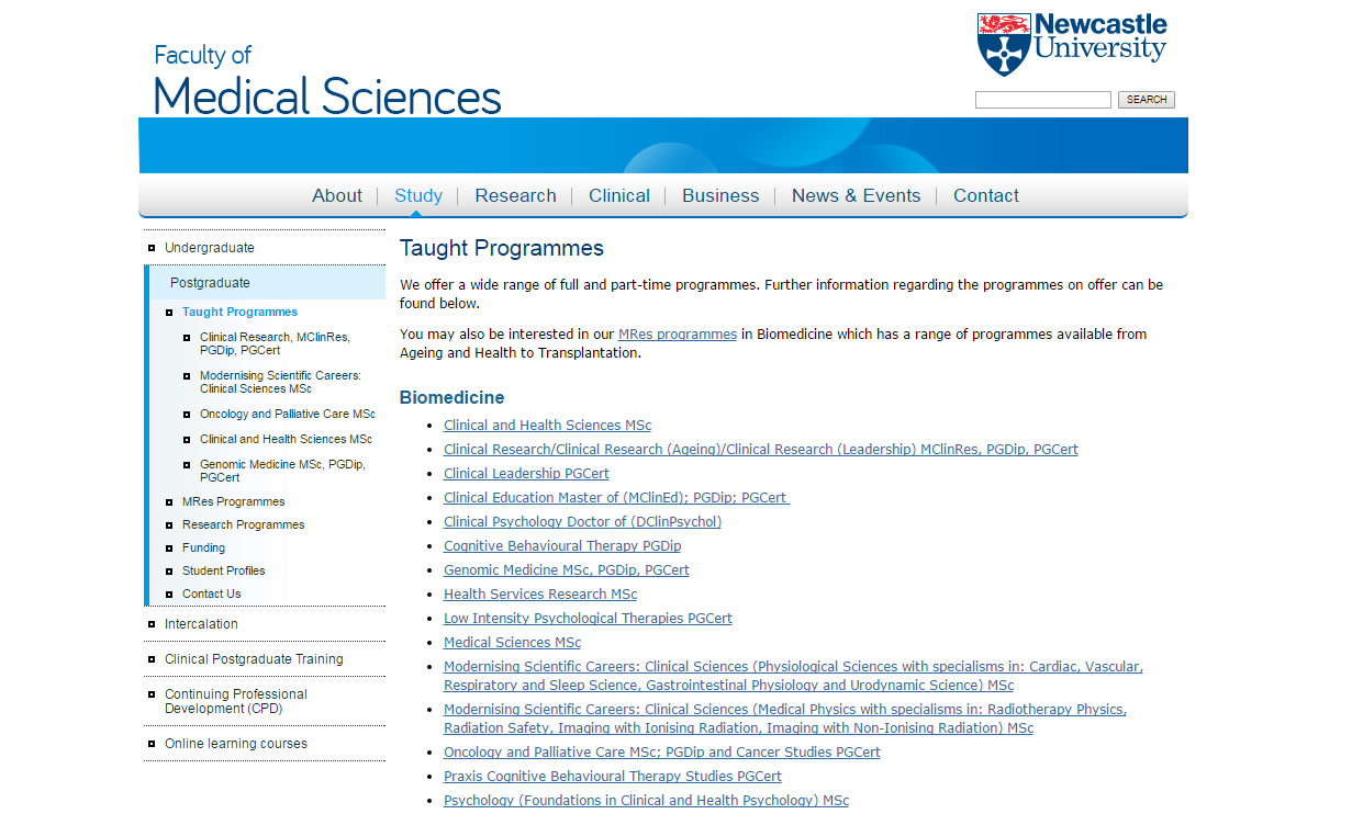
Some degree programmes appear as menu items in the left-hand navigation, others appear as links in the main body of the page.

In reality, there is no significant difference between these programmes, but the way they’re organised gives a false impression of hierarchy. It ascribes importance to the ones in the sidebar. Users could leave this page with the impression that the faculty values the programmes in the sidebar more highly than the ones in the list.

Here is the same page on the new Faculty of Medical Sciences website.

An example of good information architecture, from the Faculty of Medical Sciences website.

All degree programmes appear as links in the main body of the page. The list is separated by subject and ordered alphabetically.

All of the taught programmes are now listed in alphabetical order in the main part of the page. They all look equally important and they’re easier for the user to navigate.

The links take the user to the central postgraduate website. This fits in with our university-wide web strategy; creating a seamless browsing experience and ensuring that the user will receive the most accurate and appropriate course information.

For another example of how information architecture works, read Understanding information architecture via my bookshelf.

Benefits of good information architecture

Good information architecture aids the user journey. It helps people to navigate through your site in a way that makes sense, before arriving at the information they’re looking for.

Bad information architecture hinders the user journey. It confuses people by providing the wrong information at the wrong time, in the wrong place.

Information architecture also helps control the interpretation of your content, and communicate what you intend.

Websites with good information architecture are better for users because:

  • content is presented in a more useful and meaningful way
  • information is given at the appropriate point in the browsing experience
  • the browsing experience easier, more enjoyable and more intuitive

Websites with good information architecture also makes it easier to keep your website up to date, because new content can find a sensible home.

Next time

In my next post, I’ll be looking at the three elements of information architecture, and how they work together to create a great user experience.

I’ll also outline how you can create and maintain good information architecture using the tools we’ve given you.

Share this post:
Share

Usability heads in the right direction

We’ve built something new. It’s a widget for giving your web users easy access to clear directions for the location of your school/faculty/service.

It’s the efficient way for our lovely web editors to help potential visitors to the University.

It eliminates the need for paragraphs of vague/potentially incorrect routes to take:

  • roads
  • rail services
  • walking routes
  • cycling routes

Our new T4 content type is ideal for your website’s Find Us or Contact Us page.

How it works

If you’re seeking to add this content type, you’ll need to choose 14. Google directions.

We advise you add this to the bottom of your page, as it sits to the left under preceding content. Use it further up and people might miss something you’ve written that is important.

There are two boxes to fill out once you’ve selected this content type. The first is title, which should be filled out with:

DIRECTIONS: insert name of your school/service/faculty here

The second box relates to where you actually want to send your website users.

Because much of the university campus has the same postcode, you need to enter the building name and postcode.

An example for the Institute of Cellular Medicine, would be:

William Leech Building NE2 4HH

Then just update and approve your content and wait for it to publish.

What your users get

Your website users will see a search facility on the page with a Find Us button. All they need to do is add their address or postcode into the box and click on the button.

They will instantly arrive on a Google Maps page that will plot the routes to your location:

  • road
  • rail
  • walking
  • cycling
  • flight (if they’re far enough away)

Because it’s all done through Google, the information is constantly updated to remain as accurate as it can be.

It’s also a visual representation that takes you through the journey and works with GPS, instead of paragraphs that vaguely get your users here.

An example is on our demo site. Have a go applying it to yours.

Share this post:
Share

To Link or Not to Link – When and Where to Use Hyperlinks

We’ve recently had a couple of questions from web editors about hyperlinks – particularly about whether to include the same link more than once on a webpage.

This post will focus on when, and when not, to use hyperlinks and where you should try and place them on a page.

Helpful content

When writing web content your aim should be to help your user find the answer to their question or complete a task.

Hyperlinks help with this because they:

  • give active instructions
  • support scan-reading
  • offer further information or a next step

It’s important to only link to relevant content that supports the messages on your page, or helps your user complete their task or answers their questions.

Careful placement

As well as thinking carefully about what you link to, you should also think carefully about where within your content you should link from.

Think about the primary message – what do you need to convey to your audience before they leave your page? If you add hyperlinks too early then you run the risk of your user leaving before they’ve had a chance to read your content.

Hit targets

Mobile has changed the placement of hyperlinks on a page as you now need to think about hit targets. Don’t have too many hyperlinks together as this will make it harder for the user to select them.

You should also try and add hyperlinks at the end of paragraphs and sentences. Again this helps with hit targets and increases the likelihood of your user reading your content before clicking a hyperlink and being taken elsewhere.

Avoid duplicating links on a page

It can be tempting to duplicate links on a page. Hoa Loranger (Nielsen Norman group) points out that people often think that duplicate links provide “alternative ways to access links” and “safety nets”.

However, too many calls to action on the same page can confuse users.

Each additional link places an extra load on users’ working memory because it causes people to have to remember whether they have seen the link before or if is a new link.

Hoa Loranger Nielsen Norman group (NNg)

In addition, duplicate links can be harmful to the user experience:

Extra links waste users time whenever users don’t realise that two links lead to the same place.”

Hoa Loranger Nielsen Norman group (NNg)

Loranger also points out that that “each additional link depletes users’ attention because it competes with all others.”

So rather than providing a safety net you’re potentially reducing the likelihood of the user spotting the link.

Instead of adding duplicate links on a page, Loranger argues that where you place the link is more important.

Making a link more noticeable by placing it prominently in an expected location on the page can yield better results than duplicating it elsewhere on the same page”

Hoa Loranger Nielsen Norman group (NNg)

Summary

To link or not to link? As always it depends on your content as to whether you should include a hyperlink on a webpage, and where on the page you should place it.

Think carefully about the purpose of your page to help decide whether to add a hyperlink to relevant content, and how early on you should include one.

However, try not to include more than one link to the same content on any webpage as this can be harmful to usability.

Related posts

References and further reading

Hoa Loranger, The Same Link Twice on the Same Page: Do Duplicates Help or Hurt? Nielsen Norman Group (NNg), 13 March 2016

Kathryn Whitenton, Minimize Cognitive Load to Maximize Usability, Nielsen Norman Group (NNg), 22 December 2013

Jennifer Cardello, Nielsen Norman Group (NNg), Four Dangerous Navigation Approaches that Can Increase Cognitive Strain, 28 September 2013

Share this post:
Share

Find Your Way Using the New Global Menu

The new global menu is visible across all sites in the new template. It replaces the mega footer seen in the old central template.

Mega footer used in old website template

Mega footer used in old website template

The menu launched at the same time as the new external homepage. In its first iteration it was static. Each menu item linked through to a landing page containing links to further content relevant to the section. For example, take the Study landing page which links through to the Undergraduate, Postgraduate and International sites, among others.

Menu behaviour on desktop

We developed the second dynamic iteration of the menu to reduce clicks. On desktop you can hover over each menu item to open a sub-menu with links to relevant sites.

Global menu on desktop screens

Global menu on desktop screens

The global menu is accessible. Keyboard access is achieved using the tab key to move through each menu item. Pressing on the down arrow on the keyboard will open the sub-menus.

Menu behaviour on mobile

When using the website on a touch based device the global menu loses the sub-menus. When you tap any item in the menu it takes you to a landing page that has similar links to those found on the sub-menu for that section.

Global menu on mobile devices

Global menu on mobile devices

Further development

This is not the end for development of the global menu, we’re testing how it is used to inform the next steps of development. This iterative process is a method we’re starting to use to approach development across the whole site.

Share this post:
Share

Designing the New University Homepage

As part of phase one of Go Mobile we redesigned the University homepage so that it works across all devices. Like the other sites going through Go Mobile it is managed in T4, the University’s content management system.

Features of the homepage

Our new homepage can be broken down into eight distinct sections.

  1. Global menu for quick access to key links
  2. Course finder for direct access to Undergraduate and Postgraduate courses
  3. Hero image slider to highlight key news, event and research stories
  4. Video content to support our key messages
  5. Seasonal message top task boxes
  6. Latest news from the Press Office
  7. Partner logos and awards carousel
  8. Social media links and directory
Newcastle University homepage features and layout

Homepage design features and desktop layout

On mobile devices these stack horizontally, one on top of the other.

We’ll look at a couple of these features in more detail.

Hero image slider

The old homepage image slider was full width. Although this created a strong visual impact, sourcing images to fit this area could be problematic.

Old full-width hero image slider

Old full-width hero image slider

The new hero image slider is smaller. It allows the Press team to source images that would fit a standard landscape 4 x 6 photo.

New hero image sliderOn mobile devices the caption drops below the image to avoid the image from being fully covered. The caption and image form a single clickable link. This is important on mobile devices as it creates a large hit target to increase successful touch interactions.

Video content

The new homepage layout has allowed the use of rich media content such as video. The analytics show that the external homepage is the most popular destination for video consumption. This has helped increase the profile of some key videos during the months of October to December 2015:

  • The Impact of a World-Class Civic University
  • How Smoking In Cars Can Affect Children
  • Dr Martin Luther King Jr Honorary Degree Ceremony
  • Our City
  • Our Campus

Related posts

Read more about the new responsive website template in our case studies:

Share this post:
Share