How to Use the Core Model to Improve Your Web Content

I came across the idea of the Core Model at a content strategy conference last year.

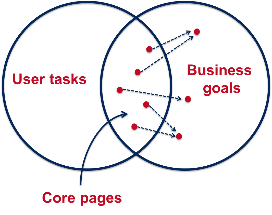
It’s an exercise that helps you to identify pages on your website where user tasks and business goals meet. These are your core pages and you should focus your efforts on improving these before other content on your site.

Core Model diagramWe use the core model exercise in our training on planning web content. So far we’ve introduced it only to those editors on the Go Mobile programme, but it’s a useful tool for anyone who looks after a website.

Elements of the core model

The core model helps you to answer a series of questions about a page on your website, and this in turn determines what content is needed on the page.

User tasks – what questions will users come to this page to answer and what tasks do they want to complete?

Business goals – what business goals drive the content on your page?

Inward paths – how will users find and access this page? Where will they start their journey?

Core content – what is the essential content you need on your page to help your users answer their questions and complete their tasks? What secondary content will help you achieve your business goals?

Foreward paths – where will users go after they’ve answered their question/completed a task on your page? Are there more business goals that you can drive them towards?

Let’s work through an example

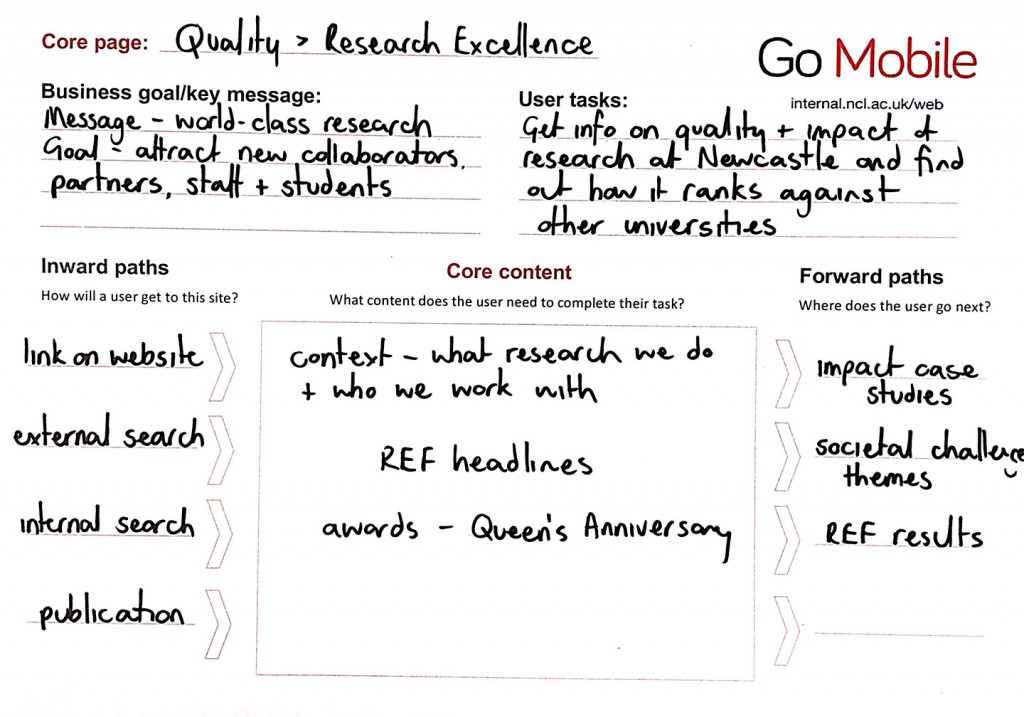
This example is taken from the About section of the University website. It’s a page about the quality of our research.

Core Model worked example - research excellenceUser tasks

A user might come to this page to find out about the quality of research done at Newcastle and to see how we rank against other universities.

Business goals

Our goals for this page are to attract new research collaborators, partners, staff and students.

Inward paths

The inward paths to most pages on the University website will be very similar. Users might get there from a:

  • search, either on the website itself or from a search engine
  • link from elsewhere on the University website, or from a link on an external site
  • link from a publication or email

Core content

For our users to complete their task we need to provide some context for them by outlining what research we do at Newcastle and who we work with. They also need to know the headlines from our REF results so they can quickly answer the question of how our research ranks against other universities. The awards we’ve received for our research are also relevant.

Foreward paths

This is where we need to think about the onward journey of our users, and how that fits with our business goals. From the research excellence page we want visitors to go on to find out more about our:

  • impact case studies
  • societal challenge themes
  • REF results

We must make sure there are calls to action on the page that link to all these destinations. These in turn will have their own calls to action, for example from the impact case studies to job vacancies.

Have a go yourself

Now that you’ve read about the core model and how it can help you prioritise content for improvement on your website, why not have a go yourself.  You can download a core model template from our website (University login required).

Share this post:
Share

Top 5 Tips: Content Calendars

It’s essential to continually plan your content to ensure it’s up to date and answering your users’ questions. Content calendars (or editorial calendars as they’re sometimes referred to) can help with this.

You can use a content calendar to map out content that will be needed at different points in the year and the deadlines for publishing content.

Read on to find out our top 5 tips for content calendars:

1. Map out key events or activities throughout the year

The best starting point when creating a content calendar is to map out key events and activities throughout the year. This could include recruitment campaigns, events and funding opportunities. You’ll then be able to identify tasks you’ll need to complete associated with each activity. This will include when you’ll need to produce or update content and source new assets.

Adding activities that take place on an annual basis will also help to identify when the busiest times for content production will be.

To help map out these activities, use our calendar template (PDF: 28.9KB, University login required).

2. Be selective with the information you include in your calendar

There’s a variety of details you could add to your calendar. Some details you might record include:

  • what content is needed (depending on the activities you need to support)
  • where on your site your new content will appear
  • the people responsible for writing and editing content
  • deadlines for writing, editing and publishing content
  • other teams that may need to be involved – will you need to contact the Corporate Web Development team (CWD) to create a new page on your site?

However, remember that the more information you include the more complex your calendar will become.

Focus your calendar on the top priorities, and consider eliminating the bottom priorities to make your calendar easy to use and maintain

Kristina Halvorson and Melissa Rach, Brain Traffic

It’s therefore important to be selective with the information you include so that your calendar is easy to understand.

3. Choose a calendar tool that works for your team

There are a variety of tools you can use to make your content calendar –  software like Outlook or Excel, or online tools like Trello. Deciding on the best tool to use depends on the amount and complexity of the information you want to record in your calendar.

For example, the CWD team first used Excel for our editorial calendar for this blog as it allowed us to record and filter a number of things. These included post categories, tags and whether a post would include an image or be a feature post. It also allowed us to easily assign authors and editors to posts. Although excel worked well, we now use Trello for our content calendar as it includes additional features, such as email notifications when tasks are due.

Learn more about Trello by reading Emma C’s post on Online Task Management with Trello.

Whatever tool you use for your content calendar ensure it works for you and all of your team.

4. Plan in plenty of time to produce content

Make sure you plan enough time to produce and update your content, or gather new assets.

Remember you may need to wait on other colleagues to provide information or request support from other teams, such as CWD or the Press Office.

Although it’s important to plan as much as possible, there will always be last minute content requests.

An editorial calendar should be a flexible, ever-changing live document – one that’s updated according to the comings and goings of your business

Chris McMahon, Sticky Content

Chris McMahon recommends scheduling in time to deal with unplanned content.

5. Share your calendar

Richard Prowse from the Digital team at the University of Bath recommends sharing your calendar:

this will demonstrate to those not involved in the editorial process that you have a considered and measurable plan for content.”

Richard Prowse, University of Bath

Sharing your calendar with customers is also useful when negotiating deadlines. The calendar will make them aware that if they are late in providing information it could delay when content is published.

The content calendar illustrates the other work you have scheduled in, and might also help to minimise those last minute content requests.

References and further reading

Kristina Halvorson and Melissa Rach, Content Strategy for the Web, Brain Traffic, 2012

Chris McMahon, Create an effective editorial calendar, Sticky Content, 24 October 2014

Chris McMahon, Fill your editorial calendar in 5 steps, Sticky Content, 31 October 2014

Richard Prowse, How to create an editorial calendar, Bath University, 6 July 2014

Share this post:
Share

Improving your Web Content with Help from Google Analytics

Like many of our web editors, I found Google Analytics a bit daunting at first. The vast amount of information available made me think, where do I start? And how do I use and interpret the data?

Earlier this week Emma wrote about how our standard dashboard is a good starting point for analytics in her post How to Create a Customised Google Analytics Dashboard.

I’m going to take this further to focus on how we can use analytics to help evaluate and improve web content. To do this, I’ve looked at the standard dashboard for one of the sites in Go Mobile – the Undergraduate Open Day website. The data referenced is from 25 May to 28 June (about a month before the Open Days).

Read on to learn about my findings…

How visitors get to your site

The analytics show that around half of the visits (50.1%) to the site were made through a search engine, such as Google. This shows the importance of search engine optimisation (SEO). For advice on improving your SEO read our posts on search.

If we look at traffic to the site from social media the analytics show that the majority of visits via social networks came from Twitter. The Open Day team need to decide whether they want to concentrate efforts on the most popular social network or to focus on increasing traffic from other networks, like Facebook.

Keyword searches

Our standard dashboard shows keywords people searched for to get to your site, both in search engines and in the onsite search.

Some of the keywords identified for the Open day site were:

  • campus tours
  • medicine
  • law
  • accommodation

These words show the types of content visitors were looking for on the Open Day site. It’s therefore important that the site contains content on these topics, even if it’s just to provide some context and a link to further information on another University website.

The keyword search also shows the terms visitors are using to find this content. Using the language of your visitors increases the likelihood that they will find the information they’re searching for.

Most popular pages

As part of our Go Mobile training, we’re advising our editors to prioritise the content they’re editing on their website. To help identify which pages to prioritise we’re using an idea called the Core Model. This identifies pages where user tasks and business goals meet – these are the core pages of your website. You should focus your efforts on improving these first.

The main user task for the Open Day site is to book a place at the event, and the main business goal for this site is to increase Open Day bookings. The Book your Place page is therefore a core page of the site and the analytics supports this.

The most popular pages in this period were the Book your Place page, followed by the Open Day homepage and the Traveling to the University page.

Finding out which pages are most popular can help you to identify and prioritise core pages.

It’s important that you don’t take this data at face value though – just because a page isn’t popular doesn’t necessarily mean that the content isn’t important to yours users. Look again at the page. Is it easy enough to find? Does it use the language of your users? Does it contain all of the relevant information? Is the content engaging and clear?

Devices used to access site

The analytics show that 50.7% of visitors viewed the site on a desktop during this period.The remaining 49.3% were accessing the site via a mobile or tablet. This is in contrast to the Undergraduate website where 66.1% of visitors accessed the site via desktop during the same period.

Vistors to Open Day website by device type Vistors to Undergraduate website by device type

The split between desktop and mobile could be more equal for the Open Day site because it’s an event website. It is therefore used in a different way by prospective students. Visitors are more likely to quickly check key details on their phones when they are preparing for or travelling to the event.

This reinforces the idea that we need to write web content that translates across devices so that we don’t exclude any of our audiences.

Summary

What I’ve found about using Google Analytics is that it all comes down to what you’re trying to achieve with your site. This will inform what data you need to look at.

Analytics is a useful tool and can tell you a myriad of things to help improve your web content, but it’s always best to look at the data in context. If visitors aren’t engaging with a page or piece of content in the way that you expect don’t just write it off as unimportant. Instead think about why it might not be working, and whether you need to re-think the content or where it sits on the site.

Share this post:
Share

Why ‘Under Construction’ Notices are Bad Practice

In the early days of the web ‘under construction’ notices or animated construction worker images were common on websites if an organisation didn’t have any content to add to a page. These messages have fallen out of fashion but have been replaced by messages such as ‘coming soon’ or ‘information to follow’.

The terminology and formatting of this message may have changed, but the outcome is the same – a dead end for users.

under construction notice

A dead end for users

Imagine a prospective student has clicked through to a page on your website expecting to find something out. Instead of an answer or information to help them complete a task, they are greeted with nothing more than an ‘information coming soon’ message.

How do they feel? Disappointed and frustrated. What do they do? They leave.

Perhaps they come back at a later date to check if the page has been updated but it’s more likely they will go somewhere else to find the information they need or worse… go to a competitor’s site.

People generally go to a website to find an answer to a question or to complete a task. An ‘under construction’ notice doesn’t tell your customer anything and is therefore a waste of their time.

Damage to credibility

‘Under construction’ notices can also damage the credibility of your website. They make the page look sloppy and unfinished. This consequently reflects badly on the organisation, giving the impression that the organisation is uncommitted and unprofessional. It could also mean that users don’t trust the other information on your site.

Bad for SEO

Search engines also respond badly to ‘under construction’ pages. If there’s no content on a page the search engine won’t rank it very highly.

Worse, if the page has a meaningful title containing key words that people are searching for, it may come up in search results. Your reader goes to read more on the page only to discover that it contains no content. This is harmful to your organisation’s credibility.

Solutions when waiting for content

If it’s business critical to advertise something (eg funding opportunities or a new research facility) before the full details are available you should add relevant information rather than a blank page. To do this, you should:

  • think about the information you already have about the funding, research facility etc
  • add relevant signposting to another site if appropriate
  • include contact details for questions until the content can be added to the site
  • update with further information as soon as it is available

Final thoughts

Finally, if you don’t have any meaningful content to add to the site don’t add a new page. A blank page or a page with irrelevant information is more harmful than excluding information altogether. You wouldn’t publish a brochure containing a blank page with a generic ‘coming soon message’, so the same rules apply to the web.

Visit our website for help on planning web content (University login required).

Image credit: Under Construction Grunge Sign by Nicolas Raymond, www.freestock.ca, licensed under CC BY 3.0

Share this post:
Share

How to Structure Content on a Webpage

Before you can start writing effective web content you need to be clear about what you’re trying to achieve with your site and who your main users are.

For every page you plan, ask yourself:

  • Why am I creating this page?
  • Who am I creating this page for?
  • What do I want the user to do after reading it?

People generally come to a site to find something out so it’s important that you answer their questions with your content.

Once you know the messages you need to communicate and who you’re communicating them to, you can start prioritising content.

The fold

‘The fold’ is a term used in web development to refer to the point on a webpage where people need to scroll.

Amy Schade (Nielsen Norman Group) in The fold Manifesto: Why the Page Fold Still Matters explains that people will only scroll if content ‘above the fold’ appears relevant to them. So it’s essential that web content at the top of your page is an accurate indicator of what information appears further down the page to encourage users to scroll.

This is a really useful concept to bear in mind when structuring content on your webpage.

The inverted pyramid

It’s also helpful to think about structuring a webpage in the same way that journalists structure a news article – by using the inverted pyramid.

The inverted pyramid is the idea of turning a story on its head. You start with the key point and then provide more detail further down the page. This ensures that essential information is at the top of the page. This is vital for mobile devices as a smaller screen size means that less content will appear ‘above the fold’.

Inverted pyramid showing where primary, secondary and supporting messages appear (primary at the top, secondary in the middle and supporting at the end)

Karen McGrane in her book, Content Strategy for Mobile, recommends thinking about your primary, secondary and supportive messages to help prioritise content on a page.

Primary message

Your primary message is the main point of the page. This should be communicated through your page title and introduction so that users can quickly see what the page is about.

Page titles should be clear and descriptive so that users can understand them at a glance. Similarly, your introduction should be concise and engaging. It should also contain key words for search engine optimisation. The introduction should summarise the main message in 50 words or less to grab the reader’s attention and encourage them to scroll down the page.

Secondary message

The secondary message is the body copy of your page. It expands on your main message and provides more detail. The body copy should answer your users’ questions and be concise and scannable.

Supporting messages

The supporting messages are qualifiers and additional information to support your main messages. They can include quotes, images and videos. Supporting messages can also provide a next step, such as a call to action like booking a place at an event or taking a virtual tour.

Summary

People spend less time reading online and will only scroll if they think that information further down the page will be useful to them. It’s vital to prioritise content so that your primary message is easily visible. Structuring content effectively is therefore fundamental to ensuring your main message is conveyed to your users.

References

Amy Schade, The fold Manifesto: Why the Page Fold Still Matters, Nielsen Norman Group, 1 February 2015

Karen McGrane, Content Strategy for Mobile, A Book Apart, 2012

Jakob Nielsen, F-Shaped Pattern For Reading Web Content, Nielsen Norman Group, 17 April 2006

Related posts

Share this post:
Share