How to Find the Most Important Pages on Your Website

If you attended our Planning and Writing Web Content training you’ll recall we cover the topic of core pages during the day. These are the most important pages on your website.

We know that more than a few people struggled to identify these core pages on their own sites. Especially once they’d left the cosy confines of our training sessions, with one of our content officers on hand to help out…

It’s not an easy concept to master as many of our websites are split into sections that could arguably all be seen as important. But here’s a method you can easily follow:

Start with a purpose

Traditionally, websites were created at the University because there was a service, a school, institute, centre or whatever. Sites existed simply because they could – so they often didn’t start with a well-defined purpose.

No one stopped to ask ‘what are we trying to achieve with this website?’

The downside to this is if websites don’t have a defined purpose, then they can literally host ANYTHING. Sorry for shouting, but it’s true. Thousands of pages of unrelated content, hundreds of pictures, videos, power point presentations, blah blah blah – you name it, we’ve seen it.

It’s better to focus on your audience’s wants and needs.

So we have a specific undergraduate website, rather than a Marketing and Student Recruitment site with undergraduate content.

Create your site purpose

  1. List your website users/audiences. For example potential staff, media, international students, researchers.
  2. List the tasks your users come to your website to do. For example contact staff, apply for a course, check event times.
  3. Think about the business goals your website is supporting. For example, recruit staff, encourage collaboration, share news, advertise courses.

These lists are your new BFF and invaluable, they’ll form the basis of your site purpose statement.

Identifying your core pages

The next step is to identify those core pages that will support your site purpose.

Start with your list of user tasks and your list of business goals. Your core pages are those where these two elements meet – where your user can complete a task and you can convey your message.

For example, on a school site users often want to contact staff. One of our University-wide business goals is to enable collaboration, so our staff profile pages are core pages.

Another core page example would be a page about a CPD (or any) course. Users want to know what, where, when and the cost – we want them to apply, contact us, sign up – our business goals.

This exercise combined with data from analytics to show your most visited pages can help you identify your core pages quite easily.

Now you know…get going!

Set aside a few moments to make those lists, and use them to identify your core pages.

We can even help you plan content for these VIP pages. Download a core page template from our website. It’s straightforward and quickly helps you focus on what should/shouldn’t be there.

You can even use your core pages to prioritise what work to tackle next on your website.

Let your core pages help you decide what’s important and what’s not.

Once you know who you’re creating your website content for, and understand what they want to do/know – focus effort on these core pages and by default, you’ll create a better website.

Related posts

How to Use the Core Model to Improve Your Web Content

Creating Effective Calls to Action

In our planning for the web training, we told you all about the core model; web pages that direct users to business goals or further information.

The paths through these pages can be highlighted as calls to action (CTA). Today, I’m going to talk about them in a little more detail.

Transactional vs navigational

There are two types of CTA, transactional and navigational.

Transactional CTA achieve business goals by getting your users to:

  • buy
  • order
  • book
  • enquire
  • pay
  • apply

Navigational CTA provide users with forward paths by linking to further information or a logical ‘next step’ in the user journey.

When you need to button it

Navigational CTA generally only need a hyperlink within the textFor example, ‘visit our Postgraduate website to find out more about funding opportunities’.

Transactional CTA require something with more impact. That’s where the T4 content type 08. Button comes in.

Buttons are larger and more eye-catching than hyperlinks. The text on them should be active, and encourage the user to do something like ‘buy now’ or ‘sign up’.

There’s examples of CTA buttons on our Go Mobile Demo website.

Storytelling

Think of your web page as a story, with the call to action as the epic climax. The narrative or your page (ie the rest of the content) should build anticipation for the call to action.

You should tell your users:

  • what the page is about
  • what the problem/issue/benefit is
  • a little of what the user will get out of pressing your button

Get it right

You can find out about different types of CTA, what types of pages to use them on, and even our top tips for using buttons.

Check Your Spelling and Grammar as You Type

Content evaluation tools, like Siteimprove, help you to fix problems like misspellings on your live website. But what about catching the mistakes before they’re made public?

For the past month or so I’ve been testing a browser-based spelling and grammar checker that highlights any issues as you type. It’s called Grammarly. You might have seen one of their ads as you’ve waited for a video to play on YouTube?

Add the browser extension to Chrome and you’re ready to go.

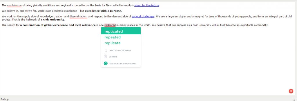
The extension works in most browser-based text editors, from webmail to social media and of course, T4. As you type you’ll see errors highlighted in red. When you hover over them an explanation of why they’ve been picked up is given along with suggested corrections. Just like the spellchecker in Word, you can review the identified errors and choose to accept or ignore them.

Screenshot of Grammarly spelling correction in T4

You can choose to sign up for a free account (although it’s not necessary) to get access to additional features:

  • choose British English rules for spelling, punctuation, and grammar
  • add words to your personal dictionary
  • write directly in Grammarly or upload documents for checking

It’s not perfect, and I’d advise you to read the explanations and use your judgment as to whether you accept them or not. It’s also not a substitute for proofreading your content before it’s published, but it’s a pretty good tool to help you take a step towards minimising spelling mistakes and grammatical errors.

User Personas

We all know that effective web content starts with our audiences (our users). If we know who we’re talking to and what their tasks and questions are we can create websites to meet their needs and achieve our business goals.

Talking about abstract, generic ‘users’ though is not helpful. After all users are people – living, breathing individuals with motivations, needs and goals. And that’s where user personas come in…

A persona is a fictional representation of a group of target users who have similar needs, goals and behaviours.

User-centred approach

To enable us to take a more user-centred approach when developing websites and creating web content, the Corporate Web team are leading on a project to create personas for all our digital audiences.

Jane and I recently attended the Nielsen Normal Group (NNg) training Personas: Turn User Data Into User-Centered Design to pick up some tips on how to create personas. Both inspiring and practical, the course furnished us with techniques to create personas and achieve stakeholder buy-in.

Benefits of personas

Personas are valuable because they bring our abstract users to life, making us more likely to relate to and care about them. They:

  • tap into our empathy for people
  • make our audiences memorable to us
  • help us predict users’ behaviour because we understand their attitudes and needs

Personas make us more likely to design for our users rather than designing for our organisation, or copying our competitors.

Framing a statement around a specific persona breaks the listeners out of self-referential thinking and removes the speaker’s reliance on opinions, shifting the discussion away from personal judgments toward that particular persona’s needs.”

Aurora Harley, Nielsen Norman group (NNg)

Personas feed into story mapping so that every time we develop a new section of a website or design a new feature we’ll think of the journey from our personas’ points of view. This means that we’re more likely to develop websites that meet our users’ needs rather than designing features and writing content based just on our opinions.

As pointed out by Aurora Harley, personas also “focus design efforts on a common goal”. They have the power to align attitudes in a team, again because they help us focus on the user rather than individual attitudes and opinions. This enables us to design a usable service that meets our customers’ needs.

Based on user research

Like all data, personas can’t be used in isolation. It’s important to use personas alongside other data such as analytics, market segmentation, usability testing and subject matter experts.

Personas are fictional but they are based on user research and existing knowledge of our audiences.

First steps

Jane and I are starting with researcher personas. We’ve designed a short, online questionnaire to collect data from research-active academic staff.

Using techniques and tips we learned at the NNg training we’ll segment and analyse the data to identify patterns and priorities so we can begin creating our personas for researchers.

Grounded in user research, we’ll also be using our existing knowledge of our audiences to shape our personas.

And of course, we’re not trying to do this alone…we’ll be coming to speak to colleagues across the University who are the subject experts for many of our audiences, and who already have a bank of user research so that we can work collaboratively to create these personas.

We’ll be blogging about our progress and experiences as we venture further into the project.

References and further reading

Kim Flaherty, How Much Time Does it Take to Create Personas? Nielsen Norman Group (NNg), 25 October 2015

Aurora Harley, Personas Make Users Memorable for Product Team Members, Nielsen Norman Group (NNg), 16 February 2015

Aurora Harley, Segment Analytics Data Using Personas, Nielsen Norman Group (NNg), 30 November 2014

A Quick Guide to… Heading Styles

There are several different headings available in T4. The style of these headings (font, size, colour) is part of our branded University web template. To comply with accessibility guidelines and the University style guide, they should always be used in a certain order.

Let’s take a look…


Page titles and introductions

Every page on your website should have a title and an introduction. Both should be added using the 01. Page Title and Intro content type, and should look like this:

page-title-intro

An example from the School of English Literature, Language and Linguistics website.

In the case of masthead pages, the title and introduction are contained within the masthead image. Here’s an example on the Electron Microscopy Research Services site.

On tabbed pages, a page title should be added as usual, but introductions should be included on each individual tab. Here’s an example on the School of Modern Languages site.


General purpose content

There are different heading styles available in the 01. General Purpose Content content type. Across University websites each of the headings are the same size and font, but the colours will vary depending on the design of your website.

Heading 2 is the first sub-heading on a page. If you want to introduce a new topic you will need to add a new Heading 2 by adding a new piece of general purpose content.

Heading 3 is the first sub-heading following Heading 2. You would use Heading 3 to introduce information related to Heading 2, but that contains enough content to form a sub section of information. Then Heading 4 is used as a sub-heading following Heading 3 and so on.

This creates a clear hierarchy of information both to users and search engines.

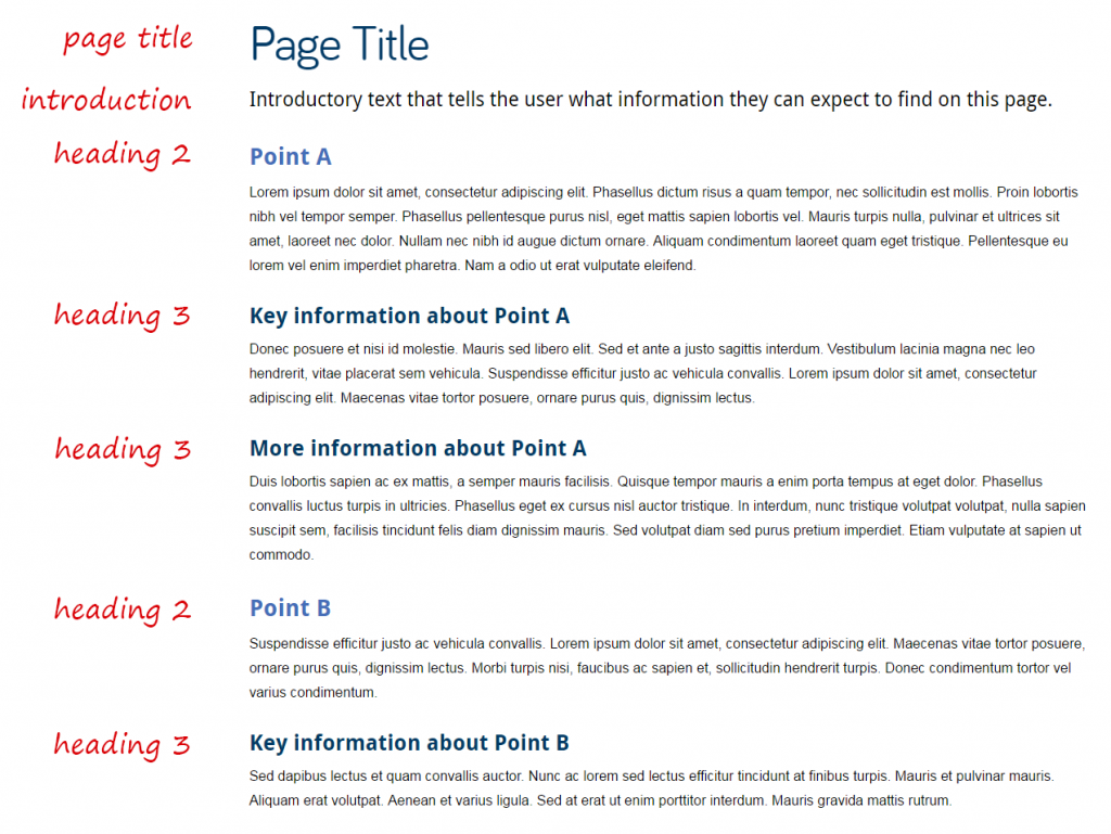
Headings in general purpose content will look something like this:

heading-styles

Heading styles in general purpose content.

You can use the same heading style multiple times on the same page. Use them to organise information in a clear, sensible way eg the first Heading 2 on the below page is followed by two Heading 3s:

headings

Example of a page using multiple headings to organise information

Headings should never be used as links. If you want to add an impactful link, use a Call to Action (CTA) button (the 08. Button content type).


Tabbed content

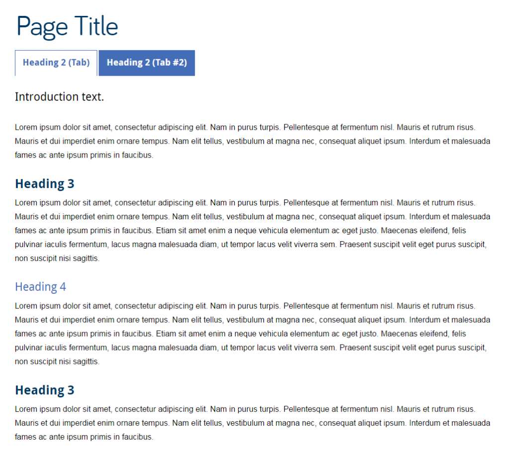
Titles in tabs are Heading 2. This means that all headings underneath them should be Heading 3 or smaller. Like this:

headers-tabs

Headings on a tabbed page.


Expandable content

The title text on expandable content defaults to Heading 3. It looks like this:

expandable-box

An expandable box using Heading 3.

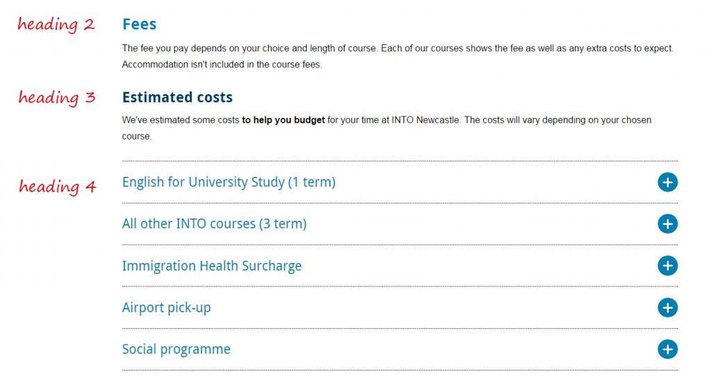
If you use a piece of expandable content under a Heading 3, you should change it’s title to Heading 4. Like this:

expandable-heading4

An example from the International Preparation Courses website.


Related posts

For advice about writing good titles and introductions, see our quick guides on headings and introductions, and our tips for improving introductions and page titles.