Improving your Web Content with Help from Google Analytics

Like many of our web editors, I found Google Analytics a bit daunting at first. The vast amount of information available made me think, where do I start? And how do I use and interpret the data?

Earlier this week Emma wrote about how our standard dashboard is a good starting point for analytics in her post How to Create a Customised Google Analytics Dashboard.

I’m going to take this further to focus on how we can use analytics to help evaluate and improve web content. To do this, I’ve looked at the standard dashboard for one of the sites in Go Mobile – the Undergraduate Open Day website. The data referenced is from 25 May to 28 June (about a month before the Open Days).

Read on to learn about my findings…

How visitors get to your site

The analytics show that around half of the visits (50.1%) to the site were made through a search engine, such as Google. This shows the importance of search engine optimisation (SEO). For advice on improving your SEO read our posts on search.

If we look at traffic to the site from social media the analytics show that the majority of visits via social networks came from Twitter. The Open Day team need to decide whether they want to concentrate efforts on the most popular social network or to focus on increasing traffic from other networks, like Facebook.

Keyword searches

Our standard dashboard shows keywords people searched for to get to your site, both in search engines and in the onsite search.

Some of the keywords identified for the Open day site were:

  • campus tours
  • medicine
  • law
  • accommodation

These words show the types of content visitors were looking for on the Open Day site. It’s therefore important that the site contains content on these topics, even if it’s just to provide some context and a link to further information on another University website.

The keyword search also shows the terms visitors are using to find this content. Using the language of your visitors increases the likelihood that they will find the information they’re searching for.

Most popular pages

As part of our Go Mobile training, we’re advising our editors to prioritise the content they’re editing on their website. To help identify which pages to prioritise we’re using an idea called the Core Model. This identifies pages where user tasks and business goals meet – these are the core pages of your website. You should focus your efforts on improving these first.

The main user task for the Open Day site is to book a place at the event, and the main business goal for this site is to increase Open Day bookings. The Book your Place page is therefore a core page of the site and the analytics supports this.

The most popular pages in this period were the Book your Place page, followed by the Open Day homepage and the Traveling to the University page.

Finding out which pages are most popular can help you to identify and prioritise core pages.

It’s important that you don’t take this data at face value though – just because a page isn’t popular doesn’t necessarily mean that the content isn’t important to yours users. Look again at the page. Is it easy enough to find? Does it use the language of your users? Does it contain all of the relevant information? Is the content engaging and clear?

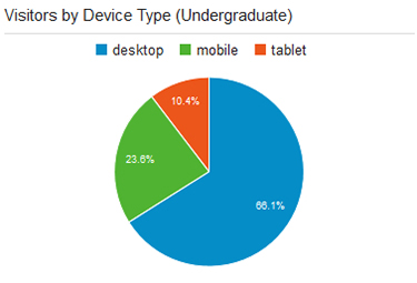
Devices used to access site

The analytics show that 50.7% of visitors viewed the site on a desktop during this period.The remaining 49.3% were accessing the site via a mobile or tablet. This is in contrast to the Undergraduate website where 66.1% of visitors accessed the site via desktop during the same period.

Vistors to Open Day website by device type Vistors to Undergraduate website by device type

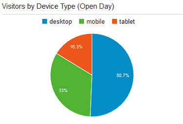
The split between desktop and mobile could be more equal for the Open Day site because it’s an event website. It is therefore used in a different way by prospective students. Visitors are more likely to quickly check key details on their phones when they are preparing for or travelling to the event.

This reinforces the idea that we need to write web content that translates across devices so that we don’t exclude any of our audiences.

Summary

What I’ve found about using Google Analytics is that it all comes down to what you’re trying to achieve with your site. This will inform what data you need to look at.

Analytics is a useful tool and can tell you a myriad of things to help improve your web content, but it’s always best to look at the data in context. If visitors aren’t engaging with a page or piece of content in the way that you expect don’t just write it off as unimportant. Instead think about why it might not be working, and whether you need to re-think the content or where it sits on the site.

Share this post:
Share

Testing our Responsive Design with Real People

The Corporate Web Development Team recently carried out some user research on the new mobile responsive postgraduate website. Our aims were to:

  • test the new design features
  • find out how easy it was for people to use the site on both mobile and desktop
  • identify developments for the postgraduate site and our Go Mobile Programme

User testing sessions

Six members of staff from the University participated.

We observed each participant complete a series of tasks on the website using a desktop, mobile or a combination of both devices. They were asked to ‘think aloud’ so that we could record their thought processes.

User testing results

The testing revealed many things about the design of the site – features that are working well and areas that need further development.

For this post I’ve pulled out some interesting outcomes.

Search

Screenshot of the search results on a mobile screen

The testing revealed that the new course search was well used and provided good results.

However, since the advanced search filters appear above the results, the search results are hidden on both desktop and mobile.

This was a particular problem for mobile users as it looks like the search hasn’t worked. One of our users kept filling in the fields even though they didn’t need to.

It shows that the course search needs further development to improve its usability.

Navigation

On mobile people easily found the blue link buttons on the homepage (eg Student Life) but desktop users did not spot these as quickly.

The buttons appear under the content on mobile, on desktop they appear to the right hand side.

Example blue call to action button from the responsive designThis supports research into online reading which shows that content to the right is often ignored.

Desktop users tried clicking headings in the main content before clicking the button. One person didn’t notice them and struggled to complete certain tasks.

The red call to action buttons were well used on both desktop and mobile. They were spotted quickly and people commented that they made tasks easier.

Example red call to action button from the responsive designThe inconsistency of hyperlink styling made it unclear what was and wasn’t a link. The majority of users didn’t find the student profile information as they weren’t aware that the heading linked through to additional content.

The user research showed that we need to review the links on the homepage. In contrast, participants quickly spotted navigation on course and supplementary pages.

Content

One of our new content types is known as mobile collapse. On desktop, the content displays as a heading and paragraph. On mobile, the content is ‘collapsed’:

Screengrab of the mobile collapse function. The user research revealed that the mobile collapse content did not stand out. Mobile users scrolled past the information without realising it could be expanded.

If our potential students can’t find accreditation information they may assume that the course is not accredited. It’s crucial that we make this content more prominent on mobile.

Design

There were lots of positive comments about the look and feel of the site. People spotted the pull quotes quickly and users liked the use of videos, images and dual tone headings.

One user described the site as “vibrant and exciting”.

Testing is vital to improve the usability of a site

This research has highlighted to me the importance of user testing – it shows us what is working and what needs improving.

If prospective students can’t find information easily it may influence their decision to apply here so it’s vital that we identify and solve usability issues.

We’re currently working on solutions for the issues identified from this testing.

Improvements to content, design and layout will also inform developments for the next batch of sites in our Go Mobile Programme.

Find out more

We base our user testing on training provided by the Nielsen Norman Group. Find out more about user testing by visiting the Nielsen Norman Group’s website.

Share this post:
Share

Improving User Journeys on the Postgraduate Website

The postgraduate (PG) website redevelopment initially began with a focus on improving the content and developing a strategy for content management. Mostly, this was to enable a more coherent user journey through the website – to improve the experience as a whole and encourage applications.

A consistent user experience

As the project got underway it became more and more obvious from our user research that we really needed the website to be optimised for mobile too.

To create a truly consistent experience, users of the website should be able to get the same experience and information no matter what device they use to view the site.
While we were trying to work out how we were going to do that, there was still some debate in the web development world about if you should or could just offer a separate mobile site. Immediately we decided that approach wasn’t helpful at all.

Project creep

The Postgraduate website goes mobile

The Postgraduate website goes mobile

Just imagine a user looking at the PG website on a desktop computer. Later they decide to go back and check some information using their phone.

What would their experience be like if we gave them a separate site? With a different structure and content? That really wouldn’t be helpful. Or coherent. Or easy to maintain.

So the work grew from a massive project of improving all the PG content and creating a PG content strategy, to also incorporating the ‘small’ technical demand of a mobile responsive website!

In 2010 Ethan Marcotte coined the term responsive design to describe a flexible, grid-based layout for a website that behaves differently depending on the device used to view it.

… It was a busy year.

Inspiring results

Now we have a really great, mobile responsive website with much improved content that we’re not only proud of, but has inspired the University’s Go Mobile project. Just a quick look at how our users are responding already (we launched at the end of October) shows, for mobile users:

  • average time spent on site has increased by a massive 240%. It was less than four minutes, now it is nearly 12
  • we’ve increased the number of pages viewed by nearly 22%

Watch this space

There were so many elements to the PG project that they merit separate blog posts, so in the coming months we’ll be sharing about how we:

  • wrote content for mobile devices (and improved the desktop reading experience)
  • created a tone of voice – and why
  • prioritized content layout for mobile optimization
  • kept sane (only kidding)

In the meantime you can visit the new PG website and discover the new features by taking a look at our PG case study presentation (PDF: 849KB) from the NU Digital event.

We’d love to hear your views about the new PG website, so feel free to leave a comment.

Update: 16 Nov 2015

Since this article was published, we’ve completed some user testing on the PG website. Check out our blog post about the great user testing results (hint: they love it).

Share this post:
Share