Creating Effective Calls to Action

In our planning for the web training, we told you all about the core model; web pages that direct users to business goals or further information.

The paths through these pages can be highlighted as calls to action (CTA). Today, I’m going to talk about them in a little more detail.

Transactional vs navigational

There are two types of CTA, transactional and navigational.

Transactional CTA achieve business goals by getting your users to:

  • buy
  • order
  • book
  • enquire
  • pay
  • apply

Navigational CTA provide users with forward paths by linking to further information or a logical ‘next step’ in the user journey.

When you need to button it

Navigational CTA generally only need a hyperlink within the textFor example, ‘visit our Postgraduate website to find out more about funding opportunities’.

Transactional CTA require something with more impact. That’s where the T4 content type 08. Button comes in.

Buttons are larger and more eye-catching than hyperlinks. The text on them should be active, and encourage the user to do something like ‘buy now’ or ‘sign up’.

There’s examples of CTA buttons on our Go Mobile Demo website.

Storytelling

Think of your web page as a story, with the call to action as the epic climax. The narrative or your page (ie the rest of the content) should build anticipation for the call to action.

You should tell your users:

  • what the page is about
  • what the problem/issue/benefit is
  • a little of what the user will get out of pressing your button

Get it right

You can find out about different types of CTA, what types of pages to use them on, and even our top tips for using buttons.

Share this post:
Share

Usability heads in the right direction

We’ve built something new. It’s a widget for giving your web users easy access to clear directions for the location of your school/faculty/service.

It’s the efficient way for our lovely web editors to help potential visitors to the University.

It eliminates the need for paragraphs of vague/potentially incorrect routes to take:

  • roads
  • rail services
  • walking routes
  • cycling routes

Our new T4 content type is ideal for your website’s Find Us or Contact Us page.

How it works

If you’re seeking to add this content type, you’ll need to choose 14. Google directions.

We advise you add this to the bottom of your page, as it sits to the left under preceding content. Use it further up and people might miss something you’ve written that is important.

There are two boxes to fill out once you’ve selected this content type. The first is title, which should be filled out with:

DIRECTIONS: insert name of your school/service/faculty here

The second box relates to where you actually want to send your website users.

Because much of the university campus has the same postcode, you need to enter the building name and postcode.

An example for the Institute of Cellular Medicine, would be:

William Leech Building NE2 4HH

Then just update and approve your content and wait for it to publish.

What your users get

Your website users will see a search facility on the page with a Find Us button. All they need to do is add their address or postcode into the box and click on the button.

They will instantly arrive on a Google Maps page that will plot the routes to your location:

  • road
  • rail
  • walking
  • cycling
  • flight (if they’re far enough away)

Because it’s all done through Google, the information is constantly updated to remain as accurate as it can be.

It’s also a visual representation that takes you through the journey and works with GPS, instead of paragraphs that vaguely get your users here.

An example is on our demo site. Have a go applying it to yours.

Share this post:
Share

Breaking Bad When It Comes to Links

Broken links are the bane of user experience.

There’s nothing worse than finding a 404 error page. And people who tart 404s up with quaint local dialect or jokes to apologise should just stop.

If you remove a page or change a url and leave the old link lingering elsewhere, you’re breaking trust.

You’re damaging the confidence people have that your website is up-to-date. You’re frustrating them with the promise of information you’ve snatched away.

Search engines won’t like you either. You are breaking their trust in sending people to your website.

Identifying broken links

You might say it’s unavoidable to have broken links. It’s not, it just requires care. If you’re killing a page, document or changing a url remember where you’ve placed links and change or remove them. This could be on your website, social media or even in print.

If you can’t remember where website links were, use these services to find them:

Make search engines work for you

What happens if search engines have indexed the page/document you removed?

They make it difficult enough to get up the search rankings without causing this kind of headache.

If you can’t redirect people elsewhere, it’s time to make Google and co work for you.

Do a search for the page/document you’ve just deleted and if you find it in their listings – report it.

Google (if you have an account) will remove dead links from search listings on request. Make them work for you.

Further reading

A Link is a Promise, Kara Pernice, NNg

Share this post:
Share

Excellent Results for Postgraduate Website Testing

We posted an article earlier this year about user testing that the Corporate Web Development team undertook on the Postgraduate (PG) website. Our testing was completed a few months after go live, last October.

Since then, as part of the final stages of the PG website project, there has been a range of extensive evaluations run and co-ordinated by the Postgraduate Marketing Team.

From clarity tests of the content, use of Google Analytics, interviews, remote user testing by our PG target audience – even an externally-run expert review.

There was also a chance to review the new website against our competitors – well it would be rude not to…and anyway we had a clear content strategy to test:

“The new Postgraduate website will have audience driven, engaging content that inspires ambitious high-flying global students to make us their confident choice for PG study”

Headline results

Overall – the new website has performed excellently, with some outstanding feedback alongside some further ideas for development.

Which is great, since the PG website project has paved the way for all our Go Mobile work!

It’s important to note once a website has been launched and tested – that’s not the end. Actually it’s just the beginning; of making further improvements, developments, finding solutions to issues and continually trying to do the best thing for our users.

Read on to find out how we did…

First impressions

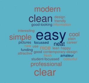
The word cloud below shows first impressions of the PG site. The most popular words that users used to describe the site included: easy, modern, simple, clear, professional, clean and cool.

 Word cloud showing first impressions of the PG website

Website content

“Everything is very clear, the words actually stand out because the design of the site is very lean and clean cut…There are no useless pieces of information.”

User tester

  • Ranked 1st or 2nd in comparison to competitor PG content according to Clarity Grader, a website content analysis tool
  • An improvement in quality and consistency of content
  • Users found the content clear, detailed, straightforward and organised and with good comprehension
  • Test participants commented on the quality of course entries they found. Users specifically found the following useful:
    • modules
    • course delivery and duration
    • facilities
    • employment infographics and related courses

some future developments

  • New content quality and consistency measures are being developed
  • Continued focus on the use of terminology, ensuring the content is accessible by our key audiences
  • Further development of supplementary information, scheduled by a web editorial calendar
  • Develop stronger links between supplementary information and course information

Design

“Wow, this one’s layout is different, I like it, it’s colourful, it’s not boring”

User tester

  • The design was well received in all testing
  • Gives a great first impression to users
  • Newcastle compares favourably in comparison to our competitors

some future developments

  • User experience testing helped to influence our Go Mobile template design
  • Further development of the PG homepage and the flow of information
  • Developments to the course search call to action and visibility on the homepage

Course search/funding search

“This is amazing. I came here the last time and I don’t believe I could find things so easily. This actually shows that the website has improved and this is actually a very good filtering that the website has added to its system”

User tester

  • Newcastle’s content performed well in comparison to competitor sites. One user stated they “strongly favoured the course navigation and content over Manchester”
  • New course search was well received and proved to be the most used method of finding a course in comparison to the A-Z list
  • The advanced search filters are being well used
  • Tab layout of the course information on desktop was well received
  • The new step-by-step guide was well received and recognised as providing useful information

Some future developments

  • Further development of search filters to ensure accurate and precise results
  • Development of additional tools to sort search results, eg by relevance, A-Z
  • Streamlining of the course and funding search functionality across all devices

Calls to action

  • Good to have recognisable calls to action
  • Footer calls to action are used well
  • Improvement in number of sessions resulting in the creation of a new (applicant) account

Some future developments

  • Renaming of some calls to action for consistency
  • Revising of placement of some calls to action
  • More visible course start dates and application deadline where they exist

Navigation

  • Users reported on the ease of navigation through the website
  • Use of tabs on course profile pages are well received on desktop

some future developments

  • Development of mobile menus: main menu; secondary menu; and tabbed menus
  • Consistent application of hyperlinks – already addressed as part of ongoing development
  • Review of the breadcrumbs design and functionality

Conclusion

So, has the new PG website been a measurable success? I would argue a resounding YES!

All the testing, evaluation and competitor analysis shows this is largely the case. Phew.

Back to the original plan then:

“The new Postgraduate website will have audience driven, engaging content that inspires ambitious high-flying global students to make us their confident choice for PG study”

Audience driven – Check. All content has been created, developed and designed with the user’s needs in mind.

Engaging content – Check. We’ve used new technology and design to enhance the user experience where appropriate; a mobile responsive design, new course search, infographics and videos to supplement course pages.

Ambitious high-flying global students – Time will tell. It’s hard to test or measure whether applicants are deciding to apply due to our marvellous new website. There are after all numerous other factors to influence an applicant – but still, shouldn’t we have an inspirational strategy to work to?

Find out more

If you’d like to learn more about the results of the PG user testing, and watch videos of the testing watch the Prezi online.

Read about our earlier user testing of the PG Website.

Share this post:
Share

Experts to Inspire You

We like to keep ourselves up to date with the latest developments in the web industry by reading. A lot.

We read books, articles, websites and blogs and thought we’d pick some of the quotes we really, really like. Hopefully you can spot why…

Usability

“When I look at a web page it should be self-evident. Obvious. Self-explanatory.

“I should be able to ‘get it’ – what it is and how to use it- without expending any effort thinking about it.”

Steve Krug
Don’t make me think

“It is very important that your website is visually pleasing. However it is much more important your website is useful.”

Gerry McGovern
Killer Web Content

Your content is important

“Language is at the heart of communication, and the only purpose of a website is to communicate.”

Seth Godin
The First Rule of Web Design

“Your writing is important. At the end of the day, you’re a person communicating with other people.”

Nicole Fenton and Kate Kiefer Lee
Nicely said. Writing for the web with style and purpose

“If the heading is the hook, the summary is the line that pulls you in. The summary gives readers all the information they need to decide whether to read on or not.”

Gerry McGovern
Killer Web Content

“A person who produces content without understanding the tasks the content needs to support is a dangerous person indeed.”

Gerry McGovern
The Stranger’s Long Neck

“With the limitations of the mobile screen as a guideline and a barrier, you’d naturally have to write differently.

  • You’d get to the point.
  • You’d put the most important information up front.
  • You’d remove all the marketing jargon and fluff.
  • You’d write short declarative sentences.
  • You wouldn’t use a long word when a short one would do.
  • You’d make every word earn its place.

Writing this way isn’t just good for writing for mobile. It’s good writing for everyone.”

Karen McGrane
Content Strategy for Mobile

Going mobile

“Use going mobile as a lens to make all our content better regardless of platform.

“It’s a big chance to create a better user experience by improving the quality of our content. Let’s not waste it.”

Karen McGrane
Content Strategy for Mobile

“The work you do now, to structure content for reuse and get it ready for mobile, is going to also make that content more prepared for wherever the future takes it.

“Considering all the different devices on which your content may be displayed forces you to focus – to take stock of what’s really important and to get rid of things that aren’t.”

Sara Wachter-Boettcher
Content Everywhere

Your messaging

“Messaging is the art of deciding what information or ideas you have that you want to give to – and get from- your users.”

Kristina Halvorson and Melissa Rach
Content Strategy for the Web

“Use the mobile screen’s constraints to help prioritise your primary, secondary and supporting messages.”

Karen McGrane
Content Strategy for Mobile

“You must have an ending to your content that is a call to action. Good web content is always task-focused, and the best ending allows your customers to go about completing their tasks.”

Gerry McGovern
Killer Web Content

A final thought…

“Today, many websites are damaging the reputation of the organization. Every time someone finds the wrong content or clicks on a broken link, the brand is hurt.”

Gerry McGovern
Killer Web Content

Feel inspired

So, do you feel inspired? And can you tell why we like these quotes?

These experts all advocate good writing practice to improve the website experience for all.

They all absolutely, utterly agree on one thing: content is king.

You don’t have to be a designer or a developer to create a useful, successful website at the University (we’ll do that for you) but you do have to care about your content.

References

Share this post:
Share