How Micro Content Can Immediately Improve Your Website

Micro content isn’t teeny tiny type on a page – it’s actually the words we put on websites for things like buttons, tabs, menus, even page titles.

Recently we looked at the micro content we used on the 404 error page for the Postgraduate (PG) website.

Our analytics showed some people who followed a broken link (a deleted page) arrived at this error page and then immediately left the website.

Okay, so those people didn’t find the page they were looking for, but we follow best practice on our error page. We very politely give helpful links to the search, homepage and sitemap so people can still try to find what they are looking for.

So why did they leave immediately?

Review micro content

A quick review of the error page micro content revealed it was perhaps a bit negative:

Our old, negative, 404 error page
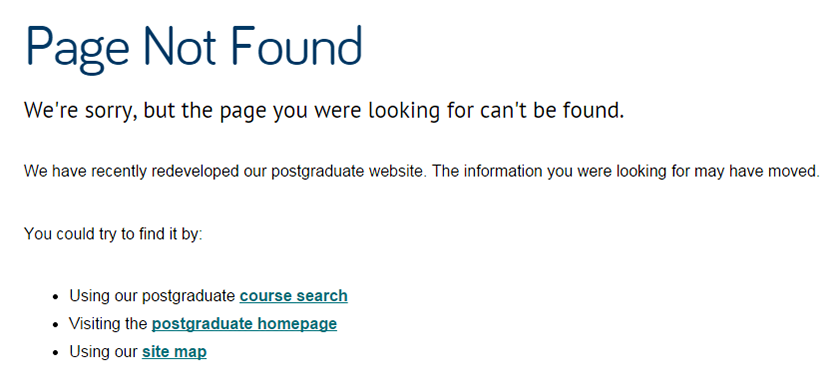
Our loud and proud micro content at the beginning of the page, didn’t encourage people to read further and use the links we had so helpfully provided.

The page was also a tad long to scan read so we changed it to:

Our new, confident and friendly, 404 error pageBy changing the micro content, we also made the error page follow the confident but friendly PG tone of voice the rest of the website uses.

Testing 1 2 3

We had several versions of the new error page, and ran these past a few people. The feedback resulted in a mashup of the different versions. Overall it’s a page that everyone felt works better.

Outstanding results

We added Google Analytics to the error page so we could tell if/when people started using the links instead and staying on the website… we had a brilliant results.

People stayed on the PG website – and six actually went on to start the application process!

So potentially, six new postgraduate students gained by changing micro content – that’s powerful stuff.

Take a look at the micro content on your website – is it saying what it needs to in the most effective way?

Have a go! What improvements can you make to your micro content?

Read more

This short but effective article, The first rule of web design by Seth Godin is worth a look. Its about making sure you use the right micro content for actions on your webpages – it certainly makes you think.

Share this post:
Share

Testing our Responsive Design with Real People

The Corporate Web Development Team recently carried out some user research on the new mobile responsive postgraduate website. Our aims were to:

  • test the new design features
  • find out how easy it was for people to use the site on both mobile and desktop
  • identify developments for the postgraduate site and our Go Mobile Programme

User testing sessions

Six members of staff from the University participated.

We observed each participant complete a series of tasks on the website using a desktop, mobile or a combination of both devices. They were asked to ‘think aloud’ so that we could record their thought processes.

User testing results

The testing revealed many things about the design of the site – features that are working well and areas that need further development.

For this post I’ve pulled out some interesting outcomes.

Search

Screenshot of the search results on a mobile screen

The testing revealed that the new course search was well used and provided good results.

However, since the advanced search filters appear above the results, the search results are hidden on both desktop and mobile.

This was a particular problem for mobile users as it looks like the search hasn’t worked. One of our users kept filling in the fields even though they didn’t need to.

It shows that the course search needs further development to improve its usability.

Navigation

On mobile people easily found the blue link buttons on the homepage (eg Student Life) but desktop users did not spot these as quickly.

The buttons appear under the content on mobile, on desktop they appear to the right hand side.

Example blue call to action button from the responsive designThis supports research into online reading which shows that content to the right is often ignored.

Desktop users tried clicking headings in the main content before clicking the button. One person didn’t notice them and struggled to complete certain tasks.

The red call to action buttons were well used on both desktop and mobile. They were spotted quickly and people commented that they made tasks easier.

Example red call to action button from the responsive designThe inconsistency of hyperlink styling made it unclear what was and wasn’t a link. The majority of users didn’t find the student profile information as they weren’t aware that the heading linked through to additional content.

The user research showed that we need to review the links on the homepage. In contrast, participants quickly spotted navigation on course and supplementary pages.

Content

One of our new content types is known as mobile collapse. On desktop, the content displays as a heading and paragraph. On mobile, the content is ‘collapsed’:

Screengrab of the mobile collapse function. The user research revealed that the mobile collapse content did not stand out. Mobile users scrolled past the information without realising it could be expanded.

If our potential students can’t find accreditation information they may assume that the course is not accredited. It’s crucial that we make this content more prominent on mobile.

Design

There were lots of positive comments about the look and feel of the site. People spotted the pull quotes quickly and users liked the use of videos, images and dual tone headings.

One user described the site as “vibrant and exciting”.

Testing is vital to improve the usability of a site

This research has highlighted to me the importance of user testing – it shows us what is working and what needs improving.

If prospective students can’t find information easily it may influence their decision to apply here so it’s vital that we identify and solve usability issues.

We’re currently working on solutions for the issues identified from this testing.

Improvements to content, design and layout will also inform developments for the next batch of sites in our Go Mobile Programme.

Find out more

We base our user testing on training provided by the Nielsen Norman Group. Find out more about user testing by visiting the Nielsen Norman Group’s website.

Share this post:
Share

Improving User Journeys on the Postgraduate Website

The postgraduate (PG) website redevelopment initially began with a focus on improving the content and developing a strategy for content management. Mostly, this was to enable a more coherent user journey through the website – to improve the experience as a whole and encourage applications.

A consistent user experience

As the project got underway it became more and more obvious from our user research that we really needed the website to be optimised for mobile too.

To create a truly consistent experience, users of the website should be able to get the same experience and information no matter what device they use to view the site.
While we were trying to work out how we were going to do that, there was still some debate in the web development world about if you should or could just offer a separate mobile site. Immediately we decided that approach wasn’t helpful at all.

Project creep

The Postgraduate website goes mobile

The Postgraduate website goes mobile

Just imagine a user looking at the PG website on a desktop computer. Later they decide to go back and check some information using their phone.

What would their experience be like if we gave them a separate site? With a different structure and content? That really wouldn’t be helpful. Or coherent. Or easy to maintain.

So the work grew from a massive project of improving all the PG content and creating a PG content strategy, to also incorporating the ‘small’ technical demand of a mobile responsive website!

In 2010 Ethan Marcotte coined the term responsive design to describe a flexible, grid-based layout for a website that behaves differently depending on the device used to view it.

… It was a busy year.

Inspiring results

Now we have a really great, mobile responsive website with much improved content that we’re not only proud of, but has inspired the University’s Go Mobile project. Just a quick look at how our users are responding already (we launched at the end of October) shows, for mobile users:

  • average time spent on site has increased by a massive 240%. It was less than four minutes, now it is nearly 12
  • we’ve increased the number of pages viewed by nearly 22%

Watch this space

There were so many elements to the PG project that they merit separate blog posts, so in the coming months we’ll be sharing about how we:

  • wrote content for mobile devices (and improved the desktop reading experience)
  • created a tone of voice – and why
  • prioritized content layout for mobile optimization
  • kept sane (only kidding)

In the meantime you can visit the new PG website and discover the new features by taking a look at our PG case study presentation (PDF: 849KB) from the NU Digital event.

We’d love to hear your views about the new PG website, so feel free to leave a comment.

Update: 16 Nov 2015

Since this article was published, we’ve completed some user testing on the PG website. Check out our blog post about the great user testing results (hint: they love it).

Share this post:
Share

Introduction to User Research

It’s fascinating to see people use our websites – it lets us see where they have problems and how we can make sites easier to use. We use this research to help us develop, structure and improve the usability of our undergraduate and postgraduate websites at Newcastle University.

We base our testing on training provided by the Nielsen Norman Group, a market leader in the user experience field.

But did you know that you only need five people to test a site?

That doesn’t seem many, but data from your first user gives immediate results – you’ve already learned almost a third of all there is to know about the usability of your design.

The second user will repeat some things with maybe a few new things, but you don’t learn as much as you did from that first user. Same goes for the third user, in fact the more users you have, the less you learn because you will keep seeing the same things again and again.

However, we can’t effectively test with just one user as you risk being misled by the specific behaviour of that single user.

So in this case at least, five is the magic number.

User Research topics

We will share case studies of the user research we’ve completed recently on our postgraduate and undergraduate websites, and how the findings directly informed changes to content, design and layout.

We’ll also take a look at the latest developments in user research – and let you know our plans for the next batch of user testing.

We may even be asking for volunteers

In the meantime, take a look at this introduction to usability by the Nielsen Norman Group.

Suggest a topic

If there’s a topic you’d like us to cover – get in touch via the comments or via our website (University login required).  

Share this post:
Share