How We’re Improving Our Google Analytics Configuration

Over the past few weeks we have been reviewing the set-up of our Google Analytics tracking.

We had to update the tracking code embedded on all pages of the website. While we were doing this it seemed sensible to look at the whole set-up to make sure we are getting the most reliable data. We’ve been working with the digital agency, iProspect, on this project.

Account structure

The biggest change you’ll notice when you log in to analytics is the structure of our account. Everything has been consolidated into two properties:

  • internal.ncl.ac.uk
  • www.ncl.ac.uk – cross site tracking

The majority of our editors will be interested in data from external sites, so I’ll focus on what can be found in the www.ncl.ac.uk property. Within this property you will see a number of views. These allow you to access data for specific sub-domains, eg research.ncl.ac.uk, or applications, eg Hobsons.

There are also two views that allow you to look at data across all of the services, and see movement between them. They are:

  • 1. MAIN // incl. Microsites, Research, Conferences & Webstore – this gives access to filtered and de-duplicated data and should be used to report on activity from July 2016 onwards
  • 9. RAW – this gives access to unfiltered data and should be used only to report on activity before July 2016

Access to analytics

As part of this review we’re also looking at who has access to our account. This will include revoking access for anyone signed up with a personal email address. If you still need access to analytics we’ll ask you to re-register with a Google Account connected to your Newcastle email address.

Service development

Over the summer we’ll be taking some time to develop the analytics service we offer. This will give us time to collate 2-3 months of data in the new configuration.

We’ll be looking at access, reporting and analysis, as well as how we feed any recommendations back into content and template development.

Related posts

Share this post:
Share

Do Your Users Interact with Dynamic Content?

Every now and again I go off on a little rant. My team’s used to it. They humour me. And thankfully, mostly, nod and agree. Or at least see my point of view. When they gave me the power to write posts here, I wonder if they thought my rants would spill over for all the world to read.

Today you’re party to a rant about carousels, image sliders and rotating banners. Call them what you will, they’re all the same – dynamic content. Dynamic content is frustrating, because content is hidden as the thing moves.

Dynamic content is largely ignored by people who come to your website to complete a task. That’s what people use websites for, you know, to find answers to their questions.

Why I don’t think you need a carousel

I have some stats to back up the theory that dynamic content is not as effective as static content.

Stats? Hmmm, maybe this is the point when a rant stops being a rant and becomes a reasoned argument.

From 3 to 17 August on the University homepage we had numerous messages relating to Clearing. Some were in the rotating banner. Some were in the static content of the page. We have tracking set up on all the links in both of these locations.

Over the two week period:

  • the banner messages were clicked 2849 times
  • the static content links were clicked 9635 times

The analytics show that our users are 3.4 times more likely to click the links in static content than they are to click links in the banner.

Why might this be the case?

There’s a lot of research from the higher education sector that confirms that carousel interactions reduce as you move through the features. So the item in position one gets most clicks and the number reduces as the banner rotates.

User research conducted by Nielson Norman supports the argument that carousels reduce the visibility of your content. A user was given a task on a site where the answer appeared in a carousel. She failed to complete the task because “the panel auto-rotated instead of staying still”.

So dynamic content like carousels hide content, and the answers to your users questions. In contrast, static content is always visible to your users.

Why you think you need a carousel

I would be rich if I had a pound for every time someone told me they wanted a carousel on their website because they:

  • look nice
  • make the page more inviting and more attractive to users
  • showcase our best assets

Let’s go back to what people come to your website for – to answer a question. Now, ask yourself – do any of the reasons given above help a user to complete a task?

If you still need convincing that carousels aren’t great, just take a look at Jared Smith’s website Should I Use a Carousel?

Creating content that answers user questions

So after telling you that you need content that answers users questions, here’s some guidance to help you plan and write effective content (University login required).

Share this post:
Share

Improving your Web Content with Help from Google Analytics

Like many of our web editors, I found Google Analytics a bit daunting at first. The vast amount of information available made me think, where do I start? And how do I use and interpret the data?

Earlier this week Emma wrote about how our standard dashboard is a good starting point for analytics in her post How to Create a Customised Google Analytics Dashboard.

I’m going to take this further to focus on how we can use analytics to help evaluate and improve web content. To do this, I’ve looked at the standard dashboard for one of the sites in Go Mobile – the Undergraduate Open Day website. The data referenced is from 25 May to 28 June (about a month before the Open Days).

Read on to learn about my findings…

How visitors get to your site

The analytics show that around half of the visits (50.1%) to the site were made through a search engine, such as Google. This shows the importance of search engine optimisation (SEO). For advice on improving your SEO read our posts on search.

If we look at traffic to the site from social media the analytics show that the majority of visits via social networks came from Twitter. The Open Day team need to decide whether they want to concentrate efforts on the most popular social network or to focus on increasing traffic from other networks, like Facebook.

Keyword searches

Our standard dashboard shows keywords people searched for to get to your site, both in search engines and in the onsite search.

Some of the keywords identified for the Open day site were:

  • campus tours
  • medicine
  • law
  • accommodation

These words show the types of content visitors were looking for on the Open Day site. It’s therefore important that the site contains content on these topics, even if it’s just to provide some context and a link to further information on another University website.

The keyword search also shows the terms visitors are using to find this content. Using the language of your visitors increases the likelihood that they will find the information they’re searching for.

Most popular pages

As part of our Go Mobile training, we’re advising our editors to prioritise the content they’re editing on their website. To help identify which pages to prioritise we’re using an idea called the Core Model. This identifies pages where user tasks and business goals meet – these are the core pages of your website. You should focus your efforts on improving these first.

The main user task for the Open Day site is to book a place at the event, and the main business goal for this site is to increase Open Day bookings. The Book your Place page is therefore a core page of the site and the analytics supports this.

The most popular pages in this period were the Book your Place page, followed by the Open Day homepage and the Traveling to the University page.

Finding out which pages are most popular can help you to identify and prioritise core pages.

It’s important that you don’t take this data at face value though – just because a page isn’t popular doesn’t necessarily mean that the content isn’t important to yours users. Look again at the page. Is it easy enough to find? Does it use the language of your users? Does it contain all of the relevant information? Is the content engaging and clear?

Devices used to access site

The analytics show that 50.7% of visitors viewed the site on a desktop during this period.The remaining 49.3% were accessing the site via a mobile or tablet. This is in contrast to the Undergraduate website where 66.1% of visitors accessed the site via desktop during the same period.
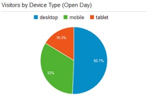
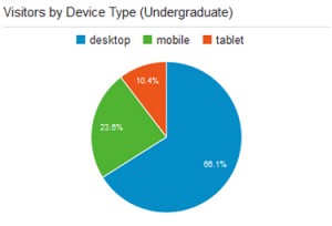
Vistors to Open Day website by device type Vistors to Undergraduate website by device type

The split between desktop and mobile could be more equal for the Open Day site because it’s an event website. It is therefore used in a different way by prospective students. Visitors are more likely to quickly check key details on their phones when they are preparing for or travelling to the event.

This reinforces the idea that we need to write web content that translates across devices so that we don’t exclude any of our audiences.

Summary

What I’ve found about using Google Analytics is that it all comes down to what you’re trying to achieve with your site. This will inform what data you need to look at.

Analytics is a useful tool and can tell you a myriad of things to help improve your web content, but it’s always best to look at the data in context. If visitors aren’t engaging with a page or piece of content in the way that you expect don’t just write it off as unimportant. Instead think about why it might not be working, and whether you need to re-think the content or where it sits on the site.

Share this post:
Share

How to Create a Customised Google Analytics Dashboard

Most of the conversations I have with our web editors about Google Analytics start like this:

Editor: I’ve got access to Google Analytics but I didn’t know where to start. There’s so much data, it’s overwhelming!

Me: We know how daunting Google Analytics can be, so we’ve created a standard dashboard you can copy and customise to get all the key metrics for your website.

It’s true. With our standard dashboard you can get data on:

  • how people are getting to your site
  • the keywords people are using to find your site
  • what devices people are using to access your site
  • the location of your audience
  • your most popular pages
  • the total number of visitors to your site
  • whether your visitors are new or returning

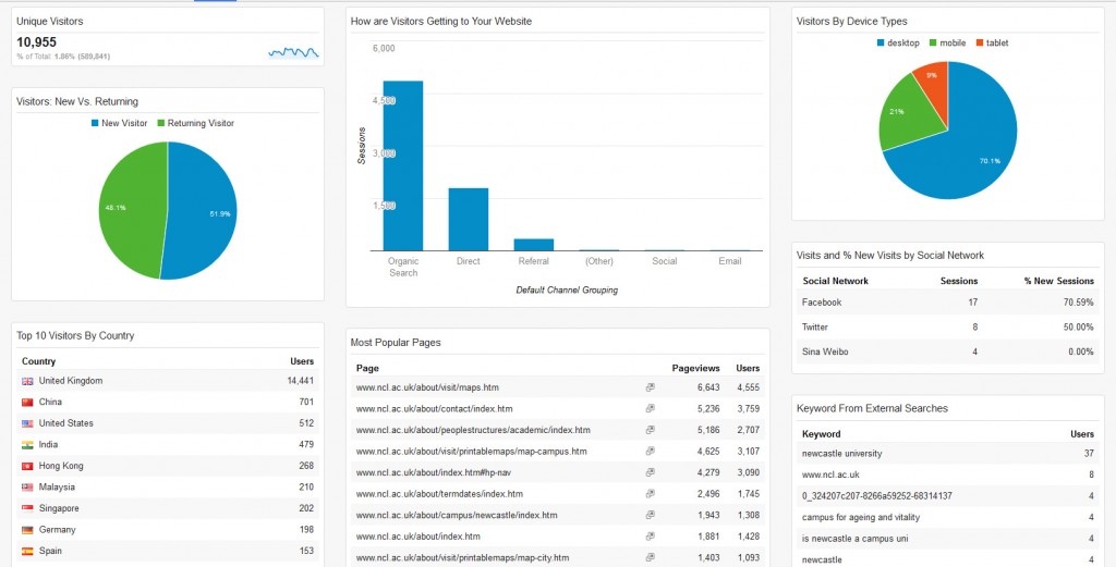
Here’s an example of what your dashboard will look like. This one is set up for the About section of the University website.

Customised Google Analytics dashboard for www.ncl.ac.uk/about

Customised Google Analytics dashboard for www.ncl.ac.uk/about

Once you’ve got the dashboard set up you can:

  • view data for different time periods
  • download the report as a PDF
  • schedule reports to be emailed to you on a regular basis.

The first step to getting the dashboard is to request access to the University’s Google Analytics (University login required). Once you have access you can customise the standard dashboard for your website. We’ve got step-by-step instructions on how to do this, plus a demo video on our website (University login required).

Our next post will cover how to make use of the data in your dashboard. If there are other analytics topics you’d like us to cover please leave us a comment below.

Share this post:
Share

Introduction to Analytics

We use Google Analytics to evaluate the performance of our website. We’ve been collecting data in this way for over 12 months. Using Google Analytics we can analyse:

  • our audience
  • how visitors get to our site
  • how visitors engage with our content

We give our web editors access to the University’s Google Analytics account. This allows you to access data for your site at any time.

Analytics topics

We’re going to use this blog to help you understand what you can get from analytics and how. We’ll begin with some jargon busting and go on to provide tips for using Google Analytics itself.

There will be a regular feature that showcases how our web editors are already using analytics and how different sections of the site are performing.

In the meantime, you can request access to Google Analytics (University Login required).

Suggest a topic

If there’s a topic you’d like us to cover – get in touch via the comments or via our website (University Login required).

Share this post:
Share