Creating Effective Calls to Action

In our planning for the web training, we told you all about the core model; web pages that direct users to business goals or further information.

The paths through these pages can be highlighted as calls to action (CTA). Today, I’m going to talk about them in a little more detail.

Transactional vs navigational

There are two types of CTA, transactional and navigational.

Transactional CTA achieve business goals by getting your users to:

  • buy
  • order
  • book
  • enquire
  • pay
  • apply

Navigational CTA provide users with forward paths by linking to further information or a logical ‘next step’ in the user journey.

When you need to button it

Navigational CTA generally only need a hyperlink within the textFor example, ‘visit our Postgraduate website to find out more about funding opportunities’.

Transactional CTA require something with more impact. That’s where the T4 content type 08. Button comes in.

Buttons are larger and more eye-catching than hyperlinks. The text on them should be active, and encourage the user to do something like ‘buy now’ or ‘sign up’.

There’s examples of CTA buttons on our Go Mobile Demo website.

Storytelling

Think of your web page as a story, with the call to action as the epic climax. The narrative or your page (ie the rest of the content) should build anticipation for the call to action.

You should tell your users:

  • what the page is about
  • what the problem/issue/benefit is
  • a little of what the user will get out of pressing your button

Get it right

You can find out about different types of CTA, what types of pages to use them on, and even our top tips for using buttons.

Share this post:
Share

An Introduction to Information Architecture

In my post about our minimalist approach to the web, I said that you should respect your users’ time by only providing them with essential information, and by guiding them through your website in a helpful way.

The best way to do this is by having good information architecture.

Information architecture is about deciding how something is organised. It’s not just about where your content is, it’s about the placement and design of that content, and what message that sends to your users.

I think the best way to explain this is with an example…

Example

In this example from the old Faculty of Medical Sciences website, five postgraduate taught programmes appear as sub-menu items in the sidebar, while the rest appear as bulleted list items on the page.

An example of bad information architecture, from the Faculty of Medical Sciences website.

Some degree programmes appear as menu items in the left-hand navigation, others appear as links in the main body of the page.

In reality, there is no significant difference between these programmes, but the way they’re organised gives a false impression of hierarchy. It ascribes importance to the ones in the sidebar. Users could leave this page with the impression that the faculty values the programmes in the sidebar more highly than the ones in the list.

Here is the same page on the new Faculty of Medical Sciences website.

An example of good information architecture, from the Faculty of Medical Sciences website.

All degree programmes appear as links in the main body of the page. The list is separated by subject and ordered alphabetically.

All of the taught programmes are now listed in alphabetical order in the main part of the page. They all look equally important and they’re easier for the user to navigate.

The links take the user to the central postgraduate website. This fits in with our university-wide web strategy; creating a seamless browsing experience and ensuring that the user will receive the most accurate and appropriate course information.

For another example of how information architecture works, read Understanding information architecture via my bookshelf.

Benefits of good information architecture

Good information architecture aids the user journey. It helps people to navigate through your site in a way that makes sense, before arriving at the information they’re looking for.

Bad information architecture hinders the user journey. It confuses people by providing the wrong information at the wrong time, in the wrong place.

Information architecture also helps control the interpretation of your content, and communicate what you intend.

Websites with good information architecture are better for users because:

  • content is presented in a more useful and meaningful way
  • information is given at the appropriate point in the browsing experience
  • the browsing experience easier, more enjoyable and more intuitive

Websites with good information architecture also makes it easier to keep your website up to date, because new content can find a sensible home.

Next time

In my next post, I’ll be looking at the three elements of information architecture, and how they work together to create a great user experience.

I’ll also outline how you can create and maintain good information architecture using the tools we’ve given you.

Share this post:
Share

Best practice example: mastheads

Each batch we put through the go live process has examples of excellent content. In this new series of blog posts, we’ll use these to highlight best practice examples.

Last time we looked at using grid boxes for section openers. This time I want to show you three different examples of best practice for mastheads.

Mastheads

Like grid boxes, mastheads are used for section openers. These are pages that give an introduction for a particular section (eg Research, Study with Us, About Us).

They help create visual hierarchy, and so should only be used for top level sections of your site (the pages that appear in the side menu when you’re on the homepage).

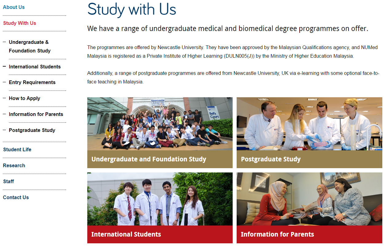
Example one: Accommodation

masthead on the Accommodation website

This example is from the Accommodation website. It uses a masthead page to give a brief introduction to the section, and point users towards some key pages.

Mastheads work well in places where you want to give a teaser for the section, but not go into too much detail.

At a glance, users can see how to get to key information.

The image gives a visual clue about the content of the section. It shows students who look like they really do live in the accommodation, rather than visiting for the first time.

We’ve prioritised the information, providing links to some of the core pages for current students – how to extend your stay, swap or transfer your room, and what to do at the end of your contract.

We’ve also added a sub-heading to introduce a sub-set of key information: how the Accommodation service can support students after first year. This quickly introduces a new topic that they might not have heard about, and shows them where to find more information.

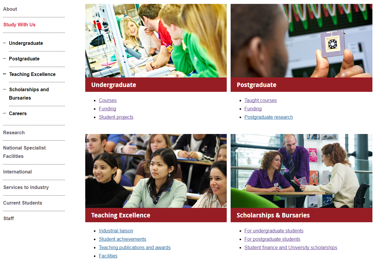
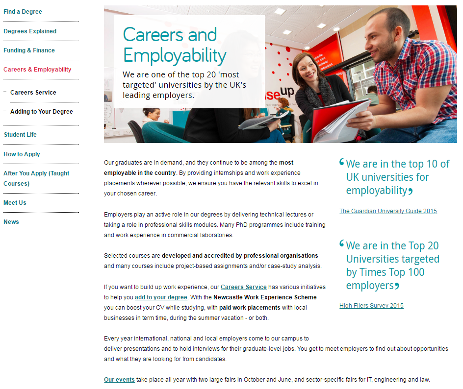
Example two: Careers

masthead on the Careers website

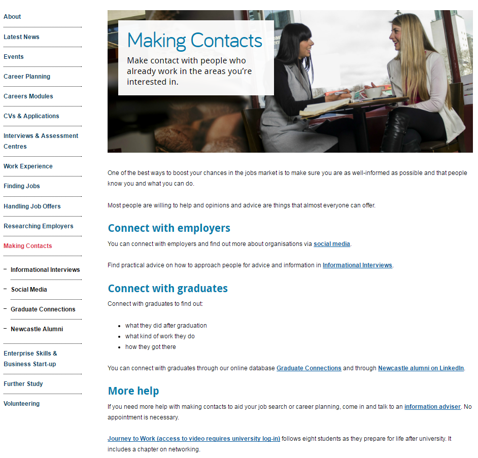
This longer example is from the Careers website. It uses a masthead page to give a more comprehensive overview of the section.

The image links very clearly to the title of the page. The shape of the photo also leaves enough space for the title box.

The sub-headings give a clear indication of how the section can help the user, and help to direct the user to appropriate information quickly and easily.

Although there is more text in this example, the page has been structured in a way that supports it. There are clear links to all pages within the section and the sub-headings work well to help users scan for information.

Hyperlinks are also used very well in this example. They’re placed at the end of sentences, which supports visitors using mobile devices. They’re not all clumped together, which would make them difficult to use on a mobile.

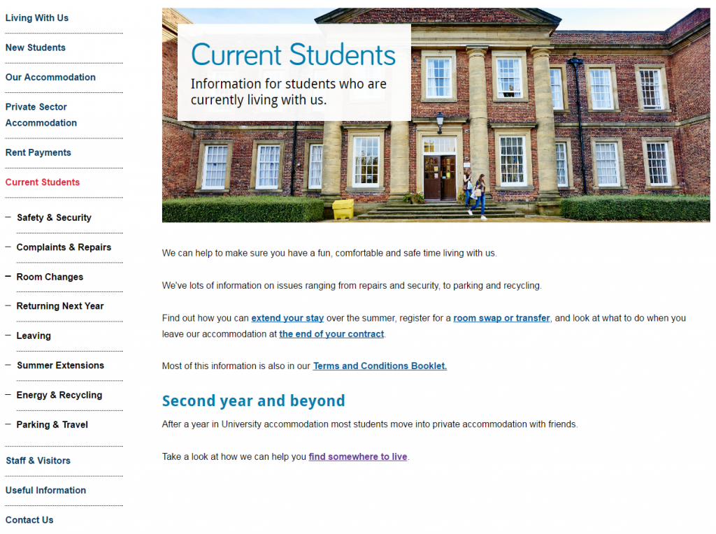
Example three: Postgraduate

masthead on the Postgraduate website

This last example is from the Postgraduate website. It uses a masthead page to support longer text and more information.

Mastheads can also be a good option if pages in the section have very specific information, and you need a catch-all page to introduce key information that won’t appear on the other pages.

There is a lot of text on this page, but users are directed to core pages by two, clear hyperlinks. Scanning is supported through short paragraphs, and bold phrases.

To improve scannability even more, we could introduce some sub-headings and bullet lists to break up the text, add white space and support scanning.

You can also support the text by using other content pieces, such as images, videos or quotes. The quotes in this example help to break up the text, and they’re relevant to the main content. They help to quickly support the message of the section.

Learn more

You’ll learn how to create and manage these pages in our T4 training sessions.

If you’re stuck, we can help you work out what format will work best for your navigational pages.

Have a look at :

Share this post:
Share

Best practice example: grid boxes

We’re often asked for examples of really good websites. The thing is, each site is different, depending on the type of site, their users, and their needs. Websites constantly evolve due to changing user needs, business goals or time-sensitive messaging.

So there’s not really one static best practice example that ticks all the boxes for everyone.

What we can do is point you in the direction of really good content usage to take inspiration from.

Each batch we put through the go live process has examples of excellent content. In this new series of blog posts, we’ll use these to highlight best practice examples.

Here’s a couple of examples of best practice for grid boxes from recent Go Mobile batches.

Grid boxes

Grid boxes are used for homepages and section openers. These are pages that give an introduction for a particular section (eg Research, Study with Us, About Us).

They help create visual hierarchy, so users can easily see where they are in your site. Because of this, they should only be used for top level sections of your site (the pages that appear in the side menu when you’re on the homepage).

boxes on the Study with Us section of the Malaysia campus website

Newcastle University Medicine Malaysia Study With Us section

This example is from Newcastle University Medicine Malaysia. It uses our ‘top task box – dark’ content piece.

This is basically four links, but presented in a visual, structured way. Visitors can immediately see what’s on offer. This is a good option when you want to give a quick overview of different services, for example.

For this Study with Us section, it was important that we had clear pathways signposted for four key groups of users: undergraduates, postgraduates, international students, and parents.

We wanted each group to feel catered for, supported, and have easy access to pages that would help them.

You can have some text above grid boxes. Keep it short, and don’t add any if it’s not needed. The boxes should take centre stage, and do a quick job of moving users on to core pages.

boxes on the Study with Us section of the Mechanical Engineering website

Mechanical Engineering Study With Us section

This example is from the School of Mechanical and Systems Engineering. It uses our ‘top task box – light’ content piece.

This box type gives you the option to include some hyperlinks (max. 4) below the image and main link. It’s a good option for pages where you know there are several core pages that you want to highlight.

In this example, we wanted to signpost prospective students towards the undergraduate pages, but knew that they’re likely to want to know about courses and funding in particular.

Light top task boxes are great for larger sections where you want to direct users explicitly to core pages.

Think about what the key messages for the section are, and what your user is looking for. Work out what are core areas (give them boxes), key pages within these areas (give them links), and what is additional information (don’t link them from your section opener).

Your additional information pages (in this case, the Careers page) will always be available within the section via the menu.

Learn more

You’ll learn how to create and manage these pages in our T4 training sessions. And you’ll find out how to identify your core pages in our training on planning web content.

If you’re stuck, we can help you work out what format will work best for your navigational pages, and help you with setting up grid layouts.

Have a look at :

Share this post:
Share

How Compression Can Increase User Satisfaction

Linking to documents that provide more information is vital for responsive design websites.

Let’s face it – no-one wants to read all your content for a specific topic on a single web page, or an endless number of web pages, on a mobile screen.

Having a 70-page research report or the terms and conditions of applying for a job as a downloadable PDF is sensible.

But what happens if that document is 15MB in size? First of all, you won’t get it in the university’s new content management system – it has an 8MB limit.

Even then, someone downloading 8MB on a 3G phone is going to be waiting a while to see it. They’ll also be eating into their data allowance at an alarming rate if they have a few of these to download.

Smaller is better

Making the file size of your documents smaller is key to improving your users’ experiences.

Compression can reduce the time documents need to load and cut the cost for those using mobile data.

Not everyone has access to Adobe Acrobat and its PDF resizing capabilities due to the cost. But there are free tools online to solve this issue; one of the best I’ve found is Smallpdf.

You can drag and drop your document from your computer onto its Compress PDF screen and it’ll do the rest. Then simply download the result for your website.

I’ve seen it take documents of 17MB and reduce them to 600KB, a much more palatable size for users. And there’s no loss of quality.

Even if you think your document is small enough not to bother with this, do it anyway. Every little helps with page loading speed and aiding user experience.

Smallpdf also provides many other PDF manipulation services that could prove helpful to you.

Make it easier for your users to access your documents and there’s every chance they will.

Share this post:
Share