Using Design to Help Users Navigate Your Site

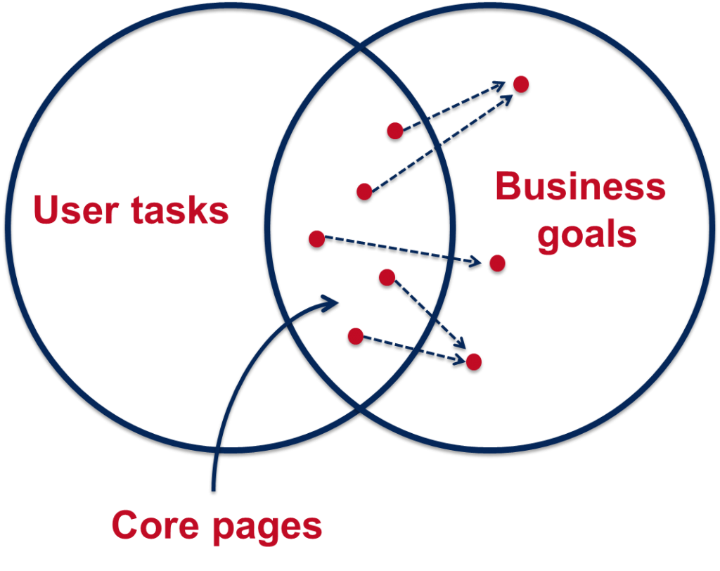
In our training for planning and writing for the web we talk a lot about user tasks. We use the core model to identify which pages on our websites provide the answers to our users’ tasks and also meet our business goals. These are known as the website’s core pages.

It’s incredibly important that we help our users get to these core pages, as they may sometimes be two or three levels down in the site’s structure. One thing we can do to help is to create inward paths to them from site homepages and section openers.

Top task driven homepages

Deciding what goes on to a site’s homepage can be a political battle. Everyone wants a link to their page. It’s also often done in isolation from planning the content on the rest of the site. Not anymore. We can use our core pages and users’ top tasks to determine what should go on a site’s homepage.

“the homepage is usually the last page we design. (How can you design the wrapping before you know what’s inside?)”
Ida Aalen, The Core Model: Designing Inside Out for Better Results

Take the new Information for Schools website, for example. Instead of having links to all of the main sections of the site (which can now be accessed from the menu on the left), there is a grid with links to the core pages: Events on Campus, Book a Visit and Support for Visits. There’s also a feature on the PARTNERS programme with links into the core pages within this section.
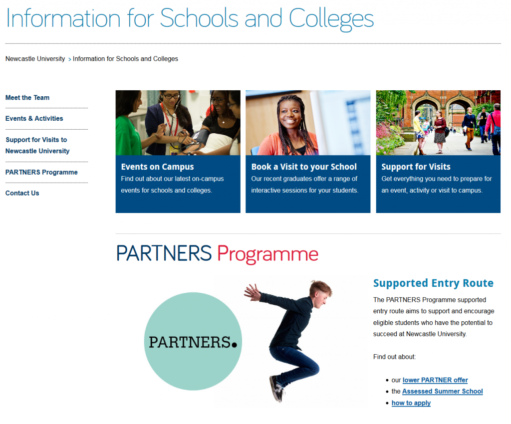
Screenshot of the Information for Schools and Colleges homepageDesign features for section openers

First off, let’s deal with the question of what exactly we mean by ‘section opener’. These are the top level pages below your homepage. You may find it easier to think of this in terms of a hierarchy diagram, with branches for the main sections of a site coming off the homepage.
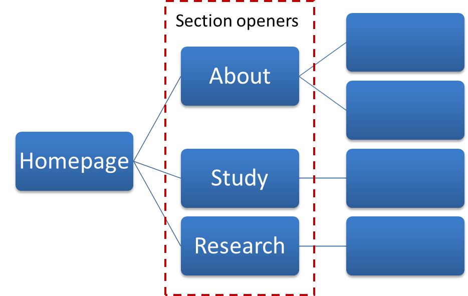
Website hierarchy diagramThere are a couple of design features you can add to your section openers, depending on their purpose.

Like your homepage, you may choose to include a top task grid to help your users navigate to the core pages in the section.

Alternatively, you can choose to add a masthead which creates a visual opener for the section. This allows you to include some contextual information to answer users’ questions, as well as links to other pages in the section.

Screenshot of Research Support section opener with mastheadVisual hierarchy

Using grids and mastheads at the section opener level can help to create a visual hierarchy so your users know where they are in the site. If we have these features deeper in the site it can cause confusion. We want to create a clear distinction between the look of a section opener, and a standard content page.

Here you can see the difference visually of a section opener and a standard content page at the next level down.

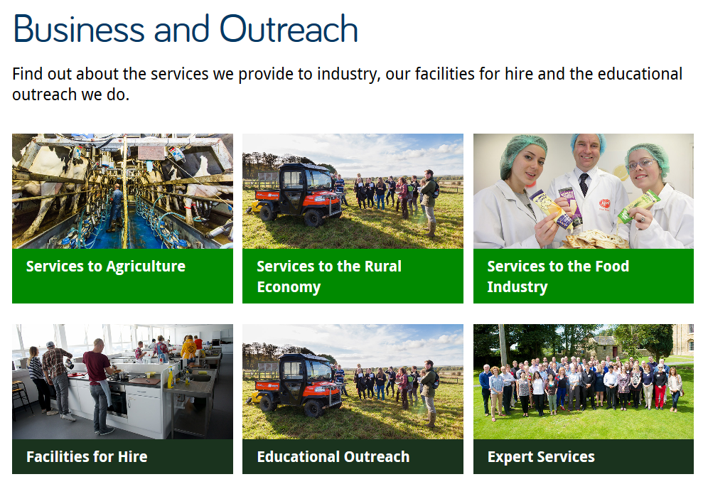
Screenshot of the Business and Outreach section opener on the AFRD website

Top task grid on the AFRD Business and Outreach section opener

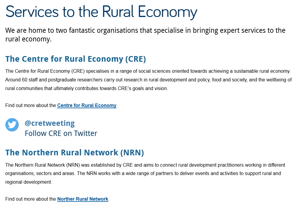
Screenshot of standard content page on the AFRD website

Standard content page for the AFRD Services to the Rural Economy page

With persistent use of grids there’s also another problem – where’s all your content? With grid after grid, you’re never actually providing the core content that will answer your users questions.

Conclusion

You can use top task grids on homepages and section openers to help your users navigate to your core pages.

Sometimes on a section opener you may want to provide some contextual content as well as links to core pages in the section. You can use a masthead in these cases.

Make sure you’re creating differentiation in the design of the section openers and your core pages. Only use grids and mastheads for your top level pages so they don’t lose their impact and so users know where they are in your site. Also remember that grid layouts are navigation rather than content so too many can create extra steps for users to find your core content.

 

Share this post:
Share

How to Use the Core Model to Improve Your Web Content

I came across the idea of the Core Model at a content strategy conference last year.

It’s an exercise that helps you to identify pages on your website where user tasks and business goals meet. These are your core pages and you should focus your efforts on improving these before other content on your site.

Core Model diagramWe use the core model exercise in our training on planning web content. So far we’ve introduced it only to those editors on the Go Mobile programme, but it’s a useful tool for anyone who looks after a website.

Elements of the core model

The core model helps you to answer a series of questions about a page on your website, and this in turn determines what content is needed on the page.

User tasks – what questions will users come to this page to answer and what tasks do they want to complete?

Business goals – what business goals drive the content on your page?

Inward paths – how will users find and access this page? Where will they start their journey?

Core content – what is the essential content you need on your page to help your users answer their questions and complete their tasks? What secondary content will help you achieve your business goals?

Foreward paths – where will users go after they’ve answered their question/completed a task on your page? Are there more business goals that you can drive them towards?

Let’s work through an example

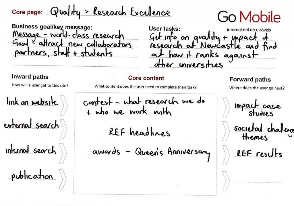
This example is taken from the About section of the University website. It’s a page about the quality of our research.

Core Model worked example - research excellenceUser tasks

A user might come to this page to find out about the quality of research done at Newcastle and to see how we rank against other universities.

Business goals

Our goals for this page are to attract new research collaborators, partners, staff and students.

Inward paths

The inward paths to most pages on the University website will be very similar. Users might get there from a:

  • search, either on the website itself or from a search engine
  • link from elsewhere on the University website, or from a link on an external site
  • link from a publication or email

Core content

For our users to complete their task we need to provide some context for them by outlining what research we do at Newcastle and who we work with. They also need to know the headlines from our REF results so they can quickly answer the question of how our research ranks against other universities. The awards we’ve received for our research are also relevant.

Foreward paths

This is where we need to think about the onward journey of our users, and how that fits with our business goals. From the research excellence page we want visitors to go on to find out more about our:

  • impact case studies
  • societal challenge themes
  • REF results

We must make sure there are calls to action on the page that link to all these destinations. These in turn will have their own calls to action, for example from the impact case studies to job vacancies.

Have a go yourself

Now that you’ve read about the core model and how it can help you prioritise content for improvement on your website, why not have a go yourself.  You can download a core model template from our website (University login required).

Share this post:
Share