The Experience of a Go Mobile Editor – a Guest Post by Fiona Simmons

Fiona SimmonsThis is the first in a series of posts giving you an insight into the Go Mobile programme from the perspective of a web editor.

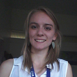
Fiona Simmons is the Institute Clerical Assistant at the Institute for Social Renewal. Along with the Institute Administrator she is responsible for the Institute’s website, blog and social media channels.


The first step – Go Mobile training

As soon as my colleague and I sat down to fill in our ‘site purpose’ exercise we knew that Go Mobile was going to be a good thing for our website. A few diagrams and coloured pens later, we had identified:

  • our core pages
  • our main user tasks
  • the business goals that we were to aim towards

At the planning and writing web content session it was brilliant to crystallise our thinking on what the Social Renewal website could do better if we gave our content a makeover.

The next training session, on editing in T4, was totally different. It took us from what was ideal and essential to what was possible. With new types of content available, it became clear how we could practically carry out our plans for a re-vamp. I went into this session with a great keenness to find out how to add link buttons, but I learnt much more!

I’d been looking forward to seeing how the new mobile responsive websites would look but was worried that our website would be the one that it just wouldn’t work for. When I’d finished the training, I realised that the team has a great understanding of our needs as an Institute. And the flexibility in the system would allow us to create content that was more consistent, usable and effective.

I loved getting a chance to practice re-writing content so that it is concise and clear, and working out the best way to structure a page.

We left the training with loads of ideas for the Social Renewal site, and so many options for how we could take it forwards. Of course, with all that enthusiasm comes a health warning.

It takes invested time to bring all this together. The main time-suckers are sourcing new images and re-imagining your site structure to reduce its depth. It’s worth it, and it’s rewarding, but the following will be useful:

  • Fotor.com – for resizing your images
  • Hemingway Editor – plug your written content in and see what comes out
  • content templates – figure out your primary message, secondary message and supporting content
  • a content calendar – use this to plan your web updates alongside your business calendar

Putting what we learned into practice

Now that the training has sunk in, we’re gearing up to have a re-think of our site content. We’ll use the templates that we’ve been given by the Corporate Web Team. In the meantime, just to tidy up our pages, I’m using lots of different types of new content, from social media buttons to tabbed pages.

When I’m looking at a page, I’m now constantly thinking of:

  • the user’s task
  • the business goal that I want to direct the user towards
  • why we want them to visit our page

I can already see the improvements.

If you haven’t experienced T4 (the new content management system) before, then my top tip is to have a play in the system as soon as you have access. You’ll quickly see the new flexibility you have, and the opportunity to re-configure your site in a meaningful way, using the resources provided. If you have used T4 before, as I had, it’s all the freedom with none of the frustration!

My next step is to work with the rest of my team in the Institute for Social Renewal to make our website showcase our activities in the best way it can. We’re very excited for our colleagues to see the finished result!

Share this post:
Share

How Meaningful Titles and Descriptions Engage Site Visitors

As we move into our responsive design (and T4), we’re introducing ways to make our content work better for mobile and tablet users.

This means that our editors are changing the way they write web ‘pages’.  In fact, let’s scrub that. The web page doesn’t exist anymore.

You are not writing for desktop.

The way the content looks on your computer, in your browser, is not the only way that it will look.

Writing for our new responsive design

Some of our new content types have different behaviour depending on where they are used.

You should always check your content on other devices (or use this handy responsive design emulator).

Titles and navigation

Titles as a style aren’t new, but are important when writing content for smaller screens. They might be the only thing your reader sees. They can also appear as navigation and part of search results.

It’s important that what you write makes sense out of context.

News items called ‘Congratulations’ and sections called ‘Additional Information’ aren’t going to encourage people to read more.

Teaser content

We’ve introduced teaser content into some of our new content types. It’s used here as the text overlay on the Masthead.

An example masthead style of content. Full width image with text overlay.

It’s important that it’s meaningful. It should summarise the page content as it displays in this order on mobile:

Masthead shown on mobile. Overlay text shows first on the page. the image flows second.

This content could be the difference between someone reading the page or going somewhere else.

Descriptions

We’ve used descriptions in news and events for years:

description-news-list

Adding a short description to the news content types doesn’t appear on the news article page. It does appear in all sorts of other places where news is syndicated:

  • News grids
  • News lists

This micro content acts to entice your site visitor to read more – it needs to work for you.

This example is vague:

  • Title: Call for Papers
  • Description: Submit now

This example gives some context, you know if it’s for you and if it is, you want to read more:

  • Title: Call for Papers: Environmental Planning
  • Description: Submissions close on 31 October. The School encourages researchers to read the submission requirements.

Introductions

We’re aiming to make sure all core pages to have an introduction. The intro style works well on mobile. It pulls out (and styles differently) the first piece of content.

We recommend a focused 50-word statement about what the page covers. It helps users decide whether to read more. (50 words sit well as a chunk of content viewed on most mobile screens.)

Expandable/mobile collapse

We’ve a new expandable content style that allows us to hide content. Users have to choose to select to read the content – they can’t see it at a glance.

This means that the heading you choose for the content is important:

Example expandable content - users have to click to see more.

We don’t want to see vague terms like ‘More information’, ‘Additional details’, ‘Other’.  If the content contains details about your facilities call it ‘Facilities’ or even better ‘Libraries and laboratories’.

Using terms that are more specific, help your readers find what they need.

Write chunks of content

We’ve had some comments about how it feels more complicated and takes longer to build up web content.

Writing for mobile forces you to think about the order of your message.

We could have slapped a responsive template on your desktop-focused content. If content was too long we could have hidden it in expandable boxes (or truncated lengthy titles).

The page would still look okay on desktop (it wouldn’t work very well on mobile).

Rewriting your content and thinking about how people read on mobile, makes sure your users don’t get a sub-standard experience.

Everyone who wants to read your message, can.

Get in touch

Let us know if you need help in reworking your content (University Login required) or post questions in the comments.

Share this post:
Share

Training our Editors to Think Digital First

Our Go Mobile programme is the driver for some brand new training to get the University thinking digital first.

Raising the bar

We’re training our web editors to operate the new content management system – T4.

We’ve also invited key site owners to come and learn about managing a site. This includes setting goals for content and best practice in writing for the web.

The first sessions ran on 7 and 8 May for trainees from the:

  • Undergraduate and Postgraduate marketing teams
  • Research Office
  • Institute for Sustainability
  • School of Agriculture, Food and Rural Development

Day 1: Writing and Planning Web Content

We want to get our web editors really thinking about their content.

The University doesn’t want a team of content-putter-uppers. It needs digitally savvy writers who understand what their site is for and how to evaluate it.

Day 1 introduces setting a site purpose and how you prioritise content to support it. It was good to be able to try out some exercises we’d picked up at Confab Europe (a content strategy conference).  Even better, our editors seemed to really understand them and could see how they might use them.

“[The] site purpose planning doc was super helpful!”

The session also covers tips for writing web content and introduce a range of tools to help you do this.

“The writing tips I know, but still find hard to put into practice…it was a useful refresher.”

Day 2: T4 Training

Our T4 training day provides an introduction to the Content Management System. It showcases the idea of responsive design and how we’re configuring T4 to support editors to write for a range of devices.

“Having news and staff lists in one place is fantastic.”

Empowering editors

Site editors can more easily influence the design of their content in T4. The first editors are starting a 2-4 week period of supported editing. In this time they’ll get to apply new layouts, add quality assets, and improve their content for reading online.

It’s a chance to cut words, tighten copy and focus on users.

Initial feedback

As we go, we’re gathering feedback on the training topics, the delivery and the new CMS. We’re in Beta mode at the moment – but hope we’ve got a good starting point. We’ll be improving the training content as we go.

Accessing training

Training is only available to site editors as part of the Go Mobile Programme: we’ll be in touch when it’s your turn!

Share this post:
Share