The Corporate Web Development Team recently carried out some user research on the new mobile responsive postgraduate website. Our aims were to:
- test the new design features
- find out how easy it was for people to use the site on both mobile and desktop
- identify developments for the postgraduate site and our Go Mobile Programme
User testing sessions
Six members of staff from the University participated.
We observed each participant complete a series of tasks on the website using a desktop, mobile or a combination of both devices. They were asked to ‘think aloud’ so that we could record their thought processes.
User testing results
The testing revealed many things about the design of the site – features that are working well and areas that need further development.
For this post I’ve pulled out some interesting outcomes.
Search
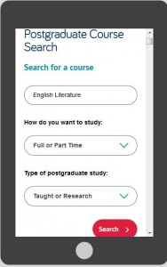
The testing revealed that the new course search was well used and provided good results.
However, since the advanced search filters appear above the results, the search results are hidden on both desktop and mobile.
This was a particular problem for mobile users as it looks like the search hasn’t worked. One of our users kept filling in the fields even though they didn’t need to.
It shows that the course search needs further development to improve its usability.
Navigation
On mobile people easily found the blue link buttons on the homepage (eg Student Life) but desktop users did not spot these as quickly.
The buttons appear under the content on mobile, on desktop they appear to the right hand side.
 This supports research into online reading which shows that content to the right is often ignored.
Desktop users tried clicking headings in the main content before clicking the button. One person didn’t notice them and struggled to complete certain tasks.
The red call to action buttons were well used on both desktop and mobile. They were spotted quickly and people commented that they made tasks easier.
 The inconsistency of hyperlink styling made it unclear what was and wasn’t a link. The majority of users didn’t find the student profile information as they weren’t aware that the heading linked through to additional content.
The user research showed that we need to review the links on the homepage. In contrast, participants quickly spotted navigation on course and supplementary pages.
Content
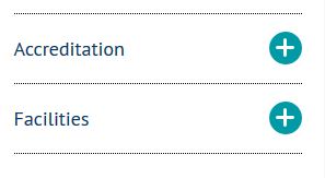
One of our new content types is known as mobile collapse. On desktop, the content displays as a heading and paragraph. On mobile, the content is ‘collapsed’:
 The user research revealed that the mobile collapse content did not stand out. Mobile users scrolled past the information without realising it could be expanded.
If our potential students can’t find accreditation information they may assume that the course is not accredited. It’s crucial that we make this content more prominent on mobile.
Design
There were lots of positive comments about the look and feel of the site. People spotted the pull quotes quickly and users liked the use of videos, images and dual tone headings.
One user described the site as “vibrant and exciting”.
Testing is vital to improve the usability of a site
This research has highlighted to me the importance of user testing – it shows us what is working and what needs improving.
If prospective students can’t find information easily it may influence their decision to apply here so it’s vital that we identify and solve usability issues.
We’re currently working on solutions for the issues identified from this testing.
Improvements to content, design and layout will also inform developments for the next batch of sites in our Go Mobile Programme.
Find out more
We base our user testing on training provided by the Nielsen Norman Group. Find out more about user testing by visiting the Nielsen Norman Group’s website.


