
Last week, Jane wrote about how to improve your website images and videos. Her post focused on image selection and placement. Go and read it if you haven’t already, it’ll set you up for what’s to come.
Welcome back.
In this post I’m going to cover some tips for editing images for your website.
Our new template has a much more visual feel than our current design. There are a number of ways you can use images to enhance your written content.
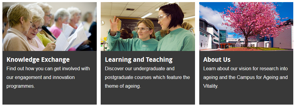
Grids
These can include landing page and news grids.
 Mastheads
Mastheads provide a visual opener to a page. The image slider used in our current design gives a similar effect.
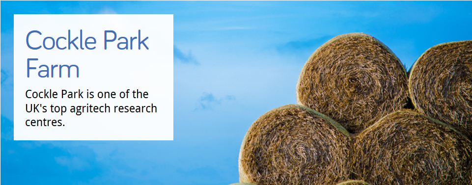 It’s a full width image with a text overlay. This means that you need to think carefully about where the focus of your image lies. If it’s on the left of the picture then it’s going to be obscured by the text. We’ve got a visual guide to the safe zones which highlights where the danger areas are.
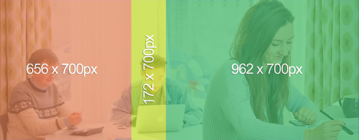 The safe zones logic applies to the image slider in the existing template too. An example of this in use is the Newcastle University London website.
Content images
You can also add images into the main content area. The default alignment for these is on the right (like our current design). On mobile they stretch to fill the full width and flow below the content.
This behaviour requires landscape images. If you’re using our current template we recommend you use landscape images too – this means your images are more likely to be reusable in the new template.
Tools for cropping and resizing images
We’ve assessed a variety of online photo editing tools and found one for you that’s easy to use and retains the high quality of your original photography. It’s called Fotor.
See our image guide (University login required) for details of the required sizes for each type of image and a step-by-step guide to using Fotor.
