Phase 1 of Go Mobile is now complete and we thought it timely to do a little show and tell of what we’ve been up to with this Go Mobile malarkey.
Two of our central sites to get the Go Mobile treatment were Research and About. These are clearly important sites for a research-intensive Russell group university, like Newcastle. These sites should showcase our achievements, but also need to explain some complex strategic content.
So they need to be able communicate effectively, but now with the added requirement of working just as well for smaller mobile devices.
We’ve posted previously about what Phase 1 of Go Mobile entailed and also talked about new ways we have of doing things, so here I’ll showcase some new layouts.
This post will focus on a core page on the Research website and the homepage for the About website. I’m going to include screen shots of the sites before and after Go Mobile, and explain why we’ve done these developments.
Research website
Take a look at the old Research Support section, one of the core pages of the research site:
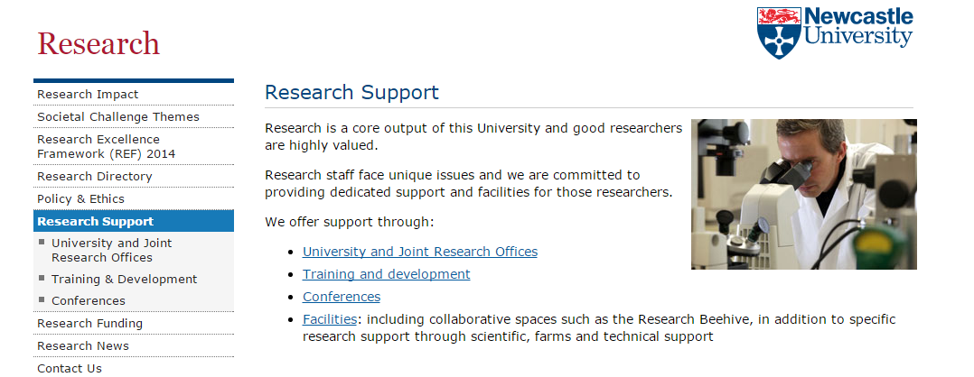 The page is quite informative and clearly formatted (short paragraphs and a bulleted list of hyperlinks) but not really engaging. It’s also not visually impressive, with only a small image to the right of the content.
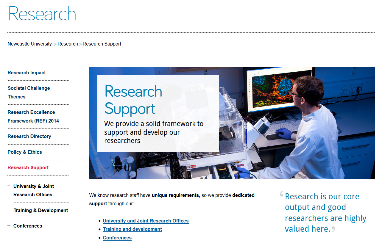
Now look at the new Research Support section:
- new ‘masthead’ design for section landing pages
- big impactful image to set the scene
- new teaser text overlay on the image to help introduce the section
- quote to substantiate our claims
- use of bold to emphasise key messages in content
- content written for mobile; direct, informative with relevant hyperlinks
Now, take a look at the new page on mobile:
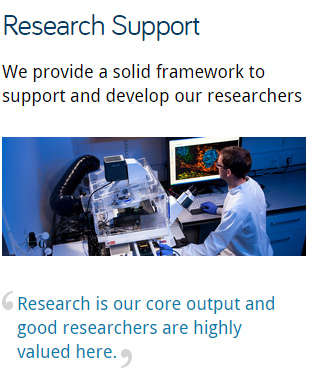 The page title clearly indicates the topic of this page and the teaser text is now used as an introduction to the page. This helps you quickly understand which page you are visiting.
The content is split into ‘blocks’ that can re-stack on mobile. The priority of content has been optimised; the image re-sizes and drops under the text.
About website
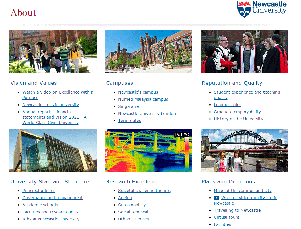
Here you can see the old About homepage:
- boxes are built for top tasks, so people can find the most popular pages quickly
- there are links under each top task box to pages within that section
- images are small
- there are no key messages
- the page is not very inspiring…
On mobile, this old page simply shrunk a bit to try to fit your mobile screen (but not very well) as it was not mobile responsive.
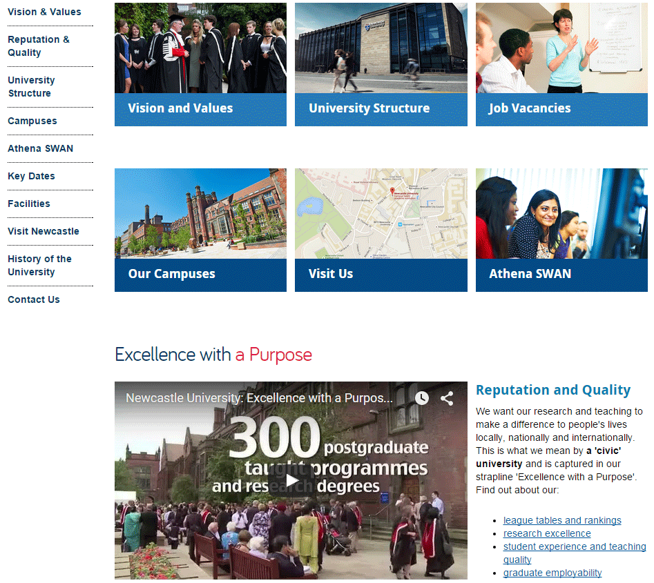
Now compare the new About homepage on desktop:
- top task boxes are still in use, to help people find what they are looking for
- side menu is now visible to help with navigating the site
- larger images are used to enhance the page
- subheadings to help introduce content, and put it in context
- use of video to help support our key messages
And see it on a mobile screen:
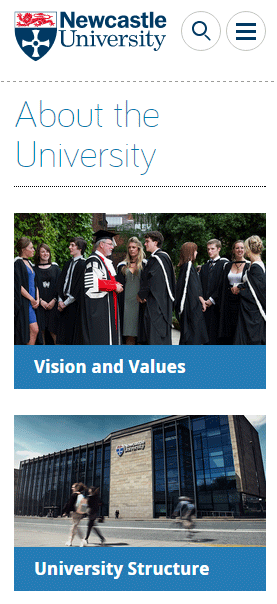
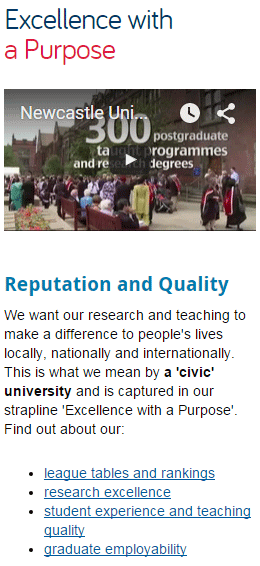
The new page re-stacks all content for mobile, including video. All content, including images and video re-size to fit your mobile device.
We’ve improved section naming ‘About the University’ rather than ‘About’ helps give people more context of which site they are on and where they are in the site.
The hamburger menu at the top gives access to the secondary navigation (the side menu on desktop).
We’ll keep you posted!
Now, prepare yourself – as we move onto Go Mobile Phase 2 more things will change.
Not only will other websites get the Go Mobile deluxe treatment, but we are still developing the technology, how we do things – constantly testing and improving what we’ve already done.
You can always keep an eye on what we’re up next to with our fortnightly updates.

