
This is the second of our Go Mobile show and tell posts. Jane has already introduced some features of the new design using examples from central sites. Now, I’m going to look at some design changes on academic unit sites.
Tabbed pages
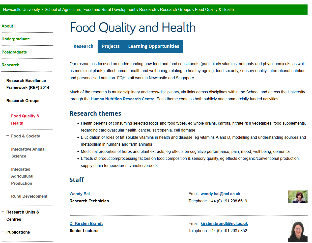
Our school sites are large. They’re complex and in some cases six or seven levels deep. Through Go Mobile we’re improving the structure of our sites and this includes making them shallower. One way of doing this is to introduce tabbed pages. Tabbed pages also allow us to split up long pages into shorter sections.
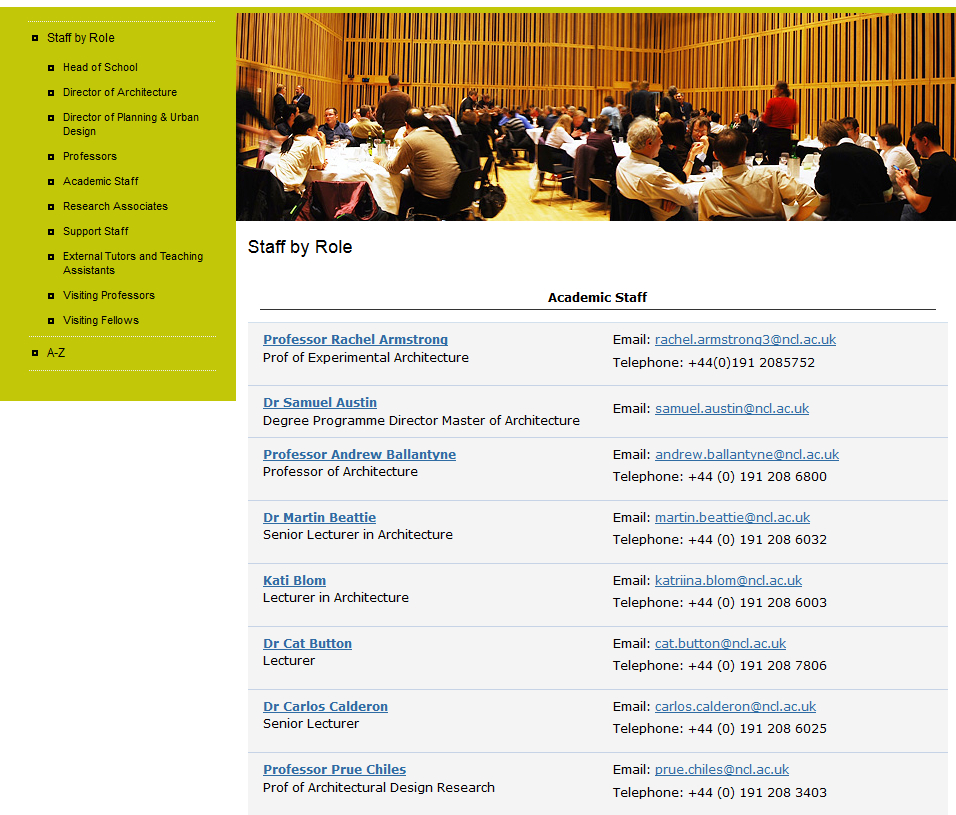
Take this example from the School of Agriculture, Food and Rural Development (AFRD).
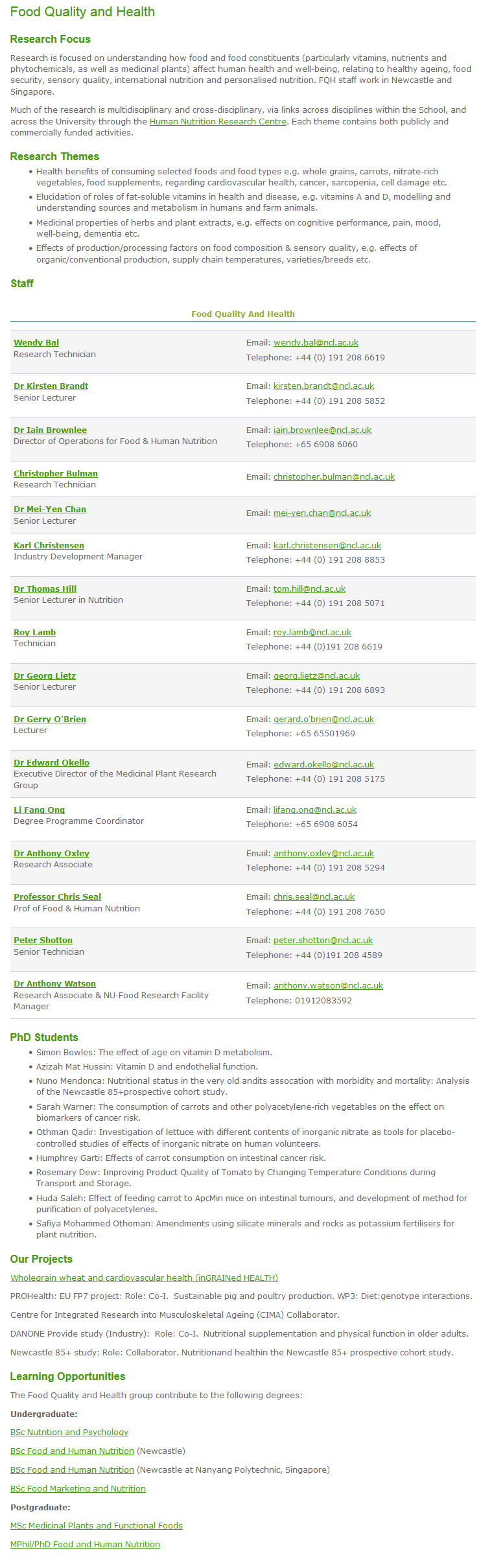
Click on the image to display the full, uncropped version of the Food Quality and Health page on the old AFRD website.
Their research groups previously had a single page that included:
- an overview of their research interests
- a list of research themes
- a staff list
- a projects list
- information about their teaching and learning activities
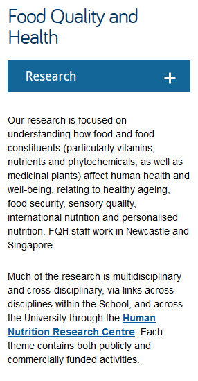
The new tabbed page allows this information to be split out into three or four much shorter pages with the tabs showing across the page on desktop.
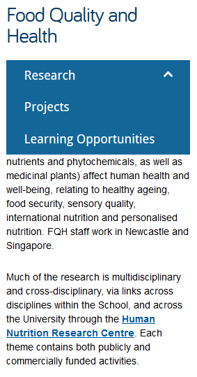
 On mobile the tabs appear in a drop-down menu:
Staff lists
In both the old and new design staff lists are generated from MyImpact data. The main difference, as you’ll see below in the example from the Schools of Architecture, Planning and Landscape (APL) is that profile images are now displayed in staff lists on desktop.
Old APL staff list
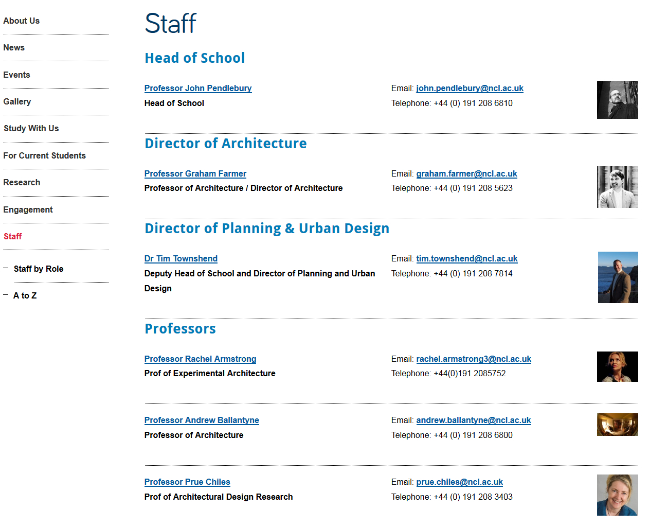
New APL staff list
On mobile the images disappear so that more information can be displayed on the smaller screen.
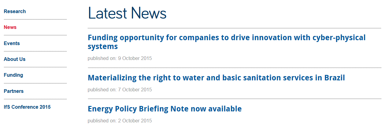
News
News lists appear in a very similar format in the old and new designs. The biggest change is behind the scenes. Previously our editors had to use a separate system to generate news for their site. News is now incorporated into the content management system (CMS) that we use to publish all content on a website.
 The new CMS allows you to syndicate news into a feature news grid on your site’s homepage. This requires high quality imagery for every news item. As an alternative, some academic units have opted to display a simple news ticker on their homepage.
 Tell us what you think
As always, we’re interested to hear your feedback. All the new sites have a link to our feedback form in their footer. You can also leave us a comment on this post.
