You might have read our post on Making New Year’s Resolutions for our Websites: mine was improving introductions to content. I’m going to expand on what this means in this post.
We’re often reworking existing content rather than writing from scratch. And because of this it’s easy to get lazy and not bother to rework the introduction. The concern is that because it looks a little bit different, that’s enough.

Our introduction is styled to look different to body text.
The introduction style is a new feature of our responsive design. It follows the title of a page and is a larger font size to help highlight it. It also comes with its own content standards, it should:
- summarise the point of the page
- be no more than 50 characters
- be descriptive
Working out if your introduction is any good
I’m inspired by Ida Aalen’s approach to this on the Gather Content blog about Testing the Usability of Text (particularly your introduction).
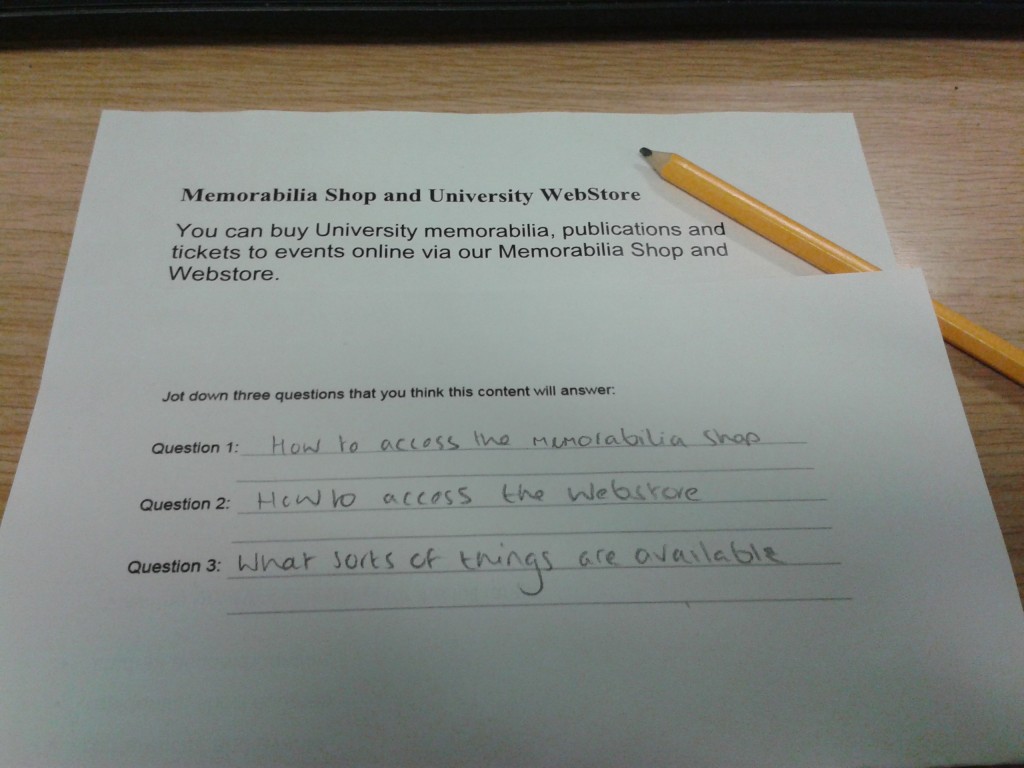
She suggests putting a copy of your content into word and printing it out. You then fold the paper so only the title and introduction are visible.

Will this content answer the questions I’ve asked?
Next step, ask yourself (or your site users) to read the title and introduction. You should then jot down three questions that you think the content will answer.
Once done, you can review the page content and see whether it does what you expect. If it doesn’t, you can rewrite the page content or improve your introduction.
In this case, I’m pleased to say that the page answers the questions I thought of – view our content on the Memorabilia Shop.
Have a go
Do your introductions work for you? Why not try this out on your colleagues or site users to objectively assess your content? Let us know how you get on in the comments.


Very helpful! I will definitely be using this technique to update the University’s KTP website.
That’s great Bethany! Let us know how you get on.