User Personas

We all know that effective web content starts with our audiences (our users). If we know who we’re talking to and what their tasks and questions are we can create websites to meet their needs and achieve our business goals.

Talking about abstract, generic ‘users’ though is not helpful. After all users are people – living, breathing individuals with motivations, needs and goals. And that’s where user personas come in…

A persona is a fictional representation of a group of target users who have similar needs, goals and behaviours.

User-centred approach

To enable us to take a more user-centred approach when developing websites and creating web content, the Corporate Web team are leading on a project to create personas for all our digital audiences.

Jane and I recently attended the Nielsen Normal Group (NNg) training Personas: Turn User Data Into User-Centered Design to pick up some tips on how to create personas. Both inspiring and practical, the course furnished us with techniques to create personas and achieve stakeholder buy-in.

Benefits of personas

Personas are valuable because they bring our abstract users to life, making us more likely to relate to and care about them. They:

  • tap into our empathy for people
  • make our audiences memorable to us
  • help us predict users’ behaviour because we understand their attitudes and needs

Personas make us more likely to design for our users rather than designing for our organisation, or copying our competitors.

Framing a statement around a specific persona breaks the listeners out of self-referential thinking and removes the speaker’s reliance on opinions, shifting the discussion away from personal judgments toward that particular persona’s needs.”

Aurora Harley, Nielsen Norman group (NNg)

Personas feed into story mapping so that every time we develop a new section of a website or design a new feature we’ll think of the journey from our personas’ points of view. This means that we’re more likely to develop websites that meet our users’ needs rather than designing features and writing content based just on our opinions.

As pointed out by Aurora Harley, personas also “focus design efforts on a common goal”. They have the power to align attitudes in a team, again because they help us focus on the user rather than individual attitudes and opinions. This enables us to design a usable service that meets our customers’ needs.

Based on user research

Like all data, personas can’t be used in isolation. It’s important to use personas alongside other data such as analytics, market segmentation, usability testing and subject matter experts.

Personas are fictional but they are based on user research and existing knowledge of our audiences.

First steps

Jane and I are starting with researcher personas. We’ve designed a short, online questionnaire to collect data from research-active academic staff.

Using techniques and tips we learned at the NNg training we’ll segment and analyse the data to identify patterns and priorities so we can begin creating our personas for researchers.

Grounded in user research, we’ll also be using our existing knowledge of our audiences to shape our personas.

And of course, we’re not trying to do this alone…we’ll be coming to speak to colleagues across the University who are the subject experts for many of our audiences, and who already have a bank of user research so that we can work collaboratively to create these personas.

We’ll be blogging about our progress and experiences as we venture further into the project.

References and further reading

Kim Flaherty, How Much Time Does it Take to Create Personas? Nielsen Norman Group (NNg), 25 October 2015

Aurora Harley, Personas Make Users Memorable for Product Team Members, Nielsen Norman Group (NNg), 16 February 2015

Aurora Harley, Segment Analytics Data Using Personas, Nielsen Norman Group (NNg), 30 November 2014

Share this post:
Share

A Quick Guide to…Embedding Videos in T4

For University web editors who have gone through Go Mobile and are using T4 to edit their sites, here’s a refresher on how to embed video content.

In the new responsive template videos are embedded using the content type ‘06. External Media’. They should be hosted on a dedicated delivery service, eg YouTube.

Before embedding a video you should check that it relates to and supports your written content.

You should also check the thumbnail for the video. If it’s caught between frames or doesn’t seem appropriate, don’t use the video and flag the issue with whoever uploaded it to the channel.

Embed code

When adding a video to your content always take the web address from the video’s embed code.

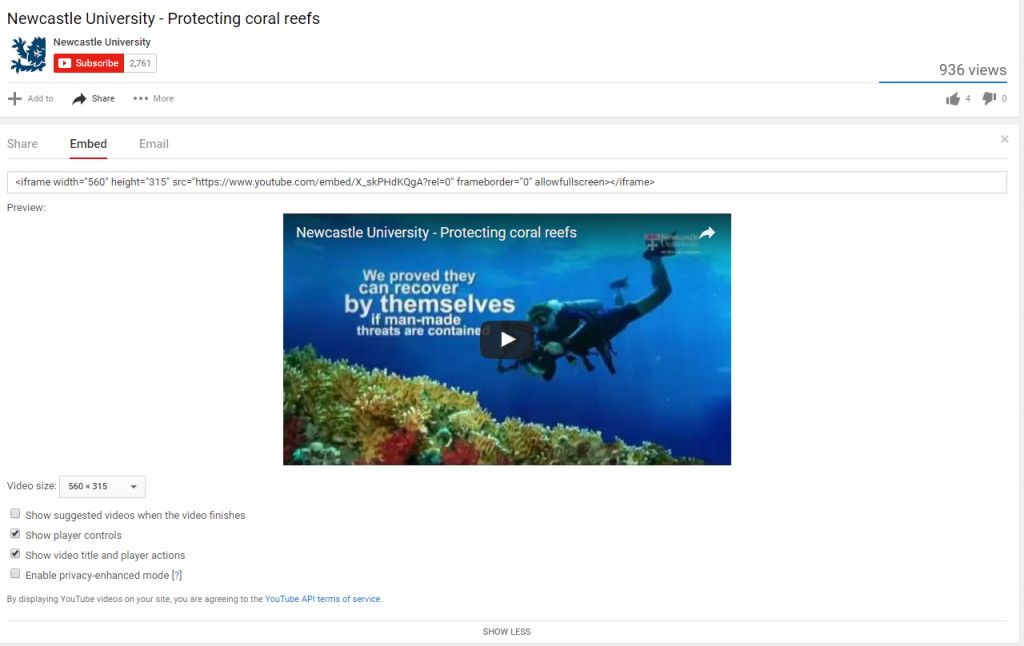
Screenshot of protecting coral reefs video on YouTube

Protecting coral reefs video on YouTube

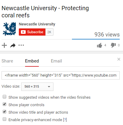
You’ll also need to make sure the option to ‘show suggested videos when the video finishes’ is unchecked. Otherwise you run the risk of unrelated videos, or worse competitors’ videos, being pulled into your page.

Screenshot of embed code for a video on YouTube

Embed code for Protecting Coral Reefs video on YouTube

Example

The video embed code will look something like this: https://www.youtube.com/embed/X_skPHdKQgA?rel=0

The code for the Protecting Coral Reefs video is X_skPHdKQgA, while the part of the code that ensures no additional videos are pulled in is: ?rel=0.

Adding to T4

When adding to T4:

  • add the prefix and name of the video
  • paste in the embed code to the Media URL field
  • add a caption to give context (limited to 50 characters)
  • don’t duplicate the video title in the caption if already displayed in the media player
  • select the most appropriate alignment for the video
Screenshot of video embed screen in T4

Screenshot of video embed screen in T4 (select to view larger image)

Alignment

On desktop, you can choose to align videos to the right of your content or make them full width so they stretch to the size of the screen.

We recommend using the full width option with caution, though – this often reduces the quality of the video. It can also look more cluttered and can make it harder for the user to find the answers to their questions.

On mobile, videos behave the same as images – stretching to fill the width of the screen and flowing below content.

Load time

We recommend that you only add one video per page. This is so that you don’t bombard the user with too much video content, but more importantly so that you don’t slow down the load time of the page.

Find out more

Check our T4 Moderator guide for how to embed external media (University login required).

Visit our website to find further advice and support about video hosting (University login required).

Related posts

Share this post:
Share

5 Reasons to Limit Video Content on your Site

As we take more sites through Go Mobile we’ve been removing quite a few video pages. We get asked a lot why we consider videos to be supplementary content on websites, and why we discourage a page containing only video content.

In this post I’m going to share five reasons why I think you should limit video content on your site.

1. Videos can be time consuming

People read differently online – they scan and dedicate less time, and often come to a website to find the answer to a question.

They are looking for a bridge for that information gap. They want to get over that bridge as quickly as possible.

Gerry McGovern

Videos are not the quickest bridge to information because, as Amy Schade (Nielsen Norman Group) points out, “they force users to access the content sequentially”. This means that users can’t quickly scan the information to see if it will be relevant to them  like they could with text.

If we rely solely on video content to convey our primary messages we run the risk of burying them. Users might not watch a video to the end, or worse, they might not watch it at all. In our new responsive template videos don’t play automatically, giving the user control over what they view.

As Amy Shade argues, users should “have the ability to collect information in another way”.

If using videos on your site you should always ensure that your primary message is also presented in text so that users can access it quickly.

2. Videos are not always accessible

When using video content you need to be mindful of accessibility.

Providing content as a video can limit access to the information contained in this format for anyone who cannot see or hear the content.

Amy Schade, Nielsen Norman Group

Is video the most appropriate medium to convey information to your target audience? For example, if one of your target audiences is from a country where Youtube is not available, relying on videos to provide information means that your audience can’t access it.

Videos can also break or be removed from the channel they’re hosted on.

3. Videos can distract from your core content

As well as videos being time consuming they can also interrupt the flow of your core content.

Video and the accompanying audio, can confuse or distract users”.

Amy Schade, Nielsen Norman Group

On mobile devices videos can take longer to scroll through as they stack to fill the smaller screen.

Since videos are potentially distracting users from your core messages, it’s important to think carefully about when and where to use them on your webpages.

4. Videos can slow the page load

Videos, like images and virtual tours, can slow the load time for your webpage. If users can’t access your information quickly they can become frustrated and leave your site.

5. Videos often don’t provide a next step

As well as coming to the web to find something out, users often come to a website to complete a task. There is a danger with videos just to tell a story rather than provide information with a call to action.

“Many videos are essentially dead ends that leave the user with no clear path to additional information.”

Amy Schade, Nielsen Norman Group

This supports my argument that videos are usually supplementary content on websites. They should sit alongside your core content to provide context or qualifying information rather than being relied on to provide essential next steps in the user journey.

Final thoughts

I’m not trying to say videos are not useful content. Do I believe they are more suitable in other mediums, such as social media? Absolutely. Like Gerry McGovern, I believe that a website is still “primarily a text-driven medium”.

However, I can also see the benefits of videos on a website. Like other dynamic content, videos can be engaging and can help break up blocks of text. They also provide context and qualifiers to support your core messages.

It’s essential though that we use this content type sparingly on websites to maximise impact, and to ensure that we’re not excluding, distracting or annoying our users.

Remember, there isn’t much time to grab the user’s attention on the web, it’s best to present your primary messages as quickly and as clearly as possible.

References and further reading

Amy Schade, Video Usability, Nielsen Norman Group (NNg), 16 November 2014

Gerry McGovern, Text is more important than images on the Web, New Thinking, 26 September 2010

Gerry McGovern, The Challenge for Writers of Web Content, New Thinking, 24 May 2015

Related posts

Share this post:
Share

Team Update: 15 – 26 August

It’s been a busy couple of weeks here in Corporate Web Development as we get ready to launch our next batch of sites in Go Mobile.

Go Mobile programme

Fen has been working with Lisa on the History, Classics and Archaeology site. She’s also been putting the finishing touches to the Web Info and Feedback site, ready for go live next Friday.

Lisa has been working with Fen to restructure and edit the History, Classics and Archaeology website ready for go live next week. She has also designed a feedback form to collate amends from editors after completing their site accuracy check before the proofing stage.

Linda has been editing the Working with Business website ready for go live next week.

Andrew has worked on the post-migration and editing of the Centre for Urban and Regional Development Studies site in T4.

Emily has been putting the finishing touches to the Singapore site, before it gets passed on for proofing. She’s also written some blog posts highlighting examples of good content use in some of our recent batches.

In preparation for batches 5 and 6, Fen has audited the Computing Science website and created a new sitemap, Emily has audited the School of Modern Languages website, and Andrew has audited the School of Dental Sciences website.

Lisa has been looking at the review process for sites that have already gone through Go Mobile.

Design and Technical developments

Our new directions content type, 14. Google directions, is now available to T4 web editors. Check out the upcoming blog post (30 August) and our demo site for more details.

Campaigns and other developments

Linda ran a workshop on a possible new sports website.

The whole team have been supporting updates/technical queries around the Clearing campaign.

Training and support

Fen delivered a Media Management workshop this week. Anne delivered a T4 CMS workshop last week.

We’ve received 35 support requests through the NU Service Helpdesk and have resolved 23 of them.

Plans for the next few weeks

Fen is meeting with the Mobility team next week to discuss content for the new Loyola pages on their website.

Anne’s preparing T4 CMS training for editors based in Singapore.

We’re getting things lined up for Batch 5 and 6 which will see us over half way through the Go Mobile Programme!

Share this post:
Share

A Quick Guide to…Hyperlinks

Hyperlinks help with reading and navigating online content. They provide users with a next step/further information, support scan-reading and enhance search engine optimisation.

In the latest of our Quick Guide series, here’s a reminder of our best practice for hyperlinks:

Link text

Your link text should be short phrases – don’t link entire sentences.

Link text needs be descriptive of the content you’re linking to so the user has an idea of where they will be taken if they select the link. Phrases such as ‘click here’ or ‘download’ are unhelpful and not accessible – think about someone relying on a screen reader to navigate your content.

Generic phrases hinder search engine optimisation (SEO). Search engines, like users, take notice of link text. It’s therefore important that link text contains keywords and phrases that you want to rank highly for. No one wants to appear at the top of search results for ‘click here’!

Open in the same browser

Hyperlinks should always open in the same browser tab/window. We leave it up to the user to decide whether they want to open a new tab/window.

Links must work

It sounds obvious but hyperlinks must be checked regularly to make sure they work. My colleagues laugh at me as I often quote Kara Pernice (Nielsen Norman Group) that a broken link is like a broken promise. However, I personally feel disappointed and frustrated when I select a link on a website that turns out to be broken, or if takes me to an unexpected place.

Broken links can damage your credibility to users and won’t help search engine optimisation, as search engines respond to well linked sites.

Related posts

Share this post:
Share