Team update: 4 July – 15 July 2016

Go Mobile programme

Batches 3 and 4

The team is well into Batch 3 of the Go Mobile programme. We’re planning for the go live of sites on 29 July!

Fen has been busy working on the School of Mathematics and Statistics website. It is now in T4 and is being edited.

Andrew has been building a new site in T4 to showcase the work of our CardioVascular Research Centre.

He’s also been redeveloping the Institute of Cellular Medicine’s website. The focus is on restructuring their research pages.

Emily is working with the Northern Institute for Cancer Research to get their content ready.  She is also working on the School of Chemical Engineering and Advanced Materials website. They are currently in the pre-migration template – ready to move into T4 next week.

Emma has been working with the Business School to get their site on track to go live in this batch.

Lisa has the Chemistry site audited and in its pre-migration phase.

We’re already planning for batch 4 too.  It never stops!

Site reviews

We’re planning to return to sites that have been through the Go Mobile programme. We’re aiming to review around six months after launch. We’ll be looking at:

  • site performance
  • broken links and spelling errors
  • last updates
  • whether it meets content standards

Fen has started a review of the Research website. Andrew has also reviewed the Institute for Sustainability’s website. We’ll be reporting back in due course on further site reviews.

Design and Technical developments

The tech team are working on requirements for Batch 3 and 4 sites.

There’s been a lot of work on the Clearing campaign particularly around analytics.  This has been keeping them out of mischief!

Training and support

We ran a successful web community event on Monday, which got together around 10 web editors – new and old!

We covered:

  • where we’re at with Go Mobile
  • a show and tell (new features in T4)
  • a World Café – an open forum for feedback on T4

We’ll be writing a further blog post on this soon.

Anne delivered T4 CMS Basics training. Jane and Fen delivered our Planning and Writing Web Content workshop.

We’ve received 43 support requests through the NU Service Helpdesk and have resolved 18 of them.

Plans for the next few weeks

Our focus for the next few weeks is finishing off Batch 3 and preparing for Batch 4!

Share this post:
Share

Improving Readability through Go Mobile

We measure the success of the Go Mobile programme by looking at the readability score for our content.

Why readability is important

It’s important to us as our websites help us communicate with a broad range of users. Everyone from school leavers to top researchers visit our sites. They all have different content needs. They all want to find answers to questions. We need to provide answers clearly and directly. This is where readability comes in.

You can find out more in our blog posts about readability and simplifying language.

Benchmarking our readability

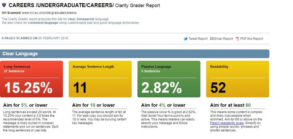
We use a browser-based tool called Clarity Grader to give us a clear language score for a website. They look like this (red indicates a bad score, amber is fair and green is good):

This shows a Clarity Grader report with a bad score for long sentences, a fair result foraverage sentence length and readability, and a good score on passive language.

To work out the scoring of a site, Clarity Grader assesses the following:

Long sentences

A long sentence has more than 20 words. Using short sentences helps you to keep them simple in structure. It means it’s easier to get your message across. It also makes them simpler to read on a mobile screen.

Clarity Grader recommends having no more than 5% of your content in long sentences.

Average sentence length

Clarity Grader recommends an average sentence length of 10 words or lower across the site. Obtaining this average will mean that your content is clearer and easier to understand.

Passive language

You should be aiming for direct language. The Clarity Grader report considers a score of 4% or lower to be a good indicator of active messages.

Readability

A score of 60 or higher indicates your message is clear. It means users of your site will understand your meaning with ease.

Access to Clarity Grader

Our subscription means that we can’t make Clarity Grader available to all editors. If you think it’d be useful to you, get in touch and we’ll see what reports we can run for you.

You can get readability scores on a page by page basis by using the Hemingway app.

University readability – before and after Go Mobile

We’re running Clarity Grader reports before and after a site goes through Go Mobile. This has given us a useful benchmark to look at the readability of University web content.

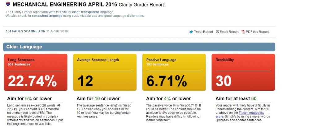
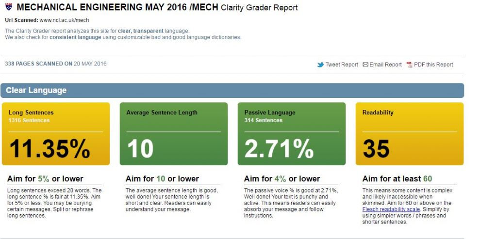
Our School of Mechanical and Systems Engineering has improved the readability of their content. They’ve reduced the length of sentences and made their content more active.

Before

mech-eng-before

After

mech-eng-after


Setting a readability score for the University

We’ve shown that Go Mobile is improving the content quality across the site. I think the Clarity Grader scores are a little strict for us right now.

I propose a set of targets to get us nearer to where we should be. Unfortunately we’ll not get the lovely all green for good from Clarity Grader. But it’s a start.

I suggest:

  • Long sentences: 15%
  • Sentence length: 10 or lower
  • Passive language: 4% or lower
  • Readability: 45 or higher

Let me know in the comments if you agree with the targets.

Share this post:
Share

Go Mobile Web Editor Community Event – a Guest Post by Anna Jenner

Anna Jenner, Student Recruitment Officer and Web editor. Anna Jenner is a Student Recruitment Officer in the Student Recruitment Team.
She is the web editor for the Information for Schools and Colleges website, which went through the Go Mobile process last summer.

Anna attended our first Web Editor Community Event (held on 3 February 2016). Here’s what she thought of the session.


I was invited to attend the Web Editor Community Event, the first of a series of events offered by the Corporate Web Team. Its aim was to build and empower the community of web editors across the University and allow us to keep in touch, ask questions and share advice.

I loved the sound of this immediately as I thought it would be a great chance to pick my colleagues’ brains about their websites and learn from their experiences of the Go Mobile process.

Cake and networking

There was also the promise of cake so I signed myself up eagerly (having sacked off my New Year’s Resolution of no cake on the 4 January when I came back to work!). My high expectations were met when I walked through the door and saw a pile of proper size cake (none of these tiny portions!) and lots of tea and coffee.

There was a lovely relaxed atmosphere from the start with ample opportunity to have a chat with colleagues from across the University. Many mirrored my own thoughts and spoke highly of the level of support they had received throughout their Go Mobile experience and celebrated the greater functionality, responsiveness and design of our sites leading to improved audience engagement.

Go mobile: the story so far

After the refreshments and networking opportunities we had a short update on the overall story so far with regard to Go Mobile. You can’t argue with Google Analytics and it is clear to see the positive effect that the Go Mobile process is having on traffic to the University webpages.

This was uplifting to all of us who have worked hard to improve the content and update the assets on our websites, whilst also getting to grips with a new content management system (T4), and made it seem even more worthwhile by seeing the bigger picture.

T4 show and tell

I found the next part of the event particularly useful, where members of the Web Team shared some useful hints and tips about the different features of T4 including:

  • how to use box types to create grid layouts on different pages
  • using the ‘Gallery’ to rotate three or four images on a page
  • different ways to move large amounts of content quickly from one part of your site to another

We got to see how these content types were created in T4 and then shown how they would look on the webpages. This information was very timely for many of us at the event as after the initial setup of our websites, we were now looking to add new features.

I have really enjoyed getting to grips with this CMS and find the functionality and navigation to be so much better to any I have used previously. It took me a while to get my head round but the training offered by the Corporate Web Team was comprehensive and easy to follow. Nevertheless, having the opportunity to get some further hints and tips was very welcome!

Question and answer session

We then got the opportunity to ask any questions about working in T4 and writing for the web. The questions that were asked were very useful and explored topics that I hadn’t thought about in detail, such as how to archive events correctly.

We finished off the event by discussing ways in which we can develop the community of web editors and share content, ask quick questions of each other (rather than constantly bothering our Web Managers – apologies to Emma Cragg, who is quite often harassed by me!) and extend our knowledge through our peers.

This event was informative, clear, concise and a great start to what will I hope become a thriving network of web editors. I am very much looking forward to the next one!

Share this post:
Share

Improving Introductions

You might have read our post on Making New Year’s Resolutions for our Websites: mine was improving introductions to content. I’m going to expand on what this means in this post.

We’re often reworking existing content rather than writing from scratch. And because of this it’s easy to get lazy and not bother to rework the introduction. The concern is that because it looks a little bit different, that’s enough.

Image showing the difference between a page title, introduction and body text.

Our introduction is styled to look different to body text.

The introduction style is a new feature of our responsive design. It follows the title of a page and is a larger font size to help highlight it. It also comes with its own content standards, it should:

  • summarise the point of the page
  • be no more than 50 characters
  • be descriptive

Working out if your introduction is any good

I’m inspired by Ida Aalen’s approach to this on the Gather Content blog about Testing the Usability of Text (particularly your introduction).

She suggests putting a copy of your content into word and printing it out. You then fold the paper so only the title and introduction are visible.

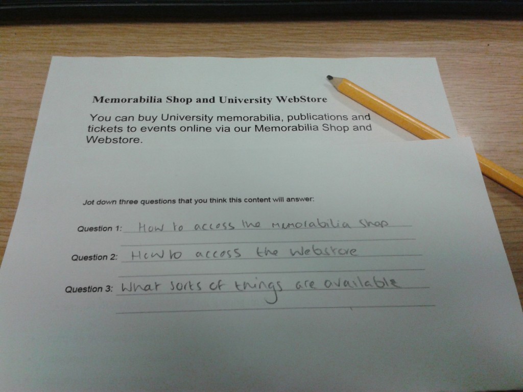
Image of page introduction with content hidden - three questions that I think the hidden content might answer have been added.

Will this content answer the questions I’ve asked?

Next step, ask yourself (or your site users) to read the title and introduction. You should then jot down three questions that you think the content will answer.

Once done, you can review the page content and see whether it does what you expect. If it doesn’t, you can rewrite the page content or improve your introduction.

In this case, I’m pleased to say that the page answers the questions I thought of – view our content on the Memorabilia Shop.

Have a go

Do your introductions work for you? Why not try this out on your colleagues or site users to objectively assess your content? Let us know how you get on in the comments.

Related blog posts

Share this post:
Share

Web Manager and Web Content Officer Jobs

Regular readers will know that we’ve completed the first phase of a University-wide website transformation programme called Go Mobile.

This is to make all Newcastle University websites mobile responsive and to move them into our content management system (T4).

These are exciting times for Newcastle University’s Web Team – we’re looking for some digital content experts to join us in our quest for high quality web content that is mobile responsive.
Scrabble - hiring

We’ve secured funding for five posts to help us get through Phase 2 in a tightly run, year-long programme of work.

All posts are fixed term for 12 months.

Faculty Web Manager vacancies

We have two F grade posts available: one for the Faculty of Medical Sciences and one for the Faculty of Humanities and Social Sciences.

Let us know in your application which Faculty would best suit your experience and background.

These jobs require excellent project management skills (Agile experience would be ideal) and digital copywriting expertise. You will also line manage a Faculty Web Content Officer.

Apply for the Faculty Web Manager jobs now. The closing date is 25 January 2016.

Faculty Web Content Officer vacancies

We have three E grade posts available:

  • Faculty of Medical Sciences Content Officer
  • Faculty of Humanities and Social Sciences Content Officer
  • Faculty of Science, Agriculture and Engineering Content Officer

Let us know in your application which Faculty would best suit your experience and background.

You will be involved in planning, creating and editing effective and innovative digital content. You will provide key editorial support for Go Mobile projects and manage content workflow.

Apply for the Faculty Web Content Officer jobs now. The closing date is 11 January 2016. Interviews will be held on the the 22 January.

Image credit: Scrabble – Hiring by Flazingo on Flickr

Share this post:
Share