How Meaningful Titles and Descriptions Engage Site Visitors

As we move into our responsive design (and T4), we’re introducing ways to make our content work better for mobile and tablet users.

This means that our editors are changing the way they write web ‘pages’.  In fact, let’s scrub that. The web page doesn’t exist anymore.

You are not writing for desktop.

The way the content looks on your computer, in your browser, is not the only way that it will look.

Writing for our new responsive design

Some of our new content types have different behaviour depending on where they are used.

You should always check your content on other devices (or use this handy responsive design emulator).

Titles and navigation

Titles as a style aren’t new, but are important when writing content for smaller screens. They might be the only thing your reader sees. They can also appear as navigation and part of search results.

It’s important that what you write makes sense out of context.

News items called ‘Congratulations’ and sections called ‘Additional Information’ aren’t going to encourage people to read more.

Teaser content

We’ve introduced teaser content into some of our new content types. It’s used here as the text overlay on the Masthead.

An example masthead style of content. Full width image with text overlay.

It’s important that it’s meaningful. It should summarise the page content as it displays in this order on mobile:

Masthead shown on mobile. Overlay text shows first on the page. the image flows second.

This content could be the difference between someone reading the page or going somewhere else.

Descriptions

We’ve used descriptions in news and events for years:

description-news-list

Adding a short description to the news content types doesn’t appear on the news article page. It does appear in all sorts of other places where news is syndicated:

  • News grids
  • News lists

This micro content acts to entice your site visitor to read more – it needs to work for you.

This example is vague:

  • Title: Call for Papers
  • Description: Submit now

This example gives some context, you know if it’s for you and if it is, you want to read more:

  • Title: Call for Papers: Environmental Planning
  • Description: Submissions close on 31 October. The School encourages researchers to read the submission requirements.

Introductions

We’re aiming to make sure all core pages to have an introduction. The intro style works well on mobile. It pulls out (and styles differently) the first piece of content.

We recommend a focused 50-word statement about what the page covers. It helps users decide whether to read more. (50 words sit well as a chunk of content viewed on most mobile screens.)

Expandable/mobile collapse

We’ve a new expandable content style that allows us to hide content. Users have to choose to select to read the content – they can’t see it at a glance.

This means that the heading you choose for the content is important:

Example expandable content - users have to click to see more.

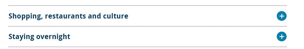
We don’t want to see vague terms like ‘More information’, ‘Additional details’, ‘Other’.  If the content contains details about your facilities call it ‘Facilities’ or even better ‘Libraries and laboratories’.

Using terms that are more specific, help your readers find what they need.

Write chunks of content

We’ve had some comments about how it feels more complicated and takes longer to build up web content.

Writing for mobile forces you to think about the order of your message.

We could have slapped a responsive template on your desktop-focused content. If content was too long we could have hidden it in expandable boxes (or truncated lengthy titles).

The page would still look okay on desktop (it wouldn’t work very well on mobile).

Rewriting your content and thinking about how people read on mobile, makes sure your users don’t get a sub-standard experience.

Everyone who wants to read your message, can.

Get in touch

Let us know if you need help in reworking your content (University Login required) or post questions in the comments.

Share this post:
Share

Remove ‘Click Here’ for Better Link Text

How many of you have linked to a webpage or document using the phrase ‘click here’? We’ve got about 830 instances across the University site. We know where they are.

Why is it so bad to use ‘click here’ as a link?

You might argue that it’s a strong call to action. You know exactly what’s expected of you when you see one. See our related blog post: 5 Ways to Improve your Calls to Action.

I think the negatives of using click here outweigh the positives. These are our top reasons for not using click here as link text.

We aren’t all using a mouse

Click here isn’t true anymore. Your user could be tapping, touching, swiping, tabbing or speaking to activate the link.

Also, most people using a mouse know that you have to click to do something: don’t be Captain Obvious.

Accessibility

Users of screen readers will often get a summary list of hyperlinks to select from. This is to help them decide where to jump to within a site.

Imagine how unhelpful it is to hear ‘click here, click here, click here, click here’ as your options.

Unless the user decides to read the whole page – they won’t get the context.

Search engine optimisation

We always get asked about getting to the top of the search results. The hyperlinks you use can help you achieve this.

Let me ask you then, how many times have you searched for pages that say ‘click here’? Google serves up around 2.4 billion search results for it.

You will never be number one for this term. You would never want to be number one for this term. So don’t use it for links within your site.

Instead, make sure you use strong, descriptive terms to link your content. How do you want people to find you? What words will they use?


Bad example: Click here to find out more about our English Language degrees.

Good example: Find out about studying our English Language degrees.


Get rid of click here using Siteimprove

Many of you use Siteimprove to keep on top of broken links and misspellings. But did you know that it also has a policy feature that allows you to target unwanted content?

We have a click here policy set up to show where it’s used in your website. We know that there are 830 instances of click here across the University’s website.

Let’s aim for zero! * 

* Siteimprove have been known to reward sites that achieve zero broken links/misspellings/policy scores with doughnuts.

Read our blog post on the Siteimprove policy feature.

Why not get access to Siteimprove (University Login required) so you can start fixing your content now?

Share this post:
Share

5 ways to improve your Calls to Action

A Call To Action (CTA) is a way to get your reader to complete a task or reach a business goal on your website.

It might be as simple as a hyperlink or it could be an embedded form that you want them to fill in.

The words you use and the placement of the content will all influence whether you get the results you want.

Here are our top 5 tips to make sure a CTA works for you.

1.     Think about where you place your link text

We recommend adding links to further content at the end of a page, paragraph or sentence.

That way your reader has understood what you had to say and can make a decision whether to follow your link or not.

If you embed the link at the start of a section they don’t know whether to click first and come back or read first then go back to follow the link. Either way, you’re making them work harder.


Bad example: We have a Conference Team who provides help with managing and planning conferences.

Good example: We provide help with managing and planning conferences: contact the Conference Team.


2.     Make your call to action stand out

You could also use a different style or design for CTAs. We use buttons to help highlight them on the University website:

Example red call to action button from the responsive design

If you are using something that’s designed like this, be consistent with its placement. Our link buttons could become intrusive if we used them everywhere.

3.     Make sure your call to action is relevant to the page

Don’t include lots of links ‘just in case’ someone might find them useful. Think about what you want your reader to do next.

If you have a clear next step in mind and you add lots of extra links – you are reducing the effectiveness of your CTAs.

For example, on a page about booking to attend an event, imagine if you included all these links:

  • Book your place (essential)
  • Watch a video (a distraction at best – they might forget to sign up)
  • Find out more about the event (this link should be further up the page)
  • Contact us (why? The aim is to get them to book at this point)

4.     Be active and descriptive

Make sure the language you use encourages people to complete the action.  Use words they’ll be familiar with and include a verb if possible.

Examples:

  • Call us now: 000000000 (a call to action might not be a hyperlink)
  • Fill in our application form
  • Watch our student services video

You should also make sure that the text you hyperlink is descriptive. This helps with Search Engine Optimisation. Google will rank your content according to the words you hyperlink. I’m guessing you don’t want to be top for the word ‘more’:


Bad example: Learn more about research opportunities at Newcastle.

Good example: Learn more about research opportunities at Newcastle.


Click Here for… and Click Here for… are particular pet hates of mine. Don’t do it! We’ve a blog post coming up on why click here is the worst call to action you could use.

5. Measure success

Decide how you will measure the success of your CTAs. Did your carefully crafted words work? Did your readers pick up the phone, book their place or fill in your form?

The University uses Google Analytics to track use of the University website. We assess where people went after reading our content. How many people left straight away without following our links?  How many people completed an action?

You can also try out different combinations of words to see which ones are most effective. Why not try a link called “Fill in our application form” for part of the week and then swap it to be: “Apply now” later? Which one has the highest completion rate?

Get in touch

Do you write your Calls To Action like this? What sort of success have you had? Let us know in the comments – we’d love to hear your thoughts.

Read more

You might like to read about how micro content (often used on our CTAs) can improve your website.

Share this post:
Share

Why do you have a Website?

Why DO you have a website? Can you answer this question in around 50 words? Any bets you’ll find it hard.

Newcastle University has around 150 external facing websites.

Our best ones have an audience in mind, have a clear set of tasks or goals to support and we measure their success. They have a site purpose.

The worst ones exist because a new department or team was set up or we wanted to tell some people about something. These sites decay over time. They aren’t updated. No-one knows if they are supporting our business goals. They fill our web real estate with waffle and ‘just in case’ content. They have no site purpose.

Defining your site purpose

As part of our Go Mobile programme we’re writing a site purpose statement for each site. Grab a piece of flipchart paper and work through these steps:

  1. Know your audience

Who are the key audiences for your site? Brainstorm with colleagues to make sure you know who you are writing for. Be mindful of not just saying “everybody”. You’ll find it hard to prioritise content if you do.

  1. Tasks

For each of your audiences, think about what they want to do when they get to your site. What are their top tasks? Two or three will do.

  1. Business Goals

What do you want your site visitor to do? Business goals should be measurable eg increasing student applications by 10 % rather than being a task like “I want to apply”. Again, two or three will do.

  1. Content and tone of voice

Come up with some words and phrases that describe how you want to come across to your readers. Are you clear, complex, conversational or professional? How do you want them to feel: confused, empowered, confident or suspicious?

Once you’ve got all this, you’re ready to write your site purpose.

Writing your site purpose

We’re using an idea presented by Sara Wachter-Boettcher at Confab Europe 2014. You can find out more about it on her blog post: Content Mad Libs.

A Mad Lib is a fill-in-the-blanks exercise where, once completed, you have the beginnings of a site purpose. It looks a bit like this and comes in at around 50-70 words:

Fill in the blanks (Madlib exercise) for the Newcastle Web Team's website.

Corporate Web Development Team’s site purpose 

I’m not going to lie, some editors have found it painful to prioritise only two or three top tasks.

In some cases, we’ve explored whether we need more than one site purpose – more of a site section purpose if you like.

This tells me that some of our sites have too many audiences to support and perhaps need dividing up into smaller sites.

Content putter-uppers no more!

The site purpose statement gives our web editors a tool to prioritise content according to audience and business need.

Our editors aren’t just there to put content up on the site. Their role is to question, prioritise and rewrite.

So, when you get asked to add some content to a site, the answer isn’t just “yes, of course”.

You question the content: is it for my audience, does it support a task or business goal, does it need rewriting?

Then the content gets added. Or, more importantly, doesn’t, if it doesn’t fit the site purpose.

Have a go

There’s no need to wait for the Go Mobile programme to try and come up with your site purpose. Have a go using the steps provided. We’ve also got some templates on our website to help you (University Login required). Get in touch if you need some further help with this.

Let us know how you get on in the comments. Happy Madlibbing!

Share this post:
Share

Team Update: 28 May – 10 June

It’s that time again – read on to find out what we’ve been up to over the past couple of weeks.

Go Mobile programme

We’re working on the sites from batches 1 and 2 which have been migrated into T4. There’s a bit of post-migration fixing to get them ready to hand over to our web editors. Editors will then have an opportunity to work on their content, using the new content types.

Batch 3 has been migrated into T4 and we are about to start importing batch 4 later this week.

We’ve updated our website to include details of the first group of sites in development and outline the stages in the development process (University login required).

Technical developments

We are currently signing off the components that our editors will be using regularly once their website has been handed over to them to edit.

More complex components (such as image galleries and grid layouts) will be worked on soon after this.

Design

Press Office and Research design mock-ups are now complete. Batch 1 and 2 base stylesheets to be developed further for roll out within T4.

Planning is underway to migrate the Undergraduate site into a responsive design.

Training and support

We received our first official feedback on our Writing and Planning Web Content workshop.

We got some great comments on the session – so we’re happy.  People seemed to really like:

  • two facilitators to break up the presentation
  • the exercises and tasks we set

We’re continuously developing our training as we learn more.

We’ve introduced a T4 show and tell session for our own team to help us understand the CMS as we start using it.

We’ve received 45 support requests through the NU Service Helpdesk and have resolved 25 of them.

Campaigns and web developments

There’s still a lot of business as usual!

Linda has worked with our International Marketing team to review plans for a restructure of their content over the summer.

Discussions/sites are in the pipeline with HR, Clearing, Careers and our Assessed Summer School.

Emma C has been monitoring our performance in search rankings. She’s also looking into better ways to report and display our analytics data.

Emma C and Lisa launched the new Newcastle University London website.

Plans for the next few weeks

We’re busy preparing for our next batch of Go Mobile training.

We’re always planning and writing blogs – let us know if there’s a topic you’d like us to cover.

Holiday season is underway. A couple of our team are over in Malaysia at the moment. They took the opportunity to visit our medical campus: NUMed Malaysia while they were there. That’s dedication!

See you next time!

Share this post:
Share