A Quick Guide to…Embedding Videos in T4

For University web editors who have gone through Go Mobile and are using T4 to edit their sites, here’s a refresher on how to embed video content.

In the new responsive template videos are embedded using the content type ‘06. External Media’. They should be hosted on a dedicated delivery service, eg YouTube.

Before embedding a video you should check that it relates to and supports your written content.

You should also check the thumbnail for the video. If it’s caught between frames or doesn’t seem appropriate, don’t use the video and flag the issue with whoever uploaded it to the channel.

Embed code

When adding a video to your content always take the web address from the video’s embed code.

Screenshot of protecting coral reefs video on YouTube

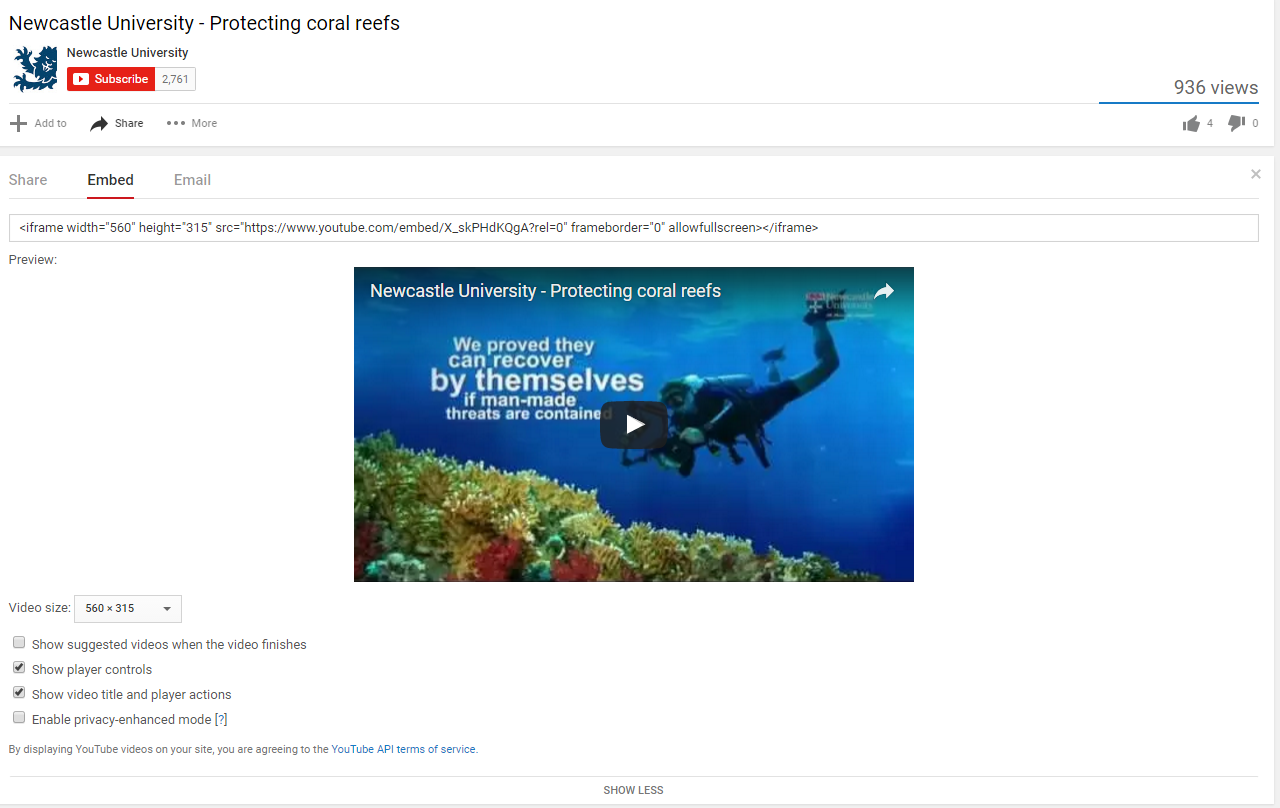
Protecting coral reefs video on YouTube

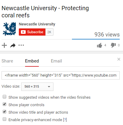
You’ll also need to make sure the option to ‘show suggested videos when the video finishes’ is unchecked. Otherwise you run the risk of unrelated videos, or worse competitors’ videos, being pulled into your page.

Screenshot of embed code for a video on YouTube

Embed code for Protecting Coral Reefs video on YouTube

Example

The video embed code will look something like this: https://www.youtube.com/embed/X_skPHdKQgA?rel=0

The code for the Protecting Coral Reefs video is X_skPHdKQgA, while the part of the code that ensures no additional videos are pulled in is: ?rel=0.

Adding to T4

When adding to T4:

  • add the prefix and name of the video
  • paste in the embed code to the Media URL field
  • add a caption to give context (limited to 50 characters)
  • don’t duplicate the video title in the caption if already displayed in the media player
  • select the most appropriate alignment for the video
Screenshot of video embed screen in T4

Screenshot of video embed screen in T4 (select to view larger image)

Alignment

On desktop, you can choose to align videos to the right of your content or make them full width so they stretch to the size of the screen.

We recommend using the full width option with caution, though – this often reduces the quality of the video. It can also look more cluttered and can make it harder for the user to find the answers to their questions.

On mobile, videos behave the same as images – stretching to fill the width of the screen and flowing below content.

Load time

We recommend that you only add one video per page. This is so that you don’t bombard the user with too much video content, but more importantly so that you don’t slow down the load time of the page.

Find out more

Check our T4 Moderator guide for how to embed external media (University login required).

Visit our website to find further advice and support about video hosting (University login required).

Related posts

Share this post:
Share

5 Reasons to Limit Video Content on your Site

As we take more sites through Go Mobile we’ve been removing quite a few video pages. We get asked a lot why we consider videos to be supplementary content on websites, and why we discourage a page containing only video content.

In this post I’m going to share five reasons why I think you should limit video content on your site.

1. Videos can be time consuming

People read differently online – they scan and dedicate less time, and often come to a website to find the answer to a question.

They are looking for a bridge for that information gap. They want to get over that bridge as quickly as possible.

Gerry McGovern

Videos are not the quickest bridge to information because, as Amy Schade (Nielsen Norman Group) points out, “they force users to access the content sequentially”. This means that users can’t quickly scan the information to see if it will be relevant to them  like they could with text.

If we rely solely on video content to convey our primary messages we run the risk of burying them. Users might not watch a video to the end, or worse, they might not watch it at all. In our new responsive template videos don’t play automatically, giving the user control over what they view.

As Amy Shade argues, users should “have the ability to collect information in another way”.

If using videos on your site you should always ensure that your primary message is also presented in text so that users can access it quickly.

2. Videos are not always accessible

When using video content you need to be mindful of accessibility.

Providing content as a video can limit access to the information contained in this format for anyone who cannot see or hear the content.

Amy Schade, Nielsen Norman Group

Is video the most appropriate medium to convey information to your target audience? For example, if one of your target audiences is from a country where Youtube is not available, relying on videos to provide information means that your audience can’t access it.

Videos can also break or be removed from the channel they’re hosted on.

3. Videos can distract from your core content

As well as videos being time consuming they can also interrupt the flow of your core content.

Video and the accompanying audio, can confuse or distract users”.

Amy Schade, Nielsen Norman Group

On mobile devices videos can take longer to scroll through as they stack to fill the smaller screen.

Since videos are potentially distracting users from your core messages, it’s important to think carefully about when and where to use them on your webpages.

4. Videos can slow the page load

Videos, like images and virtual tours, can slow the load time for your webpage. If users can’t access your information quickly they can become frustrated and leave your site.

5. Videos often don’t provide a next step

As well as coming to the web to find something out, users often come to a website to complete a task. There is a danger with videos just to tell a story rather than provide information with a call to action.

“Many videos are essentially dead ends that leave the user with no clear path to additional information.”

Amy Schade, Nielsen Norman Group

This supports my argument that videos are usually supplementary content on websites. They should sit alongside your core content to provide context or qualifying information rather than being relied on to provide essential next steps in the user journey.

Final thoughts

I’m not trying to say videos are not useful content. Do I believe they are more suitable in other mediums, such as social media? Absolutely. Like Gerry McGovern, I believe that a website is still “primarily a text-driven medium”.

However, I can also see the benefits of videos on a website. Like other dynamic content, videos can be engaging and can help break up blocks of text. They also provide context and qualifiers to support your core messages.

It’s essential though that we use this content type sparingly on websites to maximise impact, and to ensure that we’re not excluding, distracting or annoying our users.

Remember, there isn’t much time to grab the user’s attention on the web, it’s best to present your primary messages as quickly and as clearly as possible.

References and further reading

Amy Schade, Video Usability, Nielsen Norman Group (NNg), 16 November 2014

Gerry McGovern, Text is more important than images on the Web, New Thinking, 26 September 2010

Gerry McGovern, The Challenge for Writers of Web Content, New Thinking, 24 May 2015

Related posts

Share this post:
Share

Making Research Readable for All

Journalists learn early that if you can’t explain your story simply – you don’t know it well enough.

It’s the old adage from experienced editors. It’s a rallying call for plain English and making the complex easy to understand.

Plain English and readability are key in getting your message across, whether your audience are esteemed academics or laypersons.

Fear of ‘dumbing down’

Some research academics break into a sweat over this. It’s as if making research understandable to all is ‘dumbing down’. But researchers often do themselves a disservice with their ‘impenetrable’ web content.

The recent Research Excellence Framework review by Lord Stern recommends research impact case studies provide evidence of public engagement and understanding.

You can achieve this with your website content. It’s also a way to attract non-traditional sources of funding. But explaining your work in 65-word sentences laden with verbose language won’t help.

Have the courage to speak plainly

I’m not saying it’s easy to write about technical research. It’s almost impossible to get away from some subject-specific jargon.

But there are ways of delivering easy-to-read research. And that’s without ‘dumbing down’ and patronising your peers.

Writing actively, in tight concise sentences is a start. Bulleted lists and bold to highlight key messages are also good ideas.

The Art of Scannable Content: How to Write for Today’s Online Readers and our blog are great for writing tips.

Use Hemingway App to help you. It allows you to play around with your words to get the best readability score.

Just doing this, without removing technical jargon, will help anyone read your content.

Don’t hide your research behind vocabulary

Don’t just stop at sentence size, structure and scannable content. You’re only half way there.

“All too often, research is hidden behind a vocabulary that is overly technical and disengaging, but there are ways to avoid that.”

Cracking the code for effective research communication, where this quote comes from, gives excellent advice on steps researchers can take to engage web audiences.

Always put forward how your research impacts on everyday life. Also think about whether you need jargon to tell people what it’s about.

Five minutes with Mark Blyth: “Turn it into things people can understand, let go of the academese, and people will engage” is useful. Academic Mark Blyth gives insight into his success through promoting his research online.

Share this post:
Share

Best practice example: mastheads

Each batch we put through the go live process has examples of excellent content. In this new series of blog posts, we’ll use these to highlight best practice examples.

Last time we looked at using grid boxes for section openers. This time I want to show you three different examples of best practice for mastheads.

Mastheads

Like grid boxes, mastheads are used for section openers. These are pages that give an introduction for a particular section (eg Research, Study with Us, About Us).

They help create visual hierarchy, and so should only be used for top level sections of your site (the pages that appear in the side menu when you’re on the homepage).

Example one: Accommodation

masthead on the Accommodation website

This example is from the Accommodation website. It uses a masthead page to give a brief introduction to the section, and point users towards some key pages.

Mastheads work well in places where you want to give a teaser for the section, but not go into too much detail.

At a glance, users can see how to get to key information.

The image gives a visual clue about the content of the section. It shows students who look like they really do live in the accommodation, rather than visiting for the first time.

We’ve prioritised the information, providing links to some of the core pages for current students – how to extend your stay, swap or transfer your room, and what to do at the end of your contract.

We’ve also added a sub-heading to introduce a sub-set of key information: how the Accommodation service can support students after first year. This quickly introduces a new topic that they might not have heard about, and shows them where to find more information.

Example two: Careers

masthead on the Careers website

This longer example is from the Careers website. It uses a masthead page to give a more comprehensive overview of the section.

The image links very clearly to the title of the page. The shape of the photo also leaves enough space for the title box.

The sub-headings give a clear indication of how the section can help the user, and help to direct the user to appropriate information quickly and easily.

Although there is more text in this example, the page has been structured in a way that supports it. There are clear links to all pages within the section and the sub-headings work well to help users scan for information.

Hyperlinks are also used very well in this example. They’re placed at the end of sentences, which supports visitors using mobile devices. They’re not all clumped together, which would make them difficult to use on a mobile.

Example three: Postgraduate

masthead on the Postgraduate website

This last example is from the Postgraduate website. It uses a masthead page to support longer text and more information.

Mastheads can also be a good option if pages in the section have very specific information, and you need a catch-all page to introduce key information that won’t appear on the other pages.

There is a lot of text on this page, but users are directed to core pages by two, clear hyperlinks. Scanning is supported through short paragraphs, and bold phrases.

To improve scannability even more, we could introduce some sub-headings and bullet lists to break up the text, add white space and support scanning.

You can also support the text by using other content pieces, such as images, videos or quotes. The quotes in this example help to break up the text, and they’re relevant to the main content. They help to quickly support the message of the section.

Learn more

You’ll learn how to create and manage these pages in our T4 training sessions.

If you’re stuck, we can help you work out what format will work best for your navigational pages.

Have a look at :

Share this post:
Share

Usability heads in the right direction

We’ve built something new. It’s a widget for giving your web users easy access to clear directions for the location of your school/faculty/service.

It’s the efficient way for our lovely web editors to help potential visitors to the University.

It eliminates the need for paragraphs of vague/potentially incorrect routes to take:

  • roads
  • rail services
  • walking routes
  • cycling routes

Our new T4 content type is ideal for your website’s Find Us or Contact Us page.

How it works

If you’re seeking to add this content type, you’ll need to choose 14. Google directions.

We advise you add this to the bottom of your page, as it sits to the left under preceding content. Use it further up and people might miss something you’ve written that is important.

There are two boxes to fill out once you’ve selected this content type. The first is title, which should be filled out with:

DIRECTIONS: insert name of your school/service/faculty here

The second box relates to where you actually want to send your website users.

Because much of the university campus has the same postcode, you need to enter the building name and postcode.

An example for the Institute of Cellular Medicine, would be:

William Leech Building NE2 4HH

Then just update and approve your content and wait for it to publish.

What your users get

Your website users will see a search facility on the page with a Find Us button. All they need to do is add their address or postcode into the box and click on the button.

They will instantly arrive on a Google Maps page that will plot the routes to your location:

  • road
  • rail
  • walking
  • cycling
  • flight (if they’re far enough away)

Because it’s all done through Google, the information is constantly updated to remain as accurate as it can be.

It’s also a visual representation that takes you through the journey and works with GPS, instead of paragraphs that vaguely get your users here.

An example is on our demo site. Have a go applying it to yours.

Share this post:
Share