The Careers website is a vitally important part of the University’s web presence, and we’ve just finished a huge, six month long Go Mobile redevelopment.
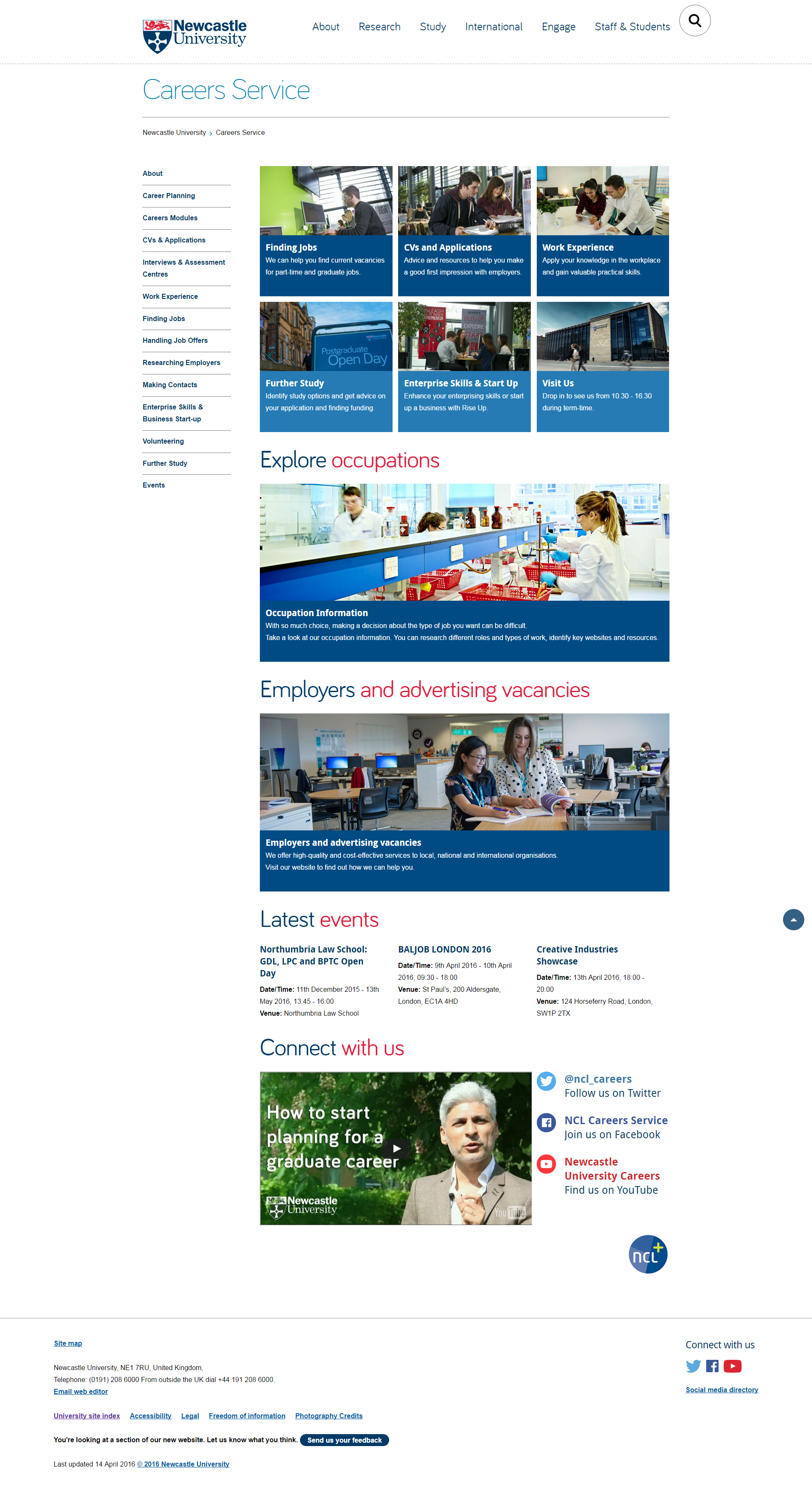
New home page
It’s a big University service with multiple audiences, including:
- prospective and current students
- parents
- old and new graduates
- our academics and staff
- employers
And these users have any number of different tasks they want to complete. From checking opening times, finding out about Recruitment Fairs or CV workshops, psychometric tests, researching occupations, and advertising jobs….
When one becomes four
The site was so big it’s now four separate websites. Why? Because like it or not, big isn’t normally beautiful on the web.
‘Big’ often means content has simply grown over the years, with more information added, and added…..and added. Simultaneously, moving or navigating around a big site is generally harder too. (And yes you’ve guessed, it’s even harder to navigate on a smaller mobile screen.)
If not diligently reviewed, big websites often suffer with duplicated or out of date information. More pages are added, so more navigation is needed. It’s a vicious circle.
But by the very nature of this information-led service, the Careers website had to hold a massive amount of content.
OK, but surely the most popular pages were easy to find? Well…no. it was big you see, so really hard to find some good stuff.
Alright, but it looked like it was part of the University right? …Oh dear.
The return of the 1980s
It’s fair to say the old Careers Service website was looking a bit….well, 1980s. And nothing like the rest of the University online. It was seriously overdue for a redevelopment!
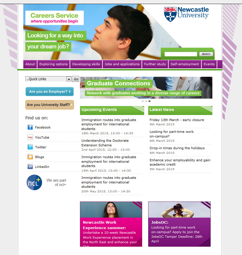
Old home page
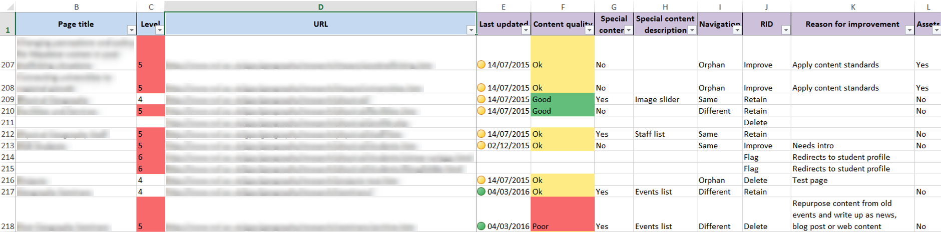
Because the site used an old template, they were also cursed with some of the longest webpages ever seen on planet earth. I kid you not.
This one example had a word count of 1,607. That’s FIVE A4 pages worth of content on one webpage.
Before:
Old CV page
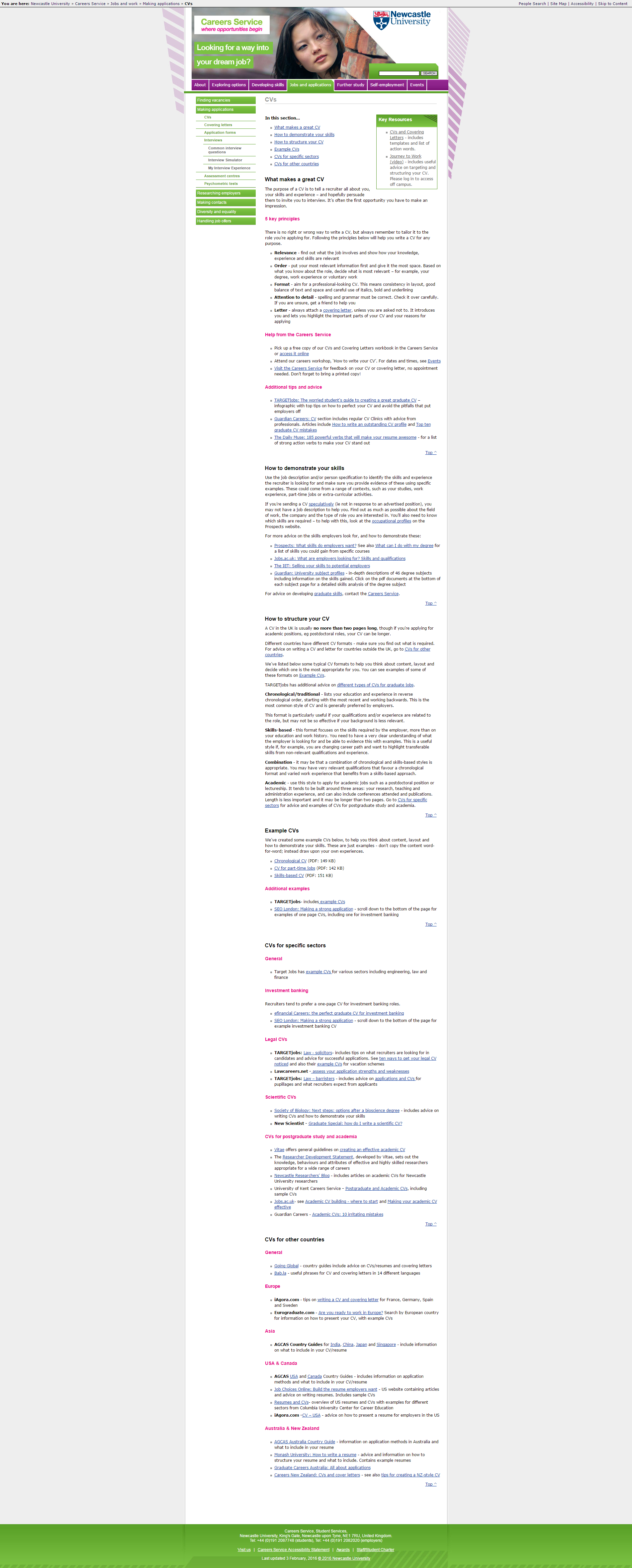
After:
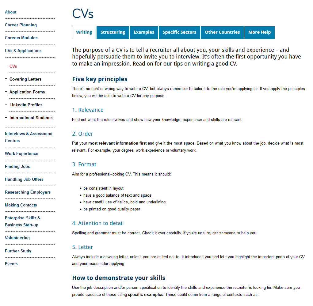
New CV page
While some pages are still quite long, the content is easier to scan read and navigate around using mobile.
So our Go Mobile project actually involved a major information architecture evaluation and wholescale restructuring, audience identification, and four separate website rebuilds.
Followed by extensive re-writing, editing, layout and format changes.
Oh, and then we made it responsive for mobile.
Now we have four new websites. Our external sites now boast tailored, audience specific content and fully responsive templates:
And information for Staff? Well that’s now an internal website of course (login required).