Content Governance: People, Processes and Policies

I’m not sure why I’ve drawn the short straw here: I get to introduce you all to the idea of content governance. Wait, don’t leave yet!

2005: we had websites with no direction

We only have to roll back about 10 years to see what our website was like with minimal governance. We had duplicated content all over the place. There were sites that didn’t follow our branding. We had a team of content-putter-uppers who just did but didn’t ask why.

What’s changed?

We still get asked to “just build a website” or “stick some content on this page”. But, nowadays, the answer is just as likely to be “no” as “yes”.

This is because we have content policies, style guides, training and the right people: our content governance.

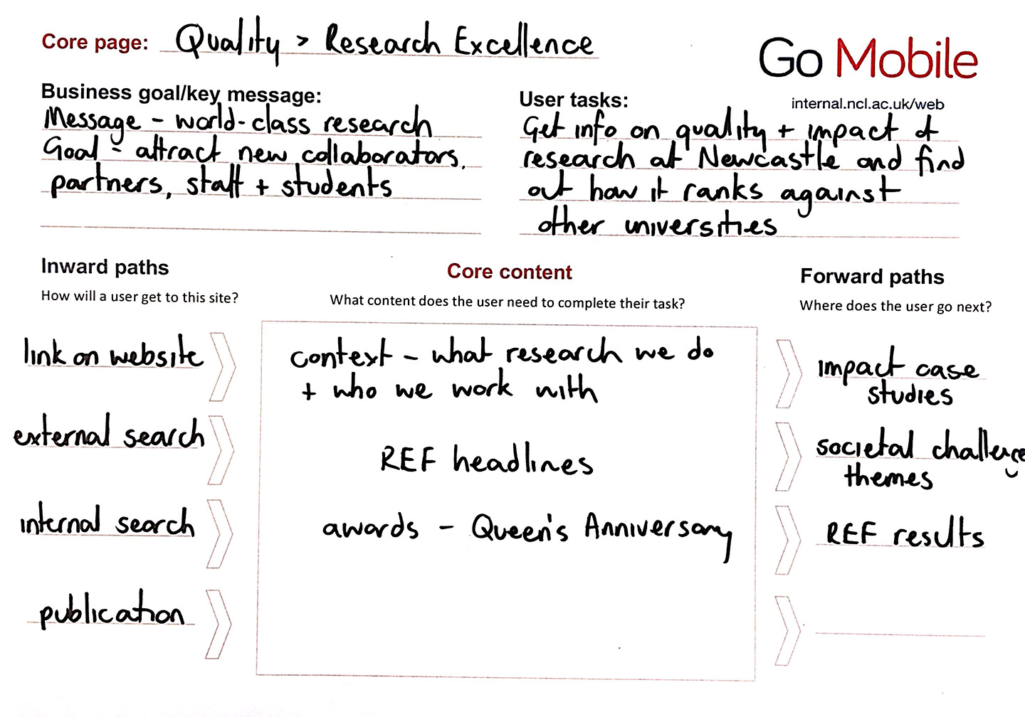
Going mobile is helping us with content governance

We’re using the Go Mobile programme to reinforce the importance of governance. There are some elements to making it a success: people, lifecycle, style guides and training.

People

With each new project we’re making sure we have at least one named editor. This means we’ve got a person in post whose job it is to manage the website and its content.

We’re still not 100% there. Web editor roles are often part of another post at the University. We are getting some accountability. And we’re working on making sure content editors have enough time to edit.

Content life cycle

Each Go Mobile site development isn’t just a project with an end date. We’re planning reviews of site content to make sure we’re maintaining quality.

We’re working with editors to introduce content management tools. These include editorial calendars, analytics and Siteimprove.

Style guides

We’ve had a set of web content standards from day one. We’ve just not been good at letting people know about them or enforcing them.

Go Mobile is raising awareness not only that our standards exist but also of their importance. These are not rules for the sake of it. They’re there to help our site users access the content they need on all devices.

If content doesn’t meet our standards, we have the authority to say it doesn’t go live.

Training

We can’t write a style guide, leave it hidden in a cupboard somewhere and then moan if people don’t use it! So we’ve developed training to help communicate our standards. We’ve produced a demo site that presents our new content design in the context of our standards.

Beyond Go Mobile

Through Go Mobile, we’re developing a skilled group of content editors. They are responsible for our web content and will be ambassadors for maintaining quality websites.

We’ve bench-marked our sites. We know how well they score for readability and whether they follow our new standards.

We’re planning to review sites around 6-8 months after they’ve launched. This will help us make sure we’re maintaining quality.

Content governance covers much more than I’ve outlined here – if we can get this right though, we’re well on our way to managing our web content effectively.

Let us know in the comments how you keep on top of content quality. Do you have any formal content governance?

Share this post:
Share

Using Design to Help Users Navigate Your Site

In our training for planning and writing for the web we talk a lot about user tasks. We use the core model to identify which pages on our websites provide the answers to our users’ tasks and also meet our business goals. These are known as the website’s core pages.

It’s incredibly important that we help our users get to these core pages, as they may sometimes be two or three levels down in the site’s structure. One thing we can do to help is to create inward paths to them from site homepages and section openers.

Top task driven homepages

Deciding what goes on to a site’s homepage can be a political battle. Everyone wants a link to their page. It’s also often done in isolation from planning the content on the rest of the site. Not anymore. We can use our core pages and users’ top tasks to determine what should go on a site’s homepage.

“the homepage is usually the last page we design. (How can you design the wrapping before you know what’s inside?)”
Ida Aalen, The Core Model: Designing Inside Out for Better Results

Take the new Information for Schools website, for example. Instead of having links to all of the main sections of the site (which can now be accessed from the menu on the left), there is a grid with links to the core pages: Events on Campus, Book a Visit and Support for Visits. There’s also a feature on the PARTNERS programme with links into the core pages within this section.

Screenshot of the Information for Schools and Colleges homepageDesign features for section openers

First off, let’s deal with the question of what exactly we mean by ‘section opener’. These are the top level pages below your homepage. You may find it easier to think of this in terms of a hierarchy diagram, with branches for the main sections of a site coming off the homepage.

Website hierarchy diagramThere are a couple of design features you can add to your section openers, depending on their purpose.

Like your homepage, you may choose to include a top task grid to help your users navigate to the core pages in the section.

Alternatively, you can choose to add a masthead which creates a visual opener for the section. This allows you to include some contextual information to answer users’ questions, as well as links to other pages in the section.

Screenshot of Research Support section opener with mastheadVisual hierarchy

Using grids and mastheads at the section opener level can help to create a visual hierarchy so your users know where they are in the site. If we have these features deeper in the site it can cause confusion. We want to create a clear distinction between the look of a section opener, and a standard content page.

Here you can see the difference visually of a section opener and a standard content page at the next level down.

Screenshot of the Business and Outreach section opener on the AFRD website

Top task grid on the AFRD Business and Outreach section opener

Screenshot of standard content page on the AFRD website

Standard content page for the AFRD Services to the Rural Economy page

With persistent use of grids there’s also another problem – where’s all your content? With grid after grid, you’re never actually providing the core content that will answer your users questions.

Conclusion

You can use top task grids on homepages and section openers to help your users navigate to your core pages.

Sometimes on a section opener you may want to provide some contextual content as well as links to core pages in the section. You can use a masthead in these cases.

Make sure you’re creating differentiation in the design of the section openers and your core pages. Only use grids and mastheads for your top level pages so they don’t lose their impact and so users know where they are in your site. Also remember that grid layouts are navigation rather than content so too many can create extra steps for users to find your core content.


Share this post:
Share

Improving Page Titles and Headlines

Linda recently posted about how meaningful titles and descriptions engage site visitors. Her post covered the importance of micro content in enticing people to read your content – particularly since content is displayed differently depending on the device used.

In this post I’m going to focus on how you can improve page titles and headlines to help people find your page and encourage them to read it.

Page titles should be clear and descriptive

Page titles help convey your primary message; its important they are clear and descriptive. This is so that your reader can quickly see what your page is about.

As argued by Jakob Nielsen, online headlines are different to printed headlines because they are used in different ways.

In print a headline is tightly associated with photos, decks, subheads, and the full body of the article, all of which can be interpreted in a single glance.

Jakob Nielsen, NNg

The contextual information that accompanies a printed headline means that it can afford to be cleverer and less descriptive. However, as pointed out by Nielsen, online headlines can appear out of context. For example they could appear in search results, news feeds, social media or navigation.

Headline text has to stand on its own and make sense when the rest of the content is not available

Jakob Nielsen, NNg

Since your page title could be displayed in a number of different places, and on a number of different screen sizes which may reduce the amount of information displayed, it’s essential they make sense out of context.

It’s also best if headlines don’t contain jargon or wordplay. For example, take a look at this example headline:

‘Cutting-edge Research’

This is vague and could be about any topic and relate to any organisation. It’s meaningless on its own as it provides no indication of what the content will be about.

Now take a look at this title:

‘Newcastle Student Unearths Rare Roman Jewellery’

This title is much more descriptive and gives a clear idea of what the article will be about. The reader can then quickly decide whether the content will be useful or of interest to them.

You only have precious seconds to grab your reader’s attention and if you waste those seconds forcing them to fathom out what your title means, they’ll lose patience and leave without reading your content.

Begin with key words

To help with search engine optimisation (SEO) your page titles should contain keywords.

For example, it’s unlikely that a vague title like ‘Students’ Union’ will appear high in search results. It will be competing with other universities who will be using the same general phrase. If we tweak the title to ‘Newcastle University Students’ Union’ this will help with SEO because the title is more specific. People will be more likely to find your page if your title contains words used by your readers.

It’s better if keywords appear at the beginning of your titles if possible, as this will help with scan reading.

Moving keywords to the front of titles increases the likelihood that they get noticed

Hoa Loranger, NNg

Eye tracking research conducted by the Nielsen Norman group shows that people read differently online in an F shaped pattern, and tend to see the first two words in a sentence.

Keep page titles short

Keeping page titles concise will also help with scan reading. Our recommendation for page titles is 50 characters (including spaces). This might not sound like many words to play with, but remember that your page title could be viewed on a small screen. If it’s too long it will run over several lines; making it much harder to read and understand.

Headline Analyzer tool

In Corporate Web Development we use a free online tool called Headline Analyzer to help write headlines for blog posts.

As shown from the screenshot below you simply type your headline into the headline field and click the ‘Analyse Now’ button. You’ll then be given a score for your headline and tips on how to improve it.

Screenshot of Headline Analyzer tool

Admittedly this tool is more useful for writing headlines for blogs than webpages. However, what I find helpful is the chance to see how my page title will look in search results. This helps me decide whether it will make sense out of context:

Screenshot of a headline displayed in search results using the Headline Analyzer tool

Have a go and see what you think!

Summary

What you call your page is crucial in helping people find it. If you use keywords that your readers will be using and if a title is descriptive of your content this will help with SEO. Furthermore, the more descriptive a page title is, the more likely people will select and read your content. This is because they will be able to quickly see whether the content is relevant to them and will help answer their questions.

References

Jakob Nielsen, Microcontent: How to Write Headlines, Page Titles, and Subject Lines, Nielsen Norman Group (NNg), 6 September 1998

Hoa Loranger, Headings Are Pick-Up Lines: 5 Tips for Writing Headlines That Convert, Nielsen Norman Group (NNg), 9 August 2015

Related posts

Share this post:
Share

How to Use the Core Model to Improve Your Web Content

I came across the idea of the Core Model at a content strategy conference last year.

It’s an exercise that helps you to identify pages on your website where user tasks and business goals meet. These are your core pages and you should focus your efforts on improving these before other content on your site.

Core Model diagramWe use the core model exercise in our training on planning web content. So far we’ve introduced it only to those editors on the Go Mobile programme, but it’s a useful tool for anyone who looks after a website.

Elements of the core model

The core model helps you to answer a series of questions about a page on your website, and this in turn determines what content is needed on the page.

User tasks – what questions will users come to this page to answer and what tasks do they want to complete?

Business goals – what business goals drive the content on your page?

Inward paths – how will users find and access this page? Where will they start their journey?

Core content – what is the essential content you need on your page to help your users answer their questions and complete their tasks? What secondary content will help you achieve your business goals?

Foreward paths – where will users go after they’ve answered their question/completed a task on your page? Are there more business goals that you can drive them towards?

Let’s work through an example

This example is taken from the About section of the University website. It’s a page about the quality of our research.

Core Model worked example - research excellenceUser tasks

A user might come to this page to find out about the quality of research done at Newcastle and to see how we rank against other universities.

Business goals

Our goals for this page are to attract new research collaborators, partners, staff and students.

Inward paths

The inward paths to most pages on the University website will be very similar. Users might get there from a:

  • search, either on the website itself or from a search engine
  • link from elsewhere on the University website, or from a link on an external site
  • link from a publication or email

Core content

For our users to complete their task we need to provide some context for them by outlining what research we do at Newcastle and who we work with. They also need to know the headlines from our REF results so they can quickly answer the question of how our research ranks against other universities. The awards we’ve received for our research are also relevant.

Foreward paths

This is where we need to think about the onward journey of our users, and how that fits with our business goals. From the research excellence page we want visitors to go on to find out more about our:

  • impact case studies
  • societal challenge themes
  • REF results

We must make sure there are calls to action on the page that link to all these destinations. These in turn will have their own calls to action, for example from the impact case studies to job vacancies.

Have a go yourself

Now that you’ve read about the core model and how it can help you prioritise content for improvement on your website, why not have a go yourself.  You can download a core model template from our website (University login required).

Share this post:
Share

Top 5 Tips: Content Calendars

It’s essential to continually plan your content to ensure it’s up to date and answering your users’ questions. Content calendars (or editorial calendars as they’re sometimes referred to) can help with this.

You can use a content calendar to map out content that will be needed at different points in the year and the deadlines for publishing content.

Read on to find out our top 5 tips for content calendars:

1. Map out key events or activities throughout the year

The best starting point when creating a content calendar is to map out key events and activities throughout the year. This could include recruitment campaigns, events and funding opportunities. You’ll then be able to identify tasks you’ll need to complete associated with each activity. This will include when you’ll need to produce or update content and source new assets.

Adding activities that take place on an annual basis will also help to identify when the busiest times for content production will be.

To help map out these activities, use our calendar template (PDF: 28.9KB, University login required).

2. Be selective with the information you include in your calendar

There’s a variety of details you could add to your calendar. Some details you might record include:

  • what content is needed (depending on the activities you need to support)
  • where on your site your new content will appear
  • the people responsible for writing and editing content
  • deadlines for writing, editing and publishing content
  • other teams that may need to be involved – will you need to contact the Corporate Web Development team (CWD) to create a new page on your site?

However, remember that the more information you include the more complex your calendar will become.

Focus your calendar on the top priorities, and consider eliminating the bottom priorities to make your calendar easy to use and maintain

Kristina Halvorson and Melissa Rach, Brain Traffic

It’s therefore important to be selective with the information you include so that your calendar is easy to understand.

3. Choose a calendar tool that works for your team

There are a variety of tools you can use to make your content calendar –  software like Outlook or Excel, or online tools like Trello. Deciding on the best tool to use depends on the amount and complexity of the information you want to record in your calendar.

For example, the CWD team first used Excel for our editorial calendar for this blog as it allowed us to record and filter a number of things. These included post categories, tags and whether a post would include an image or be a feature post. It also allowed us to easily assign authors and editors to posts. Although excel worked well, we now use Trello for our content calendar as it includes additional features, such as email notifications when tasks are due.

Learn more about Trello by reading Emma C’s post on Online Task Management with Trello.

Whatever tool you use for your content calendar ensure it works for you and all of your team.

4. Plan in plenty of time to produce content

Make sure you plan enough time to produce and update your content, or gather new assets.

Remember you may need to wait on other colleagues to provide information or request support from other teams, such as CWD or the Press Office.

Although it’s important to plan as much as possible, there will always be last minute content requests.

An editorial calendar should be a flexible, ever-changing live document – one that’s updated according to the comings and goings of your business

Chris McMahon, Sticky Content

Chris McMahon recommends scheduling in time to deal with unplanned content.

5. Share your calendar

Richard Prowse from the Digital team at the University of Bath recommends sharing your calendar:

this will demonstrate to those not involved in the editorial process that you have a considered and measurable plan for content.”

Richard Prowse, University of Bath

Sharing your calendar with customers is also useful when negotiating deadlines. The calendar will make them aware that if they are late in providing information it could delay when content is published.

The content calendar illustrates the other work you have scheduled in, and might also help to minimise those last minute content requests.

References and further reading

Kristina Halvorson and Melissa Rach, Content Strategy for the Web, Brain Traffic, 2012

Chris McMahon, Create an effective editorial calendar, Sticky Content, 24 October 2014

Chris McMahon, Fill your editorial calendar in 5 steps, Sticky Content, 31 October 2014

Richard Prowse, How to create an editorial calendar, Bath University, 6 July 2014

Share this post:
Share