Using Design to Help Users Navigate Your Site

In our training for planning and writing for the web we talk a lot about user tasks. We use the core model to identify which pages on our websites provide the answers to our users’ tasks and also meet our business goals. These are known as the website’s core pages.

It’s incredibly important that we help our users get to these core pages, as they may sometimes be two or three levels down in the site’s structure. One thing we can do to help is to create inward paths to them from site homepages and section openers.

Top task driven homepages

Deciding what goes on to a site’s homepage can be a political battle. Everyone wants a link to their page. It’s also often done in isolation from planning the content on the rest of the site. Not anymore. We can use our core pages and users’ top tasks to determine what should go on a site’s homepage.

“the homepage is usually the last page we design. (How can you design the wrapping before you know what’s inside?)”
Ida Aalen, The Core Model: Designing Inside Out for Better Results

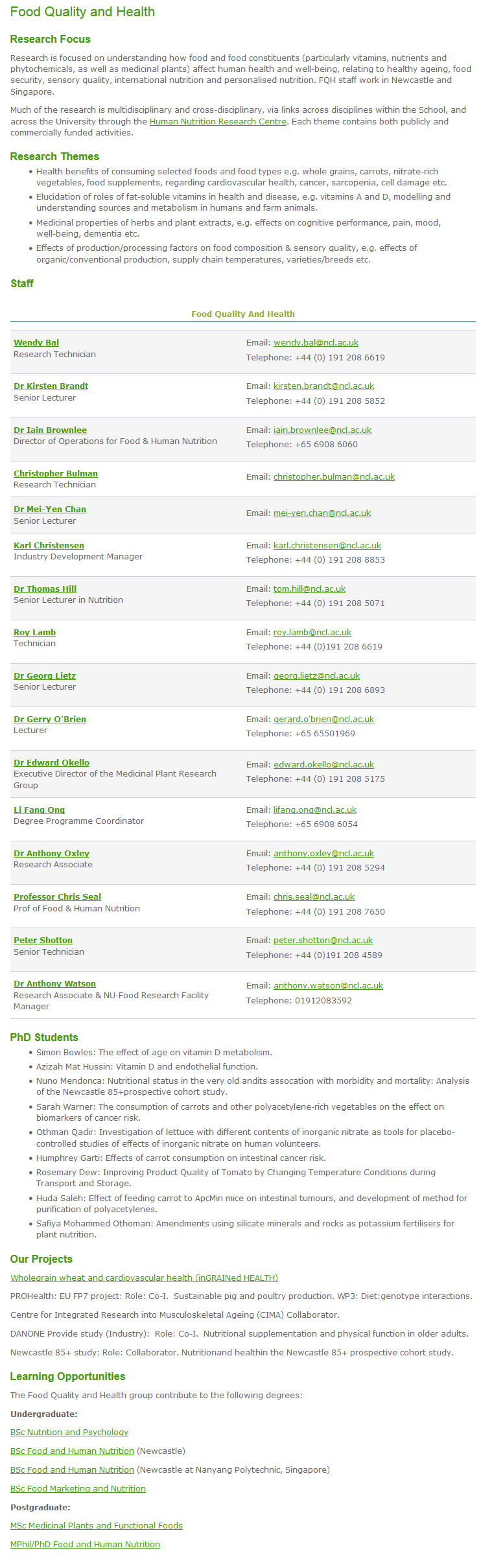
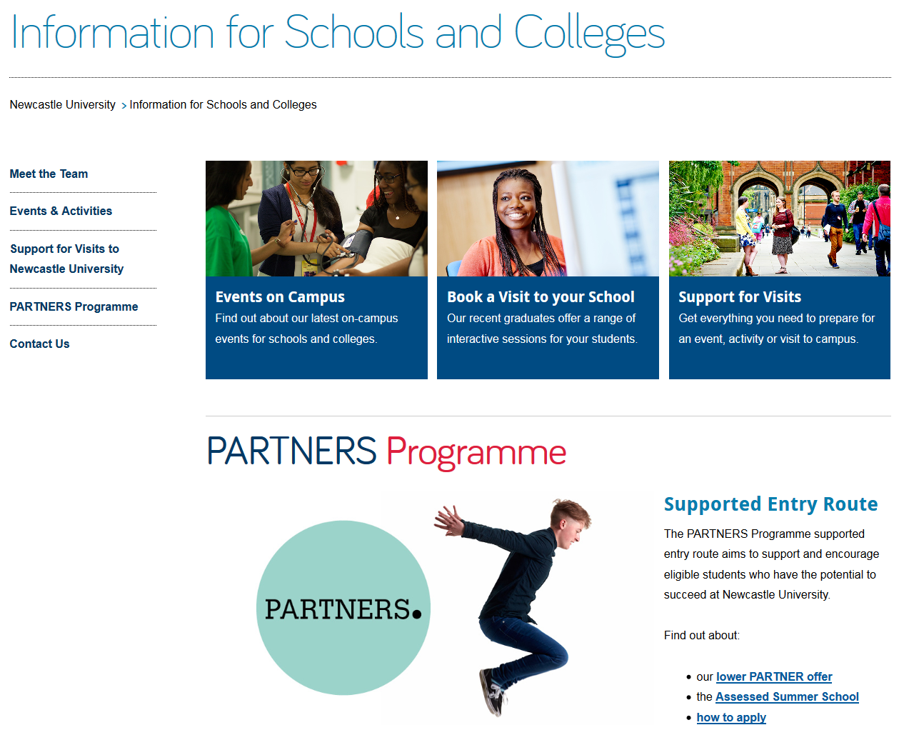
Take the new Information for Schools website, for example. Instead of having links to all of the main sections of the site (which can now be accessed from the menu on the left), there is a grid with links to the core pages: Events on Campus, Book a Visit and Support for Visits. There’s also a feature on the PARTNERS programme with links into the core pages within this section.

Screenshot of the Information for Schools and Colleges homepageDesign features for section openers

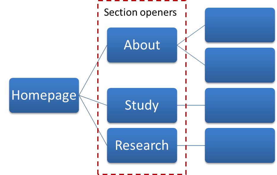
First off, let’s deal with the question of what exactly we mean by ‘section opener’. These are the top level pages below your homepage. You may find it easier to think of this in terms of a hierarchy diagram, with branches for the main sections of a site coming off the homepage.

Website hierarchy diagramThere are a couple of design features you can add to your section openers, depending on their purpose.

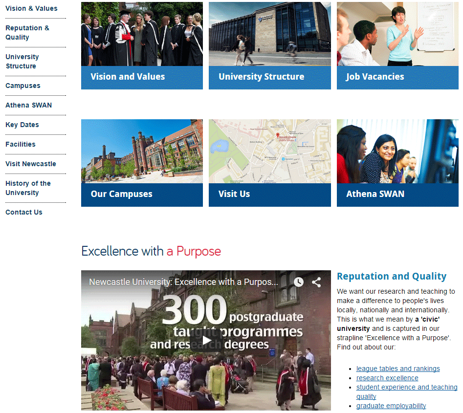
Like your homepage, you may choose to include a top task grid to help your users navigate to the core pages in the section.

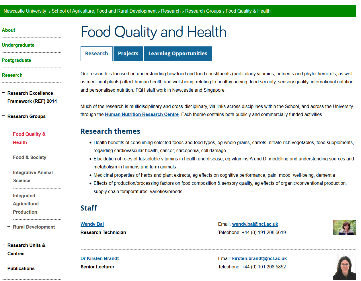
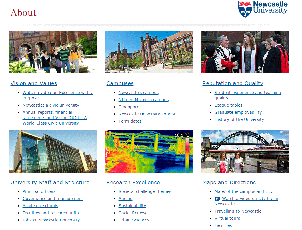
Alternatively, you can choose to add a masthead which creates a visual opener for the section. This allows you to include some contextual information to answer users’ questions, as well as links to other pages in the section.

Screenshot of Research Support section opener with mastheadVisual hierarchy

Using grids and mastheads at the section opener level can help to create a visual hierarchy so your users know where they are in the site. If we have these features deeper in the site it can cause confusion. We want to create a clear distinction between the look of a section opener, and a standard content page.

Here you can see the difference visually of a section opener and a standard content page at the next level down.

Screenshot of the Business and Outreach section opener on the AFRD website

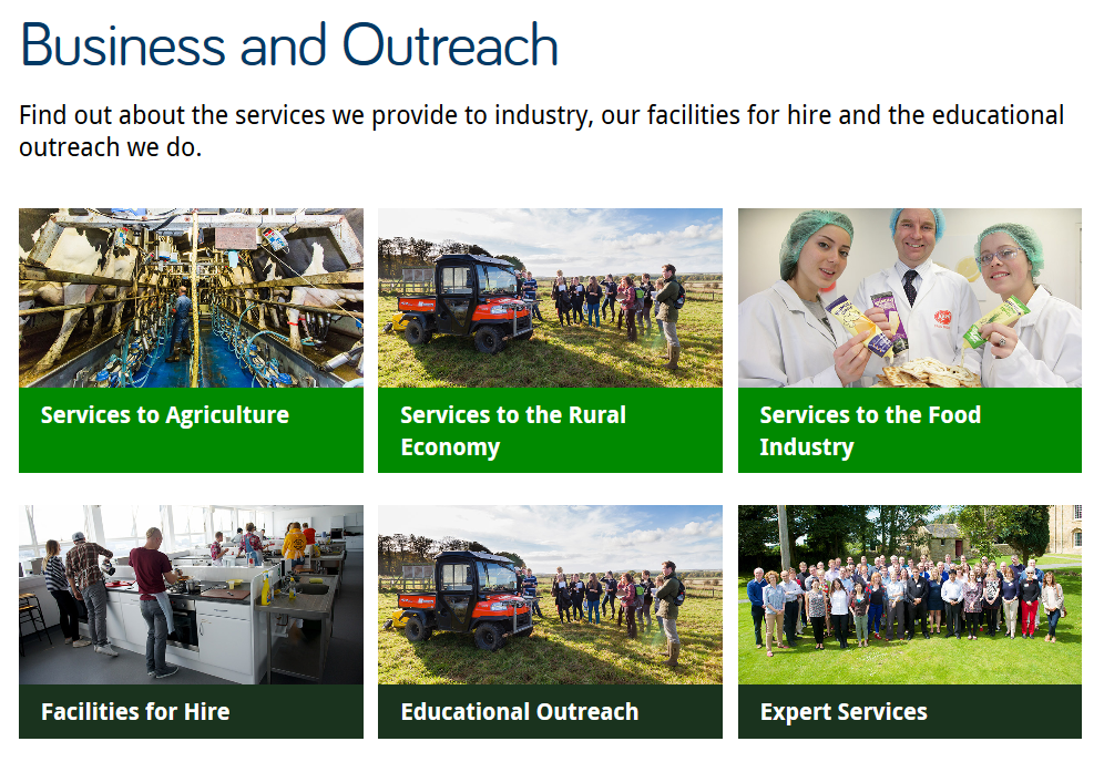
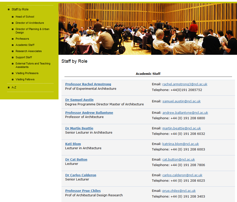
Top task grid on the AFRD Business and Outreach section opener

Screenshot of standard content page on the AFRD website

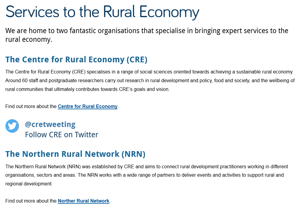
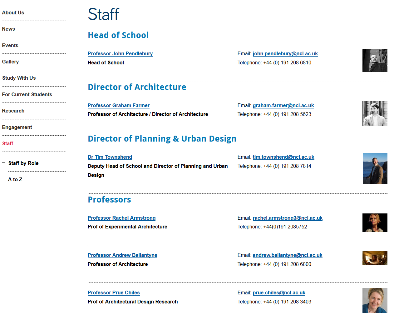
Standard content page for the AFRD Services to the Rural Economy page

With persistent use of grids there’s also another problem – where’s all your content? With grid after grid, you’re never actually providing the core content that will answer your users questions.

Conclusion

You can use top task grids on homepages and section openers to help your users navigate to your core pages.

Sometimes on a section opener you may want to provide some contextual content as well as links to core pages in the section. You can use a masthead in these cases.

Make sure you’re creating differentiation in the design of the section openers and your core pages. Only use grids and mastheads for your top level pages so they don’t lose their impact and so users know where they are in your site. Also remember that grid layouts are navigation rather than content so too many can create extra steps for users to find your core content.


Share this post:
Share

Streamlining Structure and Systems: Case Study of Academic Unit Sites

This is the second of our Go Mobile show and tell posts. Jane has already introduced some features of the new design using examples from central sites. Now, I’m going to look at some design changes on academic unit sites.

Tabbed pages

Our school sites are large. They’re complex and in some cases six or seven levels deep. Through Go Mobile we’re improving the structure of our sites and this includes making them shallower. One way of doing this is to introduce tabbed pages. Tabbed pages also allow us to split up long pages into shorter sections.

Take this example from the School of Agriculture, Food and Rural Development (AFRD).

Screenshot of cropped research group page on old Agriculture, Food and Rural Development website

Click on the image to display the full, uncropped version of the Food Quality and Health page on the old AFRD website.

Their research groups previously had a single page that included:

  • an overview of their research interests
  • a list of research themes
  • a staff list
  • a projects list
  • information about their teaching and learning activities

The new tabbed page allows this information to be split out into three or four much shorter pages with the tabs showing across the page on desktop.

Screenshot of tabbed research group page on new Agriculture, Food and Rural Development websiteOn mobile the tabs appear in a drop-down menu:

Screenshot of research group page on mobile with drop-down menu collapsed        Screenshot of research group page on mobile with drop-down menu expanded

Staff lists

In both the old and new design staff lists are generated from MyImpact data. The main difference, as you’ll see below in the example from the Schools of Architecture, Planning and Landscape (APL) is that profile images are now displayed in staff lists on desktop.

Screenshot of staff list on old Architecture, Planning and Landscape website

Old APL staff list

Screenshot of staff list on new Architecture, Planning and Landscape website

New APL staff list

On mobile the images disappear so that more information can be displayed on the smaller screen.

News

News lists appear in a very similar format in the old and new designs. The biggest change is behind the scenes. Previously our editors had to use a separate system to generate news for their site. News is now incorporated into the content management system (CMS) that we use to publish all content on a website.

Screenshot of latest news page on the new Institute of Sustainability websiteThe new CMS allows you to syndicate news into a feature news grid on your site’s homepage. This requires high quality imagery for every news item. As an alternative, some academic units have opted to display a simple news ticker on their homepage.

Screenshot of homepage news grid on the new Institute of Sustainability websiteTell us what you think

As always, we’re interested to hear your feedback. All the new sites have a link to our feedback form in their footer. You can also leave us a comment on this post.

Related posts

Share this post:
Share

A Brand New Mobile World: Case Study of Central Sites

Phase 1 of Go Mobile is now complete and we thought it timely to do a little show and tell of what we’ve been up to with this Go Mobile malarkey.

Two of our central sites to get the Go Mobile treatment were Research and About. These are clearly important sites for a research-intensive Russell group university, like Newcastle. These sites should showcase our achievements, but also need to explain some complex strategic content.

So they need to be able communicate effectively, but now with the added requirement of working just as well for smaller mobile devices.

We’ve posted previously about what Phase 1 of Go Mobile entailed and also talked about new ways we have of doing things, so here I’ll showcase some new layouts.

This post will focus on a core page on the Research website and the homepage for the About website. I’m going to include screen shots of the sites before and after Go Mobile, and explain why we’ve done these developments.

Research website

Take a look at the old Research Support section, one of the core pages of the research site:

Screenshot of old Research Support page on desktop The page is quite informative and clearly formatted (short paragraphs and a bulleted list of hyperlinks) but not really engaging. It’s also not visually impressive, with only a small image to the right of the content.

Now look at the new Research Support section:

Screenshot of new Research Support page on desktop.Note the:

  • new ‘masthead’ design for section landing pages
  • big impactful image to set the scene
  • new teaser text overlay on the image to help introduce the section
  • quote to substantiate our claims
  • use of bold to emphasise key messages in content
  • content written for mobile; direct, informative with relevant hyperlinks

Now, take a look at the new page on mobile:

Screenshot of Research Support page on mobile The page title clearly indicates the topic of this page and the teaser text is now used as an introduction to the page. This helps you quickly understand which page you are visiting.

The content is split into ‘blocks’ that can re-stack on mobile. The priority of content has been optimised; the image re-sizes and drops under the text.

About website

Here you can see the old About homepage:

Screenshot of the old About homepage on desktopYou can see that:

  • boxes are built for top tasks, so people can find the most popular pages quickly
  • there are links under each top task box to pages within that section
  • images are small
  • there are no key messages
  • the page is not very inspiring…

On mobile, this old page simply shrunk a bit to try to fit your mobile screen (but not very well) as it was not mobile responsive.

Now compare the new About homepage on desktop:

Screenshot of the new About homepage on desktopNote the:

  • top task boxes are still in use, to help people find what they are looking for
  • side menu is now visible to help with navigating the site
  • larger images are used to enhance the page
  • subheadings to help introduce content, and put it in context
  • use of video to help support our key messages

And see it on a mobile screen:
Screenshot of a section of the About website's homepage on mobile (showing website title and top task boxes)Screenshot of a section of the About website's homepage  on mobile (showing video and text)

The new page re-stacks all content for mobile, including video. All content, including images and video re-size to fit your mobile device.

We’ve improved section naming ‘About the University’ rather than ‘About’ helps give people more context of which site they are on and where they are in the site.

The hamburger menu at the top gives access to the secondary navigation (the side menu on desktop).

We’ll keep you posted!

Now, prepare yourself – as we move onto Go Mobile Phase 2 more things will change.

Not only will other websites get the Go Mobile deluxe treatment, but we are still developing the technology, how we do things – constantly testing and improving what we’ve already done.

You can always keep an eye on what we’re up next to with our fortnightly updates.

Share this post:
Share