Team update: 18 July – 29 July 2016

Go Mobile programme

Linda met with the School of History, Classics and Archaeology to line up their site for Batch 4. She’s also been working on the Business School website to make sure it’s ready to go.

This last week has been all about the proofreading and final amends to sites to get them ready for launch on 29 July (today).

Emily’s been working on the NICR and CEAM sites to get them ready to go live, and has also helped out with the proofing of the Business School site.

Emma C made the final amends to the School of English Literature, Language and Linguistics website before passing it on to Andrew for proofing.

Andrew’s worked on editing sites for the Cardiovascular Research Centre and Institute of Cellular Medicine, before proofing English and helping proof the Business School site. He’s also completed the audit for CURDS in Batch 4.

Anne’s been proofing the Maths & Stats website ready for go live on 29 July.

Fen has been working on the School of Mathematics and Statistics website, and proofing the School of Chemistry website ready for go live today. She’s also been prepping for Batches 4 and 5, with audits of the Conference Team, Catering and Business Services websites.

Lisa has edited the School of Chemistry website, which has been proofed by Fen with help from Jane, who has pitched in with proofing for a number of sites. Jane also met with Accommodation to discuss further developments to their site, which launched in Batch 2.

There’s always ongoing planning for the next batches. Emma B and Linda have mapped out work in Batches 4 and 5.

Design and Technical developments

Catherine completed the colours and styles for websites in Batch 3 and has started some of Batch 4

Catherine has been building a T4 widget to provide Directions to our schools, faculties and services, with input from Jane and Andrew.

Peter has been conducting the technical preparation of websites in Batch 3, ready for Go Live on the 29 July (today).

Campaigns and other developments

Linda and Catherine met with the Advancement Team about design requirements for the new system they are implementing to manage the alumni community and events.

Peter dealt with a request from NU London to add campaign tracking from Rubicon.

Training and support

Fen and Linda delivered a full day training in Planning and Writing Web Content.

Andrew has delivered a half-day of media management training.

We’ve received 39 support requests through the NU Service Helpdesk and have resolved 22 of them.

Plans for the next few weeks

Starting Batch 4: audits, kick-off meetings and planning.

Share this post:
Share

Improving Readability through Go Mobile

We measure the success of the Go Mobile programme by looking at the readability score for our content.

Why readability is important

It’s important to us as our websites help us communicate with a broad range of users. Everyone from school leavers to top researchers visit our sites. They all have different content needs. They all want to find answers to questions. We need to provide answers clearly and directly. This is where readability comes in.

You can find out more in our blog posts about readability and simplifying language.

Benchmarking our readability

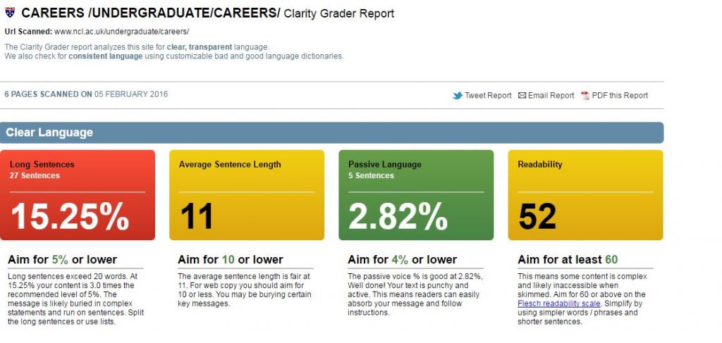
We use a browser-based tool called Clarity Grader to give us a clear language score for a website. They look like this (red indicates a bad score, amber is fair and green is good):

This shows a Clarity Grader report with a bad score for long sentences, a fair result foraverage sentence length and readability, and a good score on passive language.

To work out the scoring of a site, Clarity Grader assesses the following:

Long sentences

A long sentence has more than 20 words. Using short sentences helps you to keep them simple in structure. It means it’s easier to get your message across. It also makes them simpler to read on a mobile screen.

Clarity Grader recommends having no more than 5% of your content in long sentences.

Average sentence length

Clarity Grader recommends an average sentence length of 10 words or lower across the site. Obtaining this average will mean that your content is clearer and easier to understand.

Passive language

You should be aiming for direct language. The Clarity Grader report considers a score of 4% or lower to be a good indicator of active messages.

Readability

A score of 60 or higher indicates your message is clear. It means users of your site will understand your meaning with ease.

Access to Clarity Grader

Our subscription means that we can’t make Clarity Grader available to all editors. If you think it’d be useful to you, get in touch and we’ll see what reports we can run for you.

You can get readability scores on a page by page basis by using the Hemingway app.

University readability – before and after Go Mobile

We’re running Clarity Grader reports before and after a site goes through Go Mobile. This has given us a useful benchmark to look at the readability of University web content.

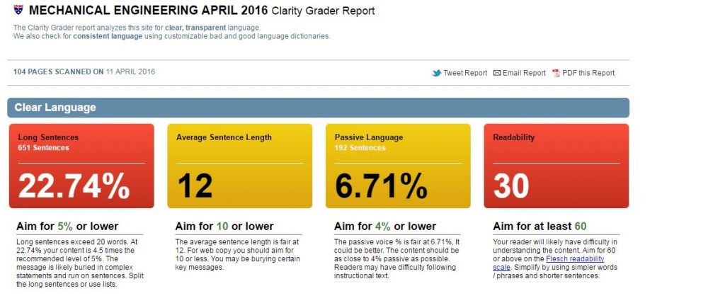
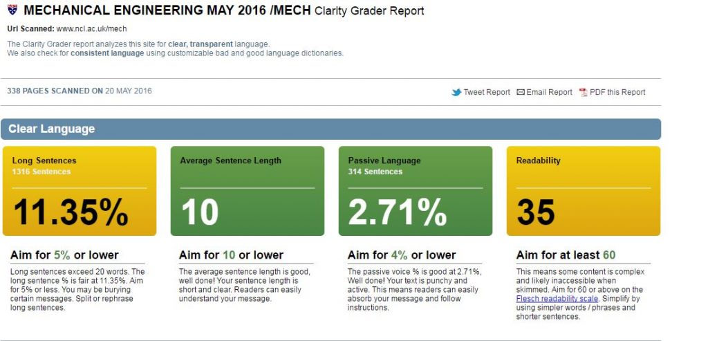
Our School of Mechanical and Systems Engineering has improved the readability of their content. They’ve reduced the length of sentences and made their content more active.

Before

mech-eng-before

After

mech-eng-after


Setting a readability score for the University

We’ve shown that Go Mobile is improving the content quality across the site. I think the Clarity Grader scores are a little strict for us right now.

I propose a set of targets to get us nearer to where we should be. Unfortunately we’ll not get the lovely all green for good from Clarity Grader. But it’s a start.

I suggest:

  • Long sentences: 15%
  • Sentence length: 10 or lower
  • Passive language: 4% or lower
  • Readability: 45 or higher

Let me know in the comments if you agree with the targets.

Share this post:
Share

Tips for Surviving Go Mobile – a Guest Post by Kate Austin

Kate AustinKate Austin is an Information Officer at the Careers Service, her role involves providing one-to-one information and advice to students and recent graduates. As part of the Information Team she researches, develops and edits content for the Careers Service website.

The Careers Service site has recently been through the Go Mobile process. In this post Kate shares the Go Mobile experiences of the Careers team.


The move to a mobile platform was a huge project for us. The Careers Service website covers anything and everything about careers and employability, with users including students, graduates, prospective students, employers and staff.

As you can imagine with all that information our site was huge – so big it has now been broken into four different websites! Now we are through the process and our new website is live, read on for our tips on surviving your own Go Mobile project.

Allow yourself plenty of time

Make sure you set aside plenty of time for your Go Mobile move. It’s a big project and I can promise everything will take a lot longer than you think. Allow extra time to tackle any bumps in the road or issues that come along. When our website went live, it wasn’t perfect – we had problems with broken links and redirects, issues with images and inconsistencies on our new occupations site. Planning in a little extra time for us to check our site before going live would have been a huge bonus.

Consider images

We soon realised the images on our old Careers Service website were not going to work on the new Go Mobile website. Our images were a little outdated and didn’t work well in the new content types, like mastheads.

If, like us, you need to have a photoshoot, make sure you brief the photographer on the types of images you’re going to need. I’d suggest having photos taken which would work well as mastheads. These need to be high quality, large photos with the focus of the image on the right-hand side. If you have your photos taken as mastheads you can always crop down the images to suit other content types later on.

If you’re unable to have a photoshoot, then make use of the University photo library. Thinking creatively and doing a bit of digging can help you find images to suit most pages. For the Careers Service Occupations website, we even managed to find images which represented particular sectors. On our Education pages, for example, we used an image from a PGCE teaching class. We were also able to use an image from a Geomatics course field trip for our page which focusses on careers in the built environment.

Use the demo site

The new content types allow you to display the information on your pages in a range of different ways.

When you’re in the planning process, it’s much easier to figure out what style will work best for your content once you’ve seen the different types in action. So have a look at the demo site and websites which have already gone through the Go Mobile process.

Make use of the training sessions

The training sessions from the Corporate Web team are informative and useful. The T4 training session in particular is great as it’s hands-on and practical.

At the training sessions, you’re also introduced to handy software such as:

  • Hemingway App for writing and editing content
  • SiteImprove for identifying broken links
  • Fotor which is great for cropping and resizing images

Once you’ve finished your training and you have access to T4, try and get straight on and give it a go. Our team had T4 training a few months before being able to edit the new website, meaning we initially had to rely a lot on the handbook which did slow us down.

Ask for feedback

Make sure you get feedback from the users of your website. When we’ve had any problems or glitches, it’s been helpful to have these pointed out as it means we can fix any issues quickly.

We’ve also had some great feedback from students and staff. Most people have commented that:

  • the website is easier to use and navigate
  • information can be found much quicker
  • the website generally looks a lot better (and not like it’s from the 80s!)
Share this post:
Share

The Role of the Go Mobile Project Manager

The aim of the Go Mobile Project Manager is to make everyone’s job as straightforward and focused as possible.

It’s no secret that a website development project is a complex process. When you’re managing client expectations, conscious of workloads of different people and trying to meet deadlines, it can feel like you’re trying to juggle chainsaws with one hand tied behind your back. That’s why good project management is essential for success.

We achieve this through good:

  • communication
  • planning
  • teamwork

Good project management

Here are some project management tips that help to keep the project on track.

Kick it off right. Work hard to get parameters and expectations agreed at the start.

Communicate. Agree milestones and deadlines throughout the project and keep everyone informed of progress.

Be flexible but realistic. If things change try to accommodate them but not to the detriment of agreed deadlines.

Standardise on what works well. If a particular approach saves time or makes the content build easier then make it part of the workflow.

Go Mobile

Your Go Mobile project manager will contact you well in advance of the start of your site’s development. This conversation alerts you to the resources required, timescales involved and process of change. We’ll ask you to consider:

  • who will be involved
  • if there’s any redundant pages that can be deleted
  • sourcing new photography
  • booking training on writing and planning web content, and how to use the new content management system

This is a good opportunity to devote some time to looking through your website and making decisions about structure and content.

The project manager for your Go Mobile development will be your point of contact and the person who will steer your site through the process. They will be like a GP who checks the heartbeat of the project at regular intervals. If there are any high blood pressure readings they’ll make sure they’re treated accordingly. The goal is to deliver a clear and useful website for your users.

Share this post:
Share

Big and (now) Beautiful

The Careers website is a vitally important part of the University’s web presence, and we’ve just finished a huge, six month long Go Mobile redevelopment.

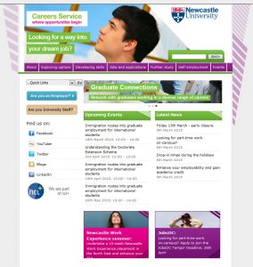
Careers website homepage

New home page

It’s a big University service with multiple audiences, including:

  • prospective and current students
  • parents
  • old and new graduates
  • our academics and staff
  • employers

And these users have any number of different tasks they want to complete. From checking opening times, finding out about Recruitment Fairs or CV workshops, psychometric tests, researching occupations, and advertising jobs….

When one becomes four

The site was so big it’s now four separate websites. Why? Because like it or not, big isn’t normally beautiful on the web.

‘Big’ often means content has simply grown over the years, with more information added, and added…..and added. Simultaneously, moving or navigating around a big site is generally harder too. (And yes you’ve guessed, it’s even harder to navigate on a smaller mobile screen.)

If not diligently reviewed, big websites often suffer with duplicated or out of date information. More pages are added, so more navigation is needed. It’s a vicious circle.
But by the very nature of this information-led service, the Careers website had to hold a massive amount of content.

OK, but surely the most popular pages were easy to find? Well…no. it was big you see, so really hard to find some good stuff.

Alright, but it looked like it was part of the University right? …Oh dear.

The return of the 1980s

It’s fair to say the old Careers Service website was looking a bit….well, 1980s. And nothing like the rest of the University online. It was seriously overdue for a redevelopment!

Old careers homepage

Old home page

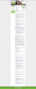
Because the site used an old template, they were also cursed with some of the longest webpages ever seen on planet earth. I kid you not.

This one example had a word count of 1,607. That’s FIVE A4 pages worth of content on one webpage.

Before:

Screenshot of old careers page which was very long

Old CV page

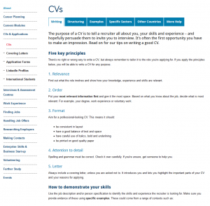
After:

Screenshot of new careers page which is much shorter

New CV page

While some pages are still quite long, the content is easier to scan read and navigate around using mobile.

So our Go Mobile project actually involved a major information architecture evaluation and wholescale restructuring, audience identification, and four separate website rebuilds.

Followed by extensive re-writing, editing, layout and format changes.

Oh, and then we made it responsive for mobile.

Now we have four new websites. Our external sites now boast tailored, audience specific content and fully responsive templates:

And information for Staff? Well that’s now an internal website of course (login required).

Share this post:
Share