We’ve Gone Mobile

We’ve come to the end of our long running and very successful University-wide change Programme, Go Mobile.

Over the duration of the programme, we created a total of 138 websites in the T4 content management system. We trained countless numbers of new editors in planning and writing web content, using video and imagery and technical skills in T4. We deleted literally thousands of pages of content that were old or redundant. Each site is now smaller, easier to manage and better focused on providing answers to its users.

I’m sure you can imagine that reaching this milestone has been cause for much celebration.

Yay!

Celebrating success

The next task for the project team is to calculate all the figures and benchmark the improvements. We’ll use this to produce a report which outlines the scale and nature of the benefits achieved by the programme.

The Go Mobile programme has been a very complex and multi-layered project to work on which has made it a great challenge for all of us. We’ve been using Agile project management methodology to make sure we stay on track and deliver a new batch of sites every five weeks. This has been a new way of working and has been a big part of our success. The model allows people to collaborate closely but also to respond quickly to changes and anticipate problems early.

The programme finished on Friday 10 March 2017, bang on schedule, with the last batch of sites going live. It’s fair to say that we’re all shattered but delighted to have reached such a significant milestone and to have achieved everything we set out to.

On the blog over the next couple of months, we’ll be highlighting some areas where we’ve made improvements to the University’s web presence, including:

  • content design
  • information architecture
  • readability
  • responsive design

We’ll use examples from across the sites to demonstrate what has changed. We’ll also look at how we’ve worked with our community of web editors to develop their skills and understanding of web publishing.

Go Mobile Batches 8 and 9

We’re in the final straight and the end of the Go Mobile project is in sight. We completed all of the large central and school sites last year. Since Christmas, we’ve been working on larger batches of institute and centre sites. Working in short, four-week cycles we’ve completed two batches so far this year.

Batch eight (27 january)

Batch nine (17 february)

Now there’s just one batch and eleven sites to go.

Top Five Takeaways From Agile Content Conference

At the end of January, I attended the Agile Content Conference in London. With the overall theme of collaboration, I was excited to pick up some practical tips to improve our work with colleagues in schools and services. Here are my top five takeaways from the day of case studies and workshops.

Embed content professionals within product/service teams

Erica Hoerl talked about her time working as a lone content strategist in the Messenger product team at Facebook. Emphasising the importance of having a voice for content at every stage of the product’s development, rather than drafting someone in for a specific content phase.

I’ve experienced the latter situation a lot. When the content team sits externally to a product or service team, we’re often brought in after the important decisions have been made. Embedding a content professional as a member of the team from the outset helps to get content seen as not just an add-on but a crucial part of any development.

Learn together

Jonathan Kahn introduced the conference with a series of collaboration tips to help find a solution that works for everyone:

  • talk to a range of people, not just those you’ve worked with before
  • align goals before identifying user needs
  • reframe objections as opportunities
  • learn together

They key to this, I think, is learning together; involving all stakeholders in user research and content design. This is supported by something Jo Wolfe asked us – to challenge ourselves to leave our preconceptions behind when starting a project. I think too often we start a project with a solution before really understanding the problem we’re trying to fix.

Pair writing workshop

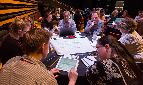
Proof I was there – taking part in a pair writing activity

Mental models help create empathy

In its simplest definition, a person’s mental model is the way they look at the world. It’s based on beliefs or assumptions about how things should work. Mental models are built up over time through experience. They are unique to an individual and change over time, as we gain more experience of different situations.

We can gain an insight into someone’s mental model through user research. This allows us to understand their motivations and concerns. It helps to create empathy and in turn, allows us to design content that meets their needs.

Use principles to drive content creation

Lauren Pope and Sarah Jones from Brilliant Noise shared a case study from their work with American Express to streamline content creation and reuse through an editorial hub. They aligned the work of multinational content production teams through a clearly defined purpose and set of principles.

The principle that stands out to me is this:

“Only AmEx can do this.”

It’s a bold statement about the importance of producing unique content. Something that I’m painfully aware of in the HE sector is the number of university websites that are just carbon copies of each other. Whenever we create new content for our sites we need to ask “what makes us unique?” and use that to tell a story.

Solve fewer problems better

This nugget of wisdom comes from Alex Watson, a product manager for BBC News. It’s pretty clear what it means, and I’m sure most of us would be likely to dismiss it as a given. And perhaps that’s the problem. We can get so swept along on a treadmill of things we need to get done, that sometimes we lose quality in the work we’re doing. I’m going to make a commitment to myself to do fewer things better. Will you join me?


Image credit: Paul Clarke on Flickr.

How to Describe Images for Accessibility and Findability

The University’s template for external websites gives great flexibility in the use of images. From visual grid layouts to mastheads and galleries.

Many users of our websites don’t see these images. They may have chosen not to download images, or might be using a screen reader to turn visual information into audio. This means it’s important to provide contextual information about our images.

Alternative text, or alt-text, is used to describe images to screen readers used by visually impaired people. It is also a useful aid for search engine optimisation, as search bots can crawl this field to get information about the image.

Good practice for alt-text

In T4 when you add an image to the media library, whatever you put in the description field is output as alt-text.

To make your alt-text effective, keep it short and descriptive. For all our web content, we recommend you write naturally and clearly – alt-text is no exception.

Long alt attributes will disrupt the flow of the content on your page. If you have a lot to say about the image, eg for a chart or graph, add a caption or describe it in the text on the page. Don’t cram this into the alt-text.

It’s good to think about including key words in your alt-text to aid findability, but they must be relevant to the image. Don’t fill your alt text with a string of random keywords just to help search optimisation. This will be confusing for users of screen readers. As we recommend for all content – write for people, not search engines.

We recommend that you avoid using text in an image as it can’t be seen by screen readers or search bots. Therefore it’s not accessible or findable. But, if you do have text in an image, make sure you also include that text in the alt attribute.

Exceptions

Alt text is not needed for:

  • purely decorative images, eg the masthead images on the NICA website
  • where there is also link text, eg top task boxes on homepages

However, there still needs to be an alt tag in the code of the page. If the alt tag is missing, a screen reader will try to add context by reading the image name, and this is often unhelpful.

An empty alt tag indicates to the screen reader that the image is meaningless. This means it’s simply ignored by the screen reader. The good news is that in T4 if the description field is left empty then the alt text field is left empty and still appears in the code.

Find out more

This video, created by Mike West, gives a great overview of what I’ve covered in this blog post. It includes examples of exactly what a screen reader picks up from images with and without alt-text.