Team Update: 15 – 26 August

It’s been a busy couple of weeks here in Corporate Web Development as we get ready to launch our next batch of sites in Go Mobile.

Go Mobile programme

Fen has been working with Lisa on the History, Classics and Archaeology site. She’s also been putting the finishing touches to the Web Info and Feedback site, ready for go live next Friday.

Lisa has been working with Fen to restructure and edit the History, Classics and Archaeology website ready for go live next week. She has also designed a feedback form to collate amends from editors after completing their site accuracy check before the proofing stage.

Linda has been editing the Working with Business website ready for go live next week.

Andrew has worked on the post-migration and editing of the Centre for Urban and Regional Development Studies site in T4.

Emily has been putting the finishing touches to the Singapore site, before it gets passed on for proofing. She’s also written some blog posts highlighting examples of good content use in some of our recent batches.

In preparation for batches 5 and 6, Fen has audited the Computing Science website and created a new sitemap, Emily has audited the School of Modern Languages website, and Andrew has audited the School of Dental Sciences website.

Lisa has been looking at the review process for sites that have already gone through Go Mobile.

Design and Technical developments

Our new directions content type, 14. Google directions, is now available to T4 web editors. Check out the upcoming blog post (30 August) and our demo site for more details.

Campaigns and other developments

Linda ran a workshop on a possible new sports website.

The whole team have been supporting updates/technical queries around the Clearing campaign.

Training and support

Fen delivered a Media Management workshop this week. Anne delivered a T4 CMS workshop last week.

We’ve received 35 support requests through the NU Service Helpdesk and have resolved 23 of them.

Plans for the next few weeks

Fen is meeting with the Mobility team next week to discuss content for the new Loyola pages on their website.

Anne’s preparing T4 CMS training for editors based in Singapore.

We’re getting things lined up for Batch 5 and 6 which will see us over half way through the Go Mobile Programme!

A Quick Guide to…Dates and Times

We’ve standardised how we write dates and times on our sites. This makes it easier for visitors to work out when things are happening.

It also makes scanning a page for key information much quicker.

In the latest of our Quick Guide series, here’s a timely reminder of our best practice for dates and times:

Dates

Dates have no punctuation.

The order should be day month year eg Thursday 4 August 2016.

A date range should look like this:

  • 2011 to 2012
  • Friday 28 February to Monday 3 March

Sometimes space is an issue, eg in tables. In this case, it’s fine to use truncated months eg Jan, Feb, Mar.

We’ve also set standards for writing decades and centuries:

  • 1930s not 1930’s
  • 20th century not twentieth century

Times

We use the 24 hour clock.

This makes times accessible to international audiences.

Here are some principles for presenting times:

  • 17.30 not 5:30pm or 1730hrs
  • 00.00 not midnight
  • 12.00 not midday or 12 noon

For periods of time, you can use a hyphen between start and end times. For example, 10.00 – 11.30

Best practice example: grid boxes

We’re often asked for examples of really good websites. The thing is, each site is different, depending on the type of site, their users, and their needs. Websites constantly evolve due to changing user needs, business goals or time-sensitive messaging.

So there’s not really one static best practice example that ticks all the boxes for everyone.

What we can do is point you in the direction of really good content usage to take inspiration from.

Each batch we put through the go live process has examples of excellent content. In this new series of blog posts, we’ll use these to highlight best practice examples.

Here’s a couple of examples of best practice for grid boxes from recent Go Mobile batches.

Grid boxes

Grid boxes are used for homepages and section openers. These are pages that give an introduction for a particular section (eg Research, Study with Us, About Us).

They help create visual hierarchy, so users can easily see where they are in your site. Because of this, they should only be used for top level sections of your site (the pages that appear in the side menu when you’re on the homepage).

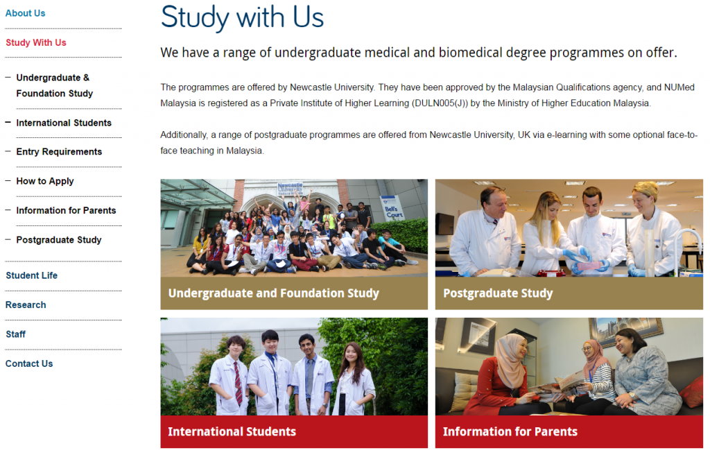
boxes on the Study with Us section of the Malaysia campus website

Newcastle University Medicine Malaysia Study With Us section

This example is from Newcastle University Medicine Malaysia. It uses our ‘top task box – dark’ content piece.

This is basically four links, but presented in a visual, structured way. Visitors can immediately see what’s on offer. This is a good option when you want to give a quick overview of different services, for example.

For this Study with Us section, it was important that we had clear pathways signposted for four key groups of users: undergraduates, postgraduates, international students, and parents.

We wanted each group to feel catered for, supported, and have easy access to pages that would help them.

You can have some text above grid boxes. Keep it short, and don’t add any if it’s not needed. The boxes should take centre stage, and do a quick job of moving users on to core pages.

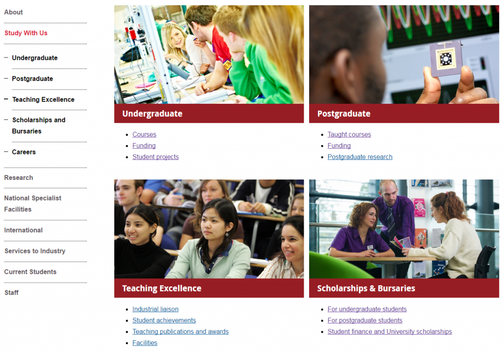
boxes on the Study with Us section of the Mechanical Engineering website

Mechanical Engineering Study With Us section

This example is from the School of Mechanical and Systems Engineering. It uses our ‘top task box – light’ content piece.

This box type gives you the option to include some hyperlinks (max. 4) below the image and main link. It’s a good option for pages where you know there are several core pages that you want to highlight.

In this example, we wanted to signpost prospective students towards the undergraduate pages, but knew that they’re likely to want to know about courses and funding in particular.

Light top task boxes are great for larger sections where you want to direct users explicitly to core pages.

Think about what the key messages for the section are, and what your user is looking for. Work out what are core areas (give them boxes), key pages within these areas (give them links), and what is additional information (don’t link them from your section opener).

Your additional information pages (in this case, the Careers page) will always be available within the section via the menu.

Learn more

You’ll learn how to create and manage these pages in our T4 training sessions. And you’ll find out how to identify your core pages in our training on planning web content.

If you’re stuck, we can help you work out what format will work best for your navigational pages, and help you with setting up grid layouts.

Have a look at :

Team update: 1 – 12 August 2016

Go Mobile programme

We’re well under way with work on sites in Batch 4 of Go Mobile.

Andrew has worked on the pre-migration tagging of the Centre for Urban and Regional Development Studies website. He will begin post-migration and editing in T4 next.

Linda has been checking the pre-migration content for the Working with Business website ready for its migration into T4 next week.

Steve and Emily have been preparing the Singapore site for migration.

Emma C has edited content for the new Spatial Analytics and Modelling site.

Fen has been working with Catherine to develop the social media directory on the Website Information and Feedback site.

Audits have begun on sites in batch 5, including:

  • Biomedical Sciences
  • Computing Science
  • Education, Communication and Languages
  • Global Urban Research Unit
  • History, Classics and Archaeology
  • University Events

Linda and Lisa met with editors in the School of History, Classics and Archaeology to discuss their migration into T4. On the cards, a new structure and colour scheme!

Design and technical developments

Catherine has been filling in for Peter while he is on holiday by doing the technical preparation and migration of Batch 4 sites.

Campaigns and other developments

Linda is working on a workshop to develop new content for a Sport website.

Steve has been planning web developments related to the Science and Engineering Excellence project.

Lisa has been restructuring and developing content on the Study website.

Fen has been developing new content for the Loyola Centre, which she will add to the Mobility website this autumn.

Catherine has been finalising the technical requirements for the Clearing campaign. She is also setting up a development website for a new library resource, the Academic Skills Kit.

Training and support

Linda and Fen delivered the Planning and Writing workshops last week and Linda delivered a Media Management session.

This week Emma C and Emily ran yet more Planning and Writing workshops. And Anne delivered a T4 Basics session.

We’ve received 52 support requests through the NU Service Helpdesk and have resolved 19 of them.

Plans for the next few weeks

Over the next couple of weeks we’ll be working on:

  • technical support for the Clearing campaign
  • batch 4 sites; migration into T4 and editing content
  • batch 5 sites; audits and scoping technical requirements
  • training development

Writing in the Active Voice

The last of our top five tips for writing for the web is to ‘be active’. This encompasses including calls to action and links, but perhaps most importantly, using the active voice.

The difference between the passive and active voice, and how you change one to the other is often something that we get asked about in training. So here’s a short blog post to help.

Active vs passive

To know the difference between the active and passive voice you need to identify the subject and the object of a sentence. Here’s an example of an active sentence:

Andrew edits web content.

In this sentence Andrew is the subject – he is active. Because there is an action the sentence also contains a verb – to edit. And the web content is the object – it is acted upon.

The passive form of this sentence would read:

Web content is edited by Andrew.

Andrew is still the subject and web content is the object, but now the passive object holds the focus of the sentence.

Benefits of using the active voice

The passive voice isn’t wrong, but it’s often a poor way to communicate your message. If you think it causes confusion for you as the author of content, imagine what it’s like for your audience. Using the active voice can make your content clearer, more direct and more engaging.

If you’re using Hemingway to check the readability of your content it will identify passive voice for you – watch out for the green highlights. You’ll see that it doesn’t ask you to remove all examples of passive voice from your writing. But it does give you a target (based on the length of your content) to aim for.

It’s ok to use passive voice when you intend to force the object into focus, for example:

Professor Chris Day has been appointed as the next Vice-Chancellor of Newcastle University.


How to move from passive to active

The easiest way to change a sentence from passive to active is to turn it on its head. Put the subject of the sentence – the one doing the action – before the verb. Once you’ve done this you can rewrite the sentence to maintain its original meaning.

Related reading

Top five tips: writing for the web