Why Deleting Old Stuff on Your Website is Good

I bet one of these situations is familiar to you:

  • struggling to close an exploding sock drawer because it’s jammed packed full
  • slamming shut your wardrobe to stop an avalanche of shoes from escaping
  • repeatedly ignoring the message popping up in your email shouting that ‘Your inbox is full’

Yup, hands up guilty as charged. I’ve done this… actually all of these.

What do these problems have in common? They are visible, physical problems (especially exploding sock drawers). They impact negatively on your life; that jammed-shut drawer, all those emails clogging up your inbox.

These are things we know we need to sort out so they stop being a problem. But they’re often tedious tasks.

We have the same problems with websites…
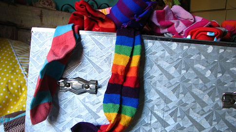
Over-flowing sock drawerExploding socks

Websites can have the same too-much-stuff problem as our sock drawer. But the real problem is it’s often invisible to us.

With websites, the problem starts when lots of ‘stuff’ builds up over time. Old documents and images, defunct logos, old versions of pages etc.

You may think this stuff is harmless; it’s all behind the scenes. You don’t link to them or use them anymore…. right?

Nope.

Just because you have removed a hyperlink to an old document for example, doesn’t mean it’s gone. If that old version still exists on your site, it’s still indexed and found by search engines and people.

Do or do not, there is no try

Your website may seem to work perfectly fine – but behind the scenes the stuff cluttering up your website can really harm it’s performance, peoples user experience – and sometimes even your reputation.

And here’s why.

Imagine somebody wants to find out the latest information about our student accommodation. Using a search engine they type in ‘student accommodation Newcastle University’.

The results list all the pages and documents that have been indexed as containing this information on the University’s website. Alongside some page links, a PDF is listed – uh oh…it’s for 2013!*

How can people trust us if our information is out of date?

This is why deleting stuff is good.

Ideally you’d delete the old content each time you replace it with new content on your website. But if you haven’t done that (or you have inherited a website from a hoarder) or just don’t know where to begin, then don’t worry help is at hand.

Delete keyMinimalist mantra

The minimalist method of cutting out clutter is an interesting approach to take. Take shoes for example.

Group all the similar shoes you have; trainers, sandals, boots etc. Decide which pairs of each type do you wear most often and want to keep, then remove the rest.

This is easily applied to your website; documents, images, logo’s, old versions of pages etc.

Decide which ones you need to keep. They are:

  • the most recent versions
  • being linked to in your content

Delete the rest.

Keep calm and stop the ROT

ROT stands for redundant, out-of-date or trivial. Large organisations (like us) that have a massive web presence find this a problem. By taking a good look at your site and deleting stuff you can stop the ROT.

Don’t treat your website like a file store. Keeping stuff ‘just in case’ on your website is:

  • dangerous – it is still indexed by search engines and found by people
  • lazy – just save it elsewhere
  • harmful – our reputation is jeopardised by out of date content, and gives a negative experience for users

As part of Go Mobile we will audit each site in the programme, and identify ROT. When making our websites work well for devices with small screens, deleting old stuff we don’t need is vital.

If you want any advice about where/how to start, just get in touch.

There’s also a good article from Paul Boag about dealing with ROT that’s worth a read.

*Relax…this search works perfectly well in real life – no old documents being indexed here!

Image credits:

Share this post:
Share

Why do you have a Website?

Why DO you have a website? Can you answer this question in around 50 words? Any bets you’ll find it hard.

Newcastle University has around 150 external facing websites.

Our best ones have an audience in mind, have a clear set of tasks or goals to support and we measure their success. They have a site purpose.

The worst ones exist because a new department or team was set up or we wanted to tell some people about something. These sites decay over time. They aren’t updated. No-one knows if they are supporting our business goals. They fill our web real estate with waffle and ‘just in case’ content. They have no site purpose.

Defining your site purpose

As part of our Go Mobile programme we’re writing a site purpose statement for each site. Grab a piece of flipchart paper and work through these steps:

  1. Know your audience

Who are the key audiences for your site? Brainstorm with colleagues to make sure you know who you are writing for. Be mindful of not just saying “everybody”. You’ll find it hard to prioritise content if you do.

  1. Tasks

For each of your audiences, think about what they want to do when they get to your site. What are their top tasks? Two or three will do.

  1. Business Goals

What do you want your site visitor to do? Business goals should be measurable eg increasing student applications by 10 % rather than being a task like “I want to apply”. Again, two or three will do.

  1. Content and tone of voice

Come up with some words and phrases that describe how you want to come across to your readers. Are you clear, complex, conversational or professional? How do you want them to feel: confused, empowered, confident or suspicious?

Once you’ve got all this, you’re ready to write your site purpose.

Writing your site purpose

We’re using an idea presented by Sara Wachter-Boettcher at Confab Europe 2014. You can find out more about it on her blog post: Content Mad Libs.

A Mad Lib is a fill-in-the-blanks exercise where, once completed, you have the beginnings of a site purpose. It looks a bit like this and comes in at around 50-70 words:

Fill in the blanks (Madlib exercise) for the Newcastle Web Team's website.

Corporate Web Development Team’s site purpose 

I’m not going to lie, some editors have found it painful to prioritise only two or three top tasks.

In some cases, we’ve explored whether we need more than one site purpose – more of a site section purpose if you like.

This tells me that some of our sites have too many audiences to support and perhaps need dividing up into smaller sites.

Content putter-uppers no more!

The site purpose statement gives our web editors a tool to prioritise content according to audience and business need.

Our editors aren’t just there to put content up on the site. Their role is to question, prioritise and rewrite.

So, when you get asked to add some content to a site, the answer isn’t just “yes, of course”.

You question the content: is it for my audience, does it support a task or business goal, does it need rewriting?

Then the content gets added. Or, more importantly, doesn’t, if it doesn’t fit the site purpose.

Have a go

There’s no need to wait for the Go Mobile programme to try and come up with your site purpose. Have a go using the steps provided. We’ve also got some templates on our website to help you (University Login required). Get in touch if you need some further help with this.

Let us know how you get on in the comments. Happy Madlibbing!

Share this post:
Share

Why ‘Under Construction’ Notices are Bad Practice

In the early days of the web ‘under construction’ notices or animated construction worker images were common on websites if an organisation didn’t have any content to add to a page. These messages have fallen out of fashion but have been replaced by messages such as ‘coming soon’ or ‘information to follow’.

The terminology and formatting of this message may have changed, but the outcome is the same – a dead end for users.

under construction notice

A dead end for users

Imagine a prospective student has clicked through to a page on your website expecting to find something out. Instead of an answer or information to help them complete a task, they are greeted with nothing more than an ‘information coming soon’ message.

How do they feel? Disappointed and frustrated. What do they do? They leave.

Perhaps they come back at a later date to check if the page has been updated but it’s more likely they will go somewhere else to find the information they need or worse… go to a competitor’s site.

People generally go to a website to find an answer to a question or to complete a task. An ‘under construction’ notice doesn’t tell your customer anything and is therefore a waste of their time.

Damage to credibility

‘Under construction’ notices can also damage the credibility of your website. They make the page look sloppy and unfinished. This consequently reflects badly on the organisation, giving the impression that the organisation is uncommitted and unprofessional. It could also mean that users don’t trust the other information on your site.

Bad for SEO

Search engines also respond badly to ‘under construction’ pages. If there’s no content on a page the search engine won’t rank it very highly.

Worse, if the page has a meaningful title containing key words that people are searching for, it may come up in search results. Your reader goes to read more on the page only to discover that it contains no content. This is harmful to your organisation’s credibility.

Solutions when waiting for content

If it’s business critical to advertise something (eg funding opportunities or a new research facility) before the full details are available you should add relevant information rather than a blank page. To do this, you should:

  • think about the information you already have about the funding, research facility etc
  • add relevant signposting to another site if appropriate
  • include contact details for questions until the content can be added to the site
  • update with further information as soon as it is available

Final thoughts

Finally, if you don’t have any meaningful content to add to the site don’t add a new page. A blank page or a page with irrelevant information is more harmful than excluding information altogether. You wouldn’t publish a brochure containing a blank page with a generic ‘coming soon message’, so the same rules apply to the web.

Visit our website for help on planning web content (University login required).

Image credit: Under Construction Grunge Sign by Nicolas Raymond, www.freestock.ca, licensed under CC BY 3.0

Share this post:
Share

How to Improve your Website Images and Videos

Images and video are used as supporting content on the University’s websites.
People don’t tend to prioritize our websites specifically for images or videos – they visit for information; your content.

That said, content can be greatly enhanced by using images or video to support your messages if they are used in the right context. So what is the right way to use them?

Choosing an image/video

High Quality

Use only high quality images. Images should not be blurry, stretched or pixelated. There is a range of University photography you can use in the photo library. Always preview your image to check the quality before publishing.

Videos should be selected from an official University YouTube channel and embedded in your site. Don’t upload the original video file directly to your website.

Support the content

Images and videos are supporting messages. They should always make sense to the user, their job is to help to enhance the meaning of your page. Your content should provide the context for the image/video.

It’s important your images and video is relevant to the content on the page. User testing increasingly shows that people are feeling more and more negative towards the use of generic stock images.

Less is more

If you have too many images or videos on a page, you can compromise the effectiveness of your content. They can:

  • slow page load times
  • interrupt the reading experience
  • make pages disjointed and harder to read

Images of text and complex images, like flowcharts or graphs, can also present a barrier for users accessing your content, and should be avoided.

This content in the image is effectively invisible to users of screen readers and anyone viewing the text only version of your site, for example a mobile user with images turned off. It is also impossible for search engines to index this content – so if you want people to find this information, use content!

If you must include a complex image in your site then a text alternative of the essential information contained in the image is required.

Image size and orientation

For sites edited via Contribute the standard image size is 320 x 180 pixels. We recommend that you use landscape images. Specific templates may have alternative sized images for banners and grid layouts.

Sites edited in T4 have many image options. For these size requirements you can view the image guide on our demo site (University login required).

Keep an eye out for a future post on editing images.

As videos are embedded onto your webpage, your website template should automatically provide you with the right size and a preview image for the box. Just look at our support pages to find out how to embed a video (University login required).

Alt text

Alt text provides alternative, textual content when an image cannot be displayed or for users of screen readers. It should be descriptive, but not necessarily a literal description of the image. Think about describing what the image represents.

Linking images

Many of our websites contain pages with grids of images, for example the Open Day landing page. Linking the image used here increases the area a user can ‘click’ or ‘tap’.

This is useful for mobile users who may be trying to select links using their finger or a stylus. Image links should always be supported by links in the text of your page.

Social media

Individual posts and campaigns run on social media are ideal for hosting video content. These channels tend to be seen as more engaging for people, as they can so easily share content – but more importantly, they enable people to talk directly to us.

Consider using social media alongside your website in this way to help your messaging. Social media can help direct people to your website, and your website should connect people to your social media.

Find out more about using social media in this way from the University’s Social Media Team.

Final thoughts

So that’s your whistle stop tour of improving images and videos for your website. These assets should always be used to enhance your pages, to enable people to better engage with your content. Find out more from our guide to images (University login required).

Share this post:
Share

Experts to Inspire You

We like to keep ourselves up to date with the latest developments in the web industry by reading. A lot.

We read books, articles, websites and blogs and thought we’d pick some of the quotes we really, really like. Hopefully you can spot why…

Usability

“When I look at a web page it should be self-evident. Obvious. Self-explanatory.

“I should be able to ‘get it’ – what it is and how to use it- without expending any effort thinking about it.”

Steve Krug
Don’t make me think

“It is very important that your website is visually pleasing. However it is much more important your website is useful.”

Gerry McGovern
Killer Web Content

Your content is important

“Language is at the heart of communication, and the only purpose of a website is to communicate.”

Seth Godin
The First Rule of Web Design

“Your writing is important. At the end of the day, you’re a person communicating with other people.”

Nicole Fenton and Kate Kiefer Lee
Nicely said. Writing for the web with style and purpose

“If the heading is the hook, the summary is the line that pulls you in. The summary gives readers all the information they need to decide whether to read on or not.”

Gerry McGovern
Killer Web Content

“A person who produces content without understanding the tasks the content needs to support is a dangerous person indeed.”

Gerry McGovern
The Stranger’s Long Neck

“With the limitations of the mobile screen as a guideline and a barrier, you’d naturally have to write differently.

  • You’d get to the point.
  • You’d put the most important information up front.
  • You’d remove all the marketing jargon and fluff.
  • You’d write short declarative sentences.
  • You wouldn’t use a long word when a short one would do.
  • You’d make every word earn its place.

Writing this way isn’t just good for writing for mobile. It’s good writing for everyone.”

Karen McGrane
Content Strategy for Mobile

Going mobile

“Use going mobile as a lens to make all our content better regardless of platform.

“It’s a big chance to create a better user experience by improving the quality of our content. Let’s not waste it.”

Karen McGrane
Content Strategy for Mobile

“The work you do now, to structure content for reuse and get it ready for mobile, is going to also make that content more prepared for wherever the future takes it.

“Considering all the different devices on which your content may be displayed forces you to focus – to take stock of what’s really important and to get rid of things that aren’t.”

Sara Wachter-Boettcher
Content Everywhere

Your messaging

“Messaging is the art of deciding what information or ideas you have that you want to give to – and get from- your users.”

Kristina Halvorson and Melissa Rach
Content Strategy for the Web

“Use the mobile screen’s constraints to help prioritise your primary, secondary and supporting messages.”

Karen McGrane
Content Strategy for Mobile

“You must have an ending to your content that is a call to action. Good web content is always task-focused, and the best ending allows your customers to go about completing their tasks.”

Gerry McGovern
Killer Web Content

A final thought…

“Today, many websites are damaging the reputation of the organization. Every time someone finds the wrong content or clicks on a broken link, the brand is hurt.”

Gerry McGovern
Killer Web Content

Feel inspired

So, do you feel inspired? And can you tell why we like these quotes?

These experts all advocate good writing practice to improve the website experience for all.

They all absolutely, utterly agree on one thing: content is king.

You don’t have to be a designer or a developer to create a useful, successful website at the University (we’ll do that for you) but you do have to care about your content.

References

Share this post:
Share