Creating Effective Calls to Action

In our planning for the web training, we told you all about the core model; web pages that direct users to business goals or further information.

The paths through these pages can be highlighted as calls to action (CTA). Today, I’m going to talk about them in a little more detail.

Transactional vs navigational

There are two types of CTA, transactional and navigational.

Transactional CTA achieve business goals by getting your users to:

  • buy
  • order
  • book
  • enquire
  • pay
  • apply

Navigational CTA provide users with forward paths by linking to further information or a logical ‘next step’ in the user journey.

When you need to button it

Navigational CTA generally only need a hyperlink within the textFor example, ‘visit our Postgraduate website to find out more about funding opportunities’.

Transactional CTA require something with more impact. That’s where the T4 content type 08. Button comes in.

Buttons are larger and more eye-catching than hyperlinks. The text on them should be active, and encourage the user to do something like ‘buy now’ or ‘sign up’.

There’s examples of CTA buttons on our Go Mobile Demo website.

Storytelling

Think of your web page as a story, with the call to action as the epic climax. The narrative or your page (ie the rest of the content) should build anticipation for the call to action.

You should tell your users:

  • what the page is about
  • what the problem/issue/benefit is
  • a little of what the user will get out of pressing your button

Get it right

You can find out about different types of CTA, what types of pages to use them on, and even our top tips for using buttons.

Share this post:
Share

Top Five Takeaways From Agile Content Conference

At the end of January, I attended the Agile Content Conference in London. With the overall theme of collaboration, I was excited to pick up some practical tips to improve our work with colleagues in schools and services. Here are my top five takeaways from the day of case studies and workshops.

Embed content professionals within product/service teams

Erica Hoerl talked about her time working as a lone content strategist in the Messenger product team at Facebook. Emphasising the importance of having a voice for content at every stage of the product’s development, rather than drafting someone in for a specific content phase.

I’ve experienced the latter situation a lot. When the content team sits externally to a product or service team, we’re often brought in after the important decisions have been made. Embedding a content professional as a member of the team from the outset helps to get content seen as not just an add-on but a crucial part of any development.

Learn together

Jonathan Kahn introduced the conference with a series of collaboration tips to help find a solution that works for everyone:

  • talk to a range of people, not just those you’ve worked with before
  • align goals before identifying user needs
  • reframe objections as opportunities
  • learn together

They key to this, I think, is learning together; involving all stakeholders in user research and content design. This is supported by something Jo Wolfe asked us – to challenge ourselves to leave our preconceptions behind when starting a project. I think too often we start a project with a solution before really understanding the problem we’re trying to fix.

Pair writing workshop

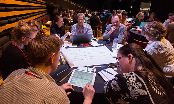
Proof I was there – taking part in a pair writing activity

Mental models help create empathy

In its simplest definition, a person’s mental model is the way they look at the world. It’s based on beliefs or assumptions about how things should work. Mental models are built up over time through experience. They are unique to an individual and change over time, as we gain more experience of different situations.

We can gain an insight into someone’s mental model through user research. This allows us to understand their motivations and concerns. It helps to create empathy and in turn, allows us to design content that meets their needs.

Use principles to drive content creation

Lauren Pope and Sarah Jones from Brilliant Noise shared a case study from their work with American Express to streamline content creation and reuse through an editorial hub. They aligned the work of multinational content production teams through a clearly defined purpose and set of principles.

The principle that stands out to me is this:

“Only AmEx can do this.”

It’s a bold statement about the importance of producing unique content. Something that I’m painfully aware of in the HE sector is the number of university websites that are just carbon copies of each other. Whenever we create new content for our sites we need to ask “what makes us unique?” and use that to tell a story.

Solve fewer problems better

This nugget of wisdom comes from Alex Watson, a product manager for BBC News. It’s pretty clear what it means, and I’m sure most of us would be likely to dismiss it as a given. And perhaps that’s the problem. We can get so swept along on a treadmill of things we need to get done, that sometimes we lose quality in the work we’re doing. I’m going to make a commitment to myself to do fewer things better. Will you join me?


Image credit: Paul Clarke on Flickr.

Share this post:
Share

A Quick Guide to… Bold

Bold text makes web pages easier to read and more SEO friendly.

You should use bold to highlight key phrases in your copy. There should be enough to help users scan the page, but not so much that it loses impact.

This quick guide will help to clarify why, when and how to use bold text.

Why to use bold

Nearly 80% of users will scan a web page before they read it; they’ll jump around the page, looking for things that catch their eye.

This means that content must communicate key messages at a glance, by drawing attention to important bits of information. One way to do this is to create visual pointers using bold text. The impression created by these visual pointers tells both humans and computers (like Google) what to expect from the rest of the content.

03geordi

To boldly go… Both humans and computers respond well to bold text.

When to use bold

You should bold text that:

  • communicates important information
  • emphasises key points
  • makes sense out of context
  • complements your titles and headings

You should avoid bolding:

  • entire sentences or paragraphs
  • too many individual words

Bold text can be used on pages and in news items.

How to use bold

Finish creating content for a page before you start adding bold to it. Then, pick out the most important pieces of information and make them bold.

An easy way to check if you’ve used bold effectively is to collect your bold phrases into one list. If you gave this list to a user, would they get the right impression about that page?

Share this post:
Share

10 Content Experts to Follow on Twitter

So, you’ve learned how to write for the web, manage media files and navigate T4. Now you’ve got the keys to your shiny new responsive website, you probably want to start creating some great new content to populate it with. This is a good time to delve a little deeper into the world of content design.

If you know where to look, social media can be a treasure trove of resources for those who write and design for the web. Following experts on Twitter is a great place to start, so we’ve rounded up 10 great accounts to share with you:

@katekiefer
As director of communications at Mail Chimp, Kate Kiefer Lee knows a thing or two about creating great content. She’s also co-author of one of our favourite books: Nicely Said, Writing for the Web with Style and Purpose.

@nicoleslaw
Nicole Fenton is a digital strategist, editor and a teacher at The School of Visual Arts in New York City. She’s the other half of the Nicely Said team.

@gerrymcgovern
If you’re wondering how to make your website users happy, Gerry McGovern is sure to have some good advice. He’s been consulting, speaking and writing about web content since 1994, and is widely regarded as a leading authority on customer experience.

@coschedule
The CoSchedule team produces a tonne of great resources for content managers (we love their handy Headline Analyzer). Follow them on Twitter to receive free guides, articles and tips.

@amythibodeau
Writer and strategist Amy Thibodeau is a pro when it comes to crafting great user interfaces. Ever thought about the tone and clarity of your error messages? How about the wording on your website’s nav buttons? Check out Amy’s Twitter feed and blog for some thought-provoking discussion.

@karenmcgrane
In her own words (and we certainly agree), Karen McGrane ‘makes the web more awesome’. She’s the author of Content Strategy for Mobile and Going Responsive, and co-host of the Responsive Web Design podcast.

@zeldman
Jeffrey Zeldman has been working on the web since 1995. His Twitter feed is a powerhouse of fascinating news and discussion. Aside from his own words of wisdom, Jeffrey shares articles from leading thinkers on the cutting edge of content strategy and web development.

@abby_the_IA
Struggling to make sense of a complex navigation system? Unsure where new information should go? Abby Covert is an expert when it comes to Information Architecture, and author of the book How to Make Sense of Any Mess. Follow her Twitter feed and blog for tips on how to improve the clarity and usability of your site.

@heydesigner
Hey Designer is a curated feed of resources for people who work on websites. From discussing the pros and cons of using icons instead of copy, to sharing top tips on writing words that SEO-bots will love – Hey Designer will populate your Twitter feed with an array of useful links.

@dlichaw
Writer, educator and consultant Donna Lichaw pioneers smart, simple methods that drive user engagement. She is the author of The User’s Journey: Storymapping Products That People Love. Follow her for advice on how to design digital content that’ll speak to your audience.

Anyone we missed out? Let us know in the comments below.

Share this post:
Share

Making New Year’s Resolutions for Our Websites

At the beginning of December I set the editorial team a little task; to come up with their new year’s resolutions for our websites. I gave no more guidance than that. Here’s what they came up with.

Introducing your content

Linda’s resolution is to write better introductions to content. She says:

“It’s so easy to slip into the lazy habit of just making the first sentence on the page into the introduction. And then not bothering to amend it.”

The introduction style is a new feature of our responsive design. It follows the title of a page and is a larger font size to help highlight it. It also comes with its own content standards, it should:

  • summarise the point of the page
  • be no more than 50 characters
  • be descriptive

Advice from the experts

We read lots of blogs, articles and books to keep up to date with what’s going on in the world of web content and design. This helps us to improve the University’s website for our users. We also use what we learn to develop the services we provide to our web editors.

Lisa says:

“My resolution is to come up with a systematic process for reading, collating and, most importantly, using the information I read to help inform our work.”

Content strategy

Jane’s not one to shy away from a challenge. Her resolution is to come up with a content strategy for the University website as a whole! We’re so used to thinking about the websites of schools and services as separate entities, we shouldn’t forget that they’re all part of the University website.

She says:

“We have a core content strategy for the Postgraduate website – now let’s tackle the rest!”

As if this weren’t enough we’ll also be looking at an overall tone of voice for University web content.

Housekeeping

My resolution is a bit of a backwards one – I’m taking a process I do well for websites, and applying it offline.

I’m meticulous about following our standards for file naming when it comes to documents and images I upload to the web. But I’m not very good at keeping on top of it in my computer’s documents folders. This year I want to change that.

This will not only help me to find files but also allow me to match up what’s online and where they’re saved elsewhere.

Health check

Anne’s resolution is to check her Siteimprove reports in January for broken links or misspellings which may have appeared over the Christmas break. And to keep on top of actions from these weekly reports throughout the year.

January might also be a good time to review the assets attached to your website (documents in particular) to make sure they’re all up-to-date. You can review assets using the Inventory function in Siteimprove.

Make your own resolutions

Now it’s your turn. What would you like to do differently this year? What tools or tips can you use to make your content management easier? Is there something you’d like to learn more about?

Follow our lead and make a resolution of your own. If you’re feeling brave, share it in the comments and we’ll check in to see how you’re getting on.

Share this post:
Share