A Quick Guide to… Heading Styles

There are several different headings available in T4. The style of these headings (font, size, colour) is part of our branded University web template. To comply with accessibility guidelines and the University style guide, they should always be used in a certain order.

Let’s take a look…


Page titles and introductions

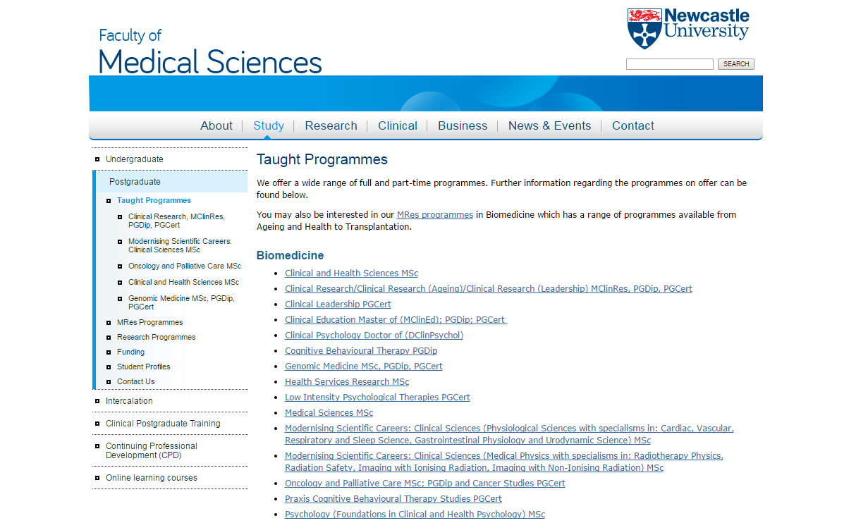
Every page on your website should have a title and an introduction. Both should be added using the 01. Page Title and Intro content type, and should look like this:

page-title-intro

An example from the School of English Literature, Language and Linguistics website.

In the case of masthead pages, the title and introduction are contained within the masthead image. Here’s an example on the Electron Microscopy Research Services site.

On tabbed pages, a page title should be added as usual, but introductions should be included on each individual tab. Here’s an example on the School of Modern Languages site.


General purpose content

There are different heading styles available in the 01. General Purpose Content content type. Across University websites each of the headings are the same size and font, but the colours will vary depending on the design of your website.

Heading 2 is the first sub-heading on a page. If you want to introduce a new topic you will need to add a new Heading 2 by adding a new piece of general purpose content.

Heading 3 is the first sub-heading following Heading 2. You would use Heading 3 to introduce information related to Heading 2, but that contains enough content to form a sub section of information. Then Heading 4 is used as a sub-heading following Heading 3 and so on.

This creates a clear hierarchy of information both to users and search engines.

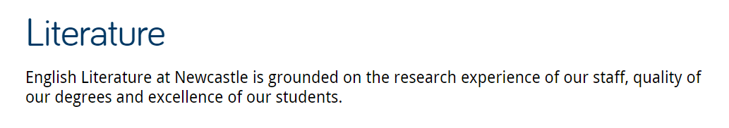
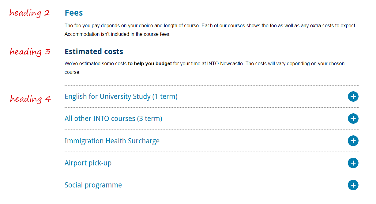
Headings in general purpose content will look something like this:

heading-styles

Heading styles in general purpose content.

You can use the same heading style multiple times on the same page. Use them to organise information in a clear, sensible way eg the first Heading 2 on the below page is followed by two Heading 3s:

headings

Example of a page using multiple headings to organise information

Headings should never be used as links. If you want to add an impactful link, use a Call to Action (CTA) button (the 08. Button content type).


Tabbed content

Titles in tabs are Heading 2. This means that all headings underneath them should be Heading 3 or smaller. Like this:

headers-tabs

Headings on a tabbed page.


Expandable content

The title text on expandable content defaults to Heading 3. It looks like this:

expandable-box

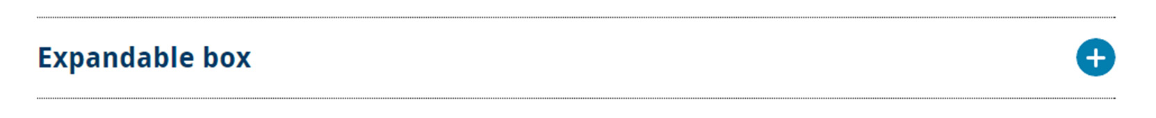
An expandable box using Heading 3.

If you use a piece of expandable content under a Heading 3, you should change it’s title to Heading 4. Like this:

expandable-heading4

An example from the International Preparation Courses website.


Related posts

For advice about writing good titles and introductions, see our quick guides on headings and introductions, and our tips for improving introductions and page titles.

Share this post:
Share

An Introduction to Information Architecture

In my post about our minimalist approach to the web, I said that you should respect your users’ time by only providing them with essential information, and by guiding them through your website in a helpful way.

The best way to do this is by having good information architecture.

Information architecture is about deciding how something is organised. It’s not just about where your content is, it’s about the placement and design of that content, and what message that sends to your users.

I think the best way to explain this is with an example…

Example

In this example from the old Faculty of Medical Sciences website, five postgraduate taught programmes appear as sub-menu items in the sidebar, while the rest appear as bulleted list items on the page.

An example of bad information architecture, from the Faculty of Medical Sciences website.

Some degree programmes appear as menu items in the left-hand navigation, others appear as links in the main body of the page.

In reality, there is no significant difference between these programmes, but the way they’re organised gives a false impression of hierarchy. It ascribes importance to the ones in the sidebar. Users could leave this page with the impression that the faculty values the programmes in the sidebar more highly than the ones in the list.

Here is the same page on the new Faculty of Medical Sciences website.

An example of good information architecture, from the Faculty of Medical Sciences website.

All degree programmes appear as links in the main body of the page. The list is separated by subject and ordered alphabetically.

All of the taught programmes are now listed in alphabetical order in the main part of the page. They all look equally important and they’re easier for the user to navigate.

The links take the user to the central postgraduate website. This fits in with our university-wide web strategy; creating a seamless browsing experience and ensuring that the user will receive the most accurate and appropriate course information.

For another example of how information architecture works, read Understanding information architecture via my bookshelf.

Benefits of good information architecture

Good information architecture aids the user journey. It helps people to navigate through your site in a way that makes sense, before arriving at the information they’re looking for.

Bad information architecture hinders the user journey. It confuses people by providing the wrong information at the wrong time, in the wrong place.

Information architecture also helps control the interpretation of your content, and communicate what you intend.

Websites with good information architecture are better for users because:

  • content is presented in a more useful and meaningful way
  • information is given at the appropriate point in the browsing experience
  • the browsing experience easier, more enjoyable and more intuitive

Websites with good information architecture also makes it easier to keep your website up to date, because new content can find a sensible home.

Next time

In my next post, I’ll be looking at the three elements of information architecture, and how they work together to create a great user experience.

I’ll also outline how you can create and maintain good information architecture using the tools we’ve given you.

Share this post:
Share

Less is More: Our Minimalist Approach to the Web

Since we started the Go Mobile process, we’ve deleted nearly 5,000 pages from university websites.

Many of these pages were out of date or duplicated content from elsewhere on the web. They were confusing our users by presenting information that had no currency or relevance. They were, essentially, digital clutter.

We have a minimalist approach to the web. We like simple websites that provide information quickly and efficiently by using clear language and an effective, uncluttered design.

“Some web designers mistakenly regard minimalism as a primarily aesthetic choice. They neglect the fact that the ultimate goals of minimalism are usability and economy – the ability to do more with less.”
Alan Smith, Usability Geek

This minimalist approach is better for users because it helps create websites that are helpful and easy to use. It’s also better for you, our editors, because it offers a formula for creating good content and a framework for prioritising information.

Here are some tips to help you approach your website with a more minimalist mindset:

Be simple and clear

In terms of both design and language.

Check our editorial and content guidelines for advice on how to write and edit for the web. Use readability tools (like Clarity Grader and the Hemingway app) to ensure your language is clear.

Focus on the essential

Your users want answers to specific questions. They should be able to find things quickly and easily, without being distracted by lots of unhelpful or irrelevant information.

“Essentialism is not about how to get more things done; it’s about how to get the right things done. It doesn’t mean just doing less for the sake of less either. It is about making the wisest possible investment of your time.”
Greg McKeown, Essentialism: The Disciplined Pursuit of Less

Treat your users’ time with respect – give them what’s essential so they can move on.

Eliminate the unnecessary

Everything on your website should serve a purpose.

The purpose could be anything from informing someone of a key date, to inspiring them with a great story. If you can’t figure out what the purpose is, it probably shouldn’t be there.

Images, videos and quotes should only be used when they support the core content of a page.

Foreground functionality

Bells and whistles can be great, but they should never compromise the functionality of a website. Design choices should help people navigate your site, not impede their journey by bombarding them with attractive but unnecessary elements.

Visit the demo site for advice on how to use content types and design new pages.

Make deliberate choices

As a web editor, you’ll receive lots of requests to add new content to your site. You need to make strong, thoughtful choices about what belongs there.

Lots of exciting things are possible in T4, and it’s easier than ever to upload new content to the web. But – to paraphrase Jeff Goldblum in Jurrasic Park – think more about what you should do, not what you can do.

Jeff Goldblum as Ian Malcom in Jurassic Park.

Fortunately, T4 is not able to recreate dinosaurs.

Share this post:
Share

Team Update: 26 September – 7 October

Campus has been really busy over the past few weeks, and our office has been no exception. We’ve been working hard to get our sites for Batch 5 finished and ready to go.

Go Mobile programme

Fen and Jane have been working on the websites for Conferences and Catering. They met with the hospitality team last week to talk through the new structure and identify where photography is required.

Fen also proofed the Biomedical Sciences website.

Emily has been busy doing the editorial work for Computing Sciences, and putting the final touches to Biomedical Sciences. She’s also proofed the Education, Communication and Language Science site.

Emma C has been working on the Events website.

Lisa has been busy doing the editorial work for GURU, and has proofed the Events website.

Steve built a brand new site for the National Centre for Energy Systems Integration (CESI), which was proofed by Linda.

We’ve launched eight new websites this afternoon:

Campaigns and other developments

Lisa has been supporting the School of History, Classics and Archaeology with some structural and  content developments on their site.

Fen has been helping the Marketing Team to update the social media listings on the Website Information and Feedback website.

Training and support

Lisa shared a quick guide to embedding videos on T4.

Anne ran a bespoke T4 session for the new Postgraduate Study website editors.

Emma C delivered media management training.

We’ve received 40 support requests through the NU Service Helpdesk and have resolved 26 of them.

Plans for the next few weeks

Next week, we’ll be starting on Batch 6 and celebrating the halfway point of the Go Mobile programme!

We’ve organised a team meeting to discuss strategy for calls to action.

Share this post:
Share

Team Update: 20 June – 1 July 2016

Go Mobile programme

We finished working on sites in batch two, with five sites going live on 24 June:

Lisa proofread the Faculty of Medical Sciences website. She also met with the editor for the new Medical Sciences Online Learning site. The editor is delighted with the site and is already planning ways to evaluate and develop the content.

Fen proofread the Medical Sciences Online Learning website. This week, she has been helping the editors in the Faculty of Medical Sciences to make some updates to their content.

Emily and Steve have been working on the School of Civil Engineering and Geosciences website, ready for go live today.

Jane and Emily have been putting the finishing touches to the Accommodation website. All members of the content team have chipped in to proof the site ready for go live today.

Fen and Linda have been working with the UG marketing team to develop new websites for Clearing and Clearing at Newcastle University London. Both sites will go live today.

Emma C has been working on the Business School website in T4, getting it ready to hand back to the NUBS marketing team for final accuracy checks.

Andrew has been working with the Institute of Cellular Medicine and the CardioVascular Research Centre on the initial stages of their website developments.

We’re continually reviewing our processes so we can be flexible and effective throughout the entire Go Mobile project. We held a ‘Sprint retrospective’ meeting on Wednesday to assess how things went in batch two, and identify where improvements can be made for future batches.

Design and technical developments

Catherine and Peter have been working on the design for some banners for our UG degree pages. The banners will link to the new Clearing website and will show which courses are available when Clearing opens in August. Catherine has also been preparing the colour schemes for the batch three sites.

Campaigns and other developments

Catherine is building a new research section for the Newcastle Academic Health Partners website.

Peter has been updating the goals in Google Analytics and adding additional button tracking for the Clearing campaign.

Emma C has worked with members of the Press Office and International Relations team to get statements from the University about the outcome of the EU Referendum onto the website.

Linda wrote a blog post about using Clarity Grader to improve the readability of a website.

Training and support

Four of the team attended a two-day Google Analytics training session to make sure we have everything set up correctly and are getting the most from our data.

Anne delivered T4 CMS Basics training.

Andrew delivered Media Management training.

Fen and Jane are preparing to deliver Planning and Writing Web Content training next week.

The whole team has been involved in planning our upcoming Web Editors Community event, taking place on Monday 11 July.

We’ve received 34 support requests through the NU Service Helpdesk and have resolved 18 of them.

Plans for the next few weeks

We’re beginning work on sites in batch three. Audits are in progress and site structures are being agreed. Next up is pre-migration work to get the sites ready to import into T4.

Share this post:
Share