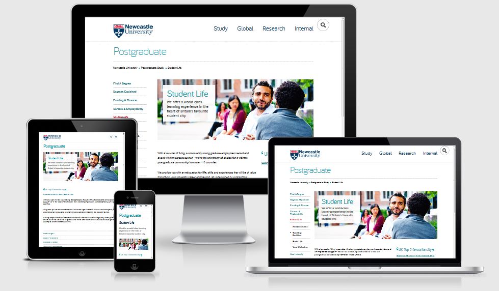
We posted an article earlier this year about user testing that the Corporate Web Development team undertook on the Postgraduate (PG) website. Our testing was completed a few months after go live, last October.
Since then, as part of the final stages of the PG website project, there has been a range of extensive evaluations run and co-ordinated by the Postgraduate Marketing Team.
From clarity tests of the content, use of Google Analytics, interviews, remote user testing by our PG target audience – even an externally-run expert review.
There was also a chance to review the new website against our competitors – well it would be rude not to…and anyway we had a clear content strategy to test:
“The new Postgraduate website will have audience driven, engaging content that inspires ambitious high-flying global students to make us their confident choice for PG study”
Headline results
Overall – the new website has performed excellently, with some outstanding feedback alongside some further ideas for development.
Which is great, since the PG website project has paved the way for all our Go Mobile work!
It’s important to note once a website has been launched and tested – that’s not the end. Actually it’s just the beginning; of making further improvements, developments, finding solutions to issues and continually trying to do the best thing for our users.
Read on to find out how we did…
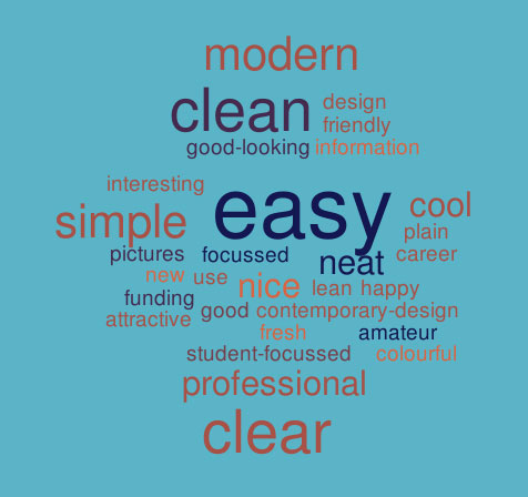
First impressions
The word cloud below shows first impressions of the PG site. The most popular words that users used to describe the site included: easy, modern, simple, clear, professional, clean and cool.
Website content
“Everything is very clear, the words actually stand out because the design of the site is very lean and clean cut…There are no useless pieces of information.”
User tester
- Ranked 1st or 2nd in comparison to competitor PG content according to Clarity Grader, a website content analysis tool
- An improvement in quality and consistency of content
- Users found the content clear, detailed, straightforward and organised and with good comprehension
- Test participants commented on the quality of course entries they found. Users specifically found the following useful:
- modules
- course delivery and duration
- facilities
- employment infographics and related courses
some future developments
- New content quality and consistency measures are being developed
- Continued focus on the use of terminology, ensuring the content is accessible by our key audiences
- Further development of supplementary information, scheduled by a web editorial calendar
- Develop stronger links between supplementary information and course information
Design
“Wow, this one’s layout is different, I like it, it’s colourful, it’s not boring”
User tester
- The design was well received in all testing
- Gives a great first impression to users
- Newcastle compares favourably in comparison to our competitors
some future developments
- User experience testing helped to influence our Go Mobile template design
- Further development of the PG homepage and the flow of information
- Developments to the course search call to action and visibility on the homepage
Course search/funding search
“This is amazing. I came here the last time and I don’t believe I could find things so easily. This actually shows that the website has improved and this is actually a very good filtering that the website has added to its system”
User tester
- Newcastle’s content performed well in comparison to competitor sites. One user stated they “strongly favoured the course navigation and content over Manchester”
- New course search was well received and proved to be the most used method of finding a course in comparison to the A-Z list
- The advanced search filters are being well used
- Tab layout of the course information on desktop was well received
- The new step-by-step guide was well received and recognised as providing useful information
Some future developments
- Further development of search filters to ensure accurate and precise results
- Development of additional tools to sort search results, eg by relevance, A-Z
- Streamlining of the course and funding search functionality across all devices
Calls to action
- Good to have recognisable calls to action
- Footer calls to action are used well
- Improvement in number of sessions resulting in the creation of a new (applicant) account
Some future developments
- Renaming of some calls to action for consistency
- Revising of placement of some calls to action
- More visible course start dates and application deadline where they exist
Navigation
- Users reported on the ease of navigation through the website
- Use of tabs on course profile pages are well received on desktop
some future developments
- Development of mobile menus: main menu; secondary menu; and tabbed menus
- Consistent application of hyperlinks – already addressed as part of ongoing development
- Review of the breadcrumbs design and functionality
Conclusion
So, has the new PG website been a measurable success? I would argue a resounding YES!
All the testing, evaluation and competitor analysis shows this is largely the case. Phew.
Back to the original plan then:
“The new Postgraduate website will have audience driven, engaging content that inspires ambitious high-flying global students to make us their confident choice for PG study”
Audience driven – Check. All content has been created, developed and designed with the user’s needs in mind.
Engaging content – Check. We’ve used new technology and design to enhance the user experience where appropriate; a mobile responsive design, new course search, infographics and videos to supplement course pages.
Ambitious high-flying global students – Time will tell. It’s hard to test or measure whether applicants are deciding to apply due to our marvellous new website. There are after all numerous other factors to influence an applicant – but still, shouldn’t we have an inspirational strategy to work to?
Find out more
If you’d like to learn more about the results of the PG user testing, and watch videos of the testing watch the Prezi online.
Read about our earlier user testing of the PG Website.