
Since we started the Go Mobile process, we’ve deleted nearly 5,000 pages from university websites.
Many of these pages were out of date or duplicated content from elsewhere on the web. They were confusing our users by presenting information that had no currency or relevance. They were, essentially, digital clutter.
We have a minimalist approach to the web. We like simple websites that provide information quickly and efficiently by using clear language and an effective, uncluttered design.
“Some web designers mistakenly regard minimalism as a primarily aesthetic choice. They neglect the fact that the ultimate goals of minimalism are usability and economy – the ability to do more with less.”
– Alan Smith, Usability Geek
This minimalist approach is better for users because it helps create websites that are helpful and easy to use. It’s also better for you, our editors, because it offers a formula for creating good content and a framework for prioritising information.
Here are some tips to help you approach your website with a more minimalist mindset:
Be simple and clear
In terms of both design and language.
Check our editorial and content guidelines for advice on how to write and edit for the web. Use readability tools (like Clarity Grader and the Hemingway app) to ensure your language is clear.
Focus on the essential
Your users want answers to specific questions. They should be able to find things quickly and easily, without being distracted by lots of unhelpful or irrelevant information.
“Essentialism is not about how to get more things done; it’s about how to get the right things done. It doesn’t mean just doing less for the sake of less either. It is about making the wisest possible investment of your time.”
– Greg McKeown, Essentialism: The Disciplined Pursuit of Less
Treat your users’ time with respect – give them what’s essential so they can move on.
Eliminate the unnecessary
Everything on your website should serve a purpose.
The purpose could be anything from informing someone of a key date, to inspiring them with a great story. If you can’t figure out what the purpose is, it probably shouldn’t be there.
Images, videos and quotes should only be used when they support the core content of a page.
Foreground functionality
Bells and whistles can be great, but they should never compromise the functionality of a website. Design choices should help people navigate your site, not impede their journey by bombarding them with attractive but unnecessary elements.
Visit the demo site for advice on how to use content types and design new pages.
Make deliberate choices
As a web editor, you’ll receive lots of requests to add new content to your site. You need to make strong, thoughtful choices about what belongs there.
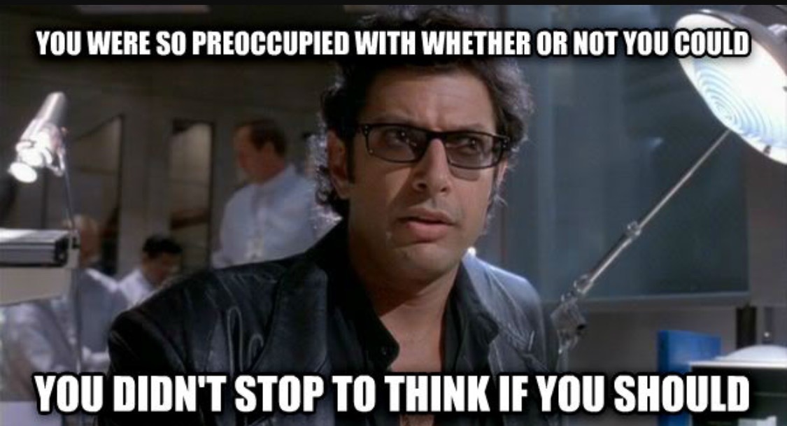
Lots of exciting things are possible in T4, and it’s easier than ever to upload new content to the web. But – to paraphrase Jeff Goldblum in Jurrasic Park – think more about what you should do, not what you can do.
Fortunately, T4 is not able to recreate dinosaurs.
