There are several different headings available in T4. The style of these headings (font, size, colour) is part of our branded University web template. To comply with accessibility guidelines and the University style guide, they should always be used in a certain order.
Let’s take a look…
Page titles and introductions
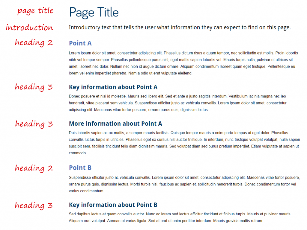
Every page on your website should have a title and an introduction. Both should be added using the 01. Page Title and Intro content type, and should look like this:
In the case of masthead pages, the title and introduction are contained within the masthead image. Here’s an example on the Electron Microscopy Research Services site.
On tabbed pages, a page title should be added as usual, but introductions should be included on each individual tab. Here’s an example on the School of Modern Languages site.
General purpose content
There are different heading styles available in the 01. General Purpose Content content type. Across University websites each of the headings are the same size and font, but the colours will vary depending on the design of your website.
Heading 2 is the first sub-heading on a page. If you want to introduce a new topic you will need to add a new Heading 2 by adding a new piece of general purpose content.
Heading 3 is the first sub-heading following Heading 2. You would use Heading 3 to introduce information related to Heading 2, but that contains enough content to form a sub section of information. Then Heading 4 is used as a sub-heading following Heading 3 and so on.
This creates a clear hierarchy of information both to users and search engines.
Headings in general purpose content will look something like this:
You can use the same heading style multiple times on the same page. Use them to organise information in a clear, sensible way eg the first Heading 2 on the below page is followed by two Heading 3s:
Headings should never be used as links. If you want to add an impactful link, use a Call to Action (CTA) button (the 08. Button content type).
Tabbed content
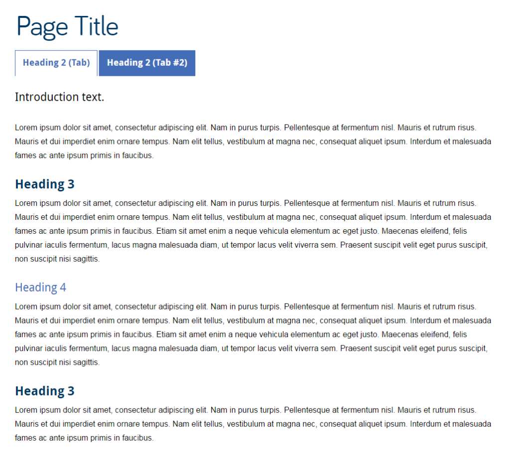
Titles in tabs are Heading 2. This means that all headings underneath them should be Heading 3 or smaller. Like this:
Expandable content
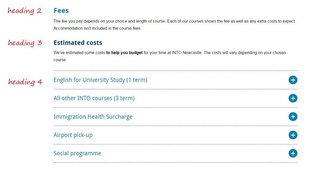
The title text on expandable content defaults to Heading 3. It looks like this:
If you use a piece of expandable content under a Heading 3, you should change it’s title to Heading 4. Like this:
Related posts
For advice about writing good titles and introductions, see our quick guides on headings and introductions, and our tips for improving introductions and page titles.


