Team update: 20 August – 2 September

The team’s not back to full capacity just yet due to holidays but there’s still been lots going on over the past couple of weeks…

Go Mobile programme

It was an exciting day yesterday as the first two sites in the programme went live: Information for Schools and Colleges and Open Day.

The Undergraduate site has been successfully tagged and migrated back into T4. Now the real fun begins: checking, fixing, and adding new content and images.

Proofreading of sites begins in earnest: The Law School, Institute for Social Renewal, Biology and Architecture, Planning and Landscape are all being checked to make sure they meet our content standards.

Design & Technical developments

We’ve been making last minute refinements to components and have been finalising the footer design for all sites in phase one.

Training and support

Last week Anne ran two workshops: a T4 CMS workshop for editors of Agriculture, Food & Rural Development and Athena SWAN websites, and the monthly Contribute workshop. She also ran a Site Manager session for editors of the Accommodation website.

We’ve received 35 support requests through the NU Service Helpdesk and have resolved 15 of them.

Campaigns and web developments

Lisa wrote a blog post about when to use expandable content, and has made some updates to the international pages of the Pre-Arrival site.

Linda wrote this month’s newsletter for the blog.

Plans for the next few weeks

September’s going to be a busy month for us as we get ready to launch the remaining sites in phase one of Go Mobile.

We’re also busy planning for phase two of the programme.

Share this post:
Share

Hide or Not to Hide…When to use Expandable Content

Expandable content, or an accordion as it is sometimes referred to, is a content type that allows you to show and hide information on a webpage.

When the content is collapsed it appears as a heading on the screen.

Expandable content (collapsed)

After the user clicks on the heading it expands to display hidden content.

Expandable content

Expandable content can be used on both desktop and mobile, or simply on mobile.

In our recent Go Mobile training, there were a few questions about when to use expandable content.

Let’s look at some of the advantages and disadvantages of this content type to help you decide when, or if, you should use expandable content on your site.

Helps reduce scrolling and provides an overview

Expandable content makes content more compact so it helps to reduce page length and scrolling. This is particularly beneficial for mobile devices, where reading is more difficult.

Expandable content also provides an overview of content on a page.

“The mini-IA provided by the accordions helps readers understand the structure of the page and lets them focus on the relevant pieces.”

Hoa Loranger Nielsen Norman group (NNg)

This helps your users decide more quickly whether your page contains the information they’re looking for, and again reduces scrolling.

Direct access

As pointed out by Raluca Budiu (NNg), expandable content also gives people direct access to information rather than forcing them to read content that may not be relevant to them.

This is really useful if you have some content that is specific to certain audiences.

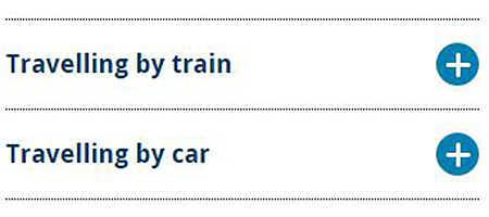
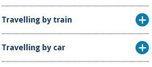
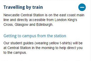
For example, we use expandable content on our Open Day website for the travel page. It works well for this content as people only need to expand the information relevant to them. If people are planning to travel to the University by train they’re not forced to read information about travelling by car and parking in the city.

Similarly, expandable content is used on our undergraduate website to display the range of qualifications accepted for undergraduate degrees. Prospective students only need to click to expand the qualifications that are applicable to them.

Extra click to access information

Giving users the choice to view content is useful, but can be problematic as they may choose not to view your content.

This means that content hidden behind an accordion may not be seen by your users.

An extra step is required to see the information. Headings and titles must be descriptive and enticing enough to motivate people to “spend” clicks on them.

Hoa Loranger (NNg)

Since content in an expandable box could be overlooked by your users this demonstrates that essential information should never be hidden.

It’s important that your main messages can still be understood, even if your users don’t click to view your expandable content.

Expandable content can also be frustrating to your users if they need to read all of the information on your page.

Forcing people to click on headings one at a time to display full content can be cumbersome, especially if there are many topics on the list that individuals care about.

Hoa Loranger (NNg)

Visual line on the screen

Another issue with expandable content is that it acts as a visual line on the screen.

We found, through user testing, that people often don’t expect content to follow expandable boxes and stop scrolling.

We therefore recommend using this content type near the end of your page if possible.

Summary

There’s no hard and fast rule about when to use expandable content. It’s use depends on the nature of your content and the audiences you’re writing for.

If content is audience-specific then expandable content is a good way to give users direct access to information that is most relevant to them – on both desktop and mobile.

Expandable boxes are also useful for secondary and supplementary content, particularly on mobile, as they save space and reduce scrolling. However, to encourage users to click expandable content it’s crucial that you’re headings are meaningful.

Use this content type sparingly – remember it’s an extra click for users to access hidden information.

If content is essential information and applicable to all of your users don’t hide it.

References

Hoa Loranger, Accordions Are Not Always the Answer for Complex Content on Desktops, Nielsen Norman Group (NNg), 18 May 2014

Raluca Budiu, Direct Access vs. Sequential Access: Definition, Nielsen Norman Group (NNg), 13 July 2014

Jakob Nielsen, Mobile Content Is Twice as Difficult, Nielsen Norman Group (NNg), 28 February 2011

Share this post:
Share

Team update: 23 July – 5 August

We’ve been a bit thin on the ground over the past couple of weeks, but there’s still been lots going on…

Go Mobile programme

Linda has been working on the specification for migrating the Undergraduate website into the responsive design in T4. Writing processes and planning the schedule for such a complex site is taxing to say the least.

Lisa has been carrying out post migration checks on the Institute of Neuroscience’s website to get it ready to hand over to the site editor. She’s also been working with the editor from the Open Day site to plan and edit content.

Design and technical developments

We’ve got boxes, grids and image sliders coming out of our ears. Work on the homepage designs for sites in Go Mobile has opened the flood gates. There are still some things to sign off but we’re getting close!

Training and support

We’re running weekly Go Mobile drop-in sessions to support those editors whose sites are part of the Go Mobile programme. If you’re busy editing your new site and have any questions or just need some dedicated time to work on your site feel free to pop along.

Thanks to all who’ve provided feedback on our T4 and Writing and Planning Web Content training. You’ve seemed to enjoy the sessions (so did we!) and have left armed with new ideas and plans for your websites.

We’ll be making some changes based on your comments like providing more targeted, shorter sessions. We’ll also be adding new training as we develop the responsive design and T4. Watch this space!

We’ve received 34 support requests through the NU Service Helpdesk and have resolved 22 of them.

Campaigns and web developments

Lisa has been re-structuring a section of the Sports Centre website.

Industry conferences, workshops & training

Emma C attended this year’s Institutional Web Managers Workshop. The two main themes were working in an agile way (and how this applies to content development) and developing a digital culture across the institution. She’s come away with lots to think about and we’ll see how we can implement some of it to improve the way we work.

Plans for the next few weeks

  • Designing and building homepages for the sites in Go Mobile
  • Checking and proofreading the new sites
  • Reviewing content standards for new content types
  • Running some Clarity Grader reports so the Postgraduate site editors can keep on top of their readability
Share this post:
Share

Improving your Web Content with Help from Google Analytics

Like many of our web editors, I found Google Analytics a bit daunting at first. The vast amount of information available made me think, where do I start? And how do I use and interpret the data?

Earlier this week Emma wrote about how our standard dashboard is a good starting point for analytics in her post How to Create a Customised Google Analytics Dashboard.

I’m going to take this further to focus on how we can use analytics to help evaluate and improve web content. To do this, I’ve looked at the standard dashboard for one of the sites in Go Mobile – the Undergraduate Open Day website. The data referenced is from 25 May to 28 June (about a month before the Open Days).

Read on to learn about my findings…

How visitors get to your site

The analytics show that around half of the visits (50.1%) to the site were made through a search engine, such as Google. This shows the importance of search engine optimisation (SEO). For advice on improving your SEO read our posts on search.

If we look at traffic to the site from social media the analytics show that the majority of visits via social networks came from Twitter. The Open Day team need to decide whether they want to concentrate efforts on the most popular social network or to focus on increasing traffic from other networks, like Facebook.

Keyword searches

Our standard dashboard shows keywords people searched for to get to your site, both in search engines and in the onsite search.

Some of the keywords identified for the Open day site were:

  • campus tours
  • medicine
  • law
  • accommodation

These words show the types of content visitors were looking for on the Open Day site. It’s therefore important that the site contains content on these topics, even if it’s just to provide some context and a link to further information on another University website.

The keyword search also shows the terms visitors are using to find this content. Using the language of your visitors increases the likelihood that they will find the information they’re searching for.

Most popular pages

As part of our Go Mobile training, we’re advising our editors to prioritise the content they’re editing on their website. To help identify which pages to prioritise we’re using an idea called the Core Model. This identifies pages where user tasks and business goals meet – these are the core pages of your website. You should focus your efforts on improving these first.

The main user task for the Open Day site is to book a place at the event, and the main business goal for this site is to increase Open Day bookings. The Book your Place page is therefore a core page of the site and the analytics supports this.

The most popular pages in this period were the Book your Place page, followed by the Open Day homepage and the Traveling to the University page.

Finding out which pages are most popular can help you to identify and prioritise core pages.

It’s important that you don’t take this data at face value though – just because a page isn’t popular doesn’t necessarily mean that the content isn’t important to yours users. Look again at the page. Is it easy enough to find? Does it use the language of your users? Does it contain all of the relevant information? Is the content engaging and clear?

Devices used to access site

The analytics show that 50.7% of visitors viewed the site on a desktop during this period.The remaining 49.3% were accessing the site via a mobile or tablet. This is in contrast to the Undergraduate website where 66.1% of visitors accessed the site via desktop during the same period.

Vistors to Open Day website by device type Vistors to Undergraduate website by device type

The split between desktop and mobile could be more equal for the Open Day site because it’s an event website. It is therefore used in a different way by prospective students. Visitors are more likely to quickly check key details on their phones when they are preparing for or travelling to the event.

This reinforces the idea that we need to write web content that translates across devices so that we don’t exclude any of our audiences.

Summary

What I’ve found about using Google Analytics is that it all comes down to what you’re trying to achieve with your site. This will inform what data you need to look at.

Analytics is a useful tool and can tell you a myriad of things to help improve your web content, but it’s always best to look at the data in context. If visitors aren’t engaging with a page or piece of content in the way that you expect don’t just write it off as unimportant. Instead think about why it might not be working, and whether you need to re-think the content or where it sits on the site.

Share this post:
Share

Why ‘Under Construction’ Notices are Bad Practice

In the early days of the web ‘under construction’ notices or animated construction worker images were common on websites if an organisation didn’t have any content to add to a page. These messages have fallen out of fashion but have been replaced by messages such as ‘coming soon’ or ‘information to follow’.

The terminology and formatting of this message may have changed, but the outcome is the same – a dead end for users.

under construction notice

A dead end for users

Imagine a prospective student has clicked through to a page on your website expecting to find something out. Instead of an answer or information to help them complete a task, they are greeted with nothing more than an ‘information coming soon’ message.

How do they feel? Disappointed and frustrated. What do they do? They leave.

Perhaps they come back at a later date to check if the page has been updated but it’s more likely they will go somewhere else to find the information they need or worse… go to a competitor’s site.

People generally go to a website to find an answer to a question or to complete a task. An ‘under construction’ notice doesn’t tell your customer anything and is therefore a waste of their time.

Damage to credibility

‘Under construction’ notices can also damage the credibility of your website. They make the page look sloppy and unfinished. This consequently reflects badly on the organisation, giving the impression that the organisation is uncommitted and unprofessional. It could also mean that users don’t trust the other information on your site.

Bad for SEO

Search engines also respond badly to ‘under construction’ pages. If there’s no content on a page the search engine won’t rank it very highly.

Worse, if the page has a meaningful title containing key words that people are searching for, it may come up in search results. Your reader goes to read more on the page only to discover that it contains no content. This is harmful to your organisation’s credibility.

Solutions when waiting for content

If it’s business critical to advertise something (eg funding opportunities or a new research facility) before the full details are available you should add relevant information rather than a blank page. To do this, you should:

  • think about the information you already have about the funding, research facility etc
  • add relevant signposting to another site if appropriate
  • include contact details for questions until the content can be added to the site
  • update with further information as soon as it is available

Final thoughts

Finally, if you don’t have any meaningful content to add to the site don’t add a new page. A blank page or a page with irrelevant information is more harmful than excluding information altogether. You wouldn’t publish a brochure containing a blank page with a generic ‘coming soon message’, so the same rules apply to the web.

Visit our website for help on planning web content (University login required).

Image credit: Under Construction Grunge Sign by Nicolas Raymond, www.freestock.ca, licensed under CC BY 3.0

Share this post:
Share