Do Your Users Interact with Dynamic Content?

Every now and again I go off on a little rant. My team’s used to it. They humour me. And thankfully, mostly, nod and agree. Or at least see my point of view. When they gave me the power to write posts here, I wonder if they thought my rants would spill over for all the world to read.

Today you’re party to a rant about carousels, image sliders and rotating banners. Call them what you will, they’re all the same – dynamic content. Dynamic content is frustrating, because content is hidden as the thing moves.

Dynamic content is largely ignored by people who come to your website to complete a task. That’s what people use websites for, you know, to find answers to their questions.

Why I don’t think you need a carousel

I have some stats to back up the theory that dynamic content is not as effective as static content.

Stats? Hmmm, maybe this is the point when a rant stops being a rant and becomes a reasoned argument.

From 3 to 17 August on the University homepage we had numerous messages relating to Clearing. Some were in the rotating banner. Some were in the static content of the page. We have tracking set up on all the links in both of these locations.

Over the two week period:

  • the banner messages were clicked 2849 times
  • the static content links were clicked 9635 times

The analytics show that our users are 3.4 times more likely to click the links in static content than they are to click links in the banner.

Why might this be the case?

There’s a lot of research from the higher education sector that confirms that carousel interactions reduce as you move through the features. So the item in position one gets most clicks and the number reduces as the banner rotates.

User research conducted by Nielson Norman supports the argument that carousels reduce the visibility of your content. A user was given a task on a site where the answer appeared in a carousel. She failed to complete the task because “the panel auto-rotated instead of staying still”.

So dynamic content like carousels hide content, and the answers to your users questions. In contrast, static content is always visible to your users.

Why you think you need a carousel

I would be rich if I had a pound for every time someone told me they wanted a carousel on their website because they:

  • look nice
  • make the page more inviting and more attractive to users
  • showcase our best assets

Let’s go back to what people come to your website for – to answer a question. Now, ask yourself – do any of the reasons given above help a user to complete a task?

If you still need convincing that carousels aren’t great, just take a look at Jared Smith’s website Should I Use a Carousel?

Creating content that answers user questions

So after telling you that you need content that answers users questions, here’s some guidance to help you plan and write effective content (University login required).

Share this post:
Share

Hide or Not to Hide…When to use Expandable Content

Expandable content, or an accordion as it is sometimes referred to, is a content type that allows you to show and hide information on a webpage.

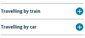
When the content is collapsed it appears as a heading on the screen.

Expandable content (collapsed)

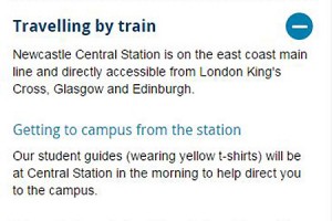
After the user clicks on the heading it expands to display hidden content.

Expandable content

Expandable content can be used on both desktop and mobile, or simply on mobile.

In our recent Go Mobile training, there were a few questions about when to use expandable content.

Let’s look at some of the advantages and disadvantages of this content type to help you decide when, or if, you should use expandable content on your site.

Helps reduce scrolling and provides an overview

Expandable content makes content more compact so it helps to reduce page length and scrolling. This is particularly beneficial for mobile devices, where reading is more difficult.

Expandable content also provides an overview of content on a page.

“The mini-IA provided by the accordions helps readers understand the structure of the page and lets them focus on the relevant pieces.”

Hoa Loranger Nielsen Norman group (NNg)

This helps your users decide more quickly whether your page contains the information they’re looking for, and again reduces scrolling.

Direct access

As pointed out by Raluca Budiu (NNg), expandable content also gives people direct access to information rather than forcing them to read content that may not be relevant to them.

This is really useful if you have some content that is specific to certain audiences.

For example, we use expandable content on our Open Day website for the travel page. It works well for this content as people only need to expand the information relevant to them. If people are planning to travel to the University by train they’re not forced to read information about travelling by car and parking in the city.

Similarly, expandable content is used on our undergraduate website to display the range of qualifications accepted for undergraduate degrees. Prospective students only need to click to expand the qualifications that are applicable to them.

Extra click to access information

Giving users the choice to view content is useful, but can be problematic as they may choose not to view your content.

This means that content hidden behind an accordion may not be seen by your users.

An extra step is required to see the information. Headings and titles must be descriptive and enticing enough to motivate people to “spend” clicks on them.

Hoa Loranger (NNg)

Since content in an expandable box could be overlooked by your users this demonstrates that essential information should never be hidden.

It’s important that your main messages can still be understood, even if your users don’t click to view your expandable content.

Expandable content can also be frustrating to your users if they need to read all of the information on your page.

Forcing people to click on headings one at a time to display full content can be cumbersome, especially if there are many topics on the list that individuals care about.

Hoa Loranger (NNg)

Visual line on the screen

Another issue with expandable content is that it acts as a visual line on the screen.

We found, through user testing, that people often don’t expect content to follow expandable boxes and stop scrolling.

We therefore recommend using this content type near the end of your page if possible.

Summary

There’s no hard and fast rule about when to use expandable content. It’s use depends on the nature of your content and the audiences you’re writing for.

If content is audience-specific then expandable content is a good way to give users direct access to information that is most relevant to them – on both desktop and mobile.

Expandable boxes are also useful for secondary and supplementary content, particularly on mobile, as they save space and reduce scrolling. However, to encourage users to click expandable content it’s crucial that you’re headings are meaningful.

Use this content type sparingly – remember it’s an extra click for users to access hidden information.

If content is essential information and applicable to all of your users don’t hide it.

References

Hoa Loranger, Accordions Are Not Always the Answer for Complex Content on Desktops, Nielsen Norman Group (NNg), 18 May 2014

Raluca Budiu, Direct Access vs. Sequential Access: Definition, Nielsen Norman Group (NNg), 13 July 2014

Jakob Nielsen, Mobile Content Is Twice as Difficult, Nielsen Norman Group (NNg), 28 February 2011

Share this post:
Share

Time and the 24 Hour Clock – Editorial Style Update

We’ve recently updated our editorial style guide to reflect a change in our content standard relating to time.

We’re now using the 24 hour clock to represent times on our website. We find it’s better for international audiences and for displaying time in lists and tables.

See the full update to our editorial style guide on our website (University login required).
Share this post:
Share

How Meaningful Titles and Descriptions Engage Site Visitors

As we move into our responsive design (and T4), we’re introducing ways to make our content work better for mobile and tablet users.

This means that our editors are changing the way they write web ‘pages’.  In fact, let’s scrub that. The web page doesn’t exist anymore.

You are not writing for desktop.

The way the content looks on your computer, in your browser, is not the only way that it will look.

Writing for our new responsive design

Some of our new content types have different behaviour depending on where they are used.

You should always check your content on other devices (or use this handy responsive design emulator).

Titles and navigation

Titles as a style aren’t new, but are important when writing content for smaller screens. They might be the only thing your reader sees. They can also appear as navigation and part of search results.

It’s important that what you write makes sense out of context.

News items called ‘Congratulations’ and sections called ‘Additional Information’ aren’t going to encourage people to read more.

Teaser content

We’ve introduced teaser content into some of our new content types. It’s used here as the text overlay on the Masthead.

An example masthead style of content. Full width image with text overlay.

It’s important that it’s meaningful. It should summarise the page content as it displays in this order on mobile:

Masthead shown on mobile. Overlay text shows first on the page. the image flows second.

This content could be the difference between someone reading the page or going somewhere else.

Descriptions

We’ve used descriptions in news and events for years:

description-news-list

Adding a short description to the news content types doesn’t appear on the news article page. It does appear in all sorts of other places where news is syndicated:

  • News grids
  • News lists

This micro content acts to entice your site visitor to read more – it needs to work for you.

This example is vague:

  • Title: Call for Papers
  • Description: Submit now

This example gives some context, you know if it’s for you and if it is, you want to read more:

  • Title: Call for Papers: Environmental Planning
  • Description: Submissions close on 31 October. The School encourages researchers to read the submission requirements.

Introductions

We’re aiming to make sure all core pages to have an introduction. The intro style works well on mobile. It pulls out (and styles differently) the first piece of content.

We recommend a focused 50-word statement about what the page covers. It helps users decide whether to read more. (50 words sit well as a chunk of content viewed on most mobile screens.)

Expandable/mobile collapse

We’ve a new expandable content style that allows us to hide content. Users have to choose to select to read the content – they can’t see it at a glance.

This means that the heading you choose for the content is important:

Example expandable content - users have to click to see more.

We don’t want to see vague terms like ‘More information’, ‘Additional details’, ‘Other’.  If the content contains details about your facilities call it ‘Facilities’ or even better ‘Libraries and laboratories’.

Using terms that are more specific, help your readers find what they need.

Write chunks of content

We’ve had some comments about how it feels more complicated and takes longer to build up web content.

Writing for mobile forces you to think about the order of your message.

We could have slapped a responsive template on your desktop-focused content. If content was too long we could have hidden it in expandable boxes (or truncated lengthy titles).

The page would still look okay on desktop (it wouldn’t work very well on mobile).

Rewriting your content and thinking about how people read on mobile, makes sure your users don’t get a sub-standard experience.

Everyone who wants to read your message, can.

Get in touch

Let us know if you need help in reworking your content (University Login required) or post questions in the comments.

Share this post:
Share

Find Content Inconsistencies Quickly and Easily using Siteimprove Policy

Use of consistent language and terminology helps to raise the reputation of your website.

We have content standards and style guides in place for the University.

But, with over 100 websites and many editors, communicating and maintaining standards is a challenge.

We use Siteimprove, a quality assurance software, to help us find and fix broken links and misspellings on our websites.

Use Siteimprove Policy to remove unwanted content

Siteimprove also has a Policy function that we’re using to inform our editors about:

  • terms we don’t want on the website – such as ‘click here’
  • content changes – eg name of an Academic Unit or Service, or highlighting content that has changed its address
  • reinforcing a standard term – eg Newcastle University not University of Newcastle upon Tyne

Siteimprove does the hard work of finding and listing the content that needs fixing. This makes it easy for editors to follow our content standards.

If you’re a University web editor already using Siteimprove you can start using the Policy tab today.

How it works

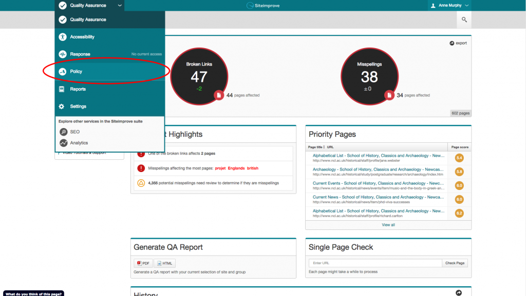
You can find the Policy tab in the Services drop down menu:

Siteimprove - how to find the Policy  function

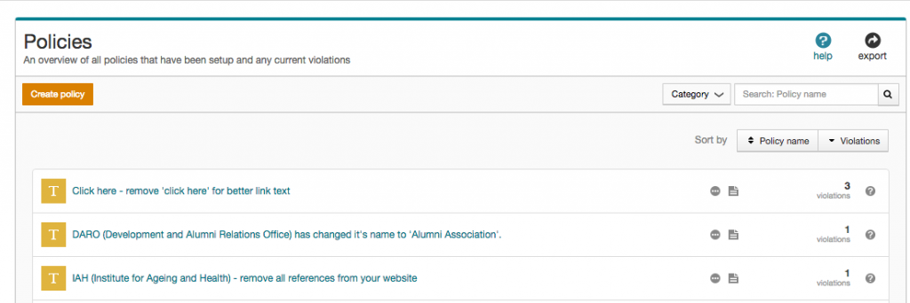
Here you’ll find a list of policies created by the web team, and the number of violations on your website:

Policies list in Siteimprove Web Governance Software

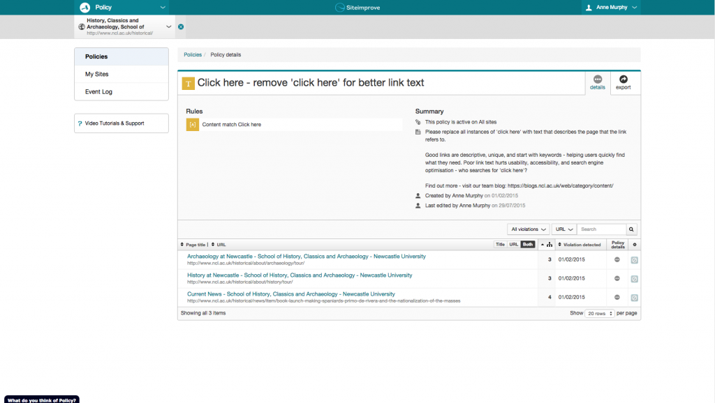
Clicking on a policy description reveals:

  •  a policy summary
  • advice on what the editor needs to do
  • list of all pages where a violation occurs

Siteimprove policy summary and location of violations

You know where the errors are, now let’s get those violations down to zero!

Create your own policies

You can create local website policies for terms that are specific to your content. View the Siteimprove Policy video tutorial to get started.

Access to Siteimprove

Request access to Siteimprove (University Login required) to get started on your website content clean up.

Share this post:
Share