A Brand New Mobile World: Case Study of Central Sites

Phase 1 of Go Mobile is now complete and we thought it timely to do a little show and tell of what we’ve been up to with this Go Mobile malarkey.

Two of our central sites to get the Go Mobile treatment were Research and About. These are clearly important sites for a research-intensive Russell group university, like Newcastle. These sites should showcase our achievements, but also need to explain some complex strategic content.

So they need to be able communicate effectively, but now with the added requirement of working just as well for smaller mobile devices.

We’ve posted previously about what Phase 1 of Go Mobile entailed and also talked about new ways we have of doing things, so here I’ll showcase some new layouts.

This post will focus on a core page on the Research website and the homepage for the About website. I’m going to include screen shots of the sites before and after Go Mobile, and explain why we’ve done these developments.

Research website

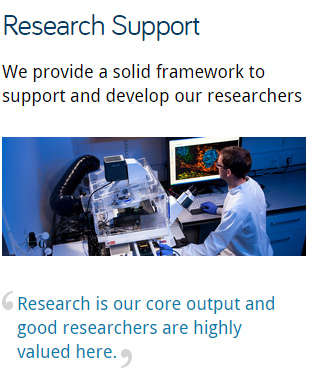
Take a look at the old Research Support section, one of the core pages of the research site:

Screenshot of old Research Support page on desktop 
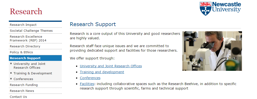
The page is quite informative and clearly formatted (short paragraphs and a bulleted list of hyperlinks) but not really engaging. It’s also not visually impressive, with only a small image to the right of the content.

Now look at the new Research Support section:
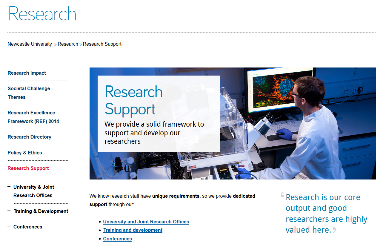
Screenshot of new Research Support page on desktop.Note the:

  • new ‘masthead’ design for section landing pages
  • big impactful image to set the scene
  • new teaser text overlay on the image to help introduce the section
  • quote to substantiate our claims
  • use of bold to emphasise key messages in content
  • content written for mobile; direct, informative with relevant hyperlinks

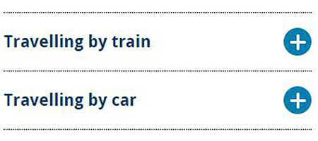
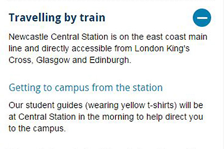
Now, take a look at the new page on mobile:

Screenshot of Research Support page on mobile The page title clearly indicates the topic of this page and the teaser text is now used as an introduction to the page. This helps you quickly understand which page you are visiting.

The content is split into ‘blocks’ that can re-stack on mobile. The priority of content has been optimised; the image re-sizes and drops under the text.
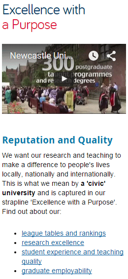
About website

Here you can see the old About homepage:
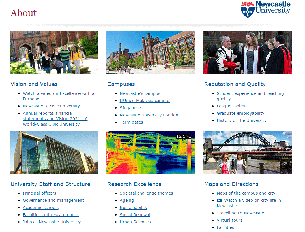
Screenshot of the old About homepage on desktopYou can see that:

  • boxes are built for top tasks, so people can find the most popular pages quickly
  • there are links under each top task box to pages within that section
  • images are small
  • there are no key messages
  • the page is not very inspiring…

On mobile, this old page simply shrunk a bit to try to fit your mobile screen (but not very well) as it was not mobile responsive.

Now compare the new About homepage on desktop:
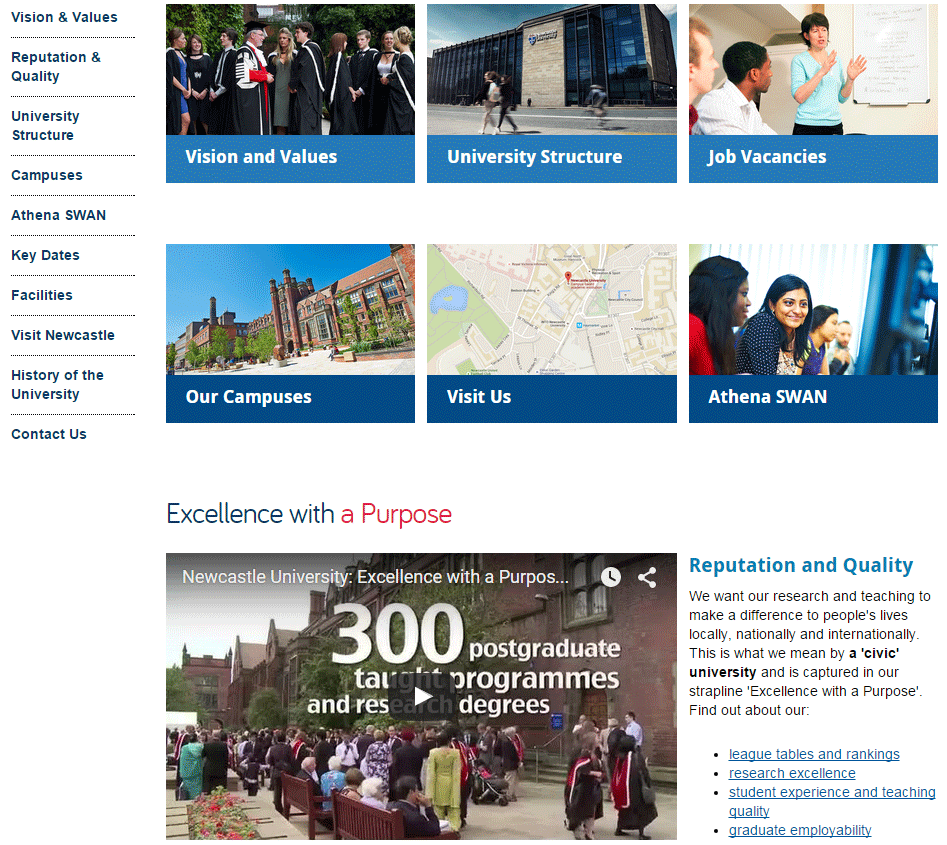
Screenshot of the new About homepage on desktopNote the:

  • top task boxes are still in use, to help people find what they are looking for
  • side menu is now visible to help with navigating the site
  • larger images are used to enhance the page
  • subheadings to help introduce content, and put it in context
  • use of video to help support our key messages

And see it on a mobile screen:
Screenshot of a section of the About website's homepage on mobile (showing website title and top task boxes)Screenshot of a section of the About website's homepage  on mobile (showing video and text)

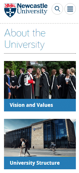
The new page re-stacks all content for mobile, including video. All content, including images and video re-size to fit your mobile device.

We’ve improved section naming ‘About the University’ rather than ‘About’ helps give people more context of which site they are on and where they are in the site.

The hamburger menu at the top gives access to the secondary navigation (the side menu on desktop).

We’ll keep you posted!

Now, prepare yourself – as we move onto Go Mobile Phase 2 more things will change.

Not only will other websites get the Go Mobile deluxe treatment, but we are still developing the technology, how we do things – constantly testing and improving what we’ve already done.

You can always keep an eye on what we’re up next to with our fortnightly updates.

Share this post:
Share

Go Mobile: the Story So Far

Our Go Mobile programme is up and running: 17, yes 17 (!) sites went live in September.

Phase 1 (our ‘beta/test/is this even possible’ phase) was a success. And because of this, we’re going to carry on and put the rest of our external-facing website through the programme.

Go mobile explained

Go Mobile is a project to make our website mobile responsive. This means it works on desktop computers as well as tablets and mobile phones.

But we’re not making things easy for ourselves. As well as adding a responsive design we’re also:

  • improving content – rewriting for mobile
  • updating assets – our new design needs higher quality images to support content
  • moving to a new content management system (TerminalFour – T4)

You can see some examples in action:

Oh no! Why have they changed everything?

Some of our feedback, particularly from University staff, has been unhappiness that we’ve changed or moved things. Remember we’re doing this for the greater good!

Our websites now work just as well on mobile as on huge desktop screens. Go Mobile is about improving access for all.

Key developments cover navigation, design and content

NAVIGATION

How you move through pages needs to be simpler and easier for mobile (smaller screens). Navigation is improved for those using desktops too. We’ve made sites shallower and removed redundant content.

DESIGN

Design enhances your website but doesn’t rule it. We’re always thinking about what our users want from the web content. For example, we’ve made sure that images are impactful and support our messages. But we’ve made sure that our template prioritises for you: on mobile, images shrink and drop under content.

Content

Text for mobile is written in short, easy to read paragraphs.  This helps when it’s stacked for smaller mobile screens.

We’ve also introduced styles like the introduction which helps to focus the point of the content on the web page. It’s allowed us to firm up our content standards. A paragraph should be around 20 words because this works better on mobile.

Even though this is part of writing for the web/writing for mobile, a lot of our changes are just about good writing generally.

So, how did we do it?

By magic of course! Well actually, a whole lot of design, technical and word wizardry.

We worked closely with colleagues in our IT Service (NUIT) as well as those in schools, faculties and central services.

We developed a brand new suite of training for our web editors. This covers editing in the new system, writing for the web, defining site objectives and using media (images and videos). We also introduced various tools to help you evaluate and improve content.

Find out what our web editors thought of the Go Mobile process.

Next steps

There are exciting times ahead. We’re turning attention to Phase 2. This is where we take the rest of the external website through Go Mobile. We’re planning to do this between January and December 2016.

It’s going to mean a lot of change for the team:

  • Agile ways of working
  • focused, time-bound project cycles to get through all the sites
  • extra staff
  • new office space

It’s going to mean a lot of commitment from our faculties and services. We need staff dedicated to developing their websites working with us and giving time for training on writing best practice and the new content management system.

We’d love to hear your comments on what we’re doing. Either comment here or use our feedback form.

Share this post:
Share

Reflections on Go Mobile Training – a Guest Post by Ivan Lazarov

This is the second in a series of posts giving you an insight into the Go Mobile programme from the perspective of a web editor.
Ivan Lazarov
Ivan Lazarov is a Public Relations Assistant in the Press Office. His work involves a range of projects, including the International Research Impact campaign, raising awareness of the outstanding work carried out at the Careers Service, helping promote entrepreneurship stories, developing publicity opportunities in India and creating video content.

As part of Go Mobile he is editing the Press Office and Research websites.


Key take-aways from Go Mobile training

I changed my attitude towards creating and publishing content thanks to the Go Mobile training. It helped illustrate the importance of a structured approach prompted by the evolving media production and consumption. Starting with analysing the website data, through to having a hard look at your content to some great tips and ideas. The training covered all aspects that help publishers deliver key messages and engaging content.

I learned a lot of new skills, but I must admit that I still need to look at cheat sheets when editing. Hopefully, this will change soon. The Top 5 Tips for writing for the web are excellent. I refer to them even when I’m not creating web content – they are a useful when I write press releases and internal newsletter articles.

The Hemingway App and headline analyser tools are interesting and I try to use them to streamline my content when possible. I also use Fotor to crop photos and do other minor editing when I don’t have Photoshop available. I highly recommend all of these tools.

The training is hands-on, with plenty of examples and scenarios to work with – I really enjoyed that. Also, the small-group dynamic ensured that all participants were engaged throughout the session. The exercises (not intended to put you on the spot!) helped us put the training into context and align it with what we do every day.

Getting stuck in to editing

The T4 training has been essential to help me get up and running. I’ve edited a number of pages within the Research website and the training is now helping me better understand the development of the Press Office website. Once the Press Office website goes live, we’ll be using T4 all the time to publish press releases and multimedia content.

The Writing for the Web training is helping me craft content that will be fit for the new content types and users’ expectations. As I mentioned, it has helped me optimise the way I write in general.

Advice for other Go Mobile editors

Try to put the training in context and ask lots of questions. The Web Team are friendly and very helpful. Also, use the opportunity to talk to the other editors and exchange ideas.

Don’t worry about taking too many notes – I am a profuse note taker, but the Web Team have produced detailed guides which include everything you need to know and can be used as a reference once you hit the ground running.

Ongoing support from the web team

The web training team run regular drop-in sessions for Go Mobile editors. They also provide space for editors to work when they need some quiet time. I think this is great and recommend you to make use of it.

When I come across any issues, I talk to the Web Team and get them sorted out right away. Many thanks! For me, the support available is more than enough.

Share this post:
Share

The Experience of a Go Mobile Editor – a Guest Post by Fiona Simmons

Fiona SimmonsThis is the first in a series of posts giving you an insight into the Go Mobile programme from the perspective of a web editor.

Fiona Simmons is the Institute Clerical Assistant at the Institute for Social Renewal. Along with the Institute Administrator she is responsible for the Institute’s website, blog and social media channels.


The first step – Go Mobile training

As soon as my colleague and I sat down to fill in our ‘site purpose’ exercise we knew that Go Mobile was going to be a good thing for our website. A few diagrams and coloured pens later, we had identified:

  • our core pages
  • our main user tasks
  • the business goals that we were to aim towards

At the planning and writing web content session it was brilliant to crystallise our thinking on what the Social Renewal website could do better if we gave our content a makeover.

The next training session, on editing in T4, was totally different. It took us from what was ideal and essential to what was possible. With new types of content available, it became clear how we could practically carry out our plans for a re-vamp. I went into this session with a great keenness to find out how to add link buttons, but I learnt much more!

I’d been looking forward to seeing how the new mobile responsive websites would look but was worried that our website would be the one that it just wouldn’t work for. When I’d finished the training, I realised that the team has a great understanding of our needs as an Institute. And the flexibility in the system would allow us to create content that was more consistent, usable and effective.

I loved getting a chance to practice re-writing content so that it is concise and clear, and working out the best way to structure a page.

We left the training with loads of ideas for the Social Renewal site, and so many options for how we could take it forwards. Of course, with all that enthusiasm comes a health warning.

It takes invested time to bring all this together. The main time-suckers are sourcing new images and re-imagining your site structure to reduce its depth. It’s worth it, and it’s rewarding, but the following will be useful:

  • Fotor.com – for resizing your images
  • Hemingway Editor – plug your written content in and see what comes out
  • content templates – figure out your primary message, secondary message and supporting content
  • a content calendar – use this to plan your web updates alongside your business calendar

Putting what we learned into practice

Now that the training has sunk in, we’re gearing up to have a re-think of our site content. We’ll use the templates that we’ve been given by the Corporate Web Team. In the meantime, just to tidy up our pages, I’m using lots of different types of new content, from social media buttons to tabbed pages.

When I’m looking at a page, I’m now constantly thinking of:

  • the user’s task
  • the business goal that I want to direct the user towards
  • why we want them to visit our page

I can already see the improvements.

If you haven’t experienced T4 (the new content management system) before, then my top tip is to have a play in the system as soon as you have access. You’ll quickly see the new flexibility you have, and the opportunity to re-configure your site in a meaningful way, using the resources provided. If you have used T4 before, as I had, it’s all the freedom with none of the frustration!

My next step is to work with the rest of my team in the Institute for Social Renewal to make our website showcase our activities in the best way it can. We’re very excited for our colleagues to see the finished result!

Share this post:
Share

Hide or Not to Hide…When to use Expandable Content

Expandable content, or an accordion as it is sometimes referred to, is a content type that allows you to show and hide information on a webpage.

When the content is collapsed it appears as a heading on the screen.

Expandable content (collapsed)

After the user clicks on the heading it expands to display hidden content.

Expandable content

Expandable content can be used on both desktop and mobile, or simply on mobile.

In our recent Go Mobile training, there were a few questions about when to use expandable content.

Let’s look at some of the advantages and disadvantages of this content type to help you decide when, or if, you should use expandable content on your site.

Helps reduce scrolling and provides an overview

Expandable content makes content more compact so it helps to reduce page length and scrolling. This is particularly beneficial for mobile devices, where reading is more difficult.

Expandable content also provides an overview of content on a page.

“The mini-IA provided by the accordions helps readers understand the structure of the page and lets them focus on the relevant pieces.”

Hoa Loranger Nielsen Norman group (NNg)

This helps your users decide more quickly whether your page contains the information they’re looking for, and again reduces scrolling.

Direct access

As pointed out by Raluca Budiu (NNg), expandable content also gives people direct access to information rather than forcing them to read content that may not be relevant to them.

This is really useful if you have some content that is specific to certain audiences.

For example, we use expandable content on our Open Day website for the travel page. It works well for this content as people only need to expand the information relevant to them. If people are planning to travel to the University by train they’re not forced to read information about travelling by car and parking in the city.

Similarly, expandable content is used on our undergraduate website to display the range of qualifications accepted for undergraduate degrees. Prospective students only need to click to expand the qualifications that are applicable to them.

Extra click to access information

Giving users the choice to view content is useful, but can be problematic as they may choose not to view your content.

This means that content hidden behind an accordion may not be seen by your users.

An extra step is required to see the information. Headings and titles must be descriptive and enticing enough to motivate people to “spend” clicks on them.

Hoa Loranger (NNg)

Since content in an expandable box could be overlooked by your users this demonstrates that essential information should never be hidden.

It’s important that your main messages can still be understood, even if your users don’t click to view your expandable content.

Expandable content can also be frustrating to your users if they need to read all of the information on your page.

Forcing people to click on headings one at a time to display full content can be cumbersome, especially if there are many topics on the list that individuals care about.

Hoa Loranger (NNg)

Visual line on the screen

Another issue with expandable content is that it acts as a visual line on the screen.

We found, through user testing, that people often don’t expect content to follow expandable boxes and stop scrolling.

We therefore recommend using this content type near the end of your page if possible.

Summary

There’s no hard and fast rule about when to use expandable content. It’s use depends on the nature of your content and the audiences you’re writing for.

If content is audience-specific then expandable content is a good way to give users direct access to information that is most relevant to them – on both desktop and mobile.

Expandable boxes are also useful for secondary and supplementary content, particularly on mobile, as they save space and reduce scrolling. However, to encourage users to click expandable content it’s crucial that you’re headings are meaningful.

Use this content type sparingly – remember it’s an extra click for users to access hidden information.

If content is essential information and applicable to all of your users don’t hide it.

References

Hoa Loranger, Accordions Are Not Always the Answer for Complex Content on Desktops, Nielsen Norman Group (NNg), 18 May 2014

Raluca Budiu, Direct Access vs. Sequential Access: Definition, Nielsen Norman Group (NNg), 13 July 2014

Jakob Nielsen, Mobile Content Is Twice as Difficult, Nielsen Norman Group (NNg), 28 February 2011

Share this post:
Share