An Introduction to the Language of T4

Through the Go Mobile programme we’re replacing the tools we use to publish websites. Here’s a quick introduction to some of the terminology used in the new systems.

Content management system (CMS)

A content management system is a tool that can be used to add, edit, publish and maintain websites.

TerminalFour (T4)

T4 is the University’s new content management system. It is currently used to publish the undergraduate and postgraduate prospectuses, and sites on research.ncl.ac.uk and conferences.ncl.ac.uk.

As part of the Go Mobile programme we will migrate all external facing sites into T4.

Section

A section is a folder in the Site Structure. It is a container for the content that appears on your website as a page. Your site is built up a number of sections in a hierarchy.

Branch

A branch is a section and its sub-sections.

T4 sections and branchesContent Type

A content type allows you to create some content in a particular format, eg a pullquote, a button, or expandable content. Each content type has a customised form with fields for you to enter your content into.

Some content types contain a TinyMCE – this is the content editor interface (a bit like word) that lets you format your text.

This is the T4 content editorWorkflow

A workflow is an approval process that a piece of content can go through before it is published. Workflows will be set up in consultation with site owners.

Media

Media refers to all files uploaded to your site, ie images and documents. The media for each site is grouped together as a category in the Media Library.

Channel

The channel is the method of publishing content as a page on a website.

Share this post:
Share

Training our Editors to Think Digital First

Our Go Mobile programme is the driver for some brand new training to get the University thinking digital first.

Raising the bar

We’re training our web editors to operate the new content management system – T4.

We’ve also invited key site owners to come and learn about managing a site. This includes setting goals for content and best practice in writing for the web.

The first sessions ran on 7 and 8 May for trainees from the:

  • Undergraduate and Postgraduate marketing teams
  • Research Office
  • Institute for Sustainability
  • School of Agriculture, Food and Rural Development

Day 1: Writing and Planning Web Content

We want to get our web editors really thinking about their content.

The University doesn’t want a team of content-putter-uppers. It needs digitally savvy writers who understand what their site is for and how to evaluate it.

Day 1 introduces setting a site purpose and how you prioritise content to support it. It was good to be able to try out some exercises we’d picked up at Confab Europe (a content strategy conference).  Even better, our editors seemed to really understand them and could see how they might use them.

“[The] site purpose planning doc was super helpful!”

The session also covers tips for writing web content and introduce a range of tools to help you do this.

“The writing tips I know, but still find hard to put into practice…it was a useful refresher.”

Day 2: T4 Training

Our T4 training day provides an introduction to the Content Management System. It showcases the idea of responsive design and how we’re configuring T4 to support editors to write for a range of devices.

“Having news and staff lists in one place is fantastic.”

Empowering editors

Site editors can more easily influence the design of their content in T4. The first editors are starting a 2-4 week period of supported editing. In this time they’ll get to apply new layouts, add quality assets, and improve their content for reading online.

It’s a chance to cut words, tighten copy and focus on users.

Initial feedback

As we go, we’re gathering feedback on the training topics, the delivery and the new CMS. We’re in Beta mode at the moment – but hope we’ve got a good starting point. We’ll be improving the training content as we go.

Accessing training

Training is only available to site editors as part of the Go Mobile Programme: we’ll be in touch when it’s your turn!

Share this post:
Share

Do you need to worry about Google’s mobile update?

On 21 April Google launched a new search algorithm that includes mobile friendliness as a ranking factor in search results. This week we’ve received a number of queries about the update and what affect it will have on how our sites perform in searches.

What we know about Google’s mobile update

  • It only impacts mobile search results
  • It’s likely to take a week to roll out (and for us to see what the impact is)
  • It’s a live algorithm, so if a page becomes mobile friendly after 21 April it won’t take long for this to be shown in the results, with the mobile-friendly tag
  • Mobile friendliness is just one element of a complex ranking algorithm

We (the team, industry experts, perhaps even Google) don’t yet know exactly what the impact of these changes is going to be. All the sensible, non-scaremongering experts out there are saying – don’t panic. And we’re inclined to agree with them.

“this is just one of over 200 signals we use to evaluate the best results. Non-mobile-friendly sites won’t disappear from mobile Search results—they may still rank high if they hold great content the user wants”

Cody Kwok on Google’s Inside Search blog

As this quote from one of Google’s principle software engineers makes clear – mobile friendliness is not the only thing you’ll be ranked on, sites that already perform well will continue to do so and the key is to provide the content that meets your users’ needs.

Making our site mobile

The good news is a number of key areas of our website are already mobile friendly, eg Clearing, Open Day, Postgraduate and Research Impact. By tracking usage of these we’ve learnt valuable lessons about what works for our users and for Google.

We’ve also prioritised transforming the parts of our site that receive high traffic and are most visible to Google (including the University homepage, Undergraduate and About). These sites are all in the first 20 to go through our Go Mobile programme.

We’ll be monitoring mobile search results for a sample of our site over the next few weeks and will respond to any changes we observe.

Share this post:
Share

How to Structure Content on a Webpage

Before you can start writing effective web content you need to be clear about what you’re trying to achieve with your site and who your main users are.

For every page you plan, ask yourself:

  • Why am I creating this page?
  • Who am I creating this page for?
  • What do I want the user to do after reading it?

People generally come to a site to find something out so it’s important that you answer their questions with your content.

Once you know the messages you need to communicate and who you’re communicating them to, you can start prioritising content.

The fold

‘The fold’ is a term used in web development to refer to the point on a webpage where people need to scroll.

Amy Schade (Nielsen Norman Group) in The fold Manifesto: Why the Page Fold Still Matters explains that people will only scroll if content ‘above the fold’ appears relevant to them. So it’s essential that web content at the top of your page is an accurate indicator of what information appears further down the page to encourage users to scroll.

This is a really useful concept to bear in mind when structuring content on your webpage.

The inverted pyramid

It’s also helpful to think about structuring a webpage in the same way that journalists structure a news article – by using the inverted pyramid.

The inverted pyramid is the idea of turning a story on its head. You start with the key point and then provide more detail further down the page. This ensures that essential information is at the top of the page. This is vital for mobile devices as a smaller screen size means that less content will appear ‘above the fold’.

Inverted pyramid showing where primary, secondary and supporting messages appear (primary at the top, secondary in the middle and supporting at the end)

Karen McGrane in her book, Content Strategy for Mobile, recommends thinking about your primary, secondary and supportive messages to help prioritise content on a page.

Primary message

Your primary message is the main point of the page. This should be communicated through your page title and introduction so that users can quickly see what the page is about.

Page titles should be clear and descriptive so that users can understand them at a glance. Similarly, your introduction should be concise and engaging. It should also contain key words for search engine optimisation. The introduction should summarise the main message in 50 words or less to grab the reader’s attention and encourage them to scroll down the page.

Secondary message

The secondary message is the body copy of your page. It expands on your main message and provides more detail. The body copy should answer your users’ questions and be concise and scannable.

Supporting messages

The supporting messages are qualifiers and additional information to support your main messages. They can include quotes, images and videos. Supporting messages can also provide a next step, such as a call to action like booking a place at an event or taking a virtual tour.

Summary

People spend less time reading online and will only scroll if they think that information further down the page will be useful to them. It’s vital to prioritise content so that your primary message is easily visible. Structuring content effectively is therefore fundamental to ensuring your main message is conveyed to your users.

References

Amy Schade, The fold Manifesto: Why the Page Fold Still Matters, Nielsen Norman Group, 1 February 2015

Karen McGrane, Content Strategy for Mobile, A Book Apart, 2012

Jakob Nielsen, F-Shaped Pattern For Reading Web Content, Nielsen Norman Group, 17 April 2006

Related posts

Share this post:
Share

Testing our Responsive Design with Real People

The Corporate Web Development Team recently carried out some user research on the new mobile responsive postgraduate website. Our aims were to:

  • test the new design features
  • find out how easy it was for people to use the site on both mobile and desktop
  • identify developments for the postgraduate site and our Go Mobile Programme

User testing sessions

Six members of staff from the University participated.

We observed each participant complete a series of tasks on the website using a desktop, mobile or a combination of both devices. They were asked to ‘think aloud’ so that we could record their thought processes.

User testing results

The testing revealed many things about the design of the site – features that are working well and areas that need further development.

For this post I’ve pulled out some interesting outcomes.

Search

Screenshot of the search results on a mobile screen

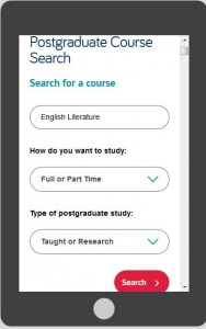
The testing revealed that the new course search was well used and provided good results.

However, since the advanced search filters appear above the results, the search results are hidden on both desktop and mobile.

This was a particular problem for mobile users as it looks like the search hasn’t worked. One of our users kept filling in the fields even though they didn’t need to.

It shows that the course search needs further development to improve its usability.

Navigation

On mobile people easily found the blue link buttons on the homepage (eg Student Life) but desktop users did not spot these as quickly.

The buttons appear under the content on mobile, on desktop they appear to the right hand side.

Example blue call to action button from the responsive design
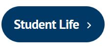
This supports research into online reading which shows that content to the right is often ignored.

Desktop users tried clicking headings in the main content before clicking the button. One person didn’t notice them and struggled to complete certain tasks.

The red call to action buttons were well used on both desktop and mobile. They were spotted quickly and people commented that they made tasks easier.

Example red call to action button from the responsive designThe inconsistency of hyperlink styling made it unclear what was and wasn’t a link. The majority of users didn’t find the student profile information as they weren’t aware that the heading linked through to additional content.

The user research showed that we need to review the links on the homepage. In contrast, participants quickly spotted navigation on course and supplementary pages.

Content

One of our new content types is known as mobile collapse. On desktop, the content displays as a heading and paragraph. On mobile, the content is ‘collapsed’:

Screengrab of the mobile collapse function. 
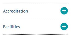
The user research revealed that the mobile collapse content did not stand out. Mobile users scrolled past the information without realising it could be expanded.

If our potential students can’t find accreditation information they may assume that the course is not accredited. It’s crucial that we make this content more prominent on mobile.

Design

There were lots of positive comments about the look and feel of the site. People spotted the pull quotes quickly and users liked the use of videos, images and dual tone headings.

One user described the site as “vibrant and exciting”.

Testing is vital to improve the usability of a site

This research has highlighted to me the importance of user testing – it shows us what is working and what needs improving.

If prospective students can’t find information easily it may influence their decision to apply here so it’s vital that we identify and solve usability issues.

We’re currently working on solutions for the issues identified from this testing.

Improvements to content, design and layout will also inform developments for the next batch of sites in our Go Mobile Programme.

Find out more

We base our user testing on training provided by the Nielsen Norman Group. Find out more about user testing by visiting the Nielsen Norman Group’s website.

Share this post:
Share