How to Structure Content on a Webpage

Before you can start writing effective web content you need to be clear about what you’re trying to achieve with your site and who your main users are.

For every page you plan, ask yourself:

  • Why am I creating this page?
  • Who am I creating this page for?
  • What do I want the user to do after reading it?

People generally come to a site to find something out so it’s important that you answer their questions with your content.

Once you know the messages you need to communicate and who you’re communicating them to, you can start prioritising content.

The fold

‘The fold’ is a term used in web development to refer to the point on a webpage where people need to scroll.

Amy Schade (Nielsen Norman Group) in The fold Manifesto: Why the Page Fold Still Matters explains that people will only scroll if content ‘above the fold’ appears relevant to them. So it’s essential that web content at the top of your page is an accurate indicator of what information appears further down the page to encourage users to scroll.

This is a really useful concept to bear in mind when structuring content on your webpage.

The inverted pyramid

It’s also helpful to think about structuring a webpage in the same way that journalists structure a news article – by using the inverted pyramid.

The inverted pyramid is the idea of turning a story on its head. You start with the key point and then provide more detail further down the page. This ensures that essential information is at the top of the page. This is vital for mobile devices as a smaller screen size means that less content will appear ‘above the fold’.

Inverted pyramid showing where primary, secondary and supporting messages appear (primary at the top, secondary in the middle and supporting at the end)

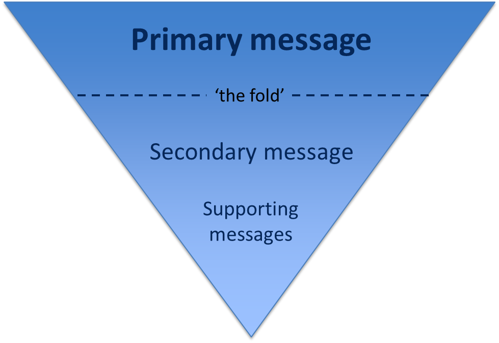
Karen McGrane in her book, Content Strategy for Mobile, recommends thinking about your primary, secondary and supportive messages to help prioritise content on a page.

Primary message

Your primary message is the main point of the page. This should be communicated through your page title and introduction so that users can quickly see what the page is about.

Page titles should be clear and descriptive so that users can understand them at a glance. Similarly, your introduction should be concise and engaging. It should also contain key words for search engine optimisation. The introduction should summarise the main message in 50 words or less to grab the reader’s attention and encourage them to scroll down the page.

Secondary message

The secondary message is the body copy of your page. It expands on your main message and provides more detail. The body copy should answer your users’ questions and be concise and scannable.

Supporting messages

The supporting messages are qualifiers and additional information to support your main messages. They can include quotes, images and videos. Supporting messages can also provide a next step, such as a call to action like booking a place at an event or taking a virtual tour.

Summary

People spend less time reading online and will only scroll if they think that information further down the page will be useful to them. It’s vital to prioritise content so that your primary message is easily visible. Structuring content effectively is therefore fundamental to ensuring your main message is conveyed to your users.

References

Amy Schade, The fold Manifesto: Why the Page Fold Still Matters, Nielsen Norman Group, 1 February 2015

Karen McGrane, Content Strategy for Mobile, A Book Apart, 2012

Jakob Nielsen, F-Shaped Pattern For Reading Web Content, Nielsen Norman Group, 17 April 2006

Related posts

Team Update: 1 – 15 April

It’s time for a team update about what we’ve been working on over the last two weeks and what’s coming up.

Go Mobile programme

  • Tagging sites ready for migration –  batch one, including Research, Law School, Press Office, Institute for Sustainability is complete. And batch two is nearing completion for; Open Day, Information for Schools and Colleges, and last but not least About
  • A lot of detailed planning of the steps in the migration process itself and scoping out potential go-live dates for the first batches of sites
  • Calculating the time taken for each task to give us an accurate picture of the resources involved in the programme overall
  • Updating our giant whiteboard, on which we are tracking our progress in migrating batches one and two

Technical developments

  • The tech team (Catherine, Pete, Andy and Paul) have been moving the final template and components to its permanent home on the live server
  • They’ve also been making final preparations for the migration of the PG site into T4
  • We have also been getting ready to migrate batch one (four sites) into T4 and looking at the individual template requirements of each site

Training and support

  • The editorial team have been finalising training materials for the new Go Mobile programme
  • Anne is still working on training for the T4 CMS
  • We’ve received 24 support requests through the NU Service Helpdesk and have resolved 7 of them

Campaigns and web developments

There’s still a lot of business as usual!

  • Emma C has been working with colleagues in Marketing and Student Recruitment to plan homepage messages for the next few months
  • Steve has developed some external research pages on the Sage Faculty website
  • Emma C attended a demo of the remote user testing platform What Users Do
  • Jane has been reviewing some videos of external user testing of the PG website, and also writing a blog post about how much we hate FAQs (it’s true)

Travel-tastic

  • We enjoyed some time off for the Easter bank holidays – some team members travelled as far afield as Copenhagen, America, London and even good old Yorkshire

Plans for the next few weeks

  • Refining layout/design options for sites in Go Mobile
  • We’ll be carrying out post-migration checks on the first batch of sites in T4
  • Our editorial team are meeting to plan future content for this blog – let us know in the comments if there’s any topics you want us to cover

See you next time!

Improve Your Content with Help from Hemingway

Hemingway Editor is a great tool for anyone who writes anything. It allows you to assess the readability of your writing before unleashing it on an audience.

How it works

You can paste in a section of text and it will give you a readability score. This tells you how difficult your words are to read – the higher the score, the more difficult it is. Hemingway uses a grade level to do this which is based on the level of education needed to read your text. If you can get your score under 10 you’re doing well.

The most useful part of this tool, particularly for those not confident with writing for the web, comes in the analysis of your text. The app will:

  • highlight sentences that are difficult or very difficult to read
  • identify the use of the passive voice and adverbs
  • highlight complex words and suggest simpler words or phrases

There are other tools out there that do a similar job. For example, on my own blog I have the Jetpack plugin installed which uses After the Deadline to check spelling and grammar. It works in a similar way to Hemingway App by highlighting complex sentences and use of the passive voice.

Hemingway Editor

The Hemingway analysis of this post

Hemingway beta

The new Hemingway, currently in beta, gives you the ability to format your text with basic styles. You can add headings, bulleted lists, bold and links. If you copy this text to another piece of software, like T4 or WordPress, the formatting is copied too.

Concluding remarks

We use this tool a lot within the Corporate Web team when producing copy for the website. It’s an easy way to check how readable your words are, putting your visitors in a better position to understand your message.

Try it out on some text from your website and see what small changes you can make to improve your writing. My greatest achievement is getting some text down from grade 41 (yes, you read that right) to grade 10. See how you get on.

Related posts

How to Get to the Top of Search Results

When you use a search engine or the University’s on-site search (powered by Google), how often do you look at the second or third page of search results? Never, right? You usually follow links that appear high up in the results.

Search Engine Optimisation (SEO) is how you go about improving your website’s position in search results. The good news is you can do something about it right now. It’s not a technical fix and money doesn’t buy you the top spot…

Text on graphic featuring the letters SEO

It’s all about your web content.

So far, so good. But what is it that you need to do?

Write search engine optimised content

Your primary focus is writing for your user not for a search engine: if you get this right then your SEO will follow.

Use the language of your reader

Think about what terms a user might use to search for your site. Use these words in your content.

Explain acronyms or industry jargon – a new member of staff is unlikely to know that we refer to ourselves as CWD (Corporate Web Development). We’d always make sure to spell out our name or refer more conversationally to ourselves as the Web Team (as that’s how we’re known).

Identify keywords and phrases that you want to rank highly for in search results. Keep the focus narrow — competing against general terms like ‘student experience’ is unrealistic.

You can use Google analytics to find out what search terms people are using to find your site. Contact us to get access to your web analytics dashboard (University login required).

Update content regularly

When a page was last updated matters to your users and search engines. It is important that you check for, and edit or delete, out-dated content.

Our post on writing for the web gives you some further hints on how to improve your copy.

Highlight important content

Make sure the search engine can easily work out which content is most important.

You can do this by including keywords in headings (particularly your page title), making them bold and using them in hyperlink text. This means no ‘click here’ link text – unless of course you want to be top of Google for that!

All these elements get marked up in the HTML so are immediately noticeable when your site gets crawled by a search engine.

Site and page structure

Web addresses also known as Uniform Resource Locators (URLs) get displayed in search results.

They can help your readers to decide whether to visit your site by indicating what the page is about. Descriptive URLs with words that are relevant to your site’s content mean more to your site visitors and search engines.

Links

Links into your site from related external websites act as verification of your content’s relevance and importance. Look for opportunities for collaborators and partners to link back to your site.

This also works across Newcastle University’s site. Make sure you link to other related content and get your colleagues to return the favour. Search engines respond to well-linked sites.

Graphics and images

Try not to rely too heavily on graphics or text in images to convey your message. Search engines can’t get at this copy – so your content doesn’t get indexed. Worse, they don’t get found by your customers.

They cause problems for accessibility too: don’t exclude your potential customers by making content difficult to engage with.

Have a go

Try a search on the University website for terms you think should find a page on your site. Make a note of where you appear in the results (eg page 5, postion 3).

Go to your website and optimise your content (use headings and bold), increase hyperlinks to the page that needs greater visibility, improve the URLs.

Give it a few days for the search to update and see how you’ve improved your search results!

Image credit: How to Search Engine Optimization by SEO Planter via photopin under CC BY-ND 2.0.

Team Update: 17 – 31 March

Welcome to our first ever Team Update.

We’ll be publishing updates every two weeks to showcase what we’ve been working on and what’s coming up.

Go Mobile programme

We set ourselves a deadline of Easter for a number of things related to Go Mobile on the basis that it was far enough away not to worry about it. Well, here we are, almost at Easter: what have we done?

There’s been a lot of liaison with the editors and owners of sites going through the Go Mobile programme. Sites coming up include: Postgraduate, Undergraduate, Press Office, Research, Institute for Sustainability, Institute for Ageing, and the Law School.

Technical developments

As we move towards applying the new responsive design to sites migrating into the T4 Content Management System, there’s been some tech set up needed. The server now supports the new template – all the stylesheets, fonts and JavaScript that run the content design are functioning.

Postgraduate components

The tech team (Andy, Catherine, Peter and Paul) have been importing the Postgraduate responsive template HTML into T4 and have broken it down into reusable components. These will form the building blocks for all the other sites going through Go Mobile.

Catherine has also been working on some new things such as making the image galleries and staff lists responsive.

site Migration planning

We’ve now got some resilient migration scripts meaning we can port over sites from where they live now (unix accounts) into T4. We tested this out last week on a small scale example website and everything seems fine.

It’s not all automated unfortunately, we have to prepare sites for migration by tagging them up in a pre-migration template. There’s also some fixing needed in the CMS once the site is in there.

The project leads in the web team have been working on tagging up sites ready for migration. Emma C and Lisa also audited each site’s content, reviewing site depth, structure and content quality.

Undergraduate site migration

The undergraduate site already uses T4 – but doesn’t use our new content components. We’ve been working with the Undergraduate team and NUIT to map out the specifics of moving this website into a responsive design (it involves a horrible spreadsheet of about 8000 cells).

Training and support

There’s a lot of development going on around our new Go Mobile training package. We’ve pulled together sessions to support our web editors in all aspects of website management:

  • Anne is developing training in the T4 CMS
  • Emma C and Linda have developed training to help you manage your site: planning content, setting site purpose and measuring success
  • Jane and Lisa created the writing for the web part of the training including top tips on structuring content, cutting out the waffle and optimising for search

We’ve also:

  • received 34 support requests through the NUService Helpdesk and have resolved 18 of them
  • trained eight web editors in the use of Contribute to manage their websites

Campaigns and web developments

There’s still a lot of business as usual!

  • Jane has been working with the Postgraduate team to set up and run external user testing, run content clarity tests, and review website changes following the results of earlier user testing
  • Emma C and Lisa have written a usability report for user testing carried out on the new responsive design: Lisa has written a summary of our key findings for the blog
  • Steve has developed some research pages on the internal Sage Faculty website
  • Steve has developed some content on The School of Biology’s Ecology and Conservation Research Group
  • We’re investigating brokering support from external suppliers for three project websites
  • There have been various content updates to Newcastle University London
  • We’re planning changes to our Engagement and International websites
  • Pete has been exploring the use of the Google Tag Manager to improve access to Google Analytics tracking code. This should make things easier in the future as it reduces the need to wrangle with HTML

Plans for the next few weeks include:

  • Testing out our new Go Mobile training on the rest of the Web Team (wish us luck – they’re a tough crowd)
  • Migrating the first batch of sites into T4 – Press Office, Institute for Sustainability, Law School and Research – we’ll see you on the other side!
  • Coming up with some further layout/design options for sites in Go Mobile
  • Moving internal-facing content and sites to internal.ncl.ac.uk

See you next time!