Find Your Way Using the New Global Menu

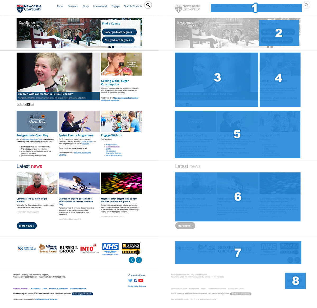
The new global menu is visible across all sites in the new template. It replaces the mega footer seen in the old central template.

Mega footer used in old website template

Mega footer used in old website template

The menu launched at the same time as the new external homepage. In its first iteration it was static. Each menu item linked through to a landing page containing links to further content relevant to the section. For example, take the Study landing page which links through to the Undergraduate, Postgraduate and International sites, among others.

Menu behaviour on desktop

We developed the second dynamic iteration of the menu to reduce clicks. On desktop you can hover over each menu item to open a sub-menu with links to relevant sites.

Global menu on desktop screens

Global menu on desktop screens

The global menu is accessible. Keyboard access is achieved using the tab key to move through each menu item. Pressing on the down arrow on the keyboard will open the sub-menus.

Menu behaviour on mobile

When using the website on a touch based device the global menu loses the sub-menus. When you tap any item in the menu it takes you to a landing page that has similar links to those found on the sub-menu for that section.

Global menu on mobile devices

Global menu on mobile devices

Further development

This is not the end for development of the global menu, we’re testing how it is used to inform the next steps of development. This iterative process is a method we’re starting to use to approach development across the whole site.

Share this post:
Share

Designing the New University Homepage

As part of phase one of Go Mobile we redesigned the University homepage so that it works across all devices. Like the other sites going through Go Mobile it is managed in T4, the University’s content management system.

Features of the homepage

Our new homepage can be broken down into eight distinct sections.

  1. Global menu for quick access to key links
  2. Course finder for direct access to Undergraduate and Postgraduate courses
  3. Hero image slider to highlight key news, event and research stories
  4. Video content to support our key messages
  5. Seasonal message top task boxes
  6. Latest news from the Press Office
  7. Partner logos and awards carousel
  8. Social media links and directory
Newcastle University homepage features and layout

Homepage design features and desktop layout

On mobile devices these stack horizontally, one on top of the other.

We’ll look at a couple of these features in more detail.

Hero image slider

The old homepage image slider was full width. Although this created a strong visual impact, sourcing images to fit this area could be problematic.

Old full-width hero image slider

Old full-width hero image slider

The new hero image slider is smaller. It allows the Press team to source images that would fit a standard landscape 4 x 6 photo.

New hero image sliderOn mobile devices the caption drops below the image to avoid the image from being fully covered. The caption and image form a single clickable link. This is important on mobile devices as it creates a large hit target to increase successful touch interactions.

Video content

The new homepage layout has allowed the use of rich media content such as video. The analytics show that the external homepage is the most popular destination for video consumption. This has helped increase the profile of some key videos during the months of October to December 2015:

  • The Impact of a World-Class Civic University
  • How Smoking In Cars Can Affect Children
  • Dr Martin Luther King Jr Honorary Degree Ceremony
  • Our City
  • Our Campus

Related posts

Read more about the new responsive website template in our case studies:

Share this post:
Share