Improving Readability through Go Mobile

We measure the success of the Go Mobile programme by looking at the readability score for our content.

Why readability is important

It’s important to us as our websites help us communicate with a broad range of users. Everyone from school leavers to top researchers visit our sites. They all have different content needs. They all want to find answers to questions. We need to provide answers clearly and directly. This is where readability comes in.

You can find out more in our blog posts about readability and simplifying language.

Benchmarking our readability

We use a browser-based tool called Clarity Grader to give us a clear language score for a website. They look like this (red indicates a bad score, amber is fair and green is good):
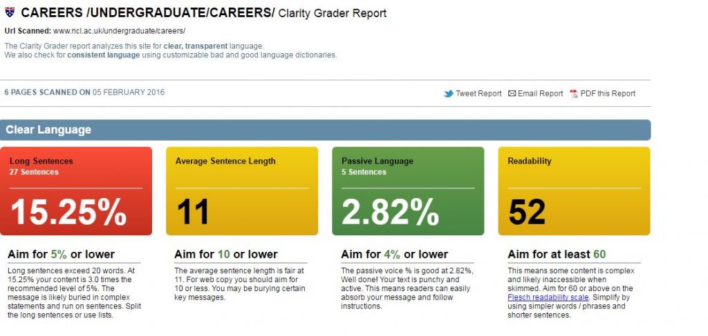
This shows a Clarity Grader report with a bad score for long sentences, a fair result foraverage sentence length and readability, and a good score on passive language.

To work out the scoring of a site, Clarity Grader assesses the following:

Long sentences

A long sentence has more than 20 words. Using short sentences helps you to keep them simple in structure. It means it’s easier to get your message across. It also makes them simpler to read on a mobile screen.

Clarity Grader recommends having no more than 5% of your content in long sentences.

Average sentence length

Clarity Grader recommends an average sentence length of 10 words or lower across the site. Obtaining this average will mean that your content is clearer and easier to understand.

Passive language

You should be aiming for direct language. The Clarity Grader report considers a score of 4% or lower to be a good indicator of active messages.

Readability

A score of 60 or higher indicates your message is clear. It means users of your site will understand your meaning with ease.

Access to Clarity Grader

Our subscription means that we can’t make Clarity Grader available to all editors. If you think it’d be useful to you, get in touch and we’ll see what reports we can run for you.

You can get readability scores on a page by page basis by using the Hemingway app.

University readability – before and after Go Mobile

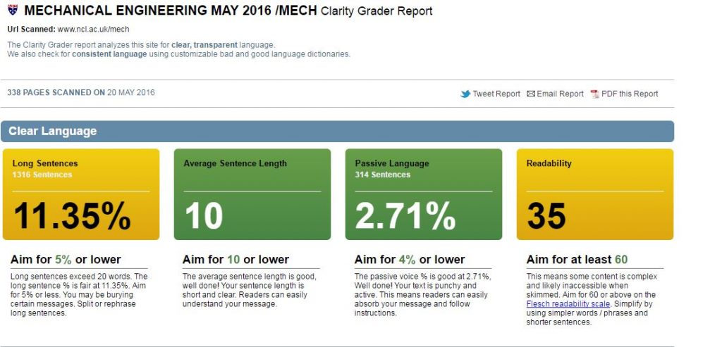
We’re running Clarity Grader reports before and after a site goes through Go Mobile. This has given us a useful benchmark to look at the readability of University web content.

Our School of Mechanical and Systems Engineering has improved the readability of their content. They’ve reduced the length of sentences and made their content more active.

Before
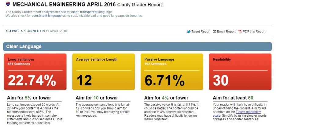
mech-eng-before

After

mech-eng-after


Setting a readability score for the University

We’ve shown that Go Mobile is improving the content quality across the site. I think the Clarity Grader scores are a little strict for us right now.

I propose a set of targets to get us nearer to where we should be. Unfortunately we’ll not get the lovely all green for good from Clarity Grader. But it’s a start.

I suggest:

  • Long sentences: 15%
  • Sentence length: 10 or lower
  • Passive language: 4% or lower
  • Readability: 45 or higher

Let me know in the comments if you agree with the targets.

Share this post:
Share

Quality as Standard: Our Proofreading Checklist

Every site we build goes through rigorous technical and quality checks before being released into the wild. I’m involved in the quality side as part of the editorial team who are responsible for proofreading the content.

There’s a simple reason for all the checks we do prior to making a site live: visitors to your site will judge you for the mistakes they find. And that judgement could be the difference between recruiting a student or attracting a new member of staff/partner/funder, or not.

Here’s our checklist of things to look out for.

Spelling and grammar

First on the list is a check to make sure there are no typos or spelling mistakes – we get help with this from SiteImprove.

We’ll also check the grammar. A misplaced comma can make a massive difference to the meaning of a sentence.

Clarity and consistency

We’ll check to make sure content is as clear as possible. Sentences and paragraphs should be short. Content should be direct and helpful – if you’re inclined to ramble, beware.

We’re looking for use of plain English. We’ll remove jargon, caveats and unnecessary words.

We’re also looking out for cases of repetition – within the page and across the site.

Currency and accuracy

Part of the proof is to make sure content is current and accurate. When we’re migrating sites we begin with a snapshot of content, and this can often go out of date during the development phase. The most common instance is where deadlines have passed.

Content and editorial standards

We have a set of content and editorial standards that help us maintain consistency across the University website. You can get a flavour of these standards through our quick guides series. Part of our proofreading is to make sure content meets these standards.

Sense check

We always make sure that someone who hasn’t worked on the content before takes on the role of proof reader. This fresh pair of eyes is more likely to spot anything that doesn’t make sense and might confuse the user.

Give it a go

Why not use our proofing checklist to make sure anything you publish on your site meets the web team’s standards. We’ve produced a content quality checklist (PDF: 74KB) to help with this.

Share this post:
Share

Breaking Bad When It Comes to Links

Broken links are the bane of user experience.

There’s nothing worse than finding a 404 error page. And people who tart 404s up with quaint local dialect or jokes to apologise should just stop.

If you remove a page or change a url and leave the old link lingering elsewhere, you’re breaking trust.

You’re damaging the confidence people have that your website is up-to-date. You’re frustrating them with the promise of information you’ve snatched away.

Search engines won’t like you either. You are breaking their trust in sending people to your website.

Identifying broken links

You might say it’s unavoidable to have broken links. It’s not, it just requires care. If you’re killing a page, document or changing a url remember where you’ve placed links and change or remove them. This could be on your website, social media or even in print.

If you can’t remember where website links were, use these services to find them:

Make search engines work for you

What happens if search engines have indexed the page/document you removed?

They make it difficult enough to get up the search rankings without causing this kind of headache.

If you can’t redirect people elsewhere, it’s time to make Google and co work for you.

Do a search for the page/document you’ve just deleted and if you find it in their listings – report it.

Google (if you have an account) will remove dead links from search listings on request. Make them work for you.

Further reading

A Link is a Promise, Kara Pernice, NNg

Share this post:
Share

Using Siteimprove to Find Content and Assets on your Website

You may already be using Siteimprove Quality Assurance reports to help fix broken links and misspelling on your website, or find content inconsistencies. If so, then I hope you’ve found it a useful tool to help keep content up to date.

The Inventory module is another function of Siteimprove that we think you’ll find useful when reviewing website content and assets.

You might want to locate a document or telephone number on your website or need help with decluttering your website to prepare for Go Mobile. The inventory module can help with this.

How to use the Inventory module

Siteimprove’s Inventory module provides an overview of all content on your site including:

  • pages
  • links and link text
  • documents
  • media files
  • scripts
  • personal information eg email addresses and telephone numbers

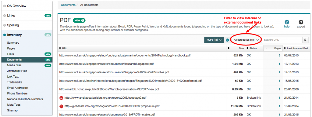
You’ll find a link to the Inventory in the left-hand panel of your Siteimprove report. The summary page lists the number of assets on your site:

Screenshot of Siteimprove inventory

To get at the details you can click into the categories on the left.

In this example, clicking the documents’ section gives an overview of:

  • documents types (PDF, Excel, Powerpoint)
  • Internal (documents within your website)
  • External (links to documents on other websites)

Screenshot of Siteimprove Documents overview

From this table you can click through and view all documents (useful if you’re decluttering your site) or focus on a particular document type:

Siteimprove Inventory module - PDF list

Here you can see a list of all PDF files linked to from the website broken down by:

  • url of each document
  • file size
  • link status – eg broken
  • pages that link to the document
  • last time modified

You can filter the list to view just external or internal PDFs by clicking on the ‘all categories’ field. You can also sort documents within each column.

For example, you can sort the ‘last time modified’ column to find out when a document was last uploaded to your site. This is useful to help you decide if an asset should be updated or removed.

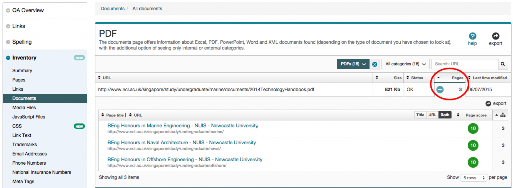
You can also see where a document is linked from on your site and from here click through to view the document link in the page. If a document is not linked up this usually means it can be deleted as it’s not in use.

As you can see from the example below, the Marine handbook is linked to from three pages on the website:

Siteimprove Inventory module - PDF referer links

Using the Inventory module to review content

Documents

As shown by the examples above, you can use the inventory tool to locate and check documents on your site.

Keep emails and phone numbers up-to-date

Out-of-date contact information will affect the credibility of your content. Use the inventory module to review email addresses and telephone numbers and check the format against our editorial style (University Login required).

image files

You can also use the inventory tool to check where an image is on your site, and when it was last updated. Updating the images on your site helps with search engine optimisation (SEO), giving the search fresh content to crawl.

Regularly review and update content

It’s important to regularly review and update your content as inaccurate content can damage the credibility of your site.

Next time you review your website content, try out the Inventory module in Siteimprove.

View the Siteimprove Inventory video tutorial to get started.

Access to Siteimprove

Request access to Siteimprove (University Login required) to get started on your website content clean up.

Share this post:
Share

Content Governance: People, Processes and Policies

I’m not sure why I’ve drawn the short straw here: I get to introduce you all to the idea of content governance. Wait, don’t leave yet!

2005: we had websites with no direction

We only have to roll back about 10 years to see what our website was like with minimal governance. We had duplicated content all over the place. There were sites that didn’t follow our branding. We had a team of content-putter-uppers who just did but didn’t ask why.

What’s changed?

We still get asked to “just build a website” or “stick some content on this page”. But, nowadays, the answer is just as likely to be “no” as “yes”.

This is because we have content policies, style guides, training and the right people: our content governance.

Going mobile is helping us with content governance

We’re using the Go Mobile programme to reinforce the importance of governance. There are some elements to making it a success: people, lifecycle, style guides and training.

People

With each new project we’re making sure we have at least one named editor. This means we’ve got a person in post whose job it is to manage the website and its content.

We’re still not 100% there. Web editor roles are often part of another post at the University. We are getting some accountability. And we’re working on making sure content editors have enough time to edit.

Content life cycle

Each Go Mobile site development isn’t just a project with an end date. We’re planning reviews of site content to make sure we’re maintaining quality.

We’re working with editors to introduce content management tools. These include editorial calendars, analytics and Siteimprove.

Style guides

We’ve had a set of web content standards from day one. We’ve just not been good at letting people know about them or enforcing them.

Go Mobile is raising awareness not only that our standards exist but also of their importance. These are not rules for the sake of it. They’re there to help our site users access the content they need on all devices.

If content doesn’t meet our standards, we have the authority to say it doesn’t go live.

Training

We can’t write a style guide, leave it hidden in a cupboard somewhere and then moan if people don’t use it! So we’ve developed training to help communicate our standards. We’ve produced a demo site that presents our new content design in the context of our standards.

Beyond Go Mobile

Through Go Mobile, we’re developing a skilled group of content editors. They are responsible for our web content and will be ambassadors for maintaining quality websites.

We’ve bench-marked our sites. We know how well they score for readability and whether they follow our new standards.

We’re planning to review sites around 6-8 months after they’ve launched. This will help us make sure we’re maintaining quality.

Content governance covers much more than I’ve outlined here – if we can get this right though, we’re well on our way to managing our web content effectively.

Let us know in the comments how you keep on top of content quality. Do you have any formal content governance?

Share this post:
Share