Find Content Inconsistencies Quickly and Easily using Siteimprove Policy

Use of consistent language and terminology helps to raise the reputation of your website.

We have content standards and style guides in place for the University.

But, with over 100 websites and many editors, communicating and maintaining standards is a challenge.

We use Siteimprove, a quality assurance software, to help us find and fix broken links and misspellings on our websites.

Use Siteimprove Policy to remove unwanted content

Siteimprove also has a Policy function that we’re using to inform our editors about:

  • terms we don’t want on the website – such as ‘click here’
  • content changes – eg name of an Academic Unit or Service, or highlighting content that has changed its address
  • reinforcing a standard term – eg Newcastle University not University of Newcastle upon Tyne

Siteimprove does the hard work of finding and listing the content that needs fixing. This makes it easy for editors to follow our content standards.

If you’re a University web editor already using Siteimprove you can start using the Policy tab today.

How it works

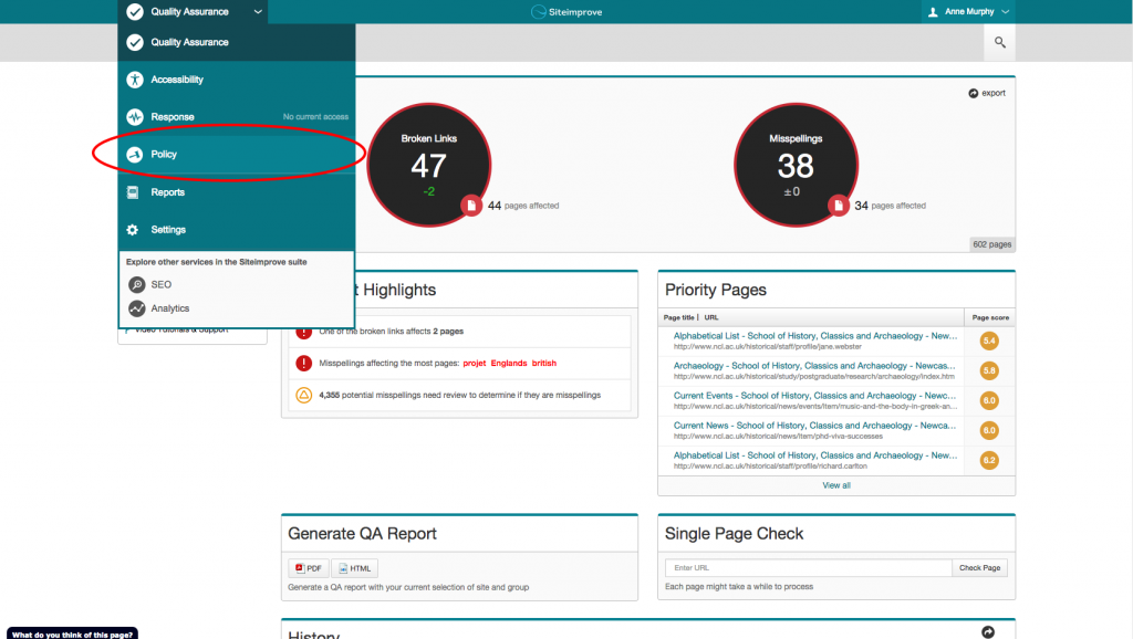
You can find the Policy tab in the Services drop down menu:

Siteimprove - how to find the Policy  function

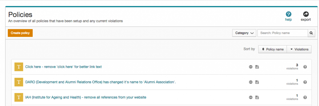
Here you’ll find a list of policies created by the web team, and the number of violations on your website:

Policies list in Siteimprove Web Governance Software

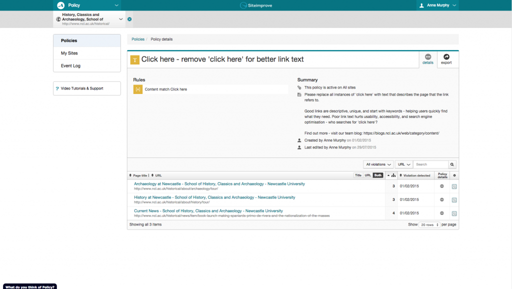
Clicking on a policy description reveals:

  •  a policy summary
  • advice on what the editor needs to do
  • list of all pages where a violation occurs

Siteimprove policy summary and location of violations

You know where the errors are, now let’s get those violations down to zero!

Create your own policies

You can create local website policies for terms that are specific to your content. View the Siteimprove Policy video tutorial to get started.

Access to Siteimprove

Request access to Siteimprove (University Login required) to get started on your website content clean up.

Share this post:
Share

Remove ‘Click Here’ for Better Link Text

How many of you have linked to a webpage or document using the phrase ‘click here’? We’ve got about 830 instances across the University site. We know where they are.

Why is it so bad to use ‘click here’ as a link?

You might argue that it’s a strong call to action. You know exactly what’s expected of you when you see one. See our related blog post: 5 Ways to Improve your Calls to Action.

I think the negatives of using click here outweigh the positives. These are our top reasons for not using click here as link text.

We aren’t all using a mouse

Click here isn’t true anymore. Your user could be tapping, touching, swiping, tabbing or speaking to activate the link.

Also, most people using a mouse know that you have to click to do something: don’t be Captain Obvious.

Accessibility

Users of screen readers will often get a summary list of hyperlinks to select from. This is to help them decide where to jump to within a site.

Imagine how unhelpful it is to hear ‘click here, click here, click here, click here’ as your options.

Unless the user decides to read the whole page – they won’t get the context.

Search engine optimisation

We always get asked about getting to the top of the search results. The hyperlinks you use can help you achieve this.

Let me ask you then, how many times have you searched for pages that say ‘click here’? Google serves up around 2.4 billion search results for it.

You will never be number one for this term. You would never want to be number one for this term. So don’t use it for links within your site.

Instead, make sure you use strong, descriptive terms to link your content. How do you want people to find you? What words will they use?


Bad example: Click here to find out more about our English Language degrees.

Good example: Find out about studying our English Language degrees.


Get rid of click here using Siteimprove

Many of you use Siteimprove to keep on top of broken links and misspellings. But did you know that it also has a policy feature that allows you to target unwanted content?

We have a click here policy set up to show where it’s used in your website. We know that there are 830 instances of click here across the University’s website.

Let’s aim for zero! * 

* Siteimprove have been known to reward sites that achieve zero broken links/misspellings/policy scores with doughnuts.

Read our blog post on the Siteimprove policy feature.

Why not get access to Siteimprove (University Login required) so you can start fixing your content now?

Share this post:
Share

Why ‘Under Construction’ Notices are Bad Practice

In the early days of the web ‘under construction’ notices or animated construction worker images were common on websites if an organisation didn’t have any content to add to a page. These messages have fallen out of fashion but have been replaced by messages such as ‘coming soon’ or ‘information to follow’.

The terminology and formatting of this message may have changed, but the outcome is the same – a dead end for users.

under construction notice

A dead end for users

Imagine a prospective student has clicked through to a page on your website expecting to find something out. Instead of an answer or information to help them complete a task, they are greeted with nothing more than an ‘information coming soon’ message.

How do they feel? Disappointed and frustrated. What do they do? They leave.

Perhaps they come back at a later date to check if the page has been updated but it’s more likely they will go somewhere else to find the information they need or worse… go to a competitor’s site.

People generally go to a website to find an answer to a question or to complete a task. An ‘under construction’ notice doesn’t tell your customer anything and is therefore a waste of their time.

Damage to credibility

‘Under construction’ notices can also damage the credibility of your website. They make the page look sloppy and unfinished. This consequently reflects badly on the organisation, giving the impression that the organisation is uncommitted and unprofessional. It could also mean that users don’t trust the other information on your site.

Bad for SEO

Search engines also respond badly to ‘under construction’ pages. If there’s no content on a page the search engine won’t rank it very highly.

Worse, if the page has a meaningful title containing key words that people are searching for, it may come up in search results. Your reader goes to read more on the page only to discover that it contains no content. This is harmful to your organisation’s credibility.

Solutions when waiting for content

If it’s business critical to advertise something (eg funding opportunities or a new research facility) before the full details are available you should add relevant information rather than a blank page. To do this, you should:

  • think about the information you already have about the funding, research facility etc
  • add relevant signposting to another site if appropriate
  • include contact details for questions until the content can be added to the site
  • update with further information as soon as it is available

Final thoughts

Finally, if you don’t have any meaningful content to add to the site don’t add a new page. A blank page or a page with irrelevant information is more harmful than excluding information altogether. You wouldn’t publish a brochure containing a blank page with a generic ‘coming soon message’, so the same rules apply to the web.

Visit our website for help on planning web content (University login required).

Image credit: Under Construction Grunge Sign by Nicolas Raymond, www.freestock.ca, licensed under CC BY 3.0

Share this post:
Share

Fix Broken Links and Misspellings with Siteimprove

Broken links and misspellings in content harm the credibility of your website. They have an impact on – search rankings, user experience, and visitor traffic.

So, it’s important that you check and update your content on a regular basis.

We’re using Siteimprove quality assurance software to help web editors do this. It’s reporting on our external Academic Unit and Support Services websites – 60,500 pages !

How it works

Siteimprove crawls your website each week, highlights issues and sends you a report that:

  • checks every page and PDF on your site for broken links
  • checks for spelling errors and potential misspellings on every page
  • highlights elements on the page for you so you see errors in context

There’s also an inventory of all media files, documents, email addresses, and phone numbers. This makes it easy to audit your website and keep things up-do-date.

Siteimprove won’t fix broken links and misspellings errors on your website but it does make it easy to find them.

Improve the quality of your web content – get rid of those broken links and misspellings  and start using your Siteimprove report!

Access to Siteimprove

You can request access to Siteimprove (University Login required).

Share this post:
Share