How to Improve the Readability of Your Webpages

Readability for websites isn’t just about people understanding the words, although of course that’s a massive part of it.

After all, if you can’t understand what the words are trying to tell you, you’ll just leave the site without the answers to your questions.

We’ve proven it time and time again – the readability of complex information can be improved by using clear, easy to understand English. It’s just making sure more people can understand it.

What I’d like to focus on for this post is some tips about the other elements that can affect readability; prioritisation of content, page layout, the use of design, and ease of navigation.

Prioritisation of content

What is it that people really need to know about on your page? If you identify it, you can prioritise the content to improve readability. Content should always be created and designed with the user’s needs in mind.

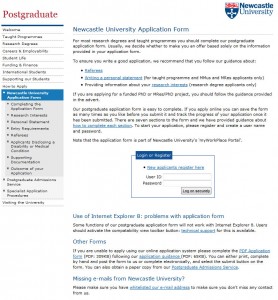
For example, here’s a screen shot of the old version of the postgraduate ‘How to Apply’ section. It had low readability; complex information, use of jargon and too many words! Your eye is also drawn to the box in the middle of the page, which was a little distracting.

example of a hard to read page

Old version of the application page (select to view expanded image)

We reviewed the section, identifying the purpose of the content (get people to apply) and  got to work editing.

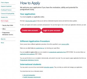
We use page titles to help accurately introduce the content for people. A change of title from ‘Newcastle University Application Form’ to a very clear ‘How To Apply’ certainly helped…

Also, editing reduced the content from 12 to just four pages.

example of an edited page

New edited version of the application section (select to view expanded image)

Another way we have improved readability is to use introductions on pages. This ensures people can quickly read a descriptive summary of the page. Take a look at Linda’s post about how to write great introductions.

Page layout

We reviewed the page layout or format, quickly deciding a step-by-step guide would be most effective at helping people though the application process. We even added a relevant video to support our primary messages.
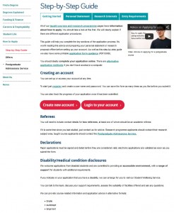
content page with tabs

Pages of content were re-worked into a simple step-by-step guide using tabbed content (select to view expanded image)

Use of design

We’ve blogged before about how design can help people navigate around your site, but it can also help draw attention to key content/things you want people to do.  And no…I’m NOT talking about flashing animation here, but more subtle design devices.

I’ll explain – we often use expandable boxes on pages to hold content for specific audiences. It’s so that content can be seen – but doesn’t have to be opened unless it is relevant to you.

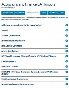
We use expandable content on the Undergraduate website for a long list of entry requirements, see the screen shot below. Don’t panic at all the options! Relax and simply choose the content relevant to you…

Image of expandable boxes on the undergraduate website

Using expandable boxes in content to help readability (select to view expanded image)

Test, test and test again

We’ve tested the content on the new postgraduate application pages using Clarity Grader (a website content analysis report) and the results are really positive:

Readability has increased from 48 to 55 (we aim for 60).

Long sentences (harder to read) were at a whopping 19.69% before we re-developed the page and have decreased to 7.97% (we aim for 5%).

This is all the more impressive when you consider the content is mostly complex and detailed information on application procedures.

Final tip

One of the key things to remember – is that you can always go back to pages and improve readability. It might be a slight tweak to a sentence, or a layout change – the main thing is that you can always improve it.

We ran some extensive testing on the postgraduate content. After all, a lot of what we did, not just to the content, but to the layout and design, then formed the master plan for Go Mobile – so it needed to be right. Did we do it?

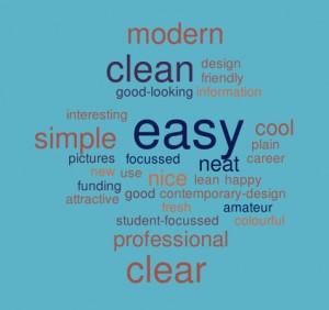
Oh yes. You can read about the excellent results in an earlier post of mine. A particular favourite is the below word cloud created from user feedback about first impressions of the postgraduate website. The most popular words that users used to describe the site included: easy, simple and clear.

Word cloud showing first impressions of the PG website

Go on, take the challenge – have a go! Choose one of your pages and see how you’d improve readability. I’d love to hear what you get up to!

Related posts

Share this post:
Share

Six Articles that will Help you Improve your Content

I read. A lot. And I love to share what I’m reading when I find something that will prove interesting or helpful to others.

Here are six articles that provide further information on some of the concepts we cover in our training for web editors. They offer practical tips on improving your content, from adding structure to enhancing search optimisation. Many also include reminders of the essential elements of writing for the web.

1. Writing great page titles and headings

A great practical guide to writing page titles and headings. Learn how you can write headings to engage and inform your users, and improve the search optimisation of your page. All examples included are from university websites.

“three guidelines that will help you create titles and headings that rock: 1) describe, 2) contextualize and 3) simplify and clarify.”

Read the full article on the Meet Content blog: Introducing Your Content – Page Titles and Headings

2. The importance of an introduction

This article by Jakob Nielsen from 2007 is still relevant today. It highlights the importance of introductory text on a web page… but only when done well.

“short intros can increase usability by explaining the remaining content’s purpose”

Read the full article on the Nielsen Norman Group website: Blah-Blah Text: Keep, Cut, or Kill?

3. Bold benefits your readers and search ranking

This article makes it on to the list simply for having a reference to Star Trek.

Ok, not really. The idea of using bold to aid search engine optimisation was something that participants in our first training session found useful. Here’s an article that outlines it in more detail.

“the head of Google’s webspam team, Matt Cutts, has hinted that the search engine might look favourably on bolded phrases.”

Read the full article on the Sticky Content blog: To boldly go – how bolding words can give you SEO lift-off

4. How to improve information-rich websites

We’ve all got pages on our sites where there’s a lot of information to cover. Sometimes it’s hard to see how we can make this less dense and more engaging. This article provides some solutions for how to present complex information without overwhelming your users.

“When there’s a blizzard of information users can struggle to complete the task they came to your site for.”

Read the full article on the Sticky Content blog: 3 problems with information-rich websites and how to solve them

5. The problem with duplicate content

This post presents three reasons why duplicate content is bad for your website. Find out how it affects your users, search engines and you.

“duplicate web content can impact findability, usability and user comprehension.”

Read the full article on the Meet Content blog: Why Duplicate Content Is Bad for the Web

6. Why you need an editorial calendar

Richard Prowse, our counterpart in the digital team at the University of Bath, offers an introduction to editorial calendars. He covers why they’re useful and what you need to consider when creating one.

“you can use an editorial calendar to plan which content you’ll need and by when”

Read the full article on Richard’s Content Bear blog: How to Create an Editorial Calendar

Help us build the ultimate reading list for web editors

Are there any articles that you’ve found helpful in explaining a concept relating to planning or writing web content? Share them in the comments.

Share this post:
Share

Meet the Supporting Cast for your Core Content

Me: “Hey website, I have a question, help me answer it. How do I get to Newcastle?”

Website: “Before I do that, why not stay a while, look at our pictures; see how they glide by. We’re showcasing our city, our campus, our staff, our facilities, and our cat (oh, you didn’t stick around for that one).”

Me (scrolling quickly): “No really, just directions would do…”

Website: “Could I interest you in this video – it’s actually about the Law School, but you know, it might have a map in it, or perhaps a Virtual Tour? We’ve got a nice one of the Sports Centre: the gym is amazing”.

Me: “Er, no thanks, bye.”

Meet your supporting cast

These image galleries, videos and virtual tours have a lot to bring to your web pages.

They can provide engaging content. They help reinforce reputation and quality. They should act as support for the core content of the page.

Problems occur when they take over and try to be the star of the show.

They interrupt the flow of your carefully crafted content. They butt in. They push the priority messages out of the way.

 “Most people come to the Web because there’s an information gap. Something has cropped up. There’s something they don’t know, something they need to do.”

Gerry McGovern

Prioritise web page content

We should be careful about placing too much emphasis on the supporting content in a page.

Stop this from happening by focusing on the priorities for the page.  Read our blog post on Structuring Content to help you.

All our supporting content flows after the core content. On desktop it floats right or under the core message. On mobile it flows under the core messages.

This means our site users are not interrupted when trying to find the answer to their questions. The supporting content is there if they have time or want to read more, watch or listen.

 “Let us not focus on getting people to spend time with our content but rather on seeing how we can save them time.”

Gerry McGovern

Supporting content examples

Supporting web content includes a whole raft of things from images to interactive virtual tours. As long as it’s relevant to the page and its placement is considered: it’s all good.

Qualifiers

Qualifiers back up our claims. They could be quotes or accolades that reinforce a core message. Partner logos and accreditation can also lend weight to statements within the content.

Images

A picture is worth a thousand words – this can be true. A good, clear, relevant photo can enhance your core content.

But, too many images can start to bring noise and distraction to the page. Consider displaying these as an image gallery. This can group together similar photography: facilities for example.

Video

Add a video if it supports the content of the page – don’t get sucked into adding videos “just because they were made”. This all represents clutter to your end user.

Virtual tours

These are a great way to showcase facilities and can help engage with your users. Again, make sure they support the context of the page.

Calls to action

Supporting content can also provide a next step.

They include calls to action like booking a place at an event. We have styled content buttons for this.

We’ve also got a suite of social media icons that can help increase visits to Facebook or Twitter.

Delete it!

Test if it really is supporting content. If you took it away would your reader still leave the page happy that they found out what they needed?

References

Gerry McGovern. The Challenge for Writers of Web Content. New Thinking. 24 May 2015.

Related posts

Image credit: magic moment by rvoegtli on Flickr

Share this post:
Share

How to Structure Content on a Webpage

Before you can start writing effective web content you need to be clear about what you’re trying to achieve with your site and who your main users are.

For every page you plan, ask yourself:

  • Why am I creating this page?
  • Who am I creating this page for?
  • What do I want the user to do after reading it?

People generally come to a site to find something out so it’s important that you answer their questions with your content.

Once you know the messages you need to communicate and who you’re communicating them to, you can start prioritising content.

The fold

‘The fold’ is a term used in web development to refer to the point on a webpage where people need to scroll.

Amy Schade (Nielsen Norman Group) in The fold Manifesto: Why the Page Fold Still Matters explains that people will only scroll if content ‘above the fold’ appears relevant to them. So it’s essential that web content at the top of your page is an accurate indicator of what information appears further down the page to encourage users to scroll.

This is a really useful concept to bear in mind when structuring content on your webpage.

The inverted pyramid

It’s also helpful to think about structuring a webpage in the same way that journalists structure a news article – by using the inverted pyramid.

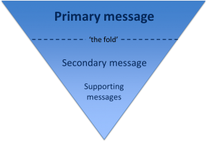
The inverted pyramid is the idea of turning a story on its head. You start with the key point and then provide more detail further down the page. This ensures that essential information is at the top of the page. This is vital for mobile devices as a smaller screen size means that less content will appear ‘above the fold’.

Inverted pyramid showing where primary, secondary and supporting messages appear (primary at the top, secondary in the middle and supporting at the end)

Karen McGrane in her book, Content Strategy for Mobile, recommends thinking about your primary, secondary and supportive messages to help prioritise content on a page.

Primary message

Your primary message is the main point of the page. This should be communicated through your page title and introduction so that users can quickly see what the page is about.

Page titles should be clear and descriptive so that users can understand them at a glance. Similarly, your introduction should be concise and engaging. It should also contain key words for search engine optimisation. The introduction should summarise the main message in 50 words or less to grab the reader’s attention and encourage them to scroll down the page.

Secondary message

The secondary message is the body copy of your page. It expands on your main message and provides more detail. The body copy should answer your users’ questions and be concise and scannable.

Supporting messages

The supporting messages are qualifiers and additional information to support your main messages. They can include quotes, images and videos. Supporting messages can also provide a next step, such as a call to action like booking a place at an event or taking a virtual tour.

Summary

People spend less time reading online and will only scroll if they think that information further down the page will be useful to them. It’s vital to prioritise content so that your primary message is easily visible. Structuring content effectively is therefore fundamental to ensuring your main message is conveyed to your users.

References

Amy Schade, The fold Manifesto: Why the Page Fold Still Matters, Nielsen Norman Group, 1 February 2015

Karen McGrane, Content Strategy for Mobile, A Book Apart, 2012

Jakob Nielsen, F-Shaped Pattern For Reading Web Content, Nielsen Norman Group, 17 April 2006

Related posts

Share this post:
Share