10 Content Experts to Follow on Twitter

So, you’ve learned how to write for the web, manage media files and navigate T4. Now you’ve got the keys to your shiny new responsive website, you probably want to start creating some great new content to populate it with. This is a good time to delve a little deeper into the world of content design.

If you know where to look, social media can be a treasure trove of resources for those who write and design for the web. Following experts on Twitter is a great place to start, so we’ve rounded up 10 great accounts to share with you:

@katekiefer
As director of communications at Mail Chimp, Kate Kiefer Lee knows a thing or two about creating great content. She’s also co-author of one of our favourite books: Nicely Said, Writing for the Web with Style and Purpose.

@nicoleslaw
Nicole Fenton is a digital strategist, editor and a teacher at The School of Visual Arts in New York City. She’s the other half of the Nicely Said team.

@gerrymcgovern
If you’re wondering how to make your website users happy, Gerry McGovern is sure to have some good advice. He’s been consulting, speaking and writing about web content since 1994, and is widely regarded as a leading authority on customer experience.

@coschedule
The CoSchedule team produces a tonne of great resources for content managers (we love their handy Headline Analyzer). Follow them on Twitter to receive free guides, articles and tips.

@amythibodeau
Writer and strategist Amy Thibodeau is a pro when it comes to crafting great user interfaces. Ever thought about the tone and clarity of your error messages? How about the wording on your website’s nav buttons? Check out Amy’s Twitter feed and blog for some thought-provoking discussion.

@karenmcgrane
In her own words (and we certainly agree), Karen McGrane ‘makes the web more awesome’. She’s the author of Content Strategy for Mobile and Going Responsive, and co-host of the Responsive Web Design podcast.

@zeldman
Jeffrey Zeldman has been working on the web since 1995. His Twitter feed is a powerhouse of fascinating news and discussion. Aside from his own words of wisdom, Jeffrey shares articles from leading thinkers on the cutting edge of content strategy and web development.

@abby_the_IA
Struggling to make sense of a complex navigation system? Unsure where new information should go? Abby Covert is an expert when it comes to Information Architecture, and author of the book How to Make Sense of Any Mess. Follow her Twitter feed and blog for tips on how to improve the clarity and usability of your site.

@heydesigner
Hey Designer is a curated feed of resources for people who work on websites. From discussing the pros and cons of using icons instead of copy, to sharing top tips on writing words that SEO-bots will love – Hey Designer will populate your Twitter feed with an array of useful links.

@dlichaw
Writer, educator and consultant Donna Lichaw pioneers smart, simple methods that drive user engagement. She is the author of The User’s Journey: Storymapping Products That People Love. Follow her for advice on how to design digital content that’ll speak to your audience.

Anyone we missed out? Let us know in the comments below.

Share this post:
Share

A Quick Guide to…Expandable Content

Expandable content allows you to show and hide information on a webpage.

This content type can be useful to reduce page length; particularly if content is only relevant to a specific audience.

An example of this can be found on the Open Day website. Expandable boxes have been used on the travel page to allow users to quickly access information relevant to their chosen mode of transport. This saves them from reading information about all of the ways to travel to the University.

The biggest drawback with an expandable box is that it’s an extra click to see information so I’ve summarised our standards for using them in our quick guide to…

Expandable content

You should never hide essential information inside an expandable box as you can’t guarantee that users will click to see the content.

When adding expandable content to a page you should:

  • include a descriptive title – you need to encourage the user to expand the box
  • keep the title to a maximum of 30 characters
  • make sure content within the box is shorter than the main content of the page
  • include no more than 100 characters within an expandable box
  • make sure the content is written for the web

You should also try to use expandable boxes at the end of a page as they act as a visual break in the content. We found in user testing that people often don’t expect content to follow expandable boxes and so they stop scrolling.

Related posts

For more advice on when to use this content type see my post: Hide or not to Hide: When to use Expandable Content.

Share this post:
Share

Big and (now) Beautiful

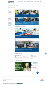
The Careers website is a vitally important part of the University’s web presence, and we’ve just finished a huge, six month long Go Mobile redevelopment.

Careers website homepage

New home page

It’s a big University service with multiple audiences, including:

  • prospective and current students
  • parents
  • old and new graduates
  • our academics and staff
  • employers

And these users have any number of different tasks they want to complete. From checking opening times, finding out about Recruitment Fairs or CV workshops, psychometric tests, researching occupations, and advertising jobs….

When one becomes four

The site was so big it’s now four separate websites. Why? Because like it or not, big isn’t normally beautiful on the web.

‘Big’ often means content has simply grown over the years, with more information added, and added…..and added. Simultaneously, moving or navigating around a big site is generally harder too. (And yes you’ve guessed, it’s even harder to navigate on a smaller mobile screen.)

If not diligently reviewed, big websites often suffer with duplicated or out of date information. More pages are added, so more navigation is needed. It’s a vicious circle.
But by the very nature of this information-led service, the Careers website had to hold a massive amount of content.

OK, but surely the most popular pages were easy to find? Well…no. it was big you see, so really hard to find some good stuff.

Alright, but it looked like it was part of the University right? …Oh dear.

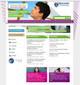
The return of the 1980s

It’s fair to say the old Careers Service website was looking a bit….well, 1980s. And nothing like the rest of the University online. It was seriously overdue for a redevelopment!

Old careers homepage

Old home page

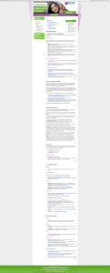
Because the site used an old template, they were also cursed with some of the longest webpages ever seen on planet earth. I kid you not.

This one example had a word count of 1,607. That’s FIVE A4 pages worth of content on one webpage.

Before:

Screenshot of old careers page which was very long

Old CV page

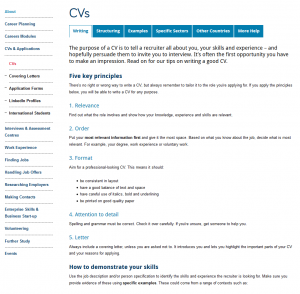
After:

Screenshot of new careers page which is much shorter

New CV page

While some pages are still quite long, the content is easier to scan read and navigate around using mobile.

So our Go Mobile project actually involved a major information architecture evaluation and wholescale restructuring, audience identification, and four separate website rebuilds.

Followed by extensive re-writing, editing, layout and format changes.

Oh, and then we made it responsive for mobile.

Now we have four new websites. Our external sites now boast tailored, audience specific content and fully responsive templates:

And information for Staff? Well that’s now an internal website of course (login required).

Share this post:
Share

A Quick Guide to… Introductions

The latest in our series of Quick Guides, here’s a reminder of best practice for:

Introductions

We have a simple three point guideline for writing introductions for the web. Introductions should:

  • have fewer than 50 words
  • be a summary of the page’s main point
  • include keywords to support search engine optimisation

We’ve recently been talking about reducing the word limit even further. Could you explain what a page is for in 30 words?

Consider it from the point of view of different devices – whereas a 50 word intro can look roomy on a huge desktop screen, it suddenly becomes very cosy when seen on a mobile.

Keep it simple, and keep it to the point. There’s nothing more annoying than having to read halfway down a page to find out that you’ve been looking at irrelevant content.

Share this post:
Share

A Quick Guide to… Lists

To help you keep track of the standards we use online – welcome to our quick guide to:

Lists

We like the use of lists online, they help you to break up large blocks of text on pages, by introducing white space. They also make your content instantly easy to understand, as they are quicker to scan read.

You can choose between bulleted and numbered lists. Here are the rules for each type of list.

Bulleted Lists

For most pages we’d recommend using bulleted lists. Make sure that you:

  • follow on from a colon
  • start each point with a lowercase letter
  • don’t add punctuation at the end of a bullet point (or at the end of the list)
  • use a minimum of three bullets but no more than six
  • begin with keywords and use bold for emphasis
  • keep each point short (not full sentences) – aim for up to 10 words

Numbered Lists

Numbered lists are recommended to use only when you want to guide a user through steps or a ‘top 5’.

  1. They don’t need to follow from a colon.
  2. Start each step with a capital letter.
  3. End each step with a full stop – each step should be a complete sentence.

Next time we’ll be covering introductions.

Share this post:
Share