Team update: 14 – 27 May

It’s that time again – read on to find out what we’ve been up to over the past couple of weeks.

Go Mobile programme

Linda is coming up with a specification for migrating the undergraduate website into the new responsive design types – it’s complicated!

We’ve updated our processes so the pre-migration template works better for us when moving sites into T4.

Technical developments

We’re exploring how best to make sure everything built in T4 works for our end users – closing the gap between build and training. This will make editing easier for our web editors.

Design

Development of the Press Office and Research design mock-ups is ongoing.

Andy has been developing the Clearing subject landing page for use on a social media campaign.

Training and support

There’s been a lot of training going on:

  • Jane and Linda delivered the second Planning and Writing Web Content session
  • Anne delivered a bespoke T4 CMS training session to the Postgraduate Marketing team
  • Steve delivered a concentrated Writing for the Web session to the SAgE Faculty marketing team

We’ve received 36 support requests through the NU Service Helpdesk and have resolved 19 of them

Campaigns and web developments

There’s still a lot of business as usual!

There have been developments to the Undergraduate Open Day site including:

  • updates to the Google Map
  • new video embeds
  • social media sharing links
  • call to action buttons

Lisa and Emma C are building a new microsite for Newcastle University London.

Steve and Peter have set up an internal site for the School of Chemical Engineering and Advanced Materials (CEAM).

Plans for the next few weeks

  • Our monthly blog roundup will be going out to our community of web editors later this week
  • Jane is writing an upcoming blog post about top tips for assets; how to best use photos and videos on our websites
  • Ongoing work in T4 on the first two batches of sites in Go Mobile

See you next time!

Share this post:
Share

Top 5 Tips: Search Engine Optimisation

In our recent Planning and Writing Web Content training there were a few questions about how to improve your website’s position in search results. So we thought it timely to share our top 5 tips for search engine optimisation (SEO).

There’s no mystery to it – writing content that will be highly ranked by search engines is the same as writing effective web content for your users.

1. Use the language of your readers

It’s important to think about the terms your readers might use to search for your site, and then to use these words in your content.

You should also identify keywords and phrases that you want to rank highly for. Keep these narrow; it’s unrealistic to compete with general terms like ‘student experience’.

2. Keep your content up to date

When a page was last updated matters to search engines as well as your users. It’s essential to check for, edit and delete out-dated content.

3. Highlight important content

Highlight key words to make sure that the search engine can work out which content is most important. You can do this by:

  • including keywords in the page title and subheadings
  • making keywords bold
  • using keywords in hyperlink text

Don’t rely on graphics or text in images to convey your message. Search engines can’t get to this copy and your content won’t get indexed.

4. Use descriptive web addresses (URLs)

URLs appear in search results. It’s therefore important that your URLs are descriptive of the content on your page. Users can then tell if the page will be relevant to them.

5. Links

Search engines respond to well-linked sites. You should link to relevant content on Newcastle University’s website and externally. Also look for opportunities for colleagues at the University and external partners to link back to your site. This verifies your content’s relevance and importance to search engines.

Related posts

Share this post:
Share

Team update: 30 April – 13 May

It’s that time again – here’s an update about what we’ve been working on over the last two weeks and what’s coming up.

Go Mobile programme

We relocated to the Dove Marine Lab in Cullercoats on Tuesday 11 May for our Go Mobile Away Day. The day consisted of taking stock of the project, pooling our collective experiences of Go Mobile so far and planning the next few months of the programme. It also involved a bit of team kite flying!

We’re currently evaluating the first two batches of sites in the new CMS (T4) to ensure that the pre-migration tagging has worked as expected. This will inform developments for migrating sites in batches three and four.

Linda has been working through a sitemapping exercise. She’s been mapping current undergraduate T4 components to the new ones. This will make sure the undergraduate site can be migrated (and gets a bit of a spring clean as we go).

Steve has been working on the Biology website ready for migration.

Technical developments

We re-launched the postgraduate website after migration to T4 and checked it looked as it should in a range of the most popular browsers.

We also migrated the first seven sites from the Go Mobile programme into T4 ready for content work to begin.

Design

Andy is in the process of creating additional content type examples for our new demo site. They will illustrate quality photography relating to the following themes, and how best to position subjects within the photo:

  • undergraduate
  • postgraduate
  • research
  • sense of place
  • student experience
  • teaching and learning

Training and support

Linda and Emma C delivered the first Writing and Planning Web Content session as part of the Go Mobile programme. It went well. There was particular interest in the Site Purpose and Core Model ideas (look out for blog posts on these topics soon). Our editors seemed to enjoy the day, which was good!

Anne (with support from Linda!) delivered a pilot of the T4 training as part of the Go Mobile programme. There are things to change, but the editors seemed to find the CMS easy to use. Result!

We built a demo site to allow editors using T4 to:

  • see the new design elements
  • understand the new content and page types
  • see our content standards in context

We’ve received 23 support requests through the NU Service Helpdesk and have resolved 4 of them.

Campaigns and web developments

There’s still a lot of business as usual!

  • Planning for Clearing is ongoing – there’s work underway on developing pages to support some subject-based campaigns
  • Emma C has updated and restructured our style guides (University login required)
  • Steve has embarked on an audit of web resources across the SAgE Faculty
  • Lisa is working on developments for the Open Day site for the next Undergraduate Open Days
  • Jane met with the Postgraduate Marketing team to discuss how to start to pull together the results of a whole raft of research completed for the postgraduate website, including:
    • user testing by ‘What Users Do’
    • comprehension tests
    • expert evaluation by Fluent Interaction
    • one to one interviews
    • Google analytics

Plans for the next few weeks

  • We will be reviewing and developing the Go Mobile training materials
  • Steve will look at updating the International Connections map
  • We will be developing a Newcastle University London microsite
  • Our editorial team are meeting to plan future content for this blog – let us know in the comments if there are any topics you’d like us to cover

That’s all for now. See you next time!

Share this post:
Share

How to Structure Content on a Webpage

Before you can start writing effective web content you need to be clear about what you’re trying to achieve with your site and who your main users are.

For every page you plan, ask yourself:

  • Why am I creating this page?
  • Who am I creating this page for?
  • What do I want the user to do after reading it?

People generally come to a site to find something out so it’s important that you answer their questions with your content.

Once you know the messages you need to communicate and who you’re communicating them to, you can start prioritising content.

The fold

‘The fold’ is a term used in web development to refer to the point on a webpage where people need to scroll.

Amy Schade (Nielsen Norman Group) in The fold Manifesto: Why the Page Fold Still Matters explains that people will only scroll if content ‘above the fold’ appears relevant to them. So it’s essential that web content at the top of your page is an accurate indicator of what information appears further down the page to encourage users to scroll.

This is a really useful concept to bear in mind when structuring content on your webpage.

The inverted pyramid

It’s also helpful to think about structuring a webpage in the same way that journalists structure a news article – by using the inverted pyramid.

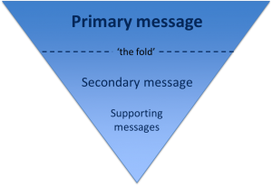
The inverted pyramid is the idea of turning a story on its head. You start with the key point and then provide more detail further down the page. This ensures that essential information is at the top of the page. This is vital for mobile devices as a smaller screen size means that less content will appear ‘above the fold’.

Inverted pyramid showing where primary, secondary and supporting messages appear (primary at the top, secondary in the middle and supporting at the end)

Karen McGrane in her book, Content Strategy for Mobile, recommends thinking about your primary, secondary and supportive messages to help prioritise content on a page.

Primary message

Your primary message is the main point of the page. This should be communicated through your page title and introduction so that users can quickly see what the page is about.

Page titles should be clear and descriptive so that users can understand them at a glance. Similarly, your introduction should be concise and engaging. It should also contain key words for search engine optimisation. The introduction should summarise the main message in 50 words or less to grab the reader’s attention and encourage them to scroll down the page.

Secondary message

The secondary message is the body copy of your page. It expands on your main message and provides more detail. The body copy should answer your users’ questions and be concise and scannable.

Supporting messages

The supporting messages are qualifiers and additional information to support your main messages. They can include quotes, images and videos. Supporting messages can also provide a next step, such as a call to action like booking a place at an event or taking a virtual tour.

Summary

People spend less time reading online and will only scroll if they think that information further down the page will be useful to them. It’s vital to prioritise content so that your primary message is easily visible. Structuring content effectively is therefore fundamental to ensuring your main message is conveyed to your users.

References

Amy Schade, The fold Manifesto: Why the Page Fold Still Matters, Nielsen Norman Group, 1 February 2015

Karen McGrane, Content Strategy for Mobile, A Book Apart, 2012

Jakob Nielsen, F-Shaped Pattern For Reading Web Content, Nielsen Norman Group, 17 April 2006

Related posts

Share this post:
Share

Testing our Responsive Design with Real People

The Corporate Web Development Team recently carried out some user research on the new mobile responsive postgraduate website. Our aims were to:

  • test the new design features
  • find out how easy it was for people to use the site on both mobile and desktop
  • identify developments for the postgraduate site and our Go Mobile Programme

User testing sessions

Six members of staff from the University participated.

We observed each participant complete a series of tasks on the website using a desktop, mobile or a combination of both devices. They were asked to ‘think aloud’ so that we could record their thought processes.

User testing results

The testing revealed many things about the design of the site – features that are working well and areas that need further development.

For this post I’ve pulled out some interesting outcomes.

Search

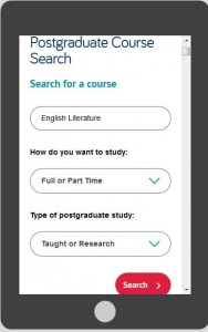
Screenshot of the search results on a mobile screen

The testing revealed that the new course search was well used and provided good results.

However, since the advanced search filters appear above the results, the search results are hidden on both desktop and mobile.

This was a particular problem for mobile users as it looks like the search hasn’t worked. One of our users kept filling in the fields even though they didn’t need to.

It shows that the course search needs further development to improve its usability.

Navigation

On mobile people easily found the blue link buttons on the homepage (eg Student Life) but desktop users did not spot these as quickly.

The buttons appear under the content on mobile, on desktop they appear to the right hand side.

Example blue call to action button from the responsive designThis supports research into online reading which shows that content to the right is often ignored.

Desktop users tried clicking headings in the main content before clicking the button. One person didn’t notice them and struggled to complete certain tasks.

The red call to action buttons were well used on both desktop and mobile. They were spotted quickly and people commented that they made tasks easier.

Example red call to action button from the responsive designThe inconsistency of hyperlink styling made it unclear what was and wasn’t a link. The majority of users didn’t find the student profile information as they weren’t aware that the heading linked through to additional content.

The user research showed that we need to review the links on the homepage. In contrast, participants quickly spotted navigation on course and supplementary pages.

Content

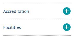
One of our new content types is known as mobile collapse. On desktop, the content displays as a heading and paragraph. On mobile, the content is ‘collapsed’:

Screengrab of the mobile collapse function. The user research revealed that the mobile collapse content did not stand out. Mobile users scrolled past the information without realising it could be expanded.

If our potential students can’t find accreditation information they may assume that the course is not accredited. It’s crucial that we make this content more prominent on mobile.

Design

There were lots of positive comments about the look and feel of the site. People spotted the pull quotes quickly and users liked the use of videos, images and dual tone headings.

One user described the site as “vibrant and exciting”.

Testing is vital to improve the usability of a site

This research has highlighted to me the importance of user testing – it shows us what is working and what needs improving.

If prospective students can’t find information easily it may influence their decision to apply here so it’s vital that we identify and solve usability issues.

We’re currently working on solutions for the issues identified from this testing.

Improvements to content, design and layout will also inform developments for the next batch of sites in our Go Mobile Programme.

Find out more

We base our user testing on training provided by the Nielsen Norman Group. Find out more about user testing by visiting the Nielsen Norman Group’s website.

Share this post:
Share