Top 5 Tips: Search Engine Optimisation

In our recent Planning and Writing Web Content training there were a few questions about how to improve your website’s position in search results. So we thought it timely to share our top 5 tips for search engine optimisation (SEO).

There’s no mystery to it – writing content that will be highly ranked by search engines is the same as writing effective web content for your users.

1. Use the language of your readers

It’s important to think about the terms your readers might use to search for your site, and then to use these words in your content.

You should also identify keywords and phrases that you want to rank highly for. Keep these narrow; it’s unrealistic to compete with general terms like ‘student experience’.

2. Keep your content up to date

When a page was last updated matters to search engines as well as your users. It’s essential to check for, edit and delete out-dated content.

3. Highlight important content

Highlight key words to make sure that the search engine can work out which content is most important. You can do this by:

  • including keywords in the page title and subheadings
  • making keywords bold
  • using keywords in hyperlink text

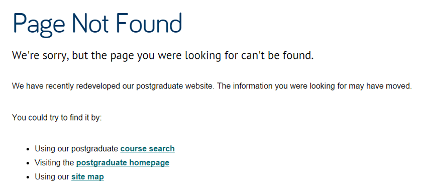
Don’t rely on graphics or text in images to convey your message. Search engines can’t get to this copy and your content won’t get indexed.

4. Use descriptive web addresses (URLs)

URLs appear in search results. It’s therefore important that your URLs are descriptive of the content on your page. Users can then tell if the page will be relevant to them.

5. Links

Search engines respond to well-linked sites. You should link to relevant content on Newcastle University’s website and externally. Also look for opportunities for colleagues at the University and external partners to link back to your site. This verifies your content’s relevance and importance to search engines.

Related posts

Share this post:
Share

FAQs and why we hate them

We often get asked why we do not want FAQs (Frequently Asked Questions) on the University’s websites.

There are lots of reasons: all to do with making our websites work well for the people who use them.

But, why do we reserve such hatred for such a simple page? Read on and I’ll explain.

Old school

Back in the day, you would always see FAQs on websites. They were used as a catch-all section for content that didn’t quite fit elsewhere.

Now websites have evolved, so has our understanding of how people use them.

The good, the bad and the ugly

Good websites base their structures, sections and content on their audience’s needs. They focus on what we call top tasks.

Content should be in the most logical section. It should be labelled clearly so people can find it and complete their task with ease.

FAQ pages are bad.  They dump a jumble of content together in one page. They are often a long list of questions in a random order. Worse, they may not even answer the question that your reader has in mind.

Another nail in the coffin for FAQs, is the very nature of them. Being a question they have useless, repetitive intros like “How do I?” or “Where can I?”

This is ugly, lazy content! Hard to read, understand and scan.

Why ask your audience questions, when they are visiting your website for answers?

They cause duplication

We’ve had examples of sites that had perfectly good sections reflecting their top tasks.

Instead of just adding content to these existing sections, a new FAQ page appears. It duplicates content in other sections.

They are patronising

FAQs talk to you in a really irritating way.

My personal favourite is the “How do I contact you?” FAQ when there is already a contact us section.

They create more work (and mistakes)

When the contact us section is updated, will the Web Editor remember to track down and update the FAQ too? Often not.

They cause confusion

Out of the two contact us sections, which one is correct? The phone number is different…

Messing with Google

Duplicated content problems show up in Google search results.

FAQ content will fight your other content for attention. Google doesn’t know which contact us content is the right one. It might show both, it might show the out of date FAQ, either way, your user isn’t going to be happy.

We’re not alone…

I hope you can start to see why we are not so keen on FAQs. And it’s not just us…

Gov.uk is stripping away all the FAQs it comes across for the same reasons I’ve just highlighted.

One of our favourite authors about all things web, Gerry McGovern writes about FAQs and really makes you question their worth.

How to avoid using FAQs

If people are repeatedly asking you the same questions:

  • make sure your web content is up to date and signposted well
  • add new content if you are missing information
  • review your top tasks, you may need a new one

Take a look

Next time you see a FAQ page on a website – take a real hard look, with my points in mind. Bet you start to cringe now too…

Share this post:
Share

How Micro Content Can Immediately Improve Your Website

Micro content isn’t teeny tiny type on a page – it’s actually the words we put on websites for things like buttons, tabs, menus, even page titles.

Recently we looked at the micro content we used on the 404 error page for the Postgraduate (PG) website.

Our analytics showed some people who followed a broken link (a deleted page) arrived at this error page and then immediately left the website.

Okay, so those people didn’t find the page they were looking for, but we follow best practice on our error page. We very politely give helpful links to the search, homepage and sitemap so people can still try to find what they are looking for.

So why did they leave immediately?

Review micro content

A quick review of the error page micro content revealed it was perhaps a bit negative:

Our old, negative, 404 error pageOur loud and proud micro content at the beginning of the page, didn’t encourage people to read further and use the links we had so helpfully provided.

The page was also a tad long to scan read so we changed it to:

Our new, confident and friendly, 404 error pageBy changing the micro content, we also made the error page follow the confident but friendly PG tone of voice the rest of the website uses.

Testing 1 2 3

We had several versions of the new error page, and ran these past a few people. The feedback resulted in a mashup of the different versions. Overall it’s a page that everyone felt works better.

Outstanding results

We added Google Analytics to the error page so we could tell if/when people started using the links instead and staying on the website… we had a brilliant results.

People stayed on the PG website – and six actually went on to start the application process!

So potentially, six new postgraduate students gained by changing micro content – that’s powerful stuff.

Take a look at the micro content on your website – is it saying what it needs to in the most effective way?

Have a go! What improvements can you make to your micro content?

Read more

This short but effective article, The first rule of web design by Seth Godin is worth a look. Its about making sure you use the right micro content for actions on your webpages – it certainly makes you think.

Share this post:
Share

Fix Broken Links and Misspellings with Siteimprove

Broken links and misspellings in content harm the credibility of your website. They have an impact on – search rankings, user experience, and visitor traffic.

So, it’s important that you check and update your content on a regular basis.

We’re using Siteimprove quality assurance software to help web editors do this. It’s reporting on our external Academic Unit and Support Services websites – 60,500 pages !

How it works

Siteimprove crawls your website each week, highlights issues and sends you a report that:

  • checks every page and PDF on your site for broken links
  • checks for spelling errors and potential misspellings on every page
  • highlights elements on the page for you so you see errors in context

There’s also an inventory of all media files, documents, email addresses, and phone numbers. This makes it easy to audit your website and keep things up-do-date.

Siteimprove won’t fix broken links and misspellings errors on your website but it does make it easy to find them.

Improve the quality of your web content – get rid of those broken links and misspellings  and start using your Siteimprove report!

Access to Siteimprove

You can request access to Siteimprove (University Login required).

Share this post:
Share

How to Structure Content on a Webpage

Before you can start writing effective web content you need to be clear about what you’re trying to achieve with your site and who your main users are.

For every page you plan, ask yourself:

  • Why am I creating this page?
  • Who am I creating this page for?
  • What do I want the user to do after reading it?

People generally come to a site to find something out so it’s important that you answer their questions with your content.

Once you know the messages you need to communicate and who you’re communicating them to, you can start prioritising content.

The fold

‘The fold’ is a term used in web development to refer to the point on a webpage where people need to scroll.

Amy Schade (Nielsen Norman Group) in The fold Manifesto: Why the Page Fold Still Matters explains that people will only scroll if content ‘above the fold’ appears relevant to them. So it’s essential that web content at the top of your page is an accurate indicator of what information appears further down the page to encourage users to scroll.

This is a really useful concept to bear in mind when structuring content on your webpage.

The inverted pyramid

It’s also helpful to think about structuring a webpage in the same way that journalists structure a news article – by using the inverted pyramid.

The inverted pyramid is the idea of turning a story on its head. You start with the key point and then provide more detail further down the page. This ensures that essential information is at the top of the page. This is vital for mobile devices as a smaller screen size means that less content will appear ‘above the fold’.

Inverted pyramid showing where primary, secondary and supporting messages appear (primary at the top, secondary in the middle and supporting at the end)

Karen McGrane in her book, Content Strategy for Mobile, recommends thinking about your primary, secondary and supportive messages to help prioritise content on a page.

Primary message

Your primary message is the main point of the page. This should be communicated through your page title and introduction so that users can quickly see what the page is about.

Page titles should be clear and descriptive so that users can understand them at a glance. Similarly, your introduction should be concise and engaging. It should also contain key words for search engine optimisation. The introduction should summarise the main message in 50 words or less to grab the reader’s attention and encourage them to scroll down the page.

Secondary message

The secondary message is the body copy of your page. It expands on your main message and provides more detail. The body copy should answer your users’ questions and be concise and scannable.

Supporting messages

The supporting messages are qualifiers and additional information to support your main messages. They can include quotes, images and videos. Supporting messages can also provide a next step, such as a call to action like booking a place at an event or taking a virtual tour.

Summary

People spend less time reading online and will only scroll if they think that information further down the page will be useful to them. It’s vital to prioritise content so that your primary message is easily visible. Structuring content effectively is therefore fundamental to ensuring your main message is conveyed to your users.

References

Amy Schade, The fold Manifesto: Why the Page Fold Still Matters, Nielsen Norman Group, 1 February 2015

Karen McGrane, Content Strategy for Mobile, A Book Apart, 2012

Jakob Nielsen, F-Shaped Pattern For Reading Web Content, Nielsen Norman Group, 17 April 2006

Related posts

Share this post:
Share