Improve Your Content with Help from Hemingway

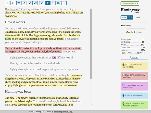
Hemingway Editor is a great tool for anyone who writes anything. It allows you to assess the readability of your writing before unleashing it on an audience.

How it works

You can paste in a section of text and it will give you a readability score. This tells you how difficult your words are to read – the higher the score, the more difficult it is. Hemingway uses a grade level to do this which is based on the level of education needed to read your text. If you can get your score under 10 you’re doing well.

The most useful part of this tool, particularly for those not confident with writing for the web, comes in the analysis of your text. The app will:

  • highlight sentences that are difficult or very difficult to read
  • identify the use of the passive voice and adverbs
  • highlight complex words and suggest simpler words or phrases

There are other tools out there that do a similar job. For example, on my own blog I have the Jetpack plugin installed which uses After the Deadline to check spelling and grammar. It works in a similar way to Hemingway App by highlighting complex sentences and use of the passive voice.

Hemingway Editor

The Hemingway analysis of this post

Hemingway beta

The new Hemingway, currently in beta, gives you the ability to format your text with basic styles. You can add headings, bulleted lists, bold and links. If you copy this text to another piece of software, like T4 or WordPress, the formatting is copied too.

Concluding remarks

We use this tool a lot within the Corporate Web team when producing copy for the website. It’s an easy way to check how readable your words are, putting your visitors in a better position to understand your message.

Try it out on some text from your website and see what small changes you can make to improve your writing. My greatest achievement is getting some text down from grade 41 (yes, you read that right) to grade 10. See how you get on.

Related posts

Share this post:
Share

How to Get to the Top of Search Results

When you use a search engine or the University’s on-site search (powered by Google), how often do you look at the second or third page of search results? Never, right? You usually follow links that appear high up in the results.

Search Engine Optimisation (SEO) is how you go about improving your website’s position in search results. The good news is you can do something about it right now. It’s not a technical fix and money doesn’t buy you the top spot…

Text on graphic featuring the letters SEO

It’s all about your web content.

So far, so good. But what is it that you need to do?

Write search engine optimised content

Your primary focus is writing for your user not for a search engine: if you get this right then your SEO will follow.

Use the language of your reader

Think about what terms a user might use to search for your site. Use these words in your content.

Explain acronyms or industry jargon – a new member of staff is unlikely to know that we refer to ourselves as CWD (Corporate Web Development). We’d always make sure to spell out our name or refer more conversationally to ourselves as the Web Team (as that’s how we’re known).

Identify keywords and phrases that you want to rank highly for in search results. Keep the focus narrow — competing against general terms like ‘student experience’ is unrealistic.

You can use Google analytics to find out what search terms people are using to find your site. Contact us to get access to your web analytics dashboard (University login required).

Update content regularly

When a page was last updated matters to your users and search engines. It is important that you check for, and edit or delete, out-dated content.

Our post on writing for the web gives you some further hints on how to improve your copy.

Highlight important content

Make sure the search engine can easily work out which content is most important.

You can do this by including keywords in headings (particularly your page title), making them bold and using them in hyperlink text. This means no ‘click here’ link text – unless of course you want to be top of Google for that!

All these elements get marked up in the HTML so are immediately noticeable when your site gets crawled by a search engine.

Site and page structure

Web addresses also known as Uniform Resource Locators (URLs) get displayed in search results.

They can help your readers to decide whether to visit your site by indicating what the page is about. Descriptive URLs with words that are relevant to your site’s content mean more to your site visitors and search engines.

Links

Links into your site from related external websites act as verification of your content’s relevance and importance. Look for opportunities for collaborators and partners to link back to your site.

This also works across Newcastle University’s site. Make sure you link to other related content and get your colleagues to return the favour. Search engines respond to well-linked sites.

Graphics and images

Try not to rely too heavily on graphics or text in images to convey your message. Search engines can’t get at this copy – so your content doesn’t get indexed. Worse, they don’t get found by your customers.

They cause problems for accessibility too: don’t exclude your potential customers by making content difficult to engage with.

Have a go

Try a search on the University website for terms you think should find a page on your site. Make a note of where you appear in the results (eg page 5, postion 3).

Go to your website and optimise your content (use headings and bold), increase hyperlinks to the page that needs greater visibility, improve the URLs.

Give it a few days for the search to update and see how you’ve improved your search results!

Image credit: How to Search Engine Optimization by SEO Planter via photopin under CC BY-ND 2.0.

Share this post:
Share

Improving User Journeys on the Postgraduate Website

The postgraduate (PG) website redevelopment initially began with a focus on improving the content and developing a strategy for content management. Mostly, this was to enable a more coherent user journey through the website – to improve the experience as a whole and encourage applications.

A consistent user experience

As the project got underway it became more and more obvious from our user research that we really needed the website to be optimised for mobile too.

To create a truly consistent experience, users of the website should be able to get the same experience and information no matter what device they use to view the site.
While we were trying to work out how we were going to do that, there was still some debate in the web development world about if you should or could just offer a separate mobile site. Immediately we decided that approach wasn’t helpful at all.

Project creep

The Postgraduate website goes mobile

The Postgraduate website goes mobile

Just imagine a user looking at the PG website on a desktop computer. Later they decide to go back and check some information using their phone.

What would their experience be like if we gave them a separate site? With a different structure and content? That really wouldn’t be helpful. Or coherent. Or easy to maintain.

So the work grew from a massive project of improving all the PG content and creating a PG content strategy, to also incorporating the ‘small’ technical demand of a mobile responsive website!

In 2010 Ethan Marcotte coined the term responsive design to describe a flexible, grid-based layout for a website that behaves differently depending on the device used to view it.

… It was a busy year.

Inspiring results

Now we have a really great, mobile responsive website with much improved content that we’re not only proud of, but has inspired the University’s Go Mobile project. Just a quick look at how our users are responding already (we launched at the end of October) shows, for mobile users:

  • average time spent on site has increased by a massive 240%. It was less than four minutes, now it is nearly 12
  • we’ve increased the number of pages viewed by nearly 22%

Watch this space

There were so many elements to the PG project that they merit separate blog posts, so in the coming months we’ll be sharing about how we:

  • wrote content for mobile devices (and improved the desktop reading experience)
  • created a tone of voice – and why
  • prioritized content layout for mobile optimization
  • kept sane (only kidding)

In the meantime you can visit the new PG website and discover the new features by taking a look at our PG case study presentation (PDF: 849KB) from the NU Digital event.

We’d love to hear your views about the new PG website, so feel free to leave a comment.

Update: 16 Nov 2015

Since this article was published, we’ve completed some user testing on the PG website. Check out our blog post about the great user testing results (hint: they love it).

Share this post:
Share

Top 5 Tips: Writing for the Web

Screenshot of Prezi - writing for the web

We often get asked about writing for the web as if it’s some mysterious dark art. It’s really not, it’s very simple.

We’ve pulled together our top 5 tips for improving web content.

View our Prezi to find out more: Top 5 tips: writing for the web.

Here’s a summary of what you’ll find there:

1. Be concise

It takes time to edit content and cut words – but it’s worth it – your users are more likely to read what you say.

Tip: try the Hemingway Editor to help you cut your copy and increase readability.

2. Be direct

Use clear, jargon-free language to get your point across to your readers.

3. Make your copy scannable

Use sub-headings, bullet points, lists and bold – all of these things help to get your content noticed.

4. Be conversational

It’s fine to be less formal on the web. Just imagine you’re having a cuppa with your reader and type as you’d talk!

5. Be active

Use hyperlinks to encourage people to read more of your site. Point out content that should interest them – what’s the next step you want them to take?

Feel free to get in touch via the comments – we’d love to hear your thoughts.

Share this post:
Share

Introduction to Content

People have different behaviour when reading online. They dedicate less time, are more task-focused and won’t read everything. As a result, writing for the web is different from writing for printed publications. This is particularly important as people are now viewing web content on a variety of mobile devices.

Content topics

We’ll be using this blog to help you improve your content management, so that your web content is more user-focused, task-driven and sustainable.

You’ll find information about planning content. Topics will range from how people read online to determining the purpose and goals of your web content and calls to action.

We’ll cover writing and formatting content, particularly for mobile. This will include topics such as language, voice and tone and making copy scannable.

There’ll also be posts about asset management, including standards for images and file types.

We’ll be sharing tips from industry experts and will let you know about useful editorial apps and websites.

What we currently offer

The Corporate Web Development Team guides and supports the University’s web editors to create and maintain high-quality, relevant web content.

We currently provide editorial support, advice about content management and training.

Visit our website (University Login required) to see our content style guide and read our top 5 tips for writing good web copy.

Suggest a topic

If there’s a topic you’d like us to cover leave a reply or get in touch via our website (University Login required).

Share this post:
Share