The Content Audit: Step 1 for Improving Your Website

The Go Mobile process begins with a content audit. I’m here to share with you what that involves and how it informs everything that follows.

The audit process

We start by taking an inventory of all the pages on a site. One of our web content officers systematically goes through it to collect information for each page, such as:

  • the page title
  • its level in the site structure
  • when it was last updated
  • its overall content quality (measured against our content standards)
  • whether there’s any content embedded or being fed in from elsewhere
  • whether it’s linked from the menu
  • if it links to any documents

We make an assessment of each page and recommend whether it should be retained, improved or deleted.

For pages marked for improvement we’ll also provide some context, or a recommendation for how the page could be built using the new content types.

The resulting spreadsheet is a riot of colour…

Example content audit spreadsheet

Acting on the audit

When the audit is finished, the auditor sits down with the project manager to go through the findings.

The project manager uses the outcome of the audit to work with the site’s owners and editors to agree the next steps.

The information gathered in the audit helps us to:

  • restructure sites
  • inform work needed before migration into T4
  • identify where we can improve content

The audit also provides a snapshot of the size and complexity of a site at a specific point. Having this information gives us a benchmark we can compare the new site to after it’s been through Go Mobile.

How you can help

Editors of websites due to go through the Go Mobile process can help us out with a bit of spring cleaning.

For tips, read Lisa’s post ‘Decluttering Your Website: How to Prepare for Go Mobile

Share this post:
Share

Go Mobile Web Editor Community Event – a Guest Post by Anna Jenner

Anna Jenner, Student Recruitment Officer and Web editor. Anna Jenner is a Student Recruitment Officer in the Student Recruitment Team.

She is the web editor for the Information for Schools and Colleges website, which went through the Go Mobile process last summer.

Anna attended our first Web Editor Community Event (held on 3 February 2016). Here’s what she thought of the session.


I was invited to attend the Web Editor Community Event, the first of a series of events offered by the Corporate Web Team. Its aim was to build and empower the community of web editors across the University and allow us to keep in touch, ask questions and share advice.

I loved the sound of this immediately as I thought it would be a great chance to pick my colleagues’ brains about their websites and learn from their experiences of the Go Mobile process.

Cake and networking

There was also the promise of cake so I signed myself up eagerly (having sacked off my New Year’s Resolution of no cake on the 4 January when I came back to work!). My high expectations were met when I walked through the door and saw a pile of proper size cake (none of these tiny portions!) and lots of tea and coffee.

There was a lovely relaxed atmosphere from the start with ample opportunity to have a chat with colleagues from across the University. Many mirrored my own thoughts and spoke highly of the level of support they had received throughout their Go Mobile experience and celebrated the greater functionality, responsiveness and design of our sites leading to improved audience engagement.

Go mobile: the story so far

After the refreshments and networking opportunities we had a short update on the overall story so far with regard to Go Mobile. You can’t argue with Google Analytics and it is clear to see the positive effect that the Go Mobile process is having on traffic to the University webpages.

This was uplifting to all of us who have worked hard to improve the content and update the assets on our websites, whilst also getting to grips with a new content management system (T4), and made it seem even more worthwhile by seeing the bigger picture.

T4 show and tell

I found the next part of the event particularly useful, where members of the Web Team shared some useful hints and tips about the different features of T4 including:

  • how to use box types to create grid layouts on different pages
  • using the ‘Gallery’ to rotate three or four images on a page
  • different ways to move large amounts of content quickly from one part of your site to another

We got to see how these content types were created in T4 and then shown how they would look on the webpages. This information was very timely for many of us at the event as after the initial setup of our websites, we were now looking to add new features.

I have really enjoyed getting to grips with this CMS and find the functionality and navigation to be so much better to any I have used previously. It took me a while to get my head round but the training offered by the Corporate Web Team was comprehensive and easy to follow. Nevertheless, having the opportunity to get some further hints and tips was very welcome!

Question and answer session

We then got the opportunity to ask any questions about working in T4 and writing for the web. The questions that were asked were very useful and explored topics that I hadn’t thought about in detail, such as how to archive events correctly.

We finished off the event by discussing ways in which we can develop the community of web editors and share content, ask quick questions of each other (rather than constantly bothering our Web Managers – apologies to Emma Cragg, who is quite often harassed by me!) and extend our knowledge through our peers.

This event was informative, clear, concise and a great start to what will I hope become a thriving network of web editors. I am very much looking forward to the next one!

Share this post:
Share

Find Your Way Using the New Global Menu

The new global menu is visible across all sites in the new template. It replaces the mega footer seen in the old central template.

Mega footer used in old website template

Mega footer used in old website template

The menu launched at the same time as the new external homepage. In its first iteration it was static. Each menu item linked through to a landing page containing links to further content relevant to the section. For example, take the Study landing page which links through to the Undergraduate, Postgraduate and International sites, among others.

Menu behaviour on desktop

We developed the second dynamic iteration of the menu to reduce clicks. On desktop you can hover over each menu item to open a sub-menu with links to relevant sites.

Global menu on desktop screens

Global menu on desktop screens

The global menu is accessible. Keyboard access is achieved using the tab key to move through each menu item. Pressing on the down arrow on the keyboard will open the sub-menus.

Menu behaviour on mobile

When using the website on a touch based device the global menu loses the sub-menus. When you tap any item in the menu it takes you to a landing page that has similar links to those found on the sub-menu for that section.

Global menu on mobile devices

Global menu on mobile devices

Further development

This is not the end for development of the global menu, we’re testing how it is used to inform the next steps of development. This iterative process is a method we’re starting to use to approach development across the whole site.

Share this post:
Share

Designing the New University Homepage

As part of phase one of Go Mobile we redesigned the University homepage so that it works across all devices. Like the other sites going through Go Mobile it is managed in T4, the University’s content management system.

Features of the homepage

Our new homepage can be broken down into eight distinct sections.

  1. Global menu for quick access to key links
  2. Course finder for direct access to Undergraduate and Postgraduate courses
  3. Hero image slider to highlight key news, event and research stories
  4. Video content to support our key messages
  5. Seasonal message top task boxes
  6. Latest news from the Press Office
  7. Partner logos and awards carousel
  8. Social media links and directory
Newcastle University homepage features and layout

Homepage design features and desktop layout

On mobile devices these stack horizontally, one on top of the other.

We’ll look at a couple of these features in more detail.

Hero image slider

The old homepage image slider was full width. Although this created a strong visual impact, sourcing images to fit this area could be problematic.

Old full-width hero image slider

Old full-width hero image slider

The new hero image slider is smaller. It allows the Press team to source images that would fit a standard landscape 4 x 6 photo.

New hero image sliderOn mobile devices the caption drops below the image to avoid the image from being fully covered. The caption and image form a single clickable link. This is important on mobile devices as it creates a large hit target to increase successful touch interactions.

Video content

The new homepage layout has allowed the use of rich media content such as video. The analytics show that the external homepage is the most popular destination for video consumption. This has helped increase the profile of some key videos during the months of October to December 2015:

  • The Impact of a World-Class Civic University
  • How Smoking In Cars Can Affect Children
  • Dr Martin Luther King Jr Honorary Degree Ceremony
  • Our City
  • Our Campus

Related posts

Read more about the new responsive website template in our case studies:

Share this post:
Share

How to Improve the Readability of Your Webpages

Readability for websites isn’t just about people understanding the words, although of course that’s a massive part of it.

After all, if you can’t understand what the words are trying to tell you, you’ll just leave the site without the answers to your questions.

We’ve proven it time and time again – the readability of complex information can be improved by using clear, easy to understand English. It’s just making sure more people can understand it.

What I’d like to focus on for this post is some tips about the other elements that can affect readability; prioritisation of content, page layout, the use of design, and ease of navigation.

Prioritisation of content

What is it that people really need to know about on your page? If you identify it, you can prioritise the content to improve readability. Content should always be created and designed with the user’s needs in mind.

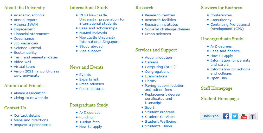
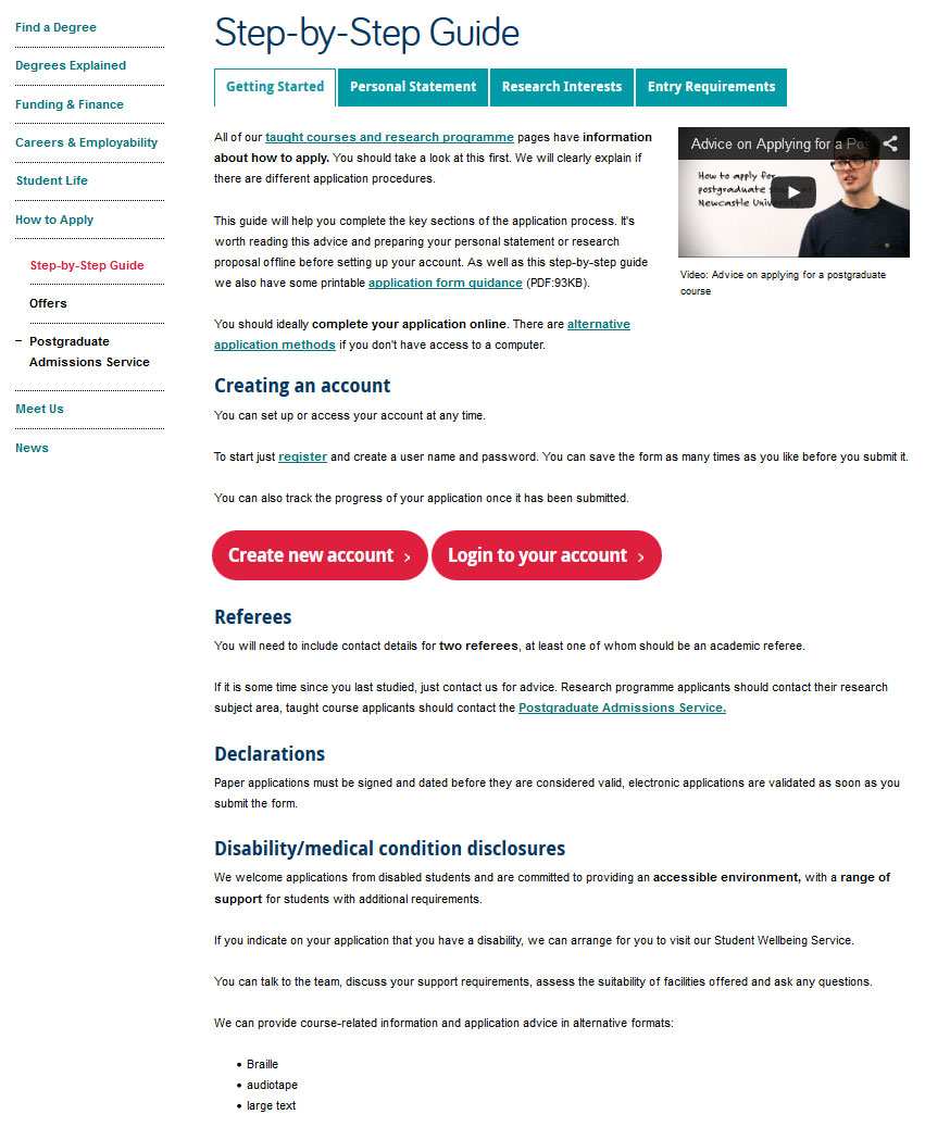
For example, here’s a screen shot of the old version of the postgraduate ‘How to Apply’ section. It had low readability; complex information, use of jargon and too many words! Your eye is also drawn to the box in the middle of the page, which was a little distracting.

example of a hard to read page

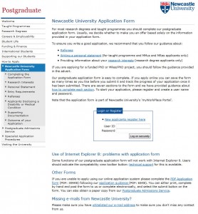
Old version of the application page (select to view expanded image)

We reviewed the section, identifying the purpose of the content (get people to apply) and  got to work editing.

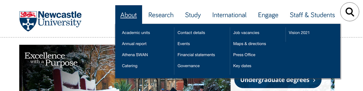
We use page titles to help accurately introduce the content for people. A change of title from ‘Newcastle University Application Form’ to a very clear ‘How To Apply’ certainly helped…

Also, editing reduced the content from 12 to just four pages.

example of an edited page

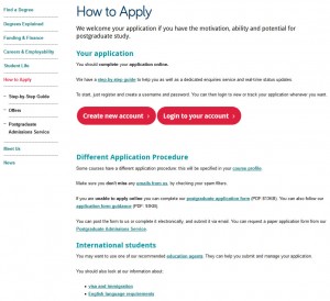
New edited version of the application section (select to view expanded image)

Another way we have improved readability is to use introductions on pages. This ensures people can quickly read a descriptive summary of the page. Take a look at Linda’s post about how to write great introductions.

Page layout

We reviewed the page layout or format, quickly deciding a step-by-step guide would be most effective at helping people though the application process. We even added a relevant video to support our primary messages.

content page with tabs

Pages of content were re-worked into a simple step-by-step guide using tabbed content (select to view expanded image)

Use of design

We’ve blogged before about how design can help people navigate around your site, but it can also help draw attention to key content/things you want people to do.  And no…I’m NOT talking about flashing animation here, but more subtle design devices.

I’ll explain – we often use expandable boxes on pages to hold content for specific audiences. It’s so that content can be seen – but doesn’t have to be opened unless it is relevant to you.

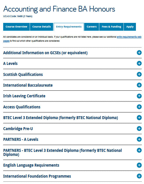
We use expandable content on the Undergraduate website for a long list of entry requirements, see the screen shot below. Don’t panic at all the options! Relax and simply choose the content relevant to you…

Image of expandable boxes on the undergraduate website

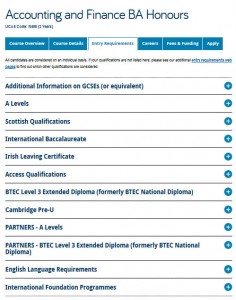
Using expandable boxes in content to help readability (select to view expanded image)

Test, test and test again

We’ve tested the content on the new postgraduate application pages using Clarity Grader (a website content analysis report) and the results are really positive:

Readability has increased from 48 to 55 (we aim for 60).

Long sentences (harder to read) were at a whopping 19.69% before we re-developed the page and have decreased to 7.97% (we aim for 5%).

This is all the more impressive when you consider the content is mostly complex and detailed information on application procedures.

Final tip

One of the key things to remember – is that you can always go back to pages and improve readability. It might be a slight tweak to a sentence, or a layout change – the main thing is that you can always improve it.

We ran some extensive testing on the postgraduate content. After all, a lot of what we did, not just to the content, but to the layout and design, then formed the master plan for Go Mobile – so it needed to be right. Did we do it?

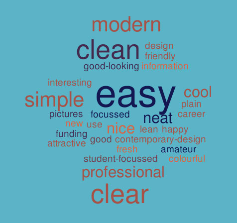
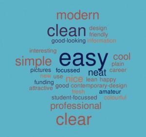
Oh yes. You can read about the excellent results in an earlier post of mine. A particular favourite is the below word cloud created from user feedback about first impressions of the postgraduate website. The most popular words that users used to describe the site included: easy, simple and clear.

Word cloud showing first impressions of the PG website

Go on, take the challenge – have a go! Choose one of your pages and see how you’d improve readability. I’d love to hear what you get up to!

Related posts

Share this post:
Share